PlayStation's retro filter confirms it: early 3D aesthetics are chic now
Wobbly vibes

The big sell of Sony’s PlayStation Plus may be the Xbox Game Pass-style catalog of games, but another feature stands out to me: the ‘vintage filter’, aimed at providing a retro feel for the old games. The filter (we can turn it off whenever) aims to transform our screens into an old CRT TV from the 90s.
Nostalgia for the 90s isn’t new by any means; Charli XCX wrote a song about 1999 in 2018, and, according to memes, there are some things only 90s kids will get. But this filter confirms a change in the gaming sphere that’s been brewing for a while; early 3D graphics are becoming the new retro aesthetic.
If you read that a game has a “retro look”, you might think Celeste, Stardew Valley, Shovel Knight; pixels accompanied by keygen music. But this look was considered retro 20 years ago when the SNES was just over a decade old. So what about the early 3D games entering their third decade? ‘Classic’ movies aren’t confined to the silent era, and ‘retro’ gaming has moved beyond the 8 and 16-bit era.
Fashion comes back around because human beings are suckers for nostalgia. You won’t have to look hard to find modern games that use the early 3D aesthetic. But is this a choice based on nostalgia alone, or do early 3D graphics have a purpose that transcends a yearning for our youth?

Making mirrors
“There's something about the PS1 aesthetic that works so well with the post-communist aesthetic,” Szrot co-developer Gustaw Mackay says. “Like a match made in heaven, one that hasn't really been done before. One of the reasons we think this style works so well is because it's a complete oxymoron. A cultural eastern European game like this could never exist in the 90s, as Japan and the US had a monopoly over the industry back then.”
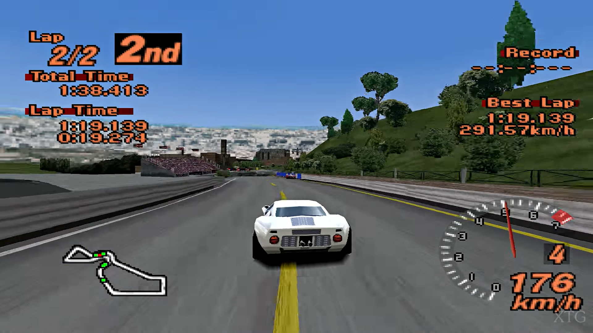
Szrot is influenced by titles like the original Metal Gear Solid and Gran Turismo 2; we can see their influence in its low poly concrete walls and car models respectively. “The way [the Gran Turismo 2 team] faked a lot of details with opacity maps is mind-blowing, and was the thing that piqued my interest in PS1 graphics,” Mackay says.
It’s more than just the models, though - it’s the use of these graphics for exploration. “I find it more artistically explorable; it's a lot more fun for me than realism,” Mackay says. “In a sense, you could call it impressionism because the visuals don't give you all the details. You have to fill in some spots yourself. The PS1 art style really amplifies this feeling of mystery… games like Riven and Silent Hill have this weird and mysterious vibe, because of the graphics. A feeling of uncertainty.”
Get daily insight, inspiration and deals in your inbox
Sign up for breaking news, reviews, opinion, top tech deals, and more.
Low poly horror

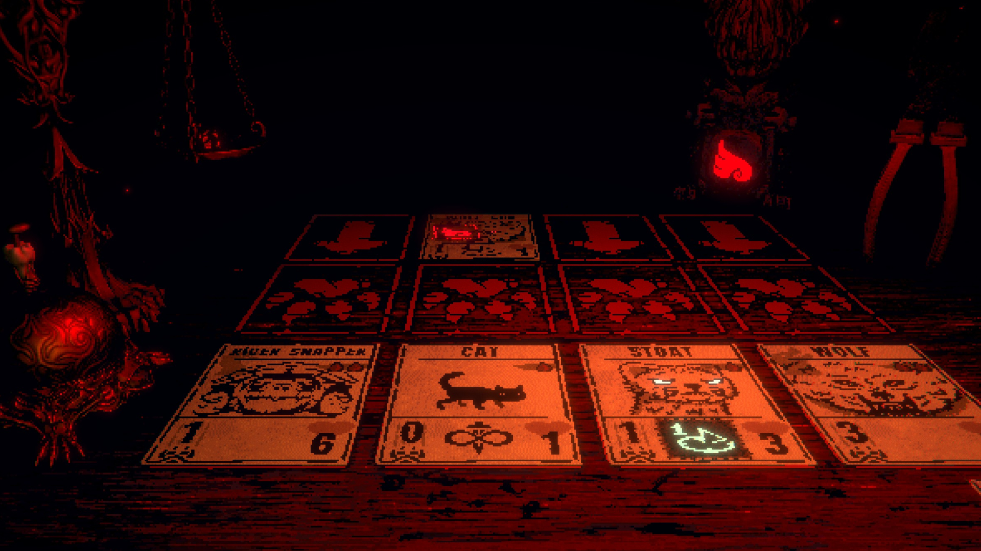
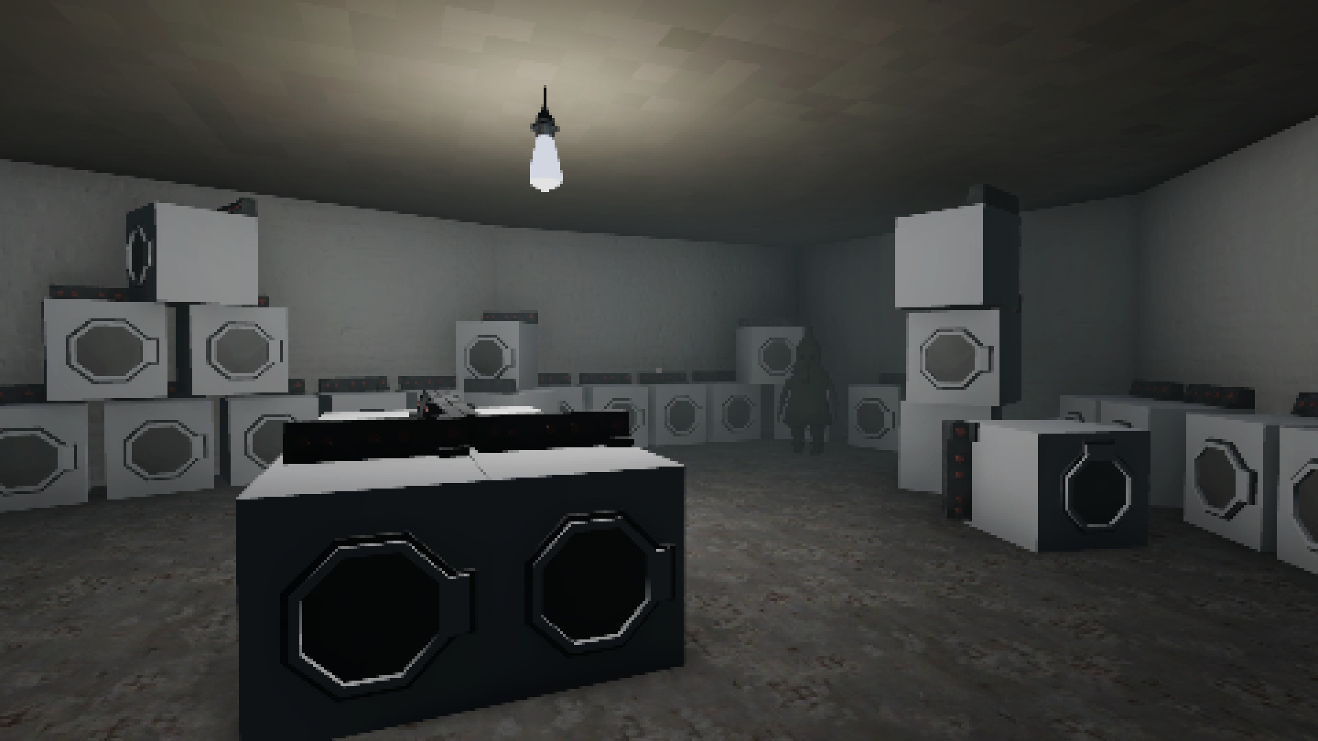
Gustaw isn’t the only developer who believes early 3D graphics provide creepy potential for modern games. Isaac Carpenter’s game Under The Warehouse follows the tradition of Inscryption and Buddy Simulator in the things-aren’t-what-they-seem meta genre, but unlike them, it plays like an early first-person low-res, low poly adventure.
The PS1 graphics gave his game a “dreamy quality,” Carpenter says. The game plays like a David Lynch movie, but it goes a step further because the dreams are, often, interactive. You wander through a mysterious warehouse and encounter, among other things, sleeping giants, a potential murder scene, and hungry guard dogs, all in the graphical style of the PS1 games. It could be a dream of the early 3D generation.
“The characters look slightly off... you can't make out much detail from their pixelated faces,” Carpenter says. “The environment is detailed enough to give the player information about where they are, but not enough to feel they’re in a real place. The unfiltered textures feel inherently grimy and dirty. The details of the world are obstructed by clunky pixels. The retro aesthetic has a lost-media vibe like you’re playing something you shouldn't be. Like the found footage genre.”
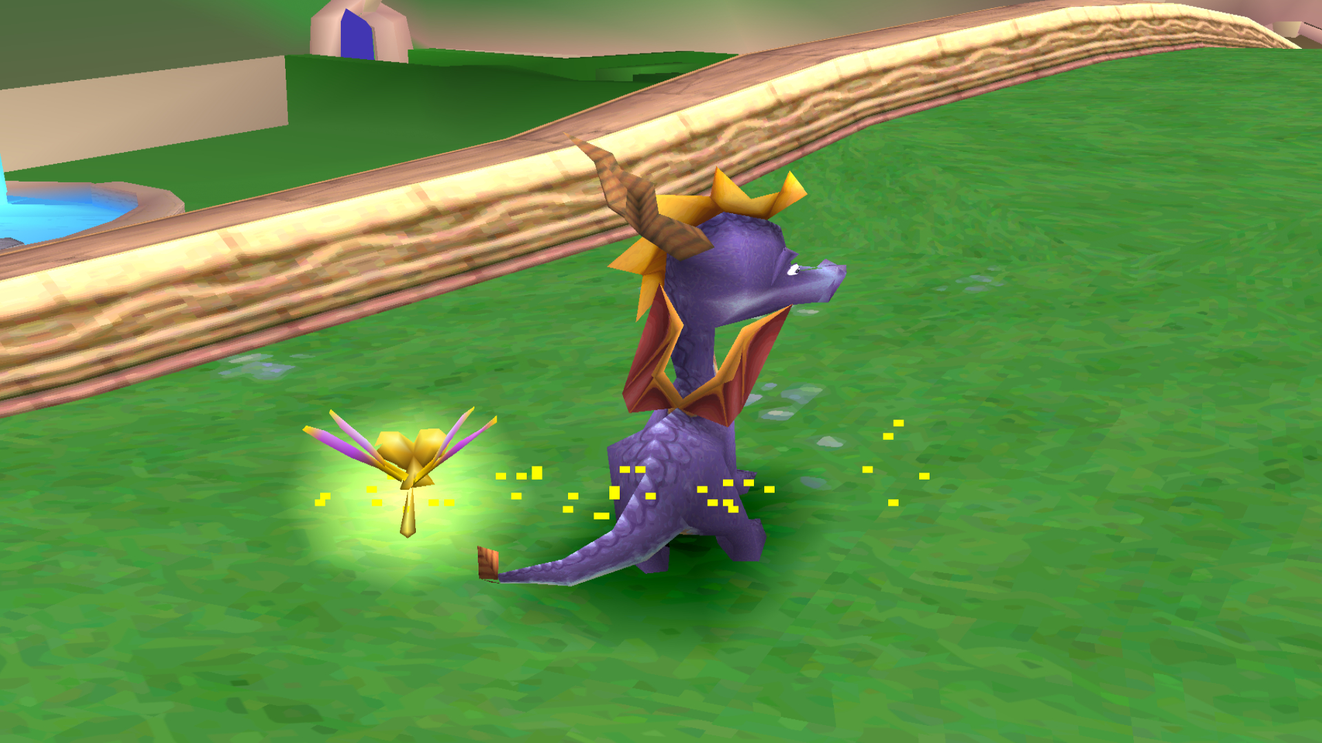
“It's an aesthetic that 's truly close to my heart,” developer Tim Harlow says. They’ve used the art style in a number of titles, including CBT, a game about Tim’s experience with panic and anxiety. “It provides a level of detail that allows the player to fill in graphical gaps with their imagination. Most of my games have melancholy themes, which I believe are well suited for the sparse strangeness of retro-3D graphics. I still play my PS1 regularly, and even with non-horror games like Spyro or Ridge Racer, I get the odd sense that I'm visiting sad, ghostly worlds.”

Just as developers of modern pixel art games yearn for Metroid and Street Fighter, there's a generation who yearn for Spyro and Goldeneye. Revisiting an older style, as I’ve said, is common in fashion. One could argue that with technology-driven art, it doesn’t make sense because old stuff only looks so due to technological restrictions.
But, as we’ve seen, new and polished graphics don't always cut it. Whether it’s the pixelated world of Celeste, or, as Gustaw said, the “feeling of uncertainty” in Szrot and Under the Warehouse - we often need to go back for inspiration. Remember that movie, The Artist, that told a story about a silent film star? There’s no way that could’ve been made without making an actual silent movie.
It’s no surprise that fans recoiled with horror when Rockstar said they’d replace all GTAs with the remastered version on Steam - which caused the company to reverse the decision. Murky low poly 3D worlds are part of our childhoods, our psyche. Just like the 2D 16-bit aesthetic, they weren’t limitations, they gave the games their character. Fortunately, developers and gamers are starting to realize this.
Ben is a freelance writer based in sunny North Wales. He has written for The Gamer, WhatCulture, and the mental health charity Safe in our World. When he’s not writing, he can be found playing PS2 games that he missed 20 years ago.
