Windows 8 is dead and we’re dancing on its grave - this is why it sucked
Time to beat a dead horse

This week is the end of an unpleasant era and I couldn’t be more excited. Windows 7 and Windows 8.1 will finally stop receiving security updates, a decade after their initial releases. There will be no more updates for the Microsoft Edge Browser and more third-party apps will soon follow suit, like how Google Chrome support for the two operating systems will end in the following month. This means users that still rely on the old OS will be left on their own, and will have to make the switch to newer, more usable software.
I have personally hated the OS since my first unfortunate run-in with Windows 8 ten years ago. Picture this: I’ve started high secondary school in Zambia, just as Windows 8 infects computers everywhere. After begging and pleading with my parents, they finally agree that I need my own laptop for school and to play solitaire at night when the power went out (at this point I had yet to learn you could very legally put movies onto your laptop).
My parents take me to the closest electronics store in town, buy me a laptop and take me home. Nothing fancy, a humble Lenovo device that would become the accessory to bad essays and group projects. I come home, turn the laptop on ready to personalise it with Death Note backgrounds and screensavers and call my new friend ‘Peaches’. Peaches the laptop comes on, the screen lights up and my heart sinks.
What’s with the weird boxes? The ugly colors? Why is everything clumped up together? Where’s my desktop?!
Good riddance to a bad OS. To celebrate this momentous occasion we’ll be counting down the seven worst things about Windows 8, why it was so unpopular in 2012 when it first launched, and weakly celebrating the only good thing I can say about it.
1. Where's the Start Menu?
Where do I begin?
Windows 8 was conceived in a post-iPad world, where tablets were gaining popularity thanks to Apple’s first iPad in 2010, and a lot of people speculated that tablets would bring about the end of the traditional computer as we know it. Of course, this didn’t happen, but with this in mind, we can see the thought process behind the aesthetic of the Windows 8 layout, with blocky app icons all over your screen to match the tablet-focused mindset.
Get daily insight, inspiration and deals in your inbox
Sign up for breaking news, reviews, opinion, top tech deals, and more.
However, this unwanted change came at the price of the most beloved, integral feature of the Windows experience: the Start menu. We lost the Start menu and everything fell apart.
So many people had become so used to the Start menu and the search feature that had been around since Windows 95 that removing it caused a lot of uproar among users that had to navigate the new wild west of Windows 8. Getting to the desktop was incredibly annoying, which leads me to my next point…
2. Fighting for my life trying to find the desktop
Innovation is meaningless if there is no aspect of familiarity involved in some way. Improving upon things that you have is where most good ideas come from. So, understandably, we were all very confused about the fact that we had to click one of those irregularly-sized squares to try and find the desktop, which was a short-lived victory when you tried to open anything else and lost the desktop in the abyss again.
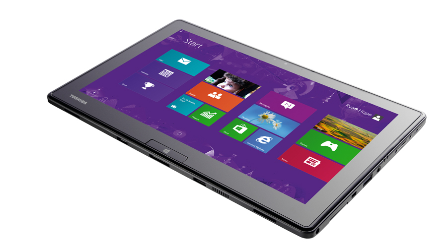
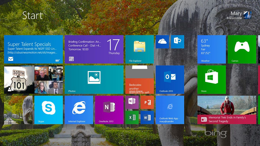
The desktop on its own was not awful, but getting there was a trek. The tile screen, with its resizable blocks and aggressive colors, was a feeble replacement for the desktop display we’d come to know and love. Naturally, it aligned with the UI of the Windows Phone OS, and well… we all know how that ended.

3. Forcing everyone into Tablet Mode
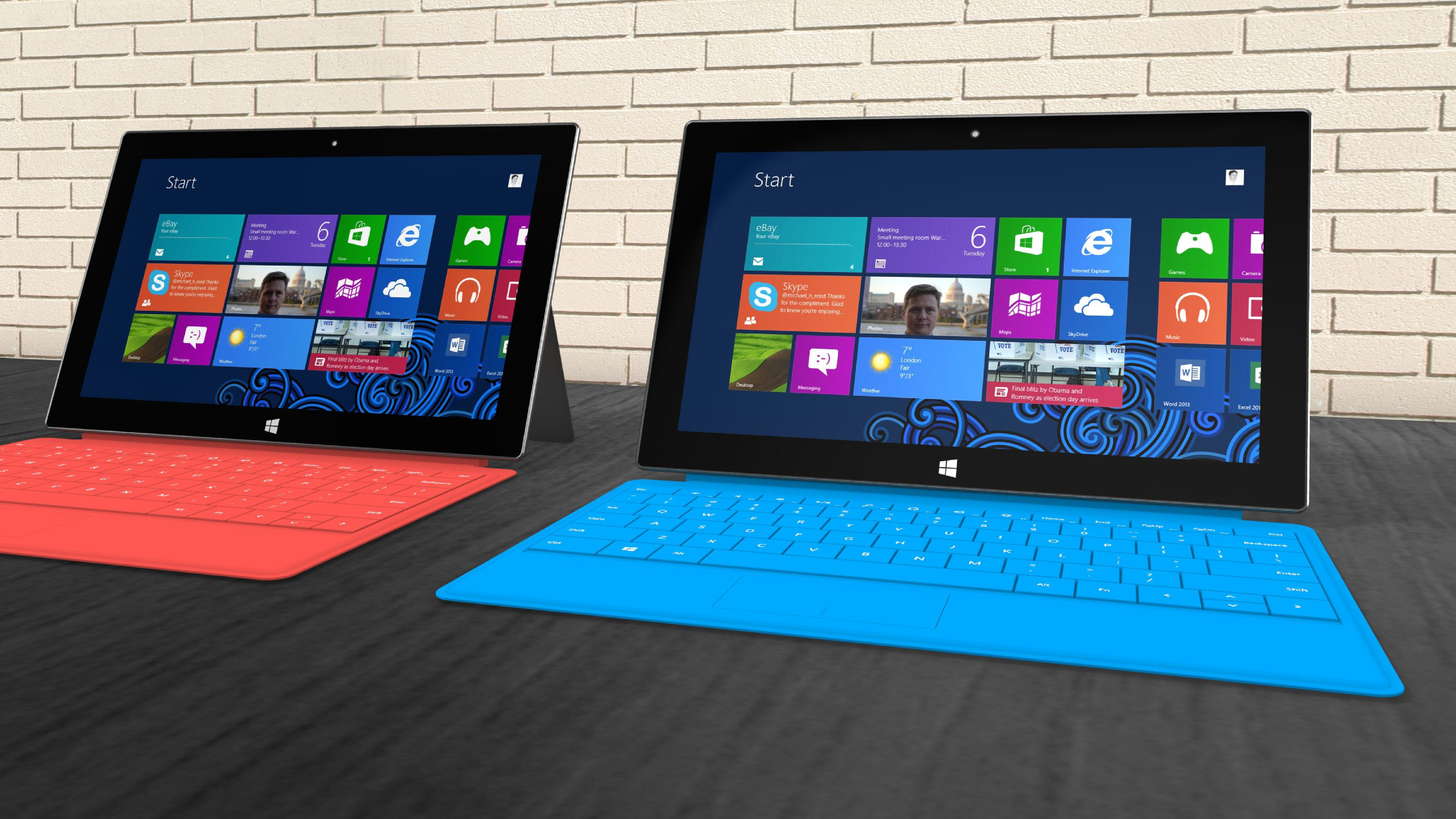
The Windows 8 drop came with a push for laptops produced at the time to be used like tablets, which was an incredibly bizarre idea. I know that Microsoft wanted to be more inclusive with its software, but if you wanted to use Windows on a tablet, you’d get yourself a Surface tablet (the Surface 3, Surface Pro and Surface Pro 2 all ran Windows 8.1).
Touchscreen devices and their users have different needs than those on desktops and laptops. How was 12-year-old me supposed to name the fifth “final final FINAL draft” folder with my fingers when a mouse would be much simpler?
Turning people's devices into tablets against their will garnered a lot of hate for the new operating system right off the bat, and for the people who weren’t interested in tablets and just wanted to carry on using what they knew, this was incredibly infuriating.

4. Exe vs Apps
Most people pre-2012 were accustomed to downloading a .exe file off the internet and installing it onto their computer. Need to run VLC, Chrome or Skype? Download the file, install your program and boom! You’re ready to go.
As mobile phones became more popular a lot of companies had to figure out how to navigate integrating apps into their software. Windows 8 took this idea and ran it right into the ground. Instead, when you wanted to download something onto your computer you would have the web browser open a green window called the Microsoft Store.
This was obviously super annoying because the apps you wanted to download now took up the entire window and often used a new UI that was yet another bit of relearning you had to do. Instead of having a calendar program, you had a calendar app. If you were opening an app, you were sticking to it. Apps are for phones, Microsoft. I know it's been over ten years. The Microsoft Store still kinda sucks.
5. You had to make an account for everything
To follow up on my above point, once you got dragged by the ankles to the Microsoft Store you could only download the apps you needed after making a Microsoft account. Everything you wanted to do that would normally take you a few minutes now resulted in you having to make an account and sign in every time you wanted to add something new to your PC.
It may sound like a silly gripe now when we all have a million other accounts on so many platforms to keep track of (or not), but the culture of personalisation that had developed with Windows 7 was a big part of why people loved it. The software you needed or wanted was turned into apps that were not optimized for tablet use, and a lot of people reverted back to Windows 7 or refused to upgrade.
It was a dark time.

6. The opening screen was full of garbage
The array of panels and apps on the screen may have come from a goal of creating convenience for the user, but it became the face of one of Microsofts most hated products ever. When I opened my laptop for the first time and looked at those rows of squares I was absolutely baffled as to how anything could be done about this. All the colours were way too bright and contrasted weirdly with each other, and no matter how much I tried to rearrange them to make things easier for myself it always looked awful.
It also came with a lot of apps that you just did not need or did not need to be made into apps specifically. Why would you have a clock app if you could just… Have the time in the right corner like normal. Whenever you downloaded a new app you had to scour the tile screen to try and find where the OS had decided to dump it. Sure, newer versions of Windows still come with bloatware, but Windows 8 really crystallized the problem.

7. Trying to multitask? Goodluck
I think the pinnacle of frustration for 12-year-old me was the inability to multitask. Once I opened the Word app or the Video app I had to commit to that app or suffer closing and opening the same window over and over because there was no way to switch between them with any relative ease.
If you were using the desktop you’d have to go back and forth between the weird screen with all the apps and your actual desktop. It felt like a step back in time, and like Microsoft were fixing a problem that did not exist.
Yes, I’m aware that Alt+Tab was an option back then, but as a sweet summer child of 12 years, I didn’t know how to do that. And let’s be honest here; alt-tabbing isn’t something the majority of Windows users do (or even know exists). Keyboard shortcuts have long been the domain of the tech-savvy, so there’s no excuse for Microsoft failing to make the OS more accessible to users who weren’t aware of the option.
So, what good came of it?
I’ve spent a lot of time here slaughtering Windows 8, with good reason, but there are a few good things that came with it. When you make a colossal misstep like this, the only way forward is up. It seems like a glitch in the system and something we all want to forget, but Windows 8 stumbled and crawled so that newer operating systems could run.
Windows 8 introduced Windows Defender, an integrated anti-virus software which meant you didn’t have to go trolling the web looking for something that might fit, particularly if you were only after something basic.
As for the dismal apps that Windows 8 threw in our faces, we did eventually become accustomed with some of them and they improved greatly over time. If Microsoft hadn’t taken a leap of faith and included them in the first place, we might not have the seamless integration we have now.
Still, I’m a petty person. Let it die.

Muskaan is TechRadar’s UK-based Computing writer. She has always been a passionate writer and has had her creative work published in several literary journals and magazines. Her debut into the writing world was a poem published in The Times of Zambia, on the subject of sunflowers and the insignificance of human existence in comparison. Growing up in Zambia, Muskaan was fascinated with technology, especially computers, and she's joined TechRadar to write about the latest GPUs, laptops and recently anything AI related. If you've got questions, moral concerns or just an interest in anything ChatGPT or general AI, you're in the right place. Muskaan also somehow managed to install a game on her work MacBook's Touch Bar, without the IT department finding out (yet).