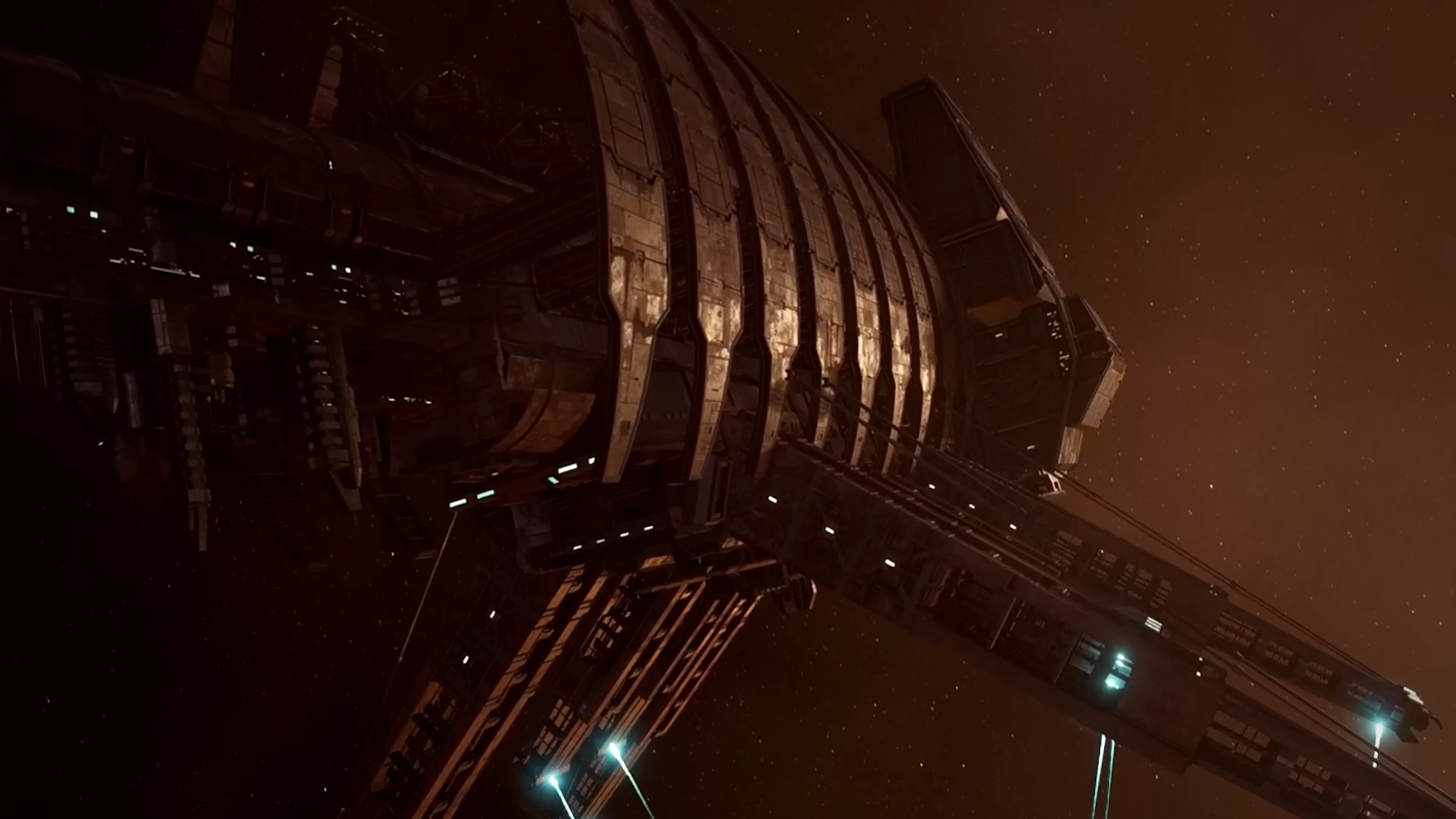
I am not traditionally a fan of horror games. I had to get Alien Isolation (great game as it is) out of my house after finishing it, and the thought of playing one of the more recent Resident Evils or any of the Outlast games is just a non-starter. Nope, not interested. However, despite this, I’ve always had a soft spot and deep admiration for sci-fi creature feature Dead Space.
Not because I don’t find it scary; of course it is. But its portrayal of the USG Ishimura spaceship and protagonist Isaac’s journey through it is sublime and makes for one of the most well-crafted and richly atmospheric places in games - horror or not. The texture, ambiance, and spatial and aesthetic design mean that the Ishimura, not the necromorphs, is often the scariest thing in Dead Space. I’ve re-experienced this recently with the Dead Space Remake, and have been relishing the experience and the sense of place on offer all over again.
Of course, the necromorphs are grotesque and terrifying monsters that used to be human crew members, bodies morphed into horrifying collections of fleshy blades. They can jump out at opportune moments to scare you - though those jump scares would be just as scary if something else bounced out - but what I always found most nerve-jangling, but also gripping and deeply interesting and impressive, was the Ishimura, and how it’s design promoted tension and terror through an assault on the sense.
This is executed through a few elements of its design and aesthetic, which culminate in a sense of claustrophobia, tension, trepidation, and atmosphere throughout the Ishimura’s levels and corridors. From audio and Isaac’s suit to the noises and lighting of the ship, the texture and vibes of the ship are what really make the game scary.
Industrial horror

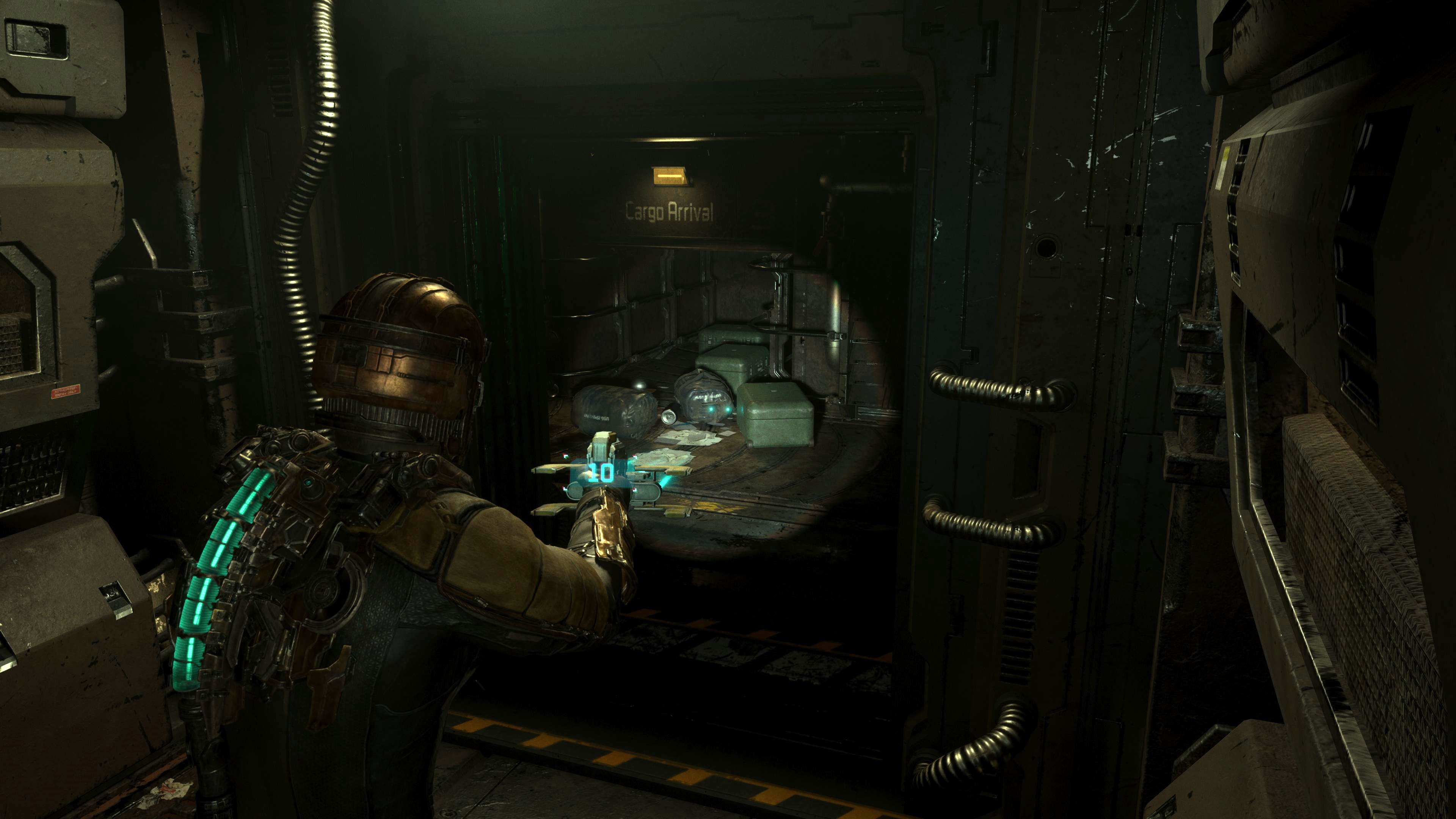
Leading the attack on the senses of us as players, and presumably Isaac himself, is the USG Ishimura’s futuristic, hyperclean, industrial aesthetic. It’s cold, soulless, and features very few means of softening edges or feeling welcoming. Every corridor and room has a similar metallic finish, making it all a symphony in coldness. Yet every space has a distinct form, hard and geometric, that gives the ship a distinct, overtly ‘strong’ feel. It was designed as a mining ship after all, and that one singular, relentlessly industrial purpose and the accompanying starkness promotes an industrial horror by design feel.
Isaac rarely finds himself in expansive, wide-open spaces either; there’s a closeness of the Ishimura’s design and layout which results in an oft-repeated sense of claustrophobia which only increases Isaac’s and our discomfort from its design. This claustrophobic ship almost adds a second metallic layer to Isaac’s suit, pressing down on him and our journey.
Even the UI of everything in the game and on Isaac’s suit that we interact with is ‘part’ of the ship’s texture: the shop and storage options come directly out of the Ishimura’s machines; Isaac’s health is indicated by his suit, not an on-screen bar; items display their own details rather than through pop-ups; Isaac’s own menu and map, and weapon ammo amounts are displayed directly from his suit or weapons for us to view, all keeping us rooted in the Ishimura and Isaac.
Get daily insight, inspiration and deals in your inbox
Sign up for breaking news, reviews, opinion, top tech deals, and more.

Throw in the audio of the ship and the bleak aesthetic becomes richer still. The clangs and bangs of steel on steel from parts of the Ishimura; the resonant echoes of Isaac’s footsteps on the metal walkways, and the distinct sound of necromorph-on-metal as they scuttle through vents, among others, provide a frankly scary audible element to the tapestry of the ship. And that’s not even mentioning the creepy, incessant, chattering whispers on offer throughout the ship.
Hello darkness my old friend

Draped over that is the exquisite use of light and shadow in the Ishimura; something that can make a plain space downright terrifying, and induce panic in an otherwise regular corridor.
And this goes far beyond the extremes of pitch-black corners and hallways, and lights that highlight corners or spaces where Isaac is meant to go, or highlighting an ex-crew member’s cadaver. There’s a more subtle approach in use on the Ishimura, that brings another level of texture to the ship. Combining well-known lighting techniques such as the above - and heart rate-increasing flickering lights, of course - with an artistic but deliberate deployment of light and shadow adds another dimension to the Ishimura’s materials and design.
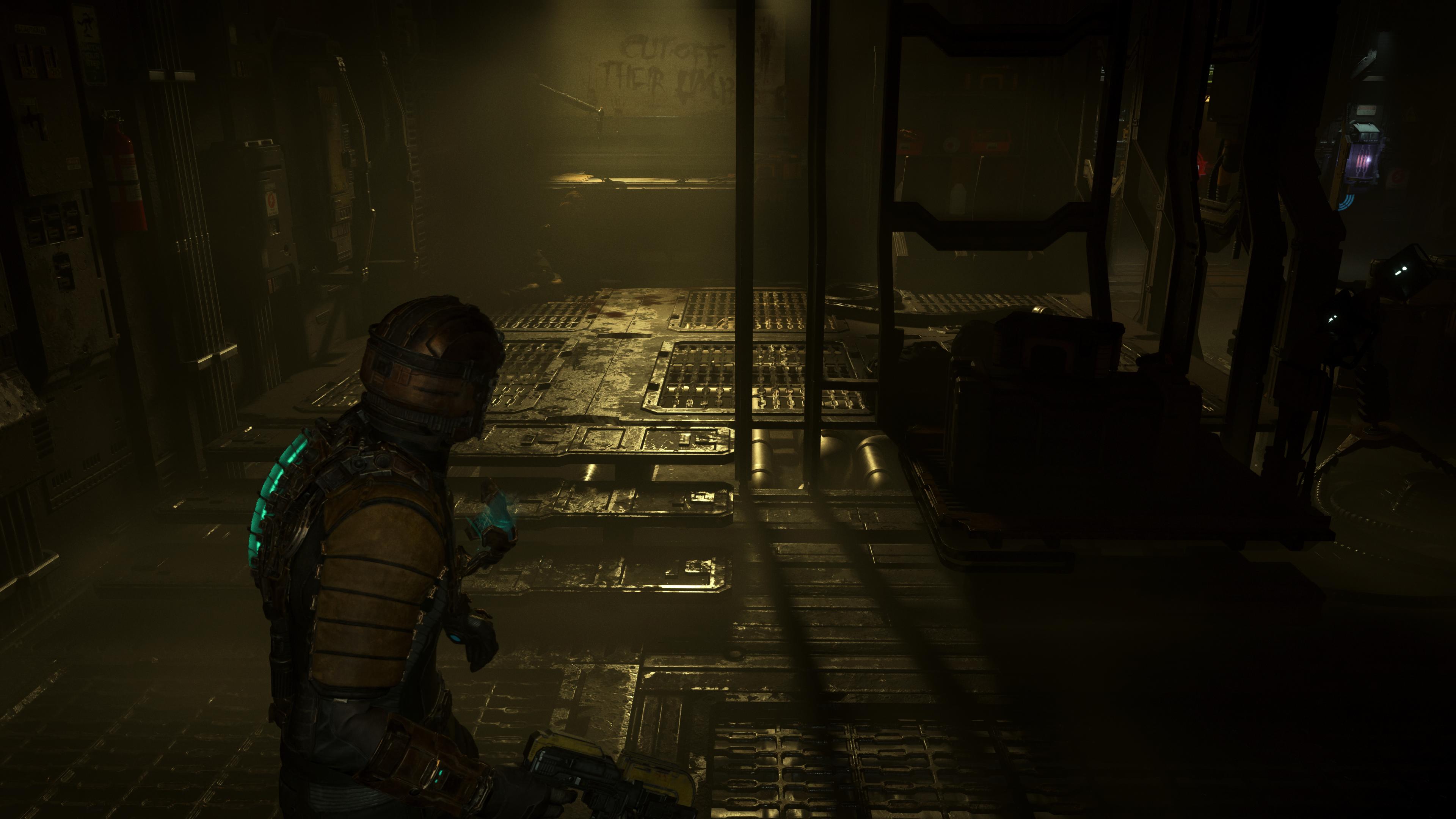
This is introduced early on in Isaac’s journey too; the other side of the iconic workbench with the words ‘Cut off their limbs’ written in blood above it, is the route forward but cast over it (particularly in the original 2008 game) are a mixture of staggered shadows and streaks of light, leading toward the door forward. Casting such shadows across the Ishimura’s bones and aesthetic ramps up tension and rhythm, and doing so with the same light which highlights something pivotal to your survival demonstrates the double-sidedness of how light is used in the game. Sometimes for good, sometimes for fear.

It’s composed so beautifully it mounts a perfect attack on almost all our senses, so much so that some of the scariest parts of the game are when we’re alone with the ship
Throwing light at all parts of the metallic architecture of the Ishimura can also build a tedious monotony in some areas ramping up the suspense by utilizing frequency and gaps between shadow and light. This draws us along routes, headfirst toward the next terrifying space or necromorph encounter, making even familiar-feeling spaces have exaggerated senses of mystery or fear. Another edge adds to this, in the Remake particularly, with low-lying fog and settling dust providing a more particle effect-sized impact on light, taking it in different directions, while also adding more gloom to spaces, shrouding parts of the ship in mystery.
All of this makes Dead Space's Ishimura not just a horribly compelling backdrop for encounters with necromorph monsters, but one of the best-realized horror game settings, which actively and tangibly promotes fear through its design, aesthetic, and ambiance. It’s composed so beautifully it mounts a perfect attack on almost all our senses, so much so that some of the scariest parts of the game are when we’re alone with the ship, with no necromorph in sight.
It’s a perfectly uncomfortable place to be, and one that’s ideal for embracing the spooks (read: absolute terror) this Halloween.
If you’re looking for something different but still spooky or scary then check out the best indie horror games and best zombie games that you can play right now.

Rob is the Managing Editor of TechRadar Gaming, a video games journalist, critic, editor, and writer, and has years of experience gained from multiple publications. Prior to being TechRadar Gaming's Managing Editor, he was TRG's Deputy Editor, and a longstanding member of GamesRadar+, being the Commissioning Editor for Hardware there for years, while also squeezing in a short stint as Gaming Editor at WePC just before joining TechRadar Gaming. He is also a writer on tech, gaming hardware, and video games but also gardens and landscapes, and has written about the virtual landscapes of games for years.