Fitbit users hate the recent Sleep page update, but a change could be coming
Complaints are being noticed by Fitbit

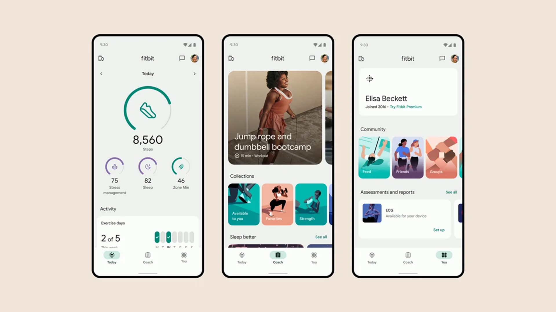
Fitbit updated the Sleep page in its app earlier this month, and like most updates, it was billed as a way to make the service more useful for Fitbit wearers. It added tools like an interactive timeline and charts to monitor your sleep stats across a range of timeframes. However, many users feel it’s anything but an improvement.
Posts across social media, including the official Fitbit forum, have labeled the new page as a “downgrade,” with comments explaining they dislike the new muted colors and inability to get a zoomed-in view by turning their phone horizontal, meaning that it’s become harder, not easier, to track their sleep data.
There are other faults to find, too, such as a lack of dark mode, leading to people saying they “hate” the new experience, and demanding ways to return to the old sleep page style. Some add that if things don't get fixed they'll jump ship to an alternative best fitness tracker and best sleep tracker.

Unfortunately, there’s no way to return to an older version of the Fitbit app, so if you also despise the new sleep page experience you’re stuck with it. At least for now.
The one glimmer of hope for people demanding change appears to be a Fitbit Moderator response to one community post asking the team to “bring back the old sleep summary page.” The moderator says that if the post “gains popularity” it’ll be shared internally with various teams at Fitbit – which could lead to the Sleep page getting fixed.
At the time of writing it has over 1,400 upvotes – significantly more than other recent posts on the Product Feedback page. Other popular posts are also complaints about other recent app alterations.
It’s yet to be seen how much this post will affect the Fitbit app. It’s possible that Fitbit could simply stay the course and hope that anger in the community dies down as people get used to the change.
Get daily insight, inspiration and deals in your inbox
Sign up for breaking news, reviews, opinion, top tech deals, and more.
That said, the level of annoyance doesn’t seem to be the usual opposition to change that app updates can bring, so it feels likely that Fitbit will do something. Bringing back the ability to turn the page horizontal, or making the colors less muted, would help a lot.
We'll just have to wait and see.
You might also like

Hamish is a Senior Staff Writer for TechRadar and you’ll see his name appearing on articles across nearly every topic on the site from smart home deals to speaker reviews to graphics card news and everything in between. He uses his broad range of knowledge to help explain the latest gadgets and if they’re a must-buy or a fad fueled by hype. Though his specialty is writing about everything going on in the world of virtual reality and augmented reality.