How to get the most out of Windows 10 Anniversary Update
Windows 10 is even better
Once you have the Windows 10 Anniversary Update you'll see two big changes – the Start Menu has been tweaked, and the Action Centre has been changed too.
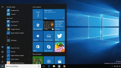
The Start Menu is bigger than before, and that's good news and bad news. It means easier access to your apps, but it also means there's more room for ads on new PCs.
The All Apps option has been removed and the menu redesigned so the icons for File Explorer, Settings and Power are clearly visible on the very left of the menu. The next column is your apps, with the most recently added ones at the top, the most used ones afterwards then an alphabetical listing below that.

After that you have the tiles telling you about birthdays, news, email and so on. There's another change that isn't immediately obvious – the Start Menu's search now includes your OneDrive files as well as the ones on your PC or tablet.
We mentioned the Action Centre earlier. It's now to the right of the clock on the Windows Taskbar, so it isn't lost among the status icons any more. Clicking on it displays the new interface, which uses cards and tiles to display additional information – so for example if you have a notification about traffic you'll see a map, and if the notification is about a person you'll see a photo.
It looks really good and makes Windows feel even friendlier.
The main task
The Taskbar hasn't been neglected either. The clock now integrates with the calendar app so clicking on it shows today's appointments, and the volume icon now enables you to switch between speakers, headphones and other outputs.
Get daily insight, inspiration and deals in your inbox
Sign up for breaking news, reviews, opinion, top tech deals, and more.
The Task View interface has been improved too, enabling you to pin windows, so they appear on every virtual desktop instead of just one. All you need to do is right-click and select the 'Show this window on all desktops' option.
At the risk of using the A-word, some of the Anniversary Update features clearly owe a debt to Apple – especially if you have a precision trackpad, where you can use the same four-finger swipe that OS X uses to switch between multiple desktops, or if you use the Cortana apps to bring phone and PC together – but that's no bad thing.
The impression you'll get from the update is that Windows is faster, smoother and friendlier than before.
Current page: Start Menu and Taskbar upgrades
Prev Page A more powerful Cortana Next Page Security updates