
Make your own cards
Paperless Post is a fun way to create all kinds of special occasion cards on your iPad, iPhone and online, with hundreds of different designs to choose from – including many from renowned graphic designers.
Having such a wide choice of cards makes it much more appealing than the stationery options you'll find in other apps or even in physical card shops. What's more, Paperless Post includes a great range of customisation options, enabling you to change typefaces, text sizes and background colours to create exactly the look you're after.
Paperless Post can even deal with more complex tasks such as party or wedding invitations: you simply add the email addresses of the people you want to invite and then decide whether or not you want invitees to see your guest list. It can even handle their replies. Best of all, Paperless Post is free to use, although you'll need to pay using In-App Purchases to send each card or use some special options.
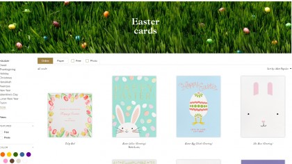
1. Pick a card, any card
Paperless Post has so many different cards to choose from that, at first, it can be overwhelming. You can narrow down your options by category and sub-category or by filtering by size, shape, colour, etc. It's also a good idea to keep an image of the person you're sending to in mind.
Sending a birthday card to Mum? Then your choices should be based on what she likes, not what you do.
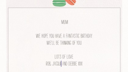
2. Add your message
Tap on a card to choose it, then click on the Design button near the bottom of the screen. Flip the card around by swiping your finger right to left and then tap on the 'T' button below.
You now have the option to tweak the existing message or delete it and add something truly personal. You'll notice that the iOS virtual keyboard has now slid into view, along with a black horizontal menu bar containing the words Typeface, Colour and Format.
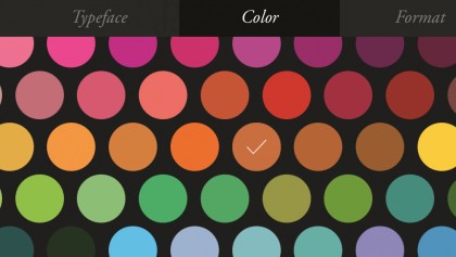
3. Adjusting attributes
Tap on Typeface and you'll see a list of different font choices you can choose from. Tapping on Color enables you to change individual words or your whole message using a varied colour palette. Format enables you to tweak the Font Size, Line Height and Letter Spacing using sliders.
You can also choose whether to left-align, centre or right-align your text. Feel free to experiment; when you've finished, tap Done in the top right corner.
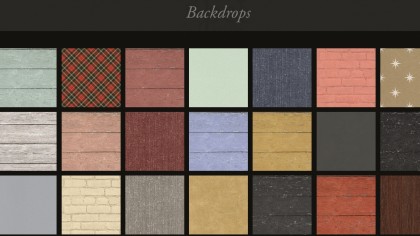
4. Background colours
When you're happy with the words, you can move on to customising the card background and add an envelope if you wish. Adding an envelope to a virtual card may seem silly, but the recipient gets a slick animation when you do, so it's a neat finishing touch.
To add a card or envelope background, tap the Background Wallpaper button to the right of the 'T' button from step 2 and then choose one you like from the menu.
5. Preview your card
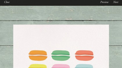
Before sending off your card, tap Preview at the top of the screen to see how it will look when your addressee receives it. This is your final chance to ensure you're happy with everything, from the words you've used to the background you've chosen.
It will even preview the envelope animation we mentioned, though recipients will need Adobe Flash, which iOS doesn't support, to view it on a computer. To exit Preview, tap the X in the white circle at the top left.
6. Send your card
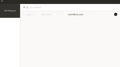
If you're happy with your card, now's the time to send it. Tap the Next button at the top right of the screen and an email form will open up.
Type the email address where you want to send the card. Don't forget to add your name in the From field and the subject of your email in the Subject field. When you're ready to go, tap Send. Paperless Post will remind you that you will be charged Coins to send the card (and also for any custom options you've added).