Master the New Xbox One Experience
Get ahead
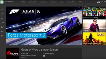
The New Xbox One Experience
Much like Xbox 360 before it, Xbox One is getting a much-needed front-end overhaul – and it's about time, too.
Two rocky years on from the console's launch, the Windows 8-inspired menus have done the much-maligned current-gen box no favours as it slowly begins to catch up to Sony's front-running PlayStation 4.
And while the New Xbox One Experience (NXE) isn't the revolutionary shake-up we were hoping for, it does address some of the key issues users have had since day one (including a cluttered approach to content layout and limited uses for pins).
More importantly, the new update takes full advantage of Windows 10, and turns using the Xbox One console into a far smoother and more intuitive experience than ever before. Microsoft says the entire operating system runs 50% faster – and while that figure isn't quite the reality, navigation feels noticeably faster and responsive.
The New Xbox One Experience will enable cross-platform gaming for the very first time. In other words, if you're playing a game with competitive or cooperative multiplayer modes you'll be able to team up with players from PC-based servers.
The NXE also combines the Store and new content updates into one far more agreeable (and more importantly, simplified) version of the OneGuide, and finally adds a new side pane that smacks of the second (and best) Xbox 360 dashboard.
Oh, and gestures for Kinect have finally been killed off for good.
How to install the New Xbox One Experience
Most consoles should prompt you to update your console with the New Xbox One Experience automatically, but if yours hasn't made a peep yet, simply press the menu button and select 'Settings' from the pop-up list that appears. Next, select 'System' then 'Update console'.
Depending on how robust your bandwidth is, NXE should take around 15-20 minutes to download and install. And with that, you're ready to dive into Microsoft's new approach to Xbox One…
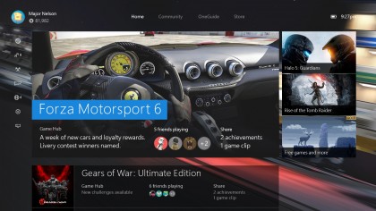
1. The Xbox One Home Page reinvented
The old Windows 8-inspired menus weren't popular with Xbox One users, so it's no surprise to see the New Xbox One Experience dropping them in favour of a far more accessible user interface.
In fact, 'accessible' is the name of the game with this new setup. The new home screen has been stripped back to the basics, with your most recent game taking centre stage – and thankfully, adverts and options for featured content have been reigned in to three small boxes to the right of your screen.
Want a comprehensive list of the extra options and features available with a particular game or app? Hit the 'Options' button (it has three lines and appears underneath the 'Xbox' button) for a handy menu.
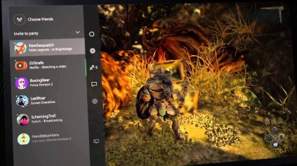
2. The new Xbox Guide panel keeps you connected
Up until now, jumping out of your game and into the menus was clunky, and the furthest thing from intuitive. To counter this, the new update adds the Xbox Guide.
Simply press the 'Xbox' button in the centre of the pad twice to bring up the panel on the left hand side of your screen. Much like the pop-up guide back on Xbox 360, this panel provides instant access to the kind of options gamers normally look for mid-game, including Party Chat, your Friends list and more.
It's also easily accessible in any menu – simply press the 'Xbox' button twice to launch it.
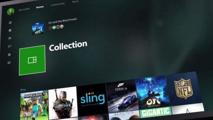
3. Pins get the NXE treatment
The idea of pinned content seemed a great idea when it launched with the Windows 8-themed update back on Xbox 360, but the options were always hidden away in another menu, essentially rendering them utterly pointless.
Since the New Xbox One Experience is all about quick and easy access to your favourite apps and games, Pins have been brought onto your new Home Page.
To pin something, simply press the 'Options' button and select 'Pin to Home'. Now simply pull the right trigger and you'll instantly jump to My Stuff, where you'll find your Pins and all your favourite apps.
4. Going retro with backwards compatibility
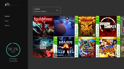
Sure, Microsoft has pulled a literal U-turn on its steadfast decision to not support backwards compatibility – but hey, who cares? Xbox 360 games on Xbox One!
Unlike Sony's PlayStation Now service, which requires you to buy PlayStation 3 games all over again, Xbox One enables you to play a steadily expanding list of Xbox 360 games, as long as you own a disc of said game or have a digital copy tied to your Gamertag.
If your game is one of the 104 currently supported titles, your Xbox One will read the disc/original digital copy like an ID, then stream the content directly to your console. You can even stream video and capture screens, just like with Xbox One games.
5. Keeping scrolling simple with new menu tabs
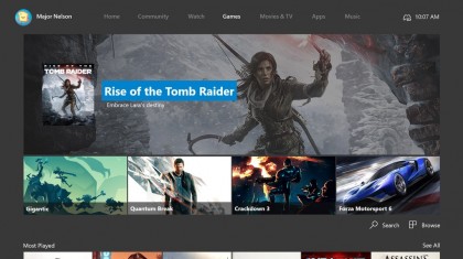
The horizontal scrolling of the old Xbox One user interface felt consistently clunky, even when using Kinect on a good day, so you'll be pleased to hear that navigating your Xbox One has been simplified.
All those needless sections have been gathered into four main headers: Home, Community, OneGuide and Store, and you can navigate them all at any time by pressing 'RB' and 'LB' (the bumper buttons on top of your controller).
Navigating between these menus is also noticeably faster, with little to no lag – another bonus from the far more reliable Windows 10 infrastructure. The Store option also expands when selected, providing access to Games, Apps, Movies & TV and Music.
6. Care in the Community
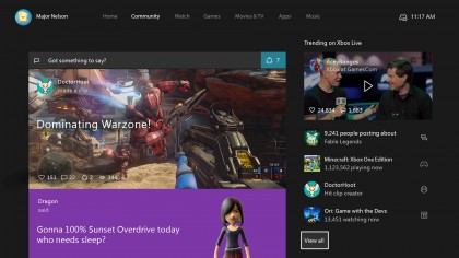
Of all the new approaches to content in the New Xbox One Experience, the Community one is the most disappointing.
The old approach to social was easily the best part of Xbox One's previous UI – a list of friends and their current/previous game activity, next to a competitive table of gamer points accumulated in the last month.
Sadly, these features are largely absent now (although you can view a live feed of your Friends list at any time from the Xbox Guide panel). Instead, the new Community page presents all the latest captures and achievements from your Friend's recent gaming activities.
7. Introducing the OneGuide
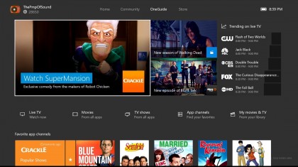
Xbox One has always been billed as an entertainment system first and foremost, so it's no surprise to see Microsoft building a section of the Xbox UI exclusively for streaming networks.
As well as being a hub for its own content (including the option to rent and buy the latest movies and recent TV offerings), highlights from across a variety of apps, including BBC iPlayer, Netflix and the WWE Network, are also kept up to date at the very top of the screen.
Press the right trigger and you'll jump down to a nifty list of apps. Each one, ranging from Amazon Instant Video to BlinkBox, is presented with a list of on-demand film and TV highlights.
8. What's in Store?
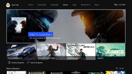
While Sony's choice of UI for PlayStation 4 still feels like the stronger of the two, the new take on the Xbox One Store trounces the bland and unintuitive PSN.
The theme here is simplicity, from the cherry-picked game highlights to the swift access to digital editions in a couple of button presses. The same structure runs throughout the four different subsections – Games, Apps, Movies & TV and Music – and you automatically highlight 'Browse all music' when you slide between each section by pressing 'LB' and 'RB'.
Deluxe and premium editions are also the jam here, so if you're looking for exclusive digital content, you won't have to snoop far.
9. Game Hubs have been tailored to you
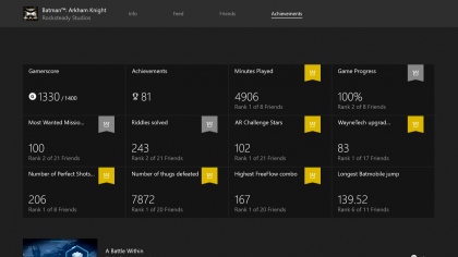
Game Hubs existed in the original version of Xbox One's user interface, but they were in dire need of a good tune up. Remember that Achievement ranking system we so sorely lamented earlier in this article? Well, it lives… albeit it in a new NXE-powered form.
Each game you install onto your console (be it from a digital download or from a physical disc) has its own Game Hub, which you can access by highlighting a game from your My Stuff pins or from the 'My games & apps' section, pressing the 'Options' button and selecting 'View game hub'.
Here you'll see all your stats from the game (with each one ranked against your friends), as well as captures from the community.
10. Button mapping and party text chat
It's not just big changes that typify the New Xbox Experience – there are plenty of tweaks and updates that make this the biggest UI shakeup the Xbox brand has received in years.
Sick of the default layout of your Xbox controller? Now you can customise every button and trigger by heading to 'Settings > Ease of access > Button Mapping' and selecting 'Configure'. Struggling to read text, or just want to zoom for added clarity? Hold the 'Xbox' button until it vibrates, then press 'Options' to magnify.
Oh, and you can now send group texts to those in Party Chat – perfect if you're gaming without a headset.