How to create and personalize your best iOS 16 Lock Screen for your iPhone
From placing widgets to choosing the best wallpaper
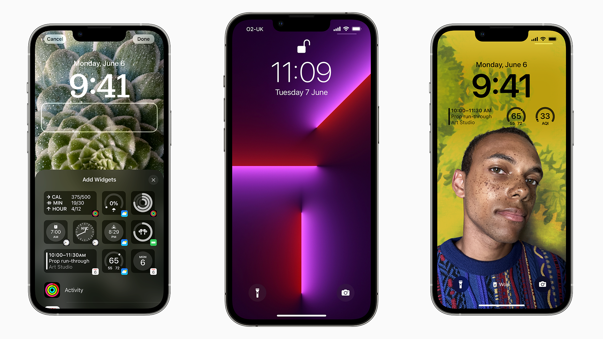
iOS 16 arrived back in September, and one of the biggest talking points (and upgrade incentives) this year is the new customizable lock screens for your iPhone.
The iOS lock screen has been fairly stagnant for years, but this latest update gives everyone the opportunity to turn theirs into a conversation starter – particularly if you have the iPhone 14 Pro or iPhone 14 Pro Max with the always-on display.
So, while the last couple of iOS updates have tweaked home screens, it’s finally the Lock Screen’s turn for some time in the limelight - and the feature dovetails with the excellent Focus Modes introduced in iOS 15, with a bunch of widgets and wallpapers you can choose from.
With this in mind, here's how to get started with building your dream iOS 16 Lock Screen.
What’s new with Lock Screens in iOS 16?
To put it simply, Apple has essentially torn apart the standard lock screen interface where you would set a photo as your wallpaper and that would be it in way of customizing your Lock Screen.
In its place, iOS 16’s Lock Screen customization extends to several key areas that we’ll cover in this guide. There are new widgets, font and color options, and innovative new techniques to make your cherished photos look their best.
There are also new power user features that mean you can tailor multiple lock screens to your liking, and change them through Focus Modes – we’ll get to those shortly.
Get daily insight, inspiration and deals in your inbox
Sign up for breaking news, reviews, opinion, top tech deals, and more.
How to start customizing your iOS 16 Lock Screen
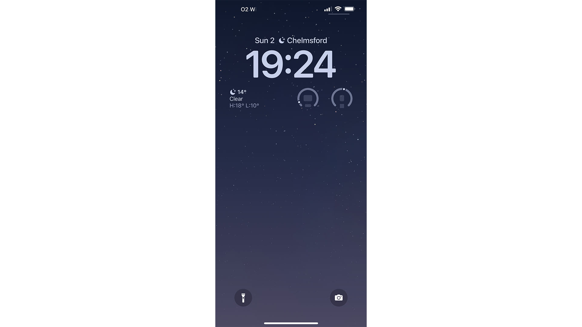
As simple as reorganizing icons on your Home Screen, simply tap and hold on your iPhone’s Lock Screen once iOS 16 is installed.
Doing so opens a 'Gallery' of Lock Screens, so you can flick through some you’ve already created or create a fresh one from scratch.
Using the latter option, your iPhone can offer options for Weather-based backgrounds, Astronomy, or fun ones like Emoji and color shift ones.
This is a great place to get started and should give an idea of the array of options available.
The Home Screen/Lock Screen relationship
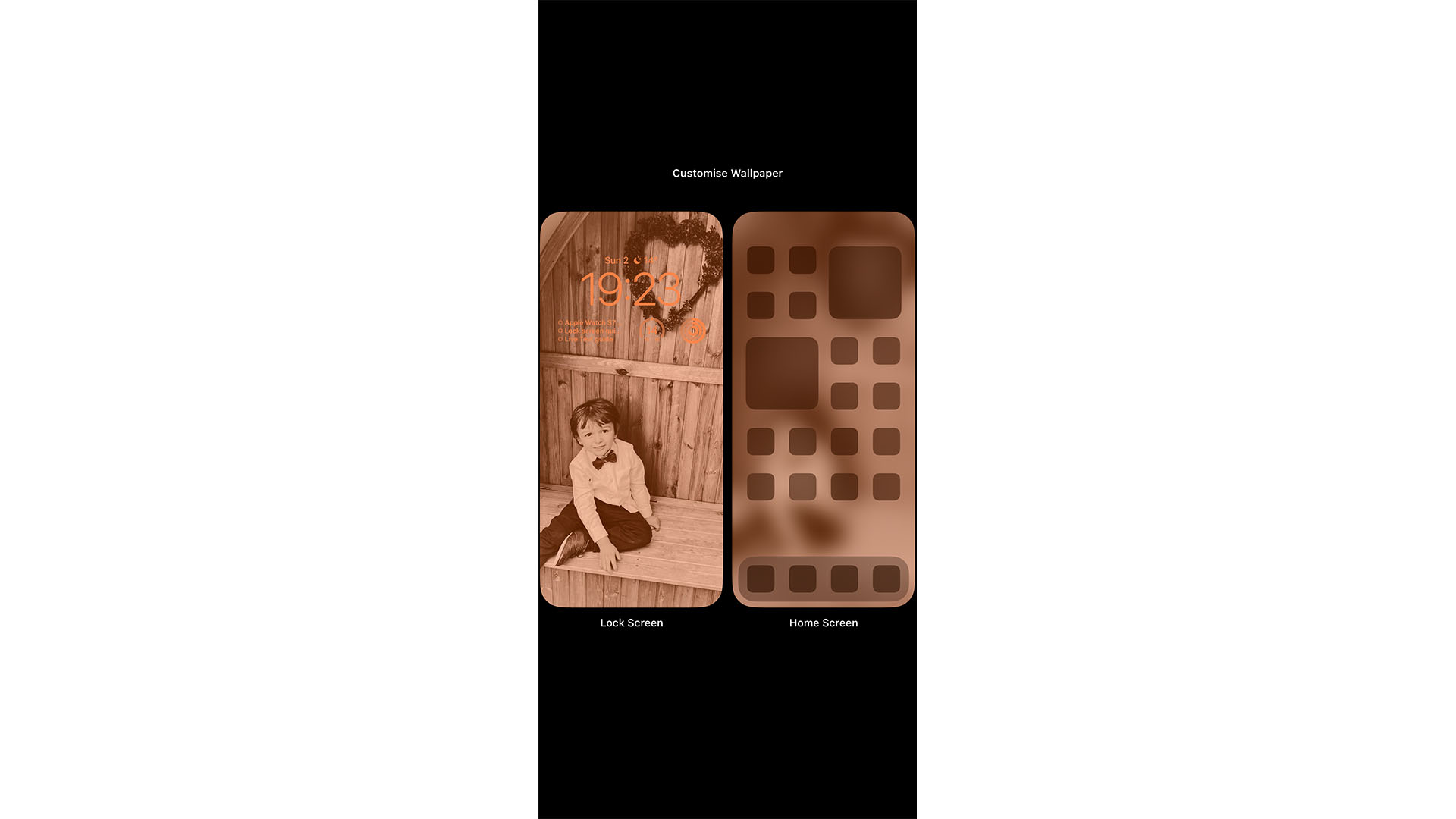
When customizing your Lock Screen, you’ll have the option to make your Home Screen match the same color palette and background image.
This is done using the 'Set As Wallpaper Pair' option, but you can also dip into the Home Screen itself and make changes there, too.
Here you can set it to blur the background image, replace it with color or gradient options, or set an entirely different background image.
Lock Screen and Focus Modes in iOS 16
One other important thing to note is that iOS 16 Lock Screens and Home Screens can be tied to the Focus Modes added last year.
This means that when you’re in, for example, a 'Personal' Focus Mode you can have a wallpaper of your family, pet, or anything that’s more personal. Then, if you switch to another Focus Mode, for example, the 'Work' option, it could be replaced by a landscape, weather, or color gradient option.
These changes can be automated along with your Focus Modes, too, so you can set your Work focus to change your Lock and Home Screens from the hours of 9 to 5 for example.
Finally, everything in this guide from this point on can be customized according to your Focus – so your widgets, fonts, and more can alter based on your current Focus Mode.
iOS 16 Lock Screen Widgets
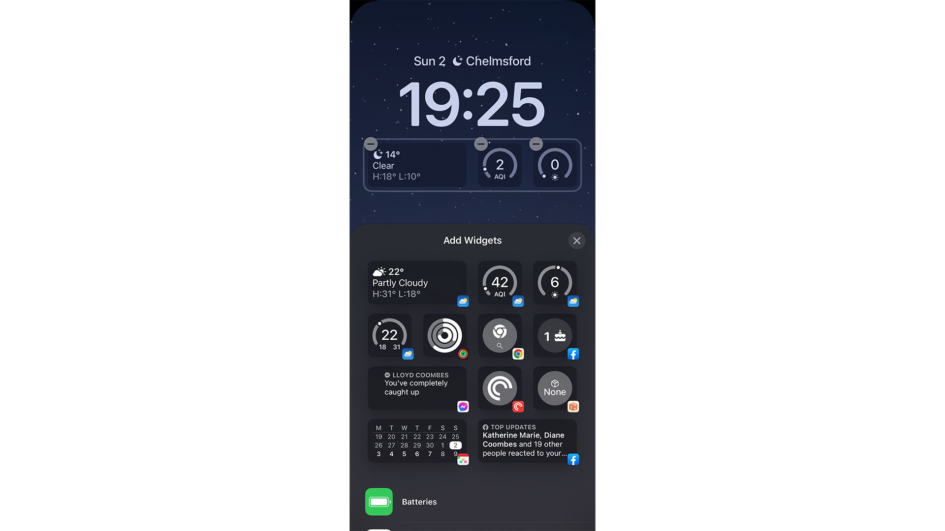
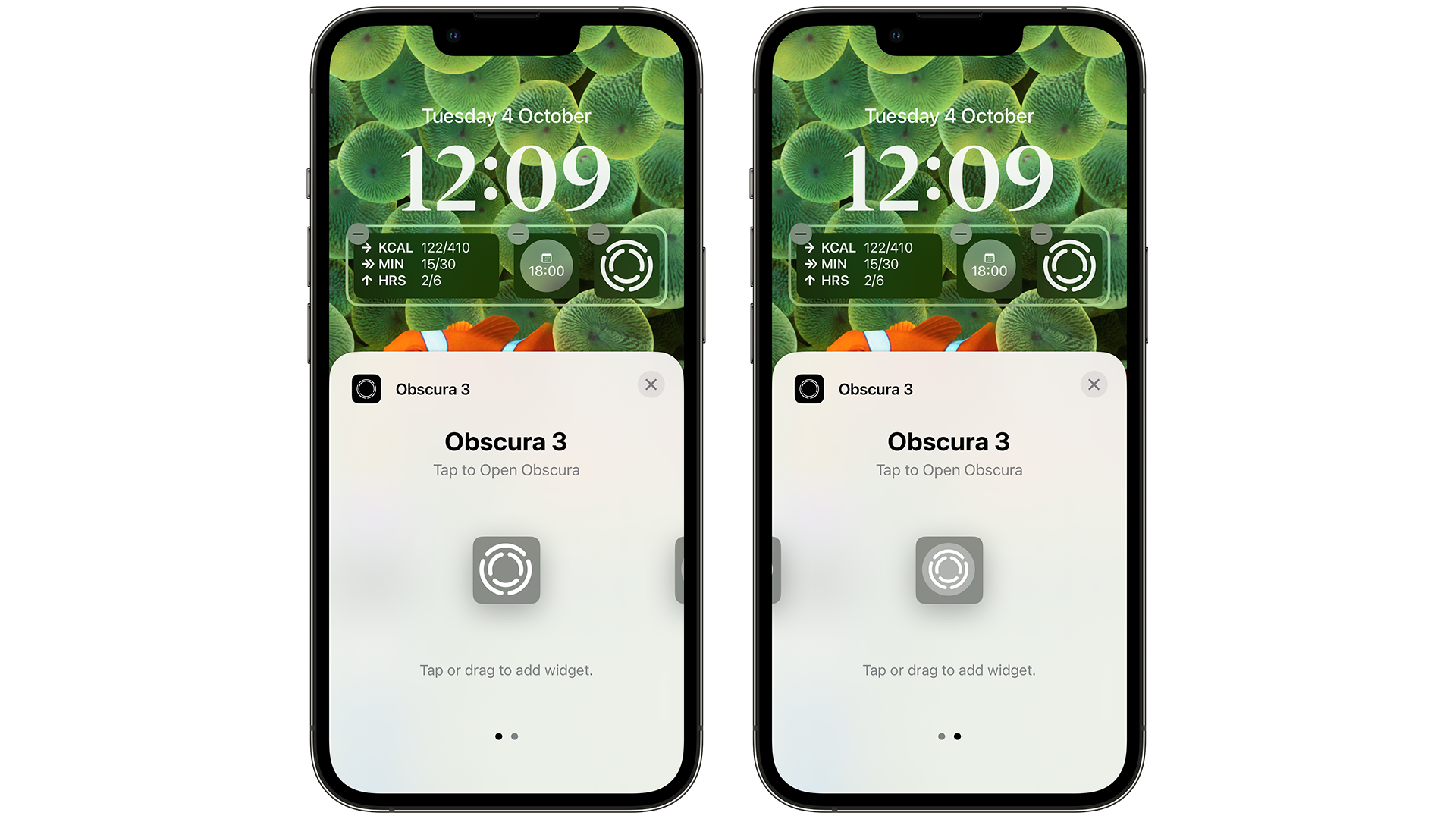
While iOS 16’s Lock Screen widgets were available during the beta process in the summer, we’ve seen plenty more developers release updates for apps to allow them to display information on your Lock Screen now that iOS 16 has been widely available for a while now.
Perennial Techradar favorite Things 3 for example, can showcase your to-do list when you pick up your phone, while Google Chrome lets you search for something with a single tap.
While more and more third-party app widgets are rolling out, there are only four 'slots' beneath the time on your Lock Screen (at least for now). The good news is that many of these are based on Apple Watch complications, so they make great use of the space – whether you want to see how much battery your devices have when your next delivery is arriving, or how well you’re doing with closing your Activity rings.
Some widgets offer multiple sizes, too, so the likes of Fantastical can offer more detailed views at the cost of taking up two widget slots.
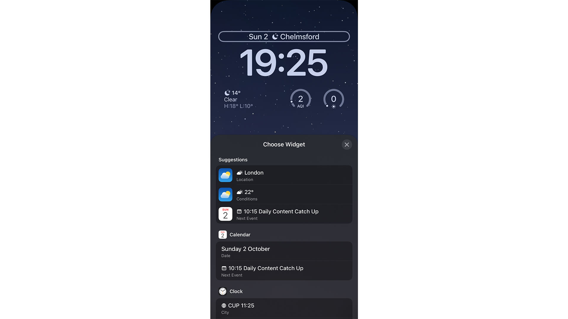
Easily forgotten is the widget slot at the top, which is found above the iPhone’s clock. This offers longer, thinner widgets that range from showing your next calendar appointment to the time in other time zones. It can also display the current date and weather.
iOS 16 Lock Screen color and font options
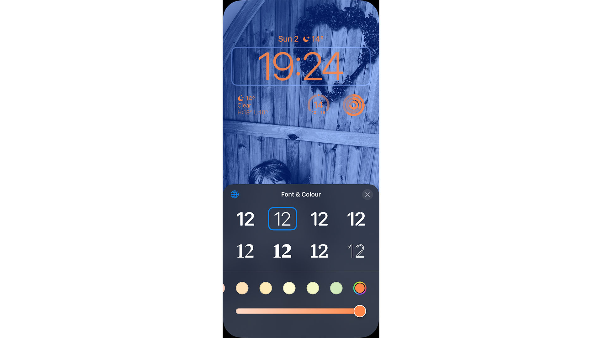
The widgets you choose, as well as the clock, can be customized further with the addition of color and font options.
Simply tap on various elements of your Lock Screen to be able to use the “Font & Color” tool to pick from a variety of shades, or create your own.
You can also change how vivid the color is using the slider at the bottom, as well as tweak the font of the system clock.
iOS 16 Lock Screen photo options
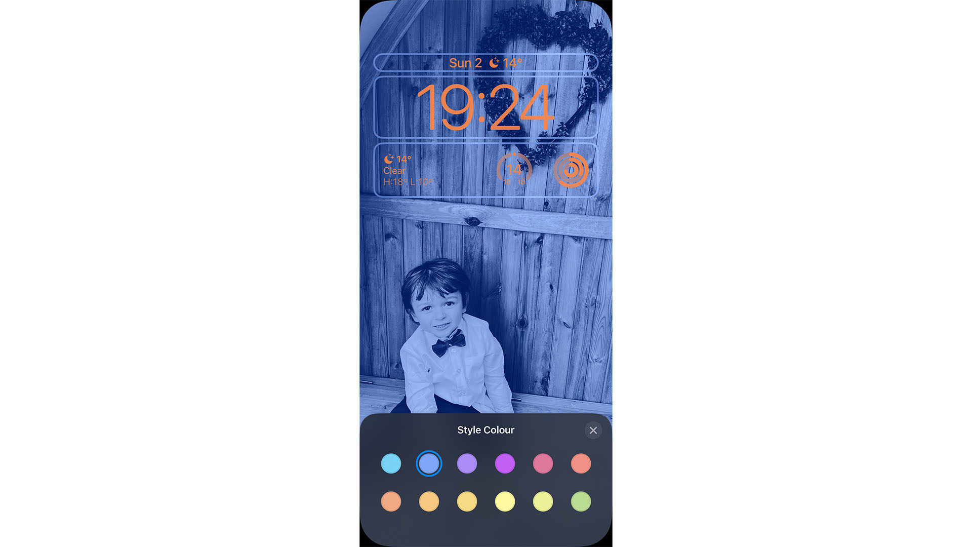
If you do opt for a photo as your iOS 16 Lock Screen background, you can customize it further with a variety of options.
Users can pinch the image to adjust the crop, and swipe between a series of options to tailor the image. On the image above for example, we’ve gone for the 'Color Wash' option with a blue hue.
There are also options for Duotone, Color Backdrop (keeping the subject in standard color), Black & White, and Studio Lighting.
If your image has the required depth data from when it was taken, you’re able to enable 'Depth Effect' through the ellipsis button in the bottom right. Doing so can allow your subject to appear in front of the clock.

Lloyd Coombes is a freelance tech and fitness writer for TechRadar. He's an expert in all things Apple as well as Computer and Gaming tech, with previous works published on TopTenReviews, Space.com, and Live Science. You'll find him regularly testing the latest MacBook or iPhone, but he spends most of his time writing about video games at Dexerto.