How to visualize complex data on Linux
Simon Quain shows how to visualize Covid-19 statistics and more with freely available open datasets and Timelion, a plugin for Elasticsearch.
Analysis...continued
As well as being chainable, we can superimpose graphs on top of other graphs by adding a comma to our existing expression and then writing a new .es() expression afterwards.
To get the cumulative sum of cases for France as well as the cumulative sum of cases for the United Kingdom on the same graph, we can write the following:
.es(index=covid, q="countriesAndTerritories: United_Kingdom”, metric=sum:cases).cusum(),
.es(index=covid, q="countriesAndTerritories: France”, metric=sum:cases).cusum()
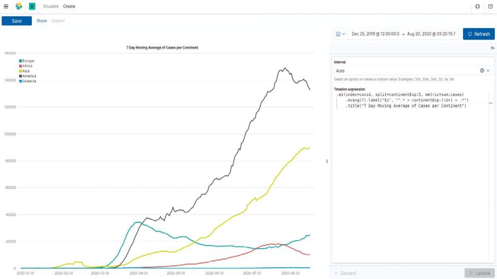
You may find that even setting the interval to daily, your graphs are still relatively spiky because the value of the metric you’re investigating fluctuates wildly day to day. To smooth these spikes out, we can use moving averages that calculate a series of averages over time for different subsets of the full dataset.
In Timelion we can calculate a moving average by adding .mvavg(NUMBER_OF_DATA_POINTS) to the end of our expression.
So to calculate a moving average over a week of the number of cases in England we can write
Are you a pro? Subscribe to our newsletter
Sign up to the TechRadar Pro newsletter to get all the top news, opinion, features and guidance your business needs to succeed!
.es(index=covid, q="countriesAndTerritories: United_Kingdom”, metric=sum:cases).mvavg(7).
So far we’ve been displaying everything as a line graph. There are many ways you can format the data, whether it be as points for each interval with .points(), as a series of bars with .bars() or perhaps you want to set the colour of a certain line to red with .color(red).
Perhaps you wanted the actual figure for cases to be displayed as a series of points, but the weekly moving average to be shown as a line graph. You could achieve this with two Timelion expressions:
.es(index=covid, q="countriesAndTerritories: United_Kingdom”, metric=sum:cases).points(),
.es(index=covid, q="countriesAndTerritories: United_Kingdom”, metric=sum:cases).mvavg(7)

You can also wrap parentheses around several Timelion expressions to have the same formatting apply to that set of expressions.
You can draw a line showing the trend for the statistic in question with the .trend() function.
The below expression sets the colour of both lines drawn previously to grey and adds a new line in red showing the trend for the time period chosen.
(.es(index=covid, q="countriesAndTerritories: United_Kingdom”, metric=sum:cases).points(),
.es(index=covid, q="countriesAndTerritories: United_Kingdom”, metric=sum:cases).mvavg(7)).color("grey"),
.es(index=covid, q="countriesAndTerritories: United_Kingdom”, metric=sum:cases).trend().color("red")
The .color() function can take colours as an argument in English or with hex values. But it’s not the only Timelion function that takes arguments.
With the .points() function you can change the fill colour with fillColor or whether the points appear as circles, diamonds or crosses with the symbol argument.
Timelion will try to autosuggest functions and arguments for you as you type, much like an IDE. You can press up and down to choose which one you want and press the Tab key to complete. The best place to see a list of all Timelion functions and the arguments they take is in the documentation on GitHub.