Stage Manager in iPadOS 16 developer beta 1: first look - an exciting new beginning
An early look, but an encouraging one
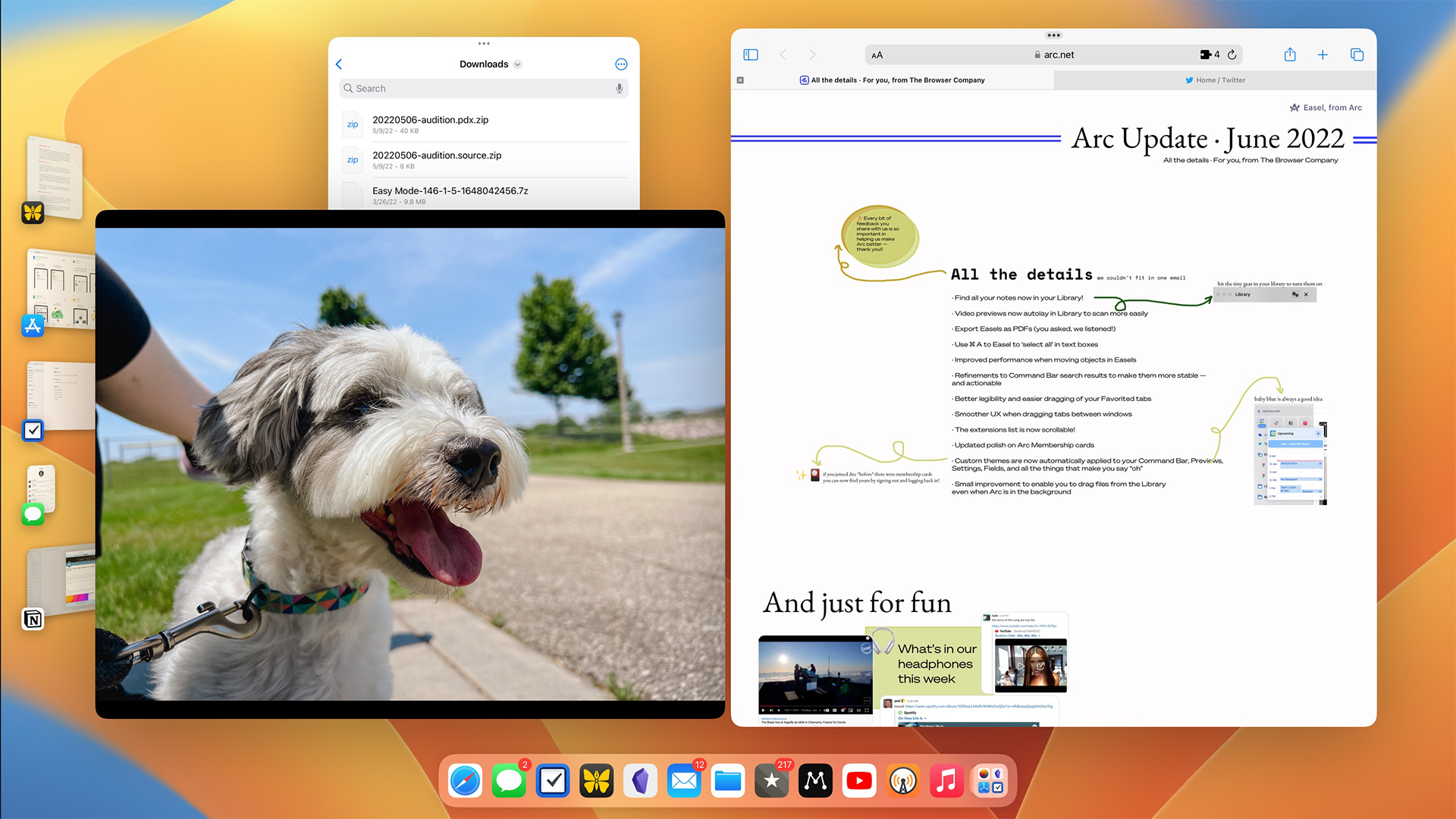
This is a first look at Stage Manager from the first developer beta 1 preview software of iPadOS 16. Our first impressions will likely differ greatly from the final public version, and features may be subject to change or even scrapped in the coming months.
Apple’s WWDC event is always good for at least a couple of surprising moments, but the company’s unveiling of Stage Manager in iPadOS 16, a new way to manage your windows on iPads, is one of the more seismic for iPad users.
After 12 years of iPads exclusively running software in full screen, this fall’s iPadOS update will let users resize app windows to a variety of sizes.
We've been using Stage Manager on an iPad Pro for a few days, and while this is a very early version we've been testing, it sets out the plans for where Apple's tablet can go...as long as you have one with the Apple Silicon chip inside.
Don't worry - your iPad can still work as before
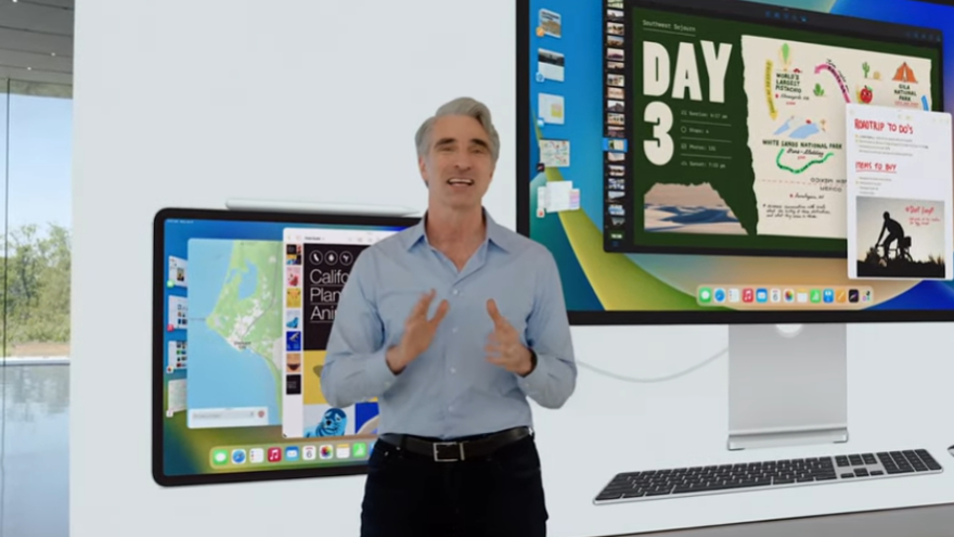
Don’t fret, the iPad is still as easy to use as it was before. Apple has not taken away any of the methods by which you use your iPad today, so you can completely ignore this new feature if you want.
Also, many iPad users won’t even see this new feature because this is the first notable software feature exclusive to the M1 chip inside the highest-end iPads.
This feature currently only works on iPad Air (2022), iPad Pro 12.9-inch (2021), or iPad Pro 11-inch (2021). If you’ve got anything older than these models, Stage Manager won’t be an option available to you.
However, if you do have one of those M1 iPads, you'll be able to activate this in iPadOS 16 by going to Settings, then Control Center and tapping the new icon for Stage Manager, which displays at the bottom of the menu.
Get daily insight, inspiration and deals in your inbox
Sign up for breaking news, reviews, opinion, top tech deals, and more.
The Stage Manager experience
As I'm using the very first developer beta of iPadOS 16, you can imagine that things are a bit rough right now. You can indeed drag windows around how you'd like, such as resizing from a full-screen view, down to a tiny window, alongside having windows overlap each other, or even completely cover up one app with another.
But there's a lot broken right now, as expected for a beta 1 release. Most apps are already designed to work at multiple screen sizes, so they scale pretty well, but I’m running into lots of bugs.
In my short time with the beta, I’ve replicated some of the layouts I’m used to using on an M1 Mac mini. For example, I often find myself working in Safari, but I keep Slack and an email app open as well.
Those windows are behind Safari, but poking out just a bit so I can see if anything important comes in and I need to task switch away from what I am doing. Technically, iPads could do this before using notifications, but personally I find this method to be less distracting.
But bugs aside, which will surely be sorted out before the public release, the experience of using Stage Manager ranges from moments of feeling confused, to other moments of feeling as though this changes everything about what it means to work from an iPad.
I first turned on Stage Manager directly on my 11-inch iPad Pro and began to launch apps and move them around the screen. It all technically worked fine, but after a decade of using iPads a certain way, it definitely felt weird to have such a different experience.
Apps felt a bit small, and those that used to feel great in full screen suddenly felt cramped and a bit tricky to manipulate. At this screen size, it was really hard for me to see why I'd ever use this mode when split-view, which supports two apps side-by-side on iPadOS, has been around for years and worked well enough anyway - which is basically how I use my MacBook Pro anyway
iPadOS 16 also comes with a new display zoom option for the 11-inch and 12.9-inch models called 'more space', which lets you slightly shrink the user interface and allows more content to show on the display at once.
This helped me find more use in Stage Manager on the iPad itself, but it definitely still felt a bit cramped, since there just isn’t that much room to begin with, and the iPad's touch-friendly user interface still takes up a good amount of space.
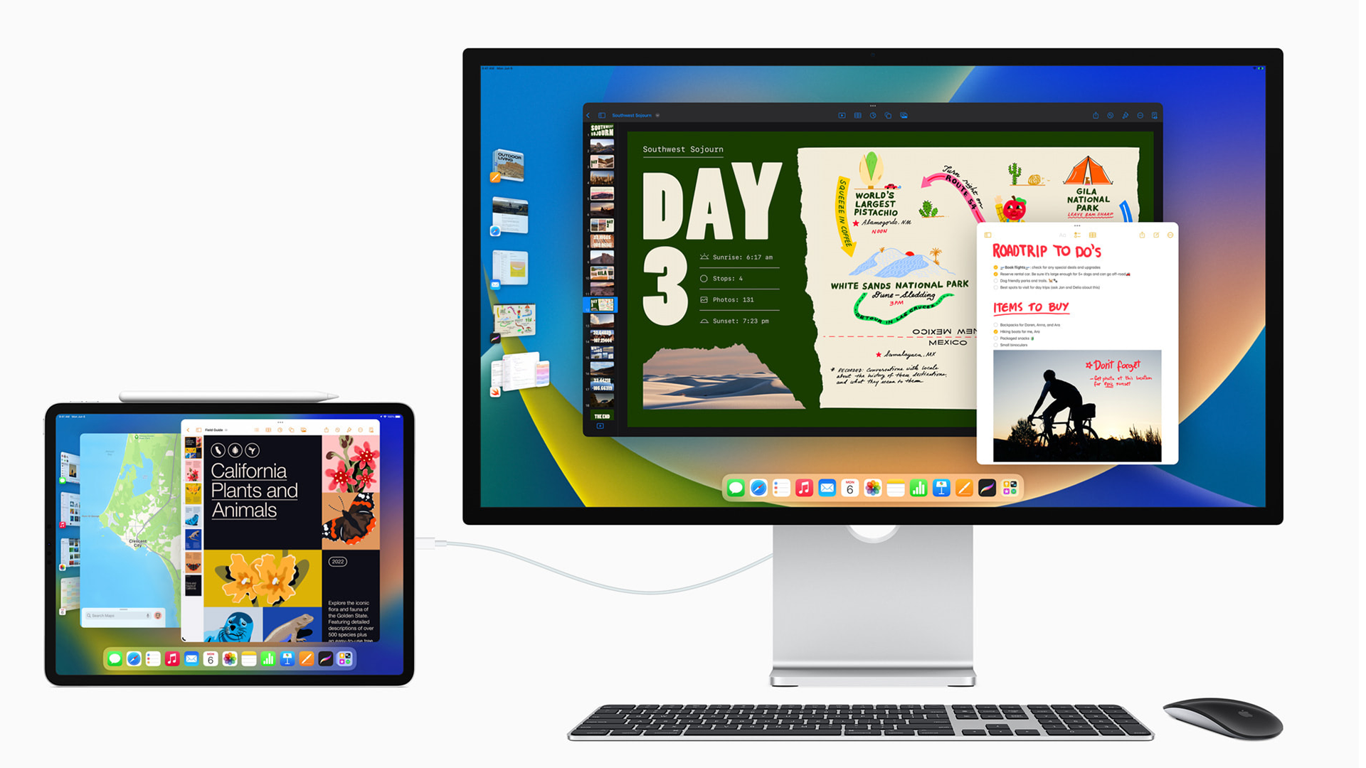
But Stage Manager doesn't just work on the tablet itself, as you can also plug your iPad into almost any external display you'd like, and it will output in full screen and in a native resolution on that display.
Finally, there are no more black bars on the left and right of your widescreen monitor, although there is a setting to go back to that if you prefer.
Now you can plug in the iPad and your display looks like, well, a Mac. Your dock is at the bottom of the external display and you can start launching apps as you would in macOS.
This is when my head started to spin with possibilities. While Stage Manager on my 11-inch iPad Pro felt a bit cramped, on a 27-inch 4K monitor it felt like iPadOS was finally breaking free from its restraints and was given room to breathe.
There and then, it felt like a brand new beginning for the platform. I could see much more of my writing and my research notes at the same time. Video editing is suddenly something that’s very doable on a large screen in a way it just wasn’t practical on the 11-inch iPad.
Photos come to life on a massive screen and dragging and dropping between apps is more natural when they’re all sharing the same space. Everything just gets as much or as little space as it needs, without everything needing to be a full-screen experience.
The future of the iPad has arrived
While it still doesn't feel like a Mac, Stage Manager made me immediately start thinking of my iPad as something I could use for more tasks in my life.
I love the simplicity of working from the iPad, but one reason I often find myself choosing to turn on my Mac is that I just want more screen space.
I want to see more of that website or I want to have more of a document available. Maybe I just want to have a screen more at eye level or use my nice mouse and keyboard that I've got at my desk. All of those used to mean switching to the Mac, but not anymore with iPadOS 16 and Stage Manager.
There are some things that aren't quite right yet, and I hope to see fixes and refinements over the beta period. But bugs aside, there's still one thing I hope that Apple fine-tunes: how windows organize themselves on screen.
As it stands, whenever you add a new window the system will move your other windows how it expects to make the most sense for you.
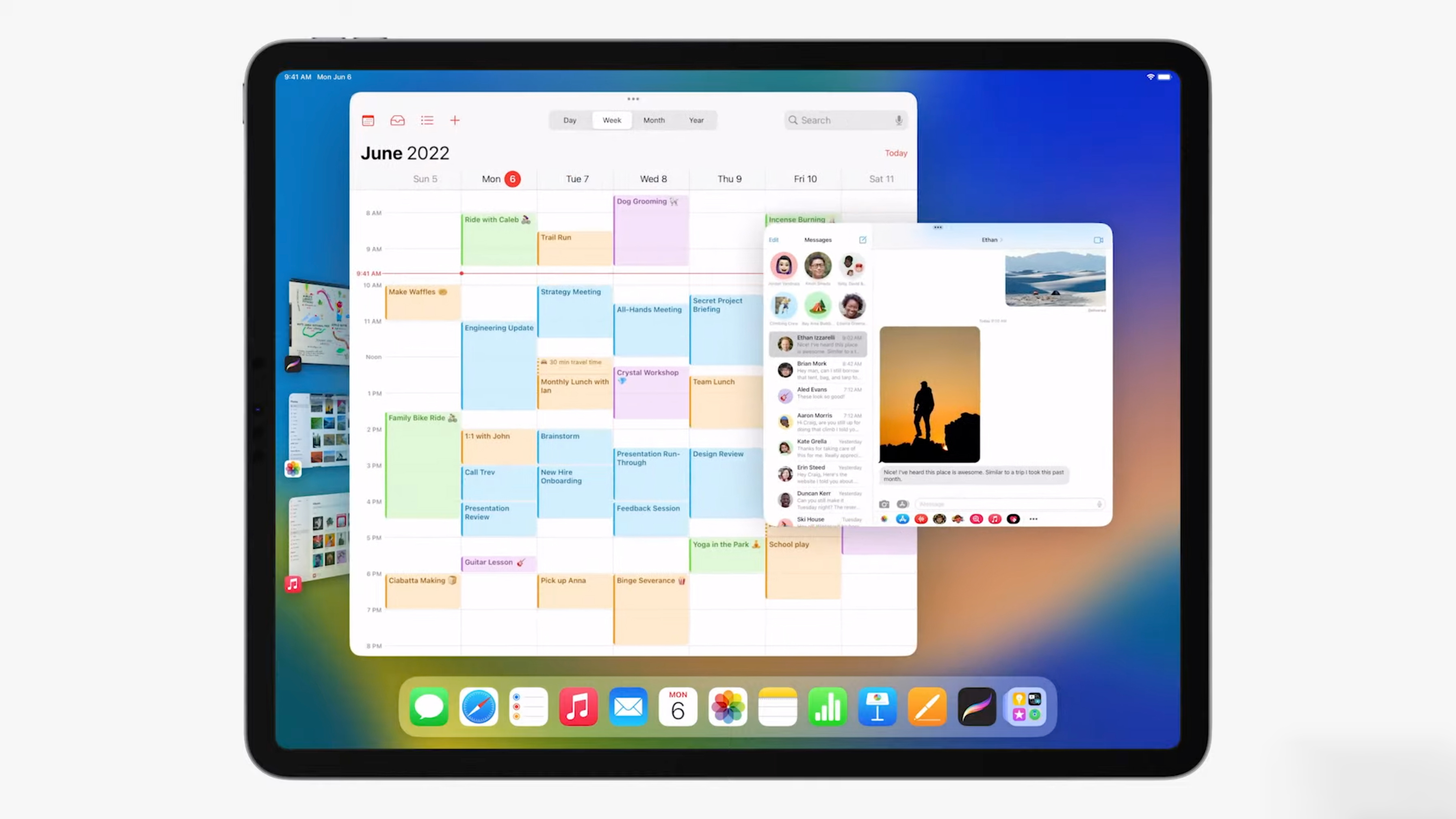
This is cool when it works, but maddening when it doesn't do what you expect. Keyboard shortcuts also need some improvements, as I'd love to be able to do more window management from the keyboard, and seemingly obvious options like force quitting apps from a button or a command like CMD + Q aren't possible right now.
This is all easier on the iPad when using touch though, so here’s hoping Apple makes the keyboard and mouse experience as smooth before release.
Balancing the needs of all iPad users is a gargantuan challenge, and while Apple has continually done a great job of catering to the basic iPad user, its more demanding customers have often felt like they were artificially limited in what they could do with the iPad.
Stage Manager doesn't remove all limits on iPad software, but it does clear a massive hurdle that many people thought the iPad would never achieve, and sets the stage for what could be coming for the tablet in the future.
