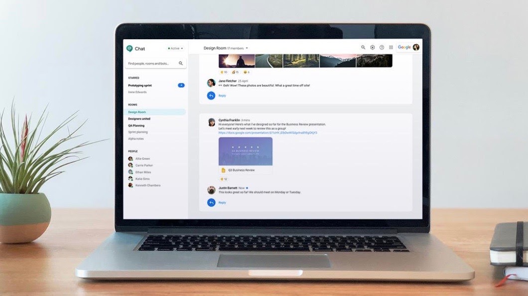
Google bunches email, chat and Meet into a single browser and app
Targets an ideal home for work experience

Google had announced last July that its plans to integrate core tools like chat, email, files, tasks and video to make them function in sync with each other. Now, it looks like their new "home for work" experience could consolidate these apps into a single browser window and a mobile application.
However, the company would also maintain standalone applications for messaging and video calling while Google Chat could end up with a redesigned web client. The company had announced its new home for work via G-Suite last July. Now there are reports of how the entire thing might function from a user's perspective.
- Google Meet is making meetings more secure for everyone
- This simple Gmail tweak will mean you'll never miss a Google Chat message again
- Google makes it easier for Chrome users to sync info across devices
While Google Chat is now available for those who have subscriptions for Workspace, personal accounts are only given access on a per-conversation basis when invited to be part of a conversation. The existing web interface is based on a side panel that has conversations grouped into Chat, Rooms, Bots and Pinned. The chosen chat is then displayed as a standard application.
A report published by 9to5Google suggests that the redesign retains the essential elements but only showing Chat and Rooms, in addition to Google Meet shortcuts. The Threads have been placed on the right side and users can "exit full screen" from the top right corner. This process offers a small chat window that looks a lot like the Hangouts interface on the Gmail web app.
These are all placed at the bottom of the screen and can be minimized in order to present just the name of the contact. Users can perform a bunch of functions from this point such as uploading images and adding emojis and send a Meet request.
It appears that Google's design team wants to ensure that the changes remain on familiar territory for longtime Gmail users. Besides ensuring that one could open up multiple talk windows, and have a Room on the main screen so that there is no need to switch screens during conversations.
The new user interface also allows us to reduce the sidebar to show profile avatars only. This allows for better utilization of available space with the search field also getting moved to the top bar.
Get daily insight, inspiration and deals in your inbox
Sign up for breaking news, reviews, opinion, top tech deals, and more.
As we speak, the new redesign is being rolled out in a phased manner, though till date it has appeared only on some personal accounts. We believe this could be a part of Google's plan to move personal Hangouts account on to Chat.
Google had announced that it was making Rooms an even better solution for longer-term projects with side-by-side access to shared chat, Drive files, and Tasks, that can be assigned to colleagues.
Get up close with consumer tech news that you can use, latest reviews and buying guides. Follow TechRadar India on Twitter, Facebook and Instagram!
A media veteran who turned a gadget lover fairly recently. An early adopter of Apple products, Raj has an insatiable curiosity for facts and figures which he puts to use in research. He engages in active sport and retreats to his farm during his spare time.
