Instagram teases quirky, new, eye-catching font as part of identity shift
Attention-grabbing features have no release date yet
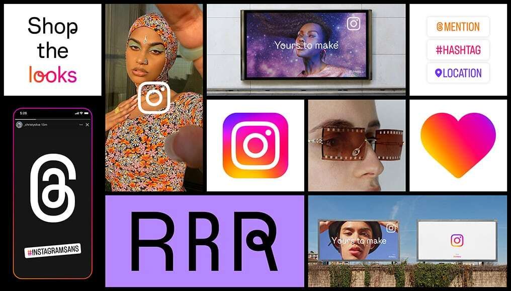
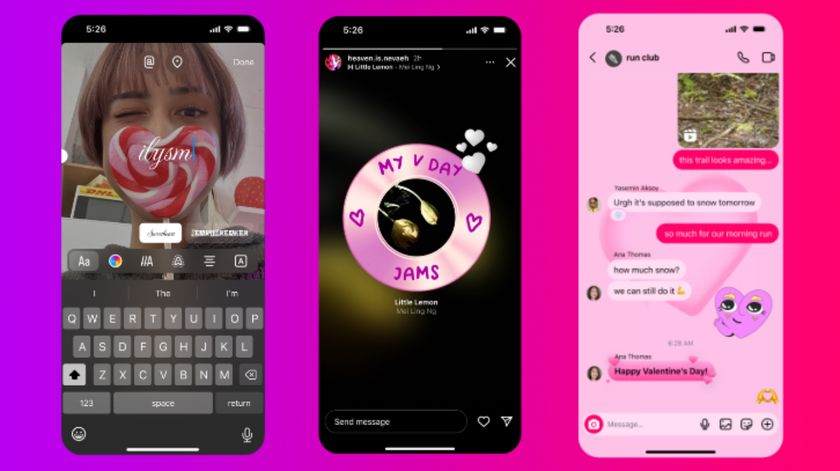
Instagram is rolling out new brand identity materials for users and influencers to use as part of a “visual refresh” that it hopes will foster creativity in the platform’s various communities.
The refresh is split into three parts: a brand new font for the app called Instagram Sans, a new layout and design system, and a new logo with moving gradient colors. Admittedly, it’s a little confusing as to how users and creators are meant to use the moving gradient logo, but it appears to be a beacon of sorts to bring more eyes to content.
Eye-catching content
Speaking of eye-catching, Instagram Sans was created for that very purpose. It's the platform’s new global font, which was inspired by the Instagram logo itself. Instagram said it worked with experts to make sure the font works with all types of languages, including those that don’t use letters such as Japanese and Arabic. Instagram Sans sports a circular motif that’s supposed to invoke friendliness. You can play with Instagram Sans on the platform’s website where you can check out the various sub-fonts like Sans Script and Medium.
The new layouts appear to break Instagram's current design boundaries, creating borderless collages in both portrait and landscape. There are four layout options (1:1, 4:5, 9:16, and 16:9) that you can experiment with and fit as much as you want in them. And it’s not restricted to images as you’ll be able to include Reels videos and Stories. Creators can also add product links to these layouts.
Instagram has a layouts page where you can get a closer look at the feature. We asked Instagram how users can share these images and if they can be posted on their own accounts. Unfortunately, they never got back to us.
The moving gradient, as stated earlier, is simply a beacon that you can find on various parts of Instagram. It can be found in Create mode, the rings around an Instagram Story, and as a sticker on Stories.
Growing its audience
We also asked Instagram when can people expect these features to roll out, but we were met with silence. What can be said with some confidence is that this is all probably a part of Instagram’s plan to go after TikTok’s audience.
Get daily insight, inspiration and deals in your inbox
Sign up for breaking news, reviews, opinion, top tech deals, and more.
The layout feature will be full-screen, and back in early May, the platform announced that it’s testing out a new vertical feed that takes up the entire display. It remains to be seen if chasing after TikTok is the way to go in the long term. Instagram’s new font and layouts are certainly interesting, but it’s up to the users to decide if they’re worth keeping.

Cesar Cadenas has been writing about the tech industry for several years now specializing in consumer electronics, entertainment devices, Windows, and the gaming industry. But he’s also passionate about smartphones, GPUs, and cybersecurity.
