MIUI 12 update: the best features and biggest changes
Fast and fluid performance
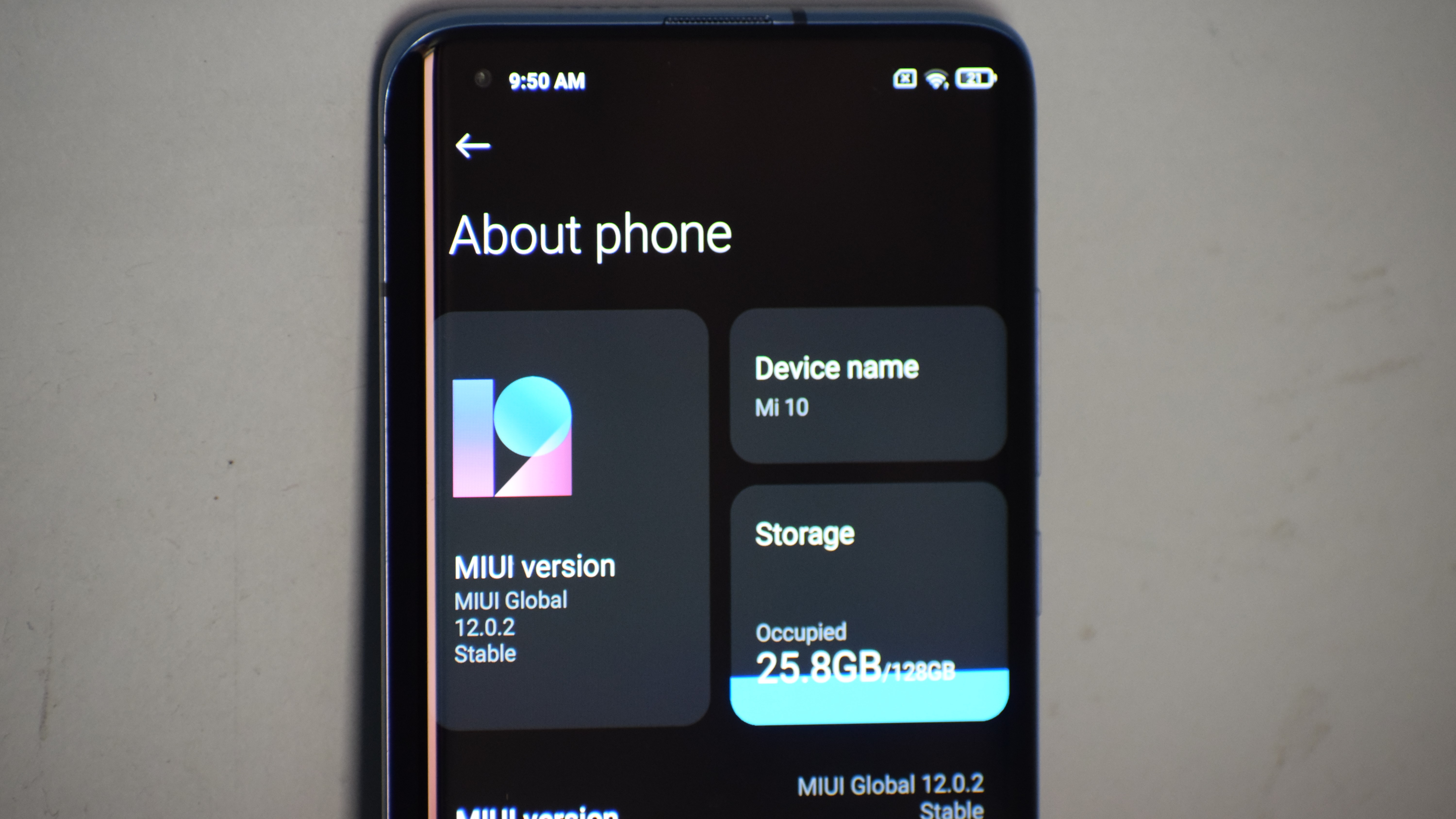
Xiaomi’s MIUI is one of the most popular Android skins out there in the market. In India itself, Xiaomi boasts of over 80 million MIUI users and around the globe, the number is close to 500 million. Even before it's smartphones became household recommendations, for geeks like us, it served as ROM that could be flashed on to our smartphones.
MIUI is one of the most popular and feature-packed skins for Android.
A few months back, the company announced MIUI 12 globally. Recently, it started rolling out to a bunch of Xiaomi phones in India, including Redmi phones and Poco devices. After testing it for a few weeks, here’s our review of the latest version of MIUI 12 on the Mi 10.
MIUI 12 brings several changes to the system which includes a host of new features, a visual overhaul, battery improvements, optimizations, and much more. Here are the top features that you need to know about.
User interface and animations
Let’s start with the most obvious one: the user interface. Firstly, there is an app drawer. This means you don’t need to swipe endlessly on the home screen to access the app you need. You can just swipe up from the home screen, which will bring you all the installed apps at one go. Xiaomi has smartly added categories in the app drawer too.
Once you swipe up you get nine categories on top - All apps, Communication, Entertainment, Photography, Tools, News & Reading, Shopping, Finance & Business, and Games. These come handy if you have lots of apps installed. Alternatively, you can also use the search box which appears on the bottom of the screen. These are customizable too.
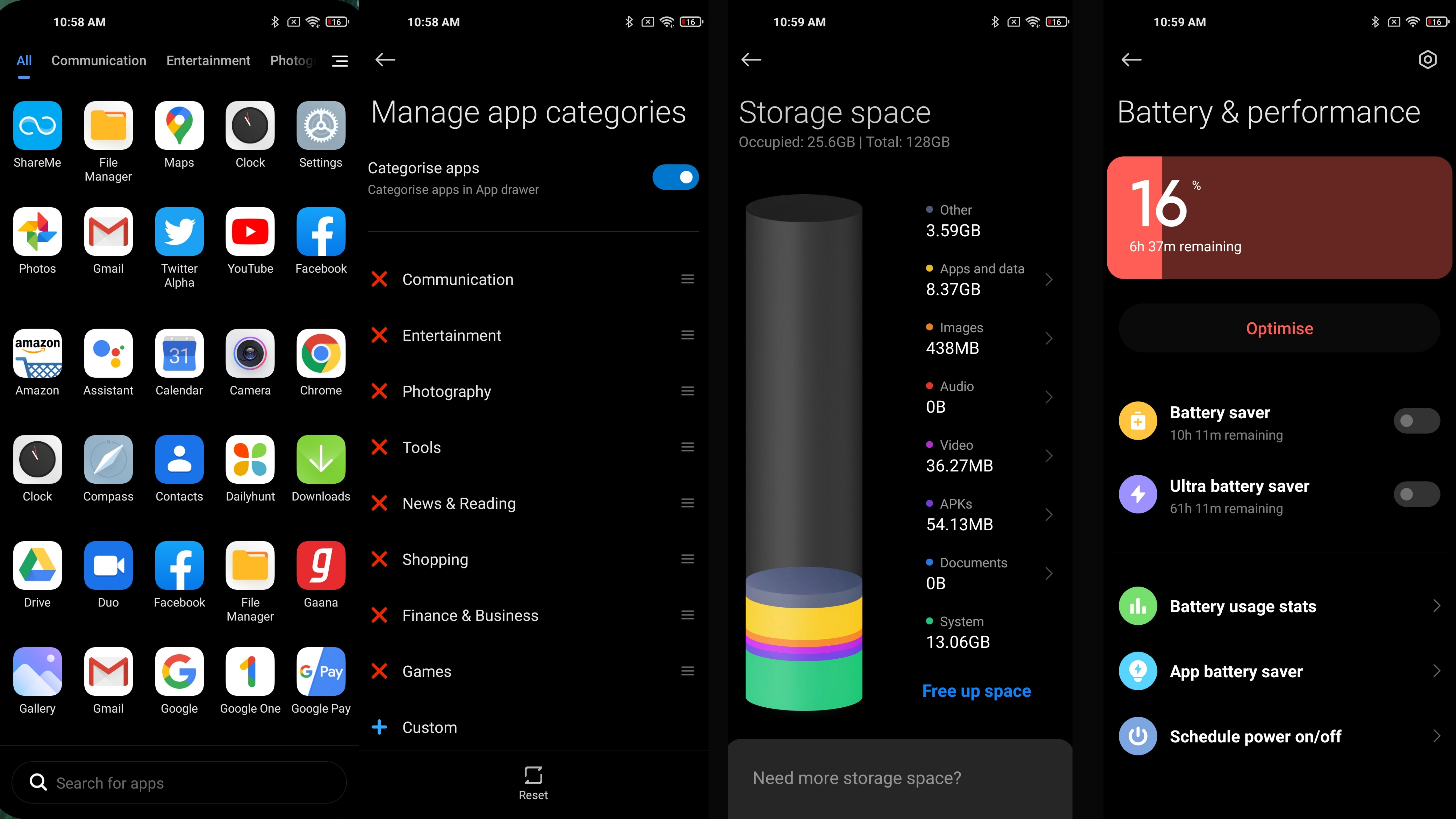
MIUI 12 also brings system-wide fluid animations which are pretty slick. The 90Hz panel on the Mi 10 makes it more enjoyable. You can see the new animation in the battery and performance menu, About phone section as well as the Storage section. The visual that appears in the storage section in my personal favourite. You get a tall cylinder with multicolour discs which tells you what exactly is taking up your storage space.
Similarly, the battery indicator inside the menu also fills up dynamically in a horizontal bar. System-wide sliders including calls, alarm, media, and others have also gained the fluid animations. Uninstalling apps are also fun as there is new animation for that too, which explodes and pushes the app icons around it. These will be a lot more enjoyable on phones with higher refresh rates.
Get daily insight, inspiration and deals in your inbox
Sign up for breaking news, reviews, opinion, top tech deals, and more.
Apart from this, you also get a new system-wide dark mode. Additionally, you also get the option to schedule the dark mode, match the dark mode with wallpaper, and the ability to force a few third-party apps such as Amazon to open in dark mode even if they don’t support it natively. Xiaomi has also added new fonts and larger texts for better readability.
Control centre
Yep, that’s exactly what Xiaomi is calling it and the purpose is also similar to what you think. Inspired by iOS, using this will take away the regular notification shade and the quick setting options. Instead, you get the all-new Control centre. This can be accessed by swiping down on the right side of the device. Swiping on the left will give you the notifications at a glance. These can also be customized.
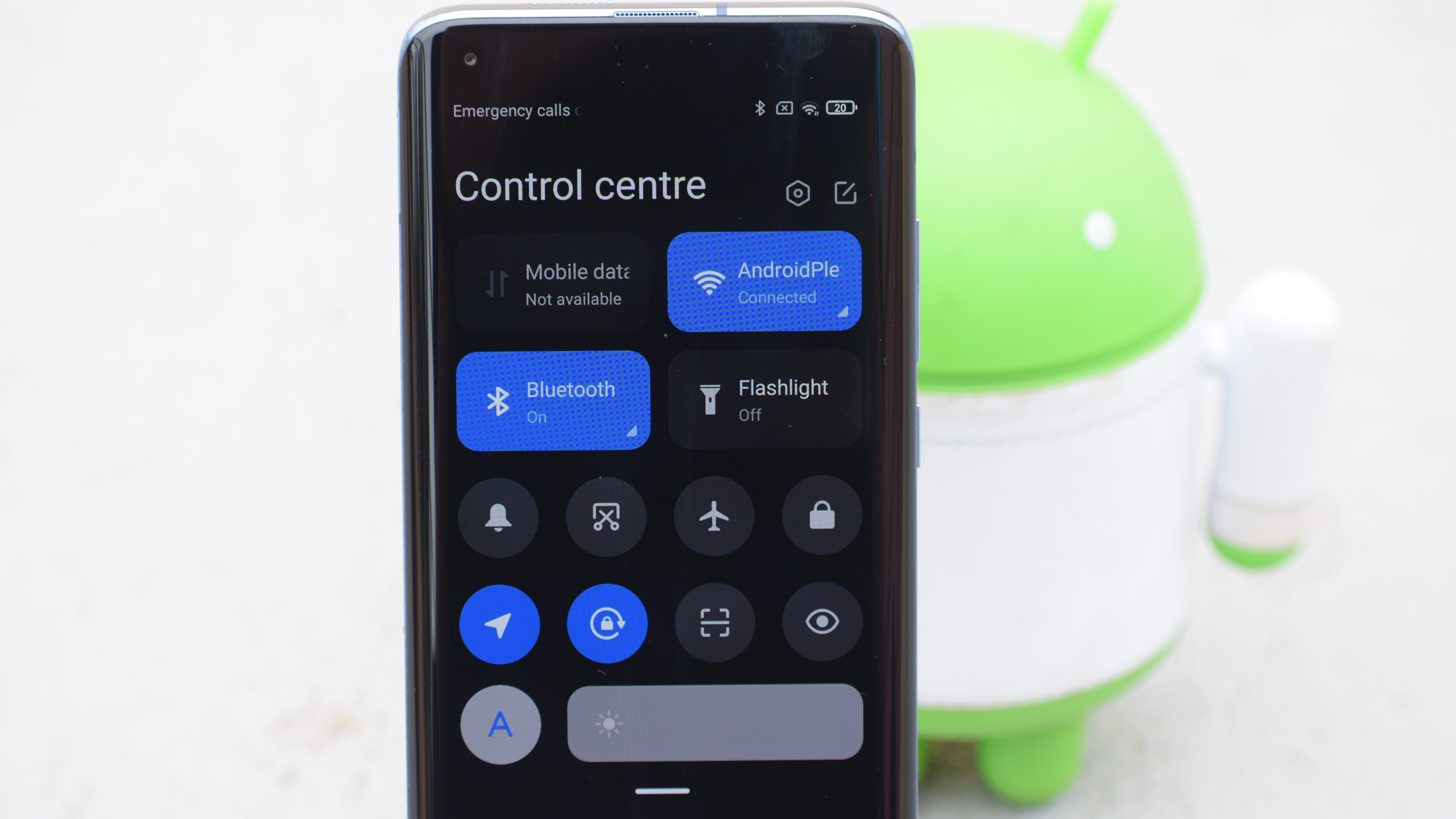
When you pull down first, you get the Mobile data, Wi-Fi, Bluetooth, and Flashlight toggle on the top with bold labels and neat animations. Just below these four toggles, you get eight quick setting tiles with a brightness slider at the bottom. You can also access more tiles by pulling the page even further. It is capable of fitting in over 25 quick setting tiles. The gestures work flawlessly and can be used from the home screen as well as any other apps. This feature is handy and convenient. If you are not a fan of this new control centre, you can always switch back to the original notification layout.
Privacy and security
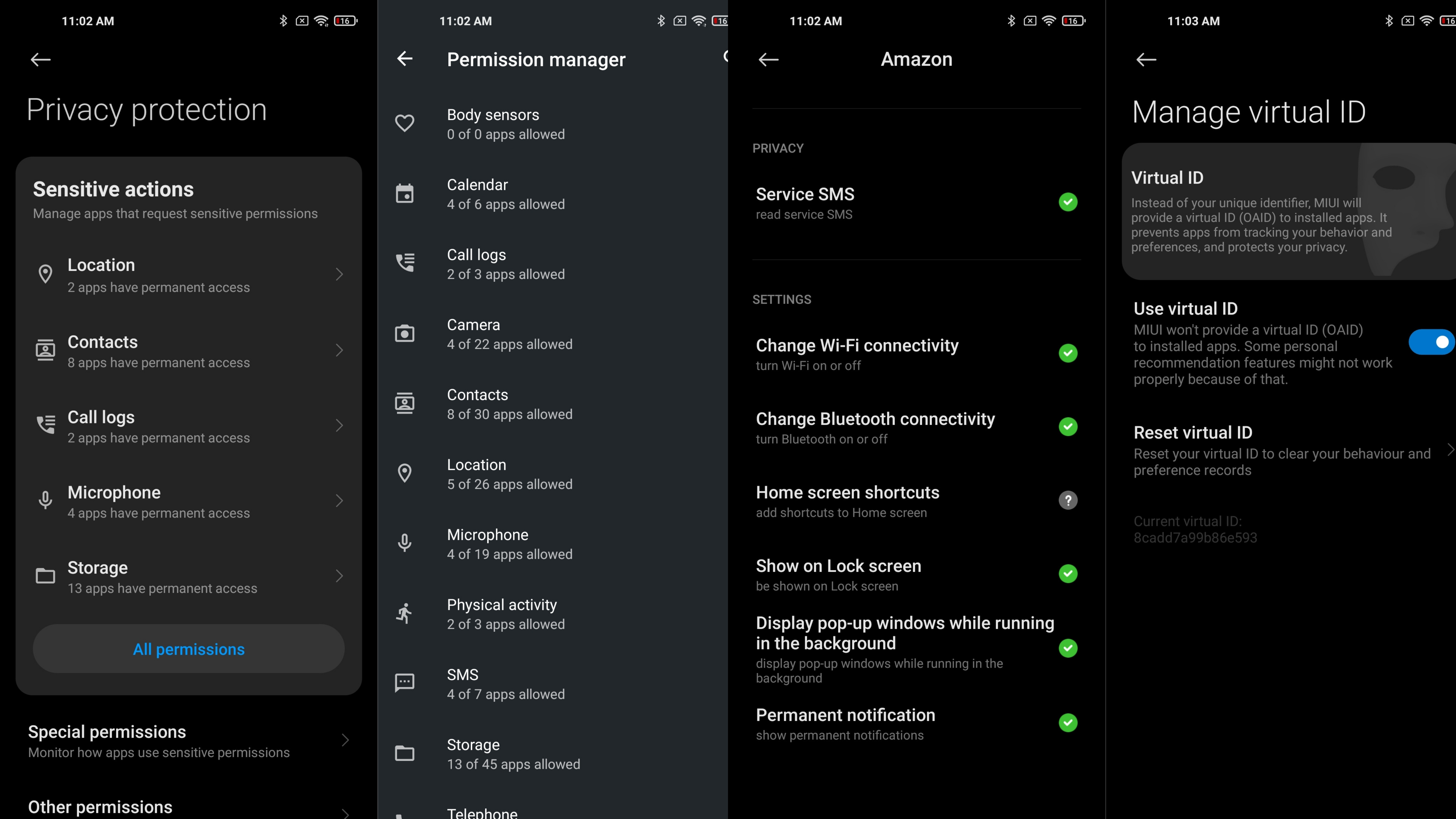
When it comes to privacy and security, Xiaomi has had to face a lot of setbacks. With MIUI 12, the company is focusing on privacy and tries to fix most of the issues. There are system-wide privacy and security alert features that will inform the users when an app or service is using the phone's camera, microphone, storage, gallery, location in the background and notify the users.
You get a newly redesigned Privacy protection menu inside the menu. This screen consists of comprehensive permission and privacy-related options. Firstly, it will show you at a glance how many apps are using the location, contacts, call logs, microphone, storage, and other permissions. You can click on any of them and check the list of apps that are accessing that particular permission and revoke the permission if needed. Similarly, you can also do vice-versa for the apps with no permission. The same can be done for all the permissions on the device including body sensors.
You can also revoke permissions for some special app access such as battery optimization, device admin apps, notification access, PiP mode, user access and more in the Special permissions section. For more primacy related permissions, you can go to other permissions and scroll through all the installed apps and check permissions for each.
Xiaomi has also added a handy feature where MIUI will give a virtual ID instead of your actual ID to apps and websites. This will avoid your data being misused and gives better privacy and security. And, lastly, MIUI 12 also comes with secure share options for photos and videos. With this option, the photos will have no location information and metadata by default.
Floating windows
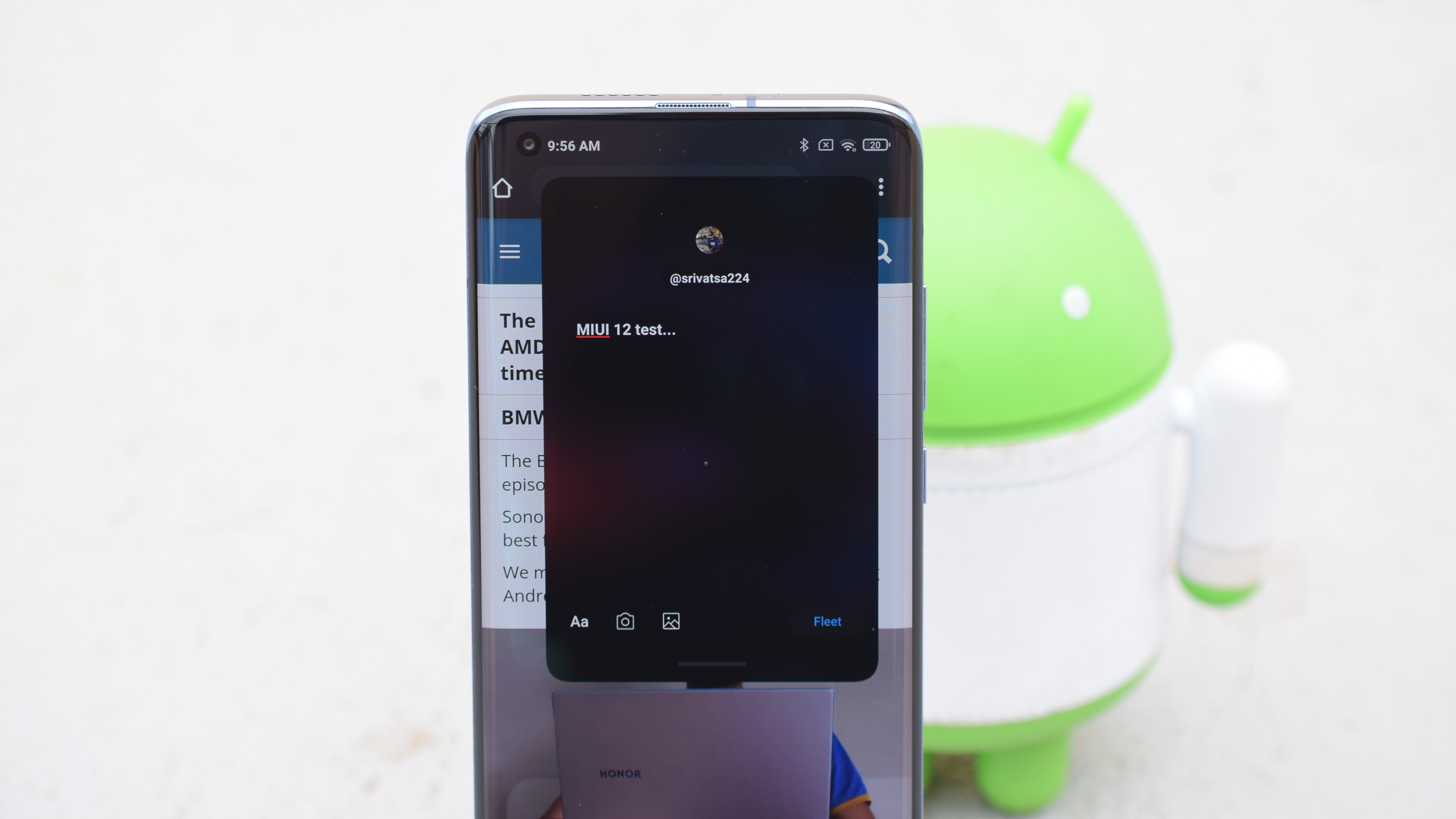
To take advantage of the modern-day big screen, you also get the floating window functionality. You can create a floating window by long-pressing any supported application in the recent screen. Once you enable it, you can also resize the window as per your requirement. This feature comes in handy when you want to watch a video and casually scroll through social media.
Super wallpapers
The first change that I noticed right after the MIUI 12 was the new wallpaper on the device. These are ultra-high-resolution, dynamic wallpapers of the Earth and Mars. Unlike other live wallpapers, these are very lively and offer seamless experience throughout the home screen, lock screen, and Alway on Display mode as well. Each time you take the phone and unlock it, you will be taken from a different level of view zooming in. The opposite happens when you lock it. Officially the super wallpapers support the Mi 10, Mi 10 Pro, POCO F2 Pro, Mi 10 Lite, Mi 9, Mi 9T Pro, Redmi K20 Pro, Mi 8, Mi 8 Pro, and Mi MIX 3.
Android 10 based gestures
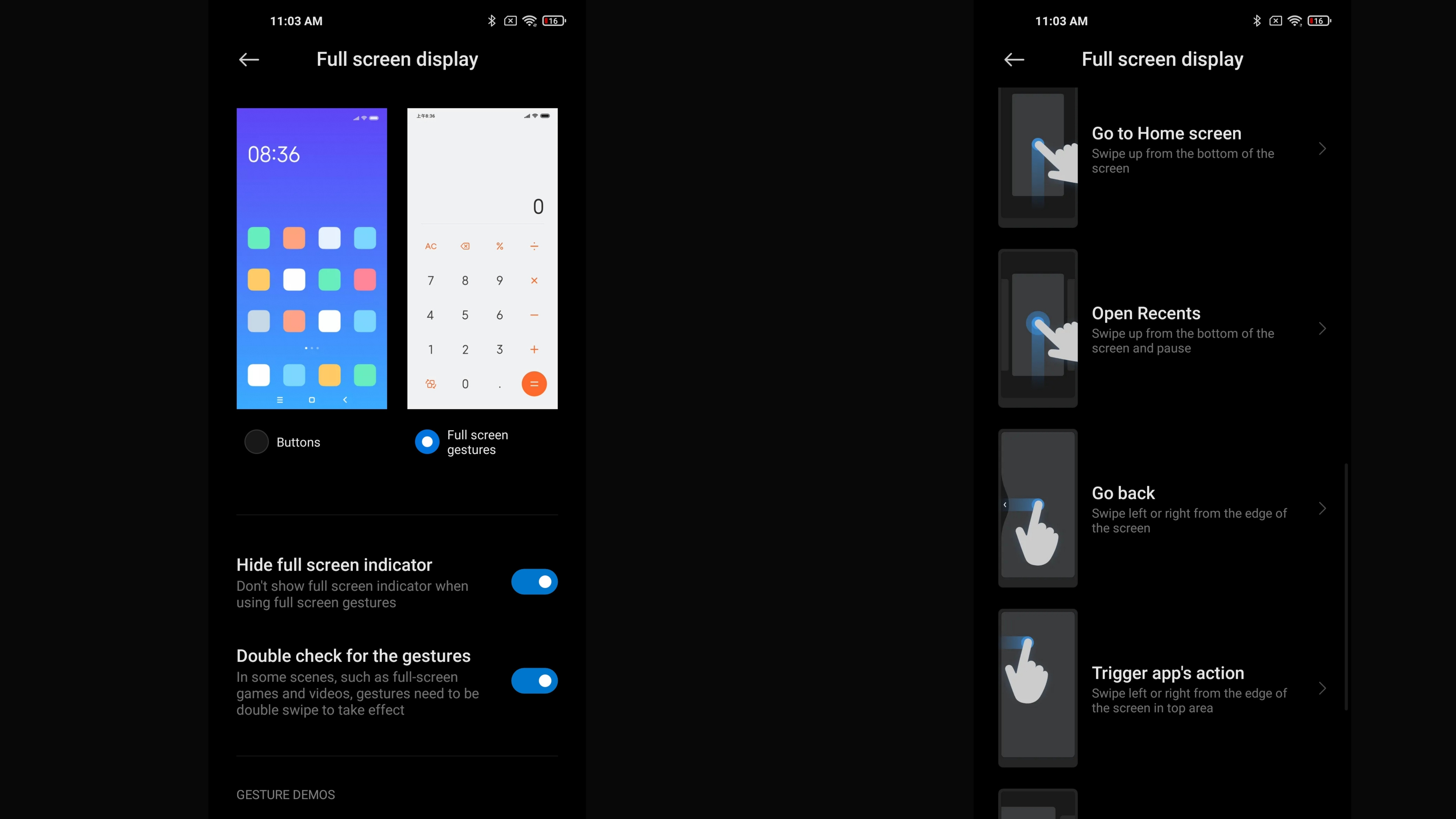
With MIUI 12 Xiaomi has finally added support for Google’s standard on-screen navigation gestures. You can go back by swiping on either side of the device. A full swipe up from the home screen will bring you back to home while holding it will take you to the recent. Xiaomi has smartly added a nifty feature here which triggers the app's action. For instance, if you are in the Play Store, and want to head to your account section in the navigation bar option, you can swipe from the top half of the screen and you will get the hamburger menu options.
The bottom line
These were the top major features of the MIUI 12 that we found to be interesting during our testing. However, apart from these half a dozen changes, the operating system comes with several other features such as Mi share, File manager, Focus mode, new camera UI, Lite mode, smart messaging, video toolbox, and much more. You can check out the list of devices that will be getting MIUI 12 here.
With MIUI 12 Xiaomi is bridging the app between other OEMs and it was good to see Android 10 based gesture on MIUI 12. The MIUI 12 was enjoyable and fluid for a person who came from stock Android experience.
Srivatsa is a prolific writer who spearheads the core writing team on tech news, buying guides, reviews, and all gadget articles. He is passionate about technology.
