Nothing unveils its product design principles ahead of launch
Shares a visual, too

Update: The Nothing Ear 1 true wireless earbuds are the company's first product, which will be unveiled on July 27.
The emphasis that Carl Pei's company Nothing is exuding on design has been pretty evident since the beginning. That was confirmed when the Nothing announced a deep partnership with Teenage Engineering, a company that shares similar ambition.
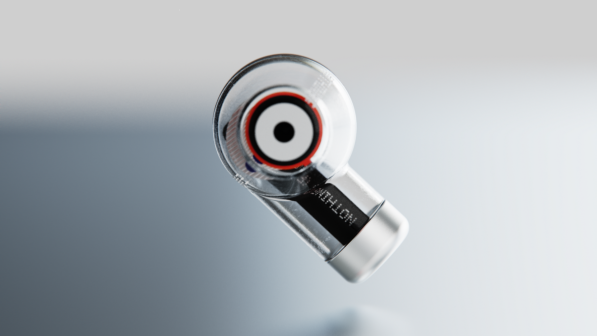
And now Nothing has shared its design principles ahead of its product launches to communicate how it is approaching the look and feel of its products. Along with a worded statement about the principles that Nothing is aiming for, it also shared a visual of what looks like an earbud.
- Nothing Ear 1 price in India, release date, news and leaks
- Nothing’s latest partnership reiterates an emphasis on design
- Nothing's plans for India get going with appointment of GM
It all starts with design, the soul of a product: https://t.co/n2lPLdCAP4 pic.twitter.com/i9YbsNUuJNMarch 9, 2021
Nothing and its design principles
The device in the image is apparently called Concept 1 and it seems to have a minimalist approach towards design. Nothing claims that it is on a "mission to remove barriers between the technology and the people to create a seamless digital future".
Long term it wants to create technology that is advanced and yet seamlessly integrates into people's lives that it feels like ‘Nothing’ and yet is everywhere. It wants to create gadgets without screens, no dedicated devices, just barely-noticeable technology that "empowers everyone to be more human".
In the near to mid-term it wants to start with existing product categories and transform them in its own design aesthetics. And the Concept 1 and the first wave of Nothing products will share a similar design element.
The Concept 1 might not be a real product but it apparently sets the tone. The transparent body of the device apparently embodies a closer connection to people. Nothing mentions that it wants to eliminate all the unnecessary branding on the surface, to focus solely on what adds true value to the user experience. It focused as much on what to remove from a product, as what it can add to it to ensure it is as lightweight as possible.
Get daily insight, inspiration and deals in your inbox
Sign up for breaking news, reviews, opinion, top tech deals, and more.
Nothing wants to make things simpler to use for the user and wants every product interaction, from picking it up to turning it on, to be intuitive, obvious, and natural. In order to made the designs look most appealing the brand uses shapes that look natural and warm. Concept 1 apparently takes inspiration from a grandmother’s tobacco pipe.
The company is trying to make its objects look familiar. But we have to wait for the real product reveal to see how the company sticks by its principles.
Hardcore gamer, gadget enthusiast & cinema buff | Gaming, tech correspondent & reviewer at TechRadar

