The M2 MacBook Pro is phenomenal - but man, I'm going to miss the Touch Bar
Hello M2, goodbye Touch Bar?
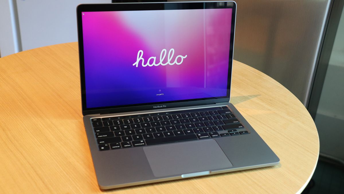
Apple’s new MacBook Pro 13-inch is, obviously, a great showcase for the newest member of the Apple Silicon team: the M2 chip. But it’s also a reminder that we cannot have our Apple-cake and eat it, too.
As Apple ushers in its remarkably powerful and power-efficient M2, it’s also preparing the smart and useful (and unfairly maligned) Touch Bar.
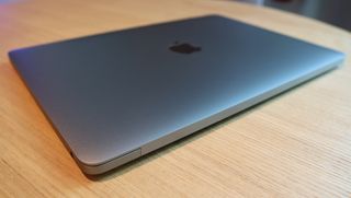
I know, it’s confusing. Apple took its newest silicon and stuffed it inside an aging design featuring its one-and-only Mac touch screen. But everything about the laptop, which we explore in our full MacBook Pro 13-in. (2022) review, screams “This is the end.” And it is, at least for the Touch Bar.
To understand what a big deal the Touch Bar was when it debuted six years ago, you have to go back to Apple co-founder and former CEO, the late Steve Jobs. Back in 2010, and not long after Apple unveiled the first iPad, Jobs dismissed the idea of a touch-screen laptop:
“We've done tons of user testing on this, and it turns out it doesn't work. Touch surfaces don't want to be vertical. It gives great demo but after a short period of time, you start to fatigue and after an extended period of time, your arm wants to fall off. it doesn't work, it's ergonomically terrible. Touch surfaces want to be horizontal, hence pads,” said Jobs.
Granted, it was a spurious argument. Within a few years, we’d see Magic Keyboards that would float iPad Pros in a more or less vertical plane above full-sized keyboards.
Why is this a thing?
On the surface of things, the M2 MacBook Pro 13-inch seems like an excellent Apple laptop for your friendly neighborhood creator. In my benchmark tests, the M2 handily beat its M1 predecessor (and an 11th Generation Intel Core i7).
Get daily insight, inspiration and deals in your inbox
Sign up for breaking news, reviews, opinion, top tech deals, and more.
Its graphics numbers are stunning, thanks to the default 10-core GPU. The $1,299 starting price gets you 8GB of unified memory, and a 256GB SSD. It has a gorgeous 13.3 LED Retina Display (2560 x 1600) and promises 20 hours of battery life. In my tests, it really does sip power (gotta love an ARM CPU in a laptop), lasting approximately 18 hours.

The problem is that the other system with the new M2 chips is the all-new $1,199 MacBook Air. Like the Pro, it starts with 8GB of unified memory and a 256GB SSD. The screen, though, at 13.6-inches is slightly larger than the Pro display. It even houses a higher-resolution FaceTime camera (1080p as opposed to 720p). Instead of stereo speakers, you get a four-speaker system.
What do you get with the MacBook Pro: an active cooling system, a promised two extra hours of battery life, and the 10-core GPU (you can upgrade the Air to 10 cores).
More importantly, though, the MacBook Air M2 does not include the Touch Bar. In fact, the new MacBook Air has more in common with the M1 Pro and M1 Max-running MacBook Pro (14 and 16-inch). None of these next-gen MacBooks offer the Touch Bar. And I think it’s safe to assume that future generations never will.
Still, even as Apple brings iPadOS and macOS close together, it’s resisted the idea of adding touch to any Mac. Until it introduced the Touch Bar, a thin, horizontal strip of touch- and gesture-friendly OLED screen that sits just above the main keyboard.
It was a blank slate for Apple and eventually developer partners to manipulate on a per-App basis.
For a time, it appeared on multiple MacBook Pro models, though there were still some sold without it.
I was an early fan, writing in my review of the first MacBook Pro (there were then 13- and 15-inch models) to feature it:
“With the Touch Bar, Apple pulls off a nearly perfect double backflip into the world of touch computers (without acknowledging that people would ever want to touch their displays).”
Now, though, Apple is pulling off a different trick, offering up a surely soon-to-be decommissioned MacBook Pro chassis and technology in service of a needed Pro-level platform for its M2 SOC.


Goodbye fun, old friend
What’s great about the Touch Bar is its innate serendipity. For every time it seems to repeat the actions offered to you on the main display, the Touch Bar also surfaces often used or hidden features. In virtually any text-entry field, it’s helpfully offering autocomplete (or autocorrect) entry options. With the Microsoft Word integration, the Touch Bar cannily displays just the contextual features you really needed in the moment. It's the Office ribbon boiled down to its necessary essence.
In iMovie, it makes the confusing obvious, displaying the word “Split” so I can, with one tap, split one clip into two. It also offers instant access to the clip volume control. That’s utility if you ask me.
Above all, the Touch Bar has always offered clear, visible access to volume controls, brightness, and Siri. On the other hand, it enraged Pro traditionalists for replacing the Function and Escape Keys. Apple quickly brought back the latter on the MacBook Pro 16-inches (2019), with seemed to calm down some Pro users.
There were also fun Touch Bar applications like the Piano and a single-lane version of Pac-Man.
Was it always necessary? No. But it was always useful and remains so on this MacBook Pro 13 with M2.
A fond farewell to familiar
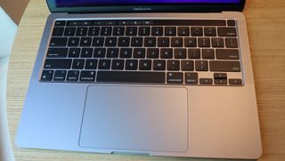
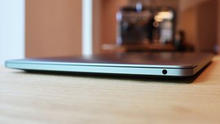
Like the Touch Bar, much of this excellent MacBook Pro 13-inch chassis design (solid, sensible, lightweight, and with an excellent keyboard) is unlikely to make it to future generations. The 14 and 16-inch Pro and MacBook Air M2 are all of a piece, offering a somewhat boxier, though no less lean vision of future MacBooks. They’ll all have bigger screens, notches, better audio, and MagSafe charge ports.
Even as I marvel at the incredible M2 performance, I can’t help but regard the MacBook Pro 13-inch as a relic. The final resting place of a particular look, feel, and Apple’s dalliance with touch on a MacBook: The Touch Bar.
Yes, I’m smitten with the laptop, but it’s hard to recommend a piece of hardware that, CPU aside, looks backward instead of to the road ahead.

A 38-year industry veteran and award-winning journalist, Lance has covered technology since PCs were the size of suitcases and “on line” meant “waiting.” He’s a former Lifewire Editor-in-Chief, Mashable Editor-in-Chief, and, before that, Editor in Chief of PCMag.com and Senior Vice President of Content for Ziff Davis, Inc. He also wrote a popular, weekly tech column for Medium called The Upgrade.
Lance Ulanoff makes frequent appearances on national, international, and local news programs including Live with Kelly and Mark, the Today Show, Good Morning America, CNBC, CNN, and the BBC.
