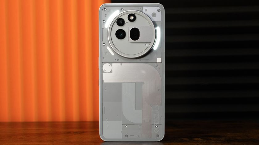
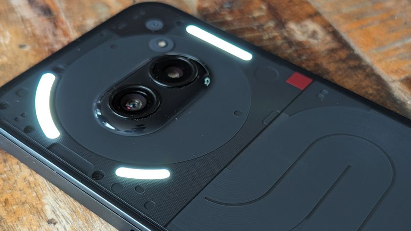
The Nothing Phone’s version of Android is surprisingly good
Best of both worlds
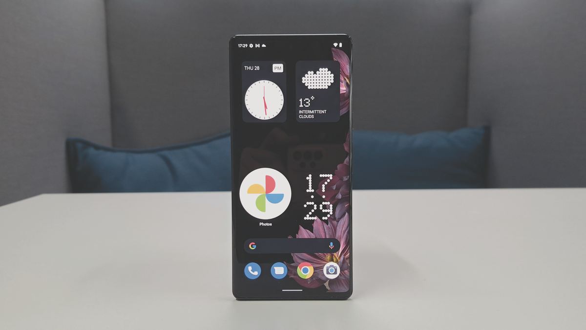
If you’re excited for the Nothing Phone (1), we’ve got big news: as promised in the phone’s teaser announcement, you can now download an early version of the device’s software to test and play about with.
Well, when we say ‘you’ we mean specifically people with a Samsung Galaxy S21 or Samsung Galaxy S22 series phone, or the Google Pixel 5 or Pixel 6 - this is just an early beta of the user interface, with only a few features and tools.
We’re expecting the Nothing Phone (1) to land sometime between June and September, but at an event with the silly name of The Truth, Nothing teased the device, and also promised that it’d launch the software soon - well, ‘soon’ is ‘now’ apparently.
What's the Nothing Launcher like?
1. Find the Nothing Launcher (beta) on the Google Play Store (or click here). Download it.
2. Go to your phone's settings menu, then apps, then default apps, then default home apps.
3. Pick the Nothing Launcher and it'll automatically install.
There are three key features that the Nothing Launcher brings onto your phone, but we’re going to presume this doesn’t represent the full feature set, because it’s a little limited. They’re built over what looks like stock Android.
Firstly, there are three Nothing-themed widgets: weather and two clocks (digital and analog). The digital clock and weather widget have a spotty retro look, while the analog clock is a little more typical.
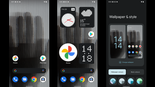
Second, there's a new Nothing wallpaper, and it’s… certainly something? We thought our phone had broken when we first saw it, but no, that’s how it’s meant to look. You can change the color of it if you want, but this only changes the text color.
Admittedly those are two rather small features, and the third one is too, but it’s one we actually like. You can choose to enlarge app and folder icons, so instead of taking one space in the home menu grid it’ll take four.
Get daily insight, inspiration and deals in your inbox
Sign up for breaking news, reviews, opinion, top tech deals, and more.
This is quite useful for ease of access - you can easily slam your thumb on one part of the screen and be sure to hit the app. We also see this being really useful for accessibility, for seniors or people with physical disabilities who might struggle to tap really small icons.
We’re fond of this feature, and can already see our everyday phone feeling a little restrictive since it doesn’t have resizable icons.
Given that the app is called the Nothing Launcher (beta), we’re assuming this is the first version of the operating system, and hopefully we’ll see new versions before the Nothing Phone (1) launches with bigger updates. But for a first impression, we’re pleasantly surprised.

Tom Bedford joined TechRadar in early 2019 as a staff writer, and left the team as deputy phones editor in late 2022 to work for entertainment site (and TR sister-site) What To Watch. He continues to contribute on a freelance basis for several sections including phones, audio and fitness.
