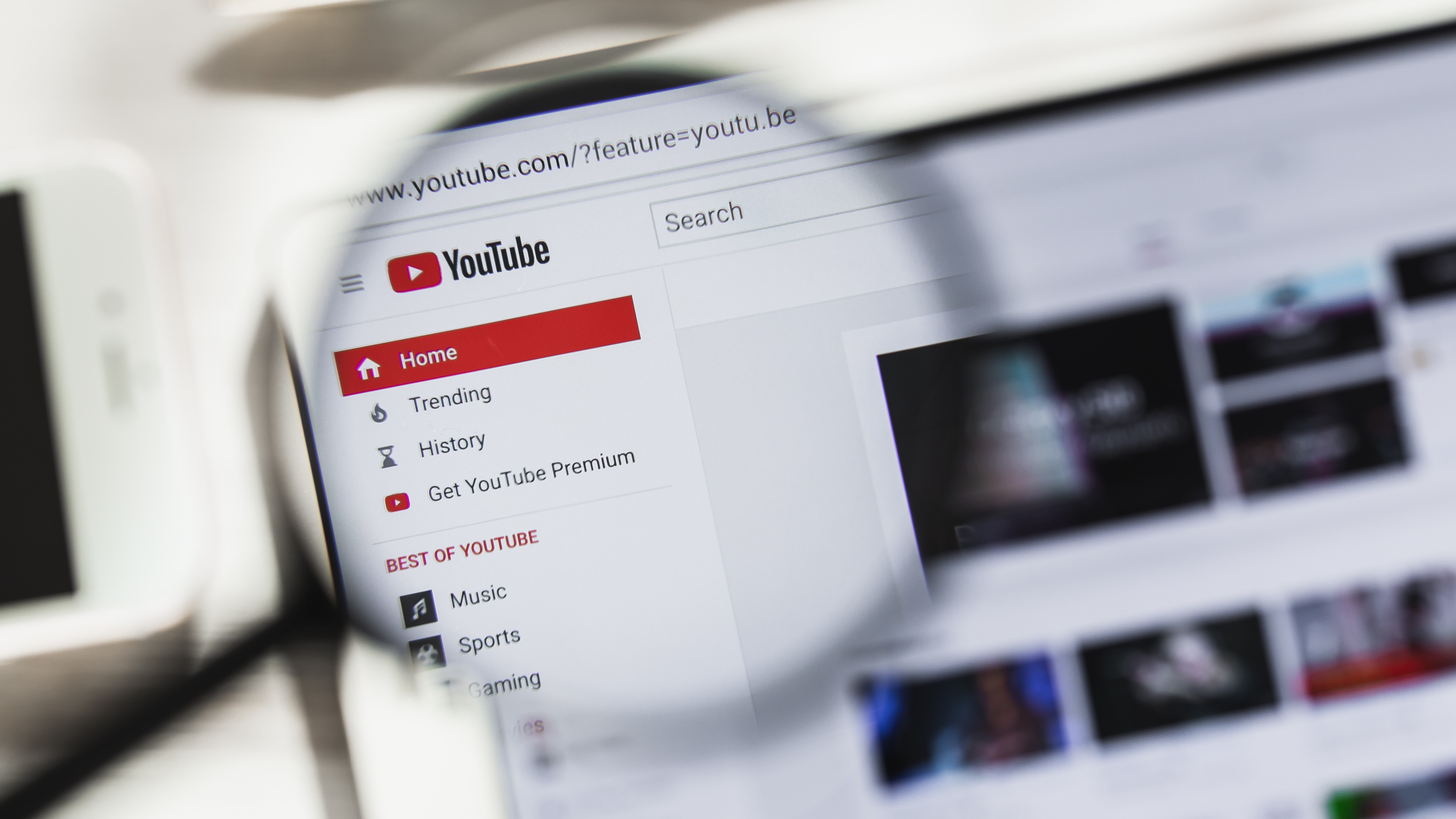
YouTube is killing off its old design next month, like it or not

Sign up for breaking news, reviews, opinion, top tech deals, and more.
You are now subscribed
Your newsletter sign-up was successful
Starting next month, YouTube's new desktop interface will be mandatory, whether you like the redesign or not. It's currently possible to switch between the old and new looks, but from March onwards, Google is killing off the classic look for good.
As 9to5Google explains, Google has been tweaking YouTube's design since 2017, adding and changing elements to fit with its Material Design principles. Other apps including Gmail and Google Calendar received a makeover back in 2018, so it's surprising that it's taken so long for the new-look YouTube to become permanent.
- Discover how to enable Gmail dark mode
- You can also try Chrome dark mode for more comfortable browsing
- We've rounded up the best YouTube downloaders
The new design include lots of modern features that most users are sure to welcome (including dark mode), but there are bound to be some holdouts who resist the change when it becomes mandatory.
Article continues belowPlay on...
The new YouTube for desktop first appeared on desktops on November 7 2019, introducing larger tiles, longer video titles and channel icons to help you recognize creators more easily. It also added the ability to create queues of videos from the homepage.
Google hasn't said exactly when it'll be killing off the classic design, but if you've been holding out, it might be a good idea to make the switch now and get used to the look so it's not a shock when it happens.
- Find out how to download YouTube videos for free
Sign up for breaking news, reviews, opinion, top tech deals, and more.

Cat is TechRadar's Homes Editor, covering smart home tech, kitchen appliances, vacuums, haircare and more. She's been a tech journalist for 15 years, having worked on print magazines including PC Plus and PC Format, and is a Speciality Coffee Association (SCA) certified barista. Whether you want to invest in some smart lights, find your ideal hair styler, or pick the espresso machine of your dreams, she's the right person to help.