TechRadar Verdict
If you can get the free download for the 10-day trial, give it a go. Maybe you’ll enjoy the trip down memory lane of how software used to be. But if you want a modern 3D home design tool, it might be best to look elsewhere.
Pros
- +
Lots of detail
- +
Many items to add
- +
Desktop software, not reliant on the internet to work
Cons
- -
Feels old
- -
Too many clicks to do simple tasks
- -
Frustrating interface
- -
Annoying persistent tools
Why you can trust TechRadar
Ashampoo Home Design has been around for years, helping people create and furnish their 3D homes. We’ve taken a look at the latest iteration: version 6, which is available for Windows 7 and up, with a minimum of 4GB of RAM (although as is the case with all of these types of apps, the more memory you feed it, the more responsive it’ll be).
Currently this home interior design software is on offer at a massive discount: $19.99 (£17.99) instead of $49.99 (£44.99) for the download-only version. If you want to give it a go, you can also take advantage of a free 10-day trial.
Getting started
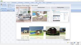
Launch the software and you’ll immediately feel that the design is passed its prime. There may have been a time when the layout was modern, but this was many moons ago. The ‘Start Wizard’ window gives you a preview carousel of some renders which are nowhere near as good as what the current competition can achieve. You have access to training videos which are eleven (!!) years old and don’t even come with any narration - this is not a good first impression, but it does explain that antiquated feel. You also have a building wizard - that’s more encouraging.
You're a wizard, home designer
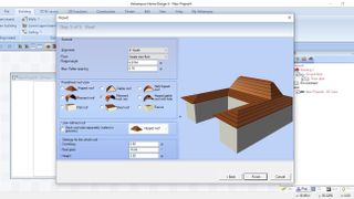
The steps you’re guided through are very simple and help you get started quickly and easily. You choose the overall shape of your house, its dimensions, even the type of roof you’re after. Once you’re ready, place your new home onto your terrain. All of this was going well until we decided to insert some windows and doors. For some inexplicable reason, which we were unable to resolve, those doors and windows insisted on being placed on the first floor, not the ground floor. Since there was no first floor, they appeared within the roof.
We tried to create another building and the door appeared in the right place… until we noticed that building was actually floating above the ground next to the other one! Maybe we shouldn’t have let a wizard design our house in the first place! There must be a way to fix this, but if this glitch appears the first time you give the app a try, and there’s no obvious and clear way to resolve it, how many potential customers will stick with the app, and how many more will venture into the arms of the competition?
Interface
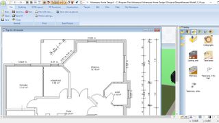
The interface is very unwieldy. You have rows of tools and icons at the top, and a project sidebar on the right. What’s left is where you will be designing your home. Except, not really. You can work on a 2D top-down plan, or a 3D virtual render of your creation. Both of these come up as floating windows which can only reside inside the space not taken up by the other tools. It’s very frustrating as those tools actually take up a lot of space, and if you enjoy working with both of those windows open, they end up fighting for limited space.
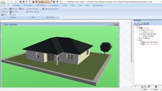
Of course, they can overlap, with one being partially behind the other, but the fact they can’t even be displayed as different tabs to maximise the limited amount of screen real estate you have makes for very poor- or very antiquated - design. Either way, it doesn’t feel up to the task.
Yes, you can hide the toolbars, but you still end up with windows competing for the same space, and you have to endlessly move them and resize them as you work. Not ideal.
Building your home
We didn’t encounter any “floating home syndrome” when building a house from scratch. The tools work well, but it feels like you need way too many clicks to get the job done. It’s also not clear if your cursor is set to use a particular tool or just there to help you move through your design. Many times we found ourselves inadvertently adding walls when all we wanted was select a different part of the build.
Now as you’d expect, you have a myriad of options at your disposal. The type of wall for instance (external, internal, load bearing, etc), how your roof is built (options which were shown thanks to our wizard above), and of course, utilities and furniture galore.

Take a door for instance. Click on it to get to its properties, and from there you can scroll through a list of various styles… except the thumbnails are rather small and more often than not it’s not clear what your selection will look like - until you select it and check the result in the 3D window. Lots and lots of clicks to get what you want.
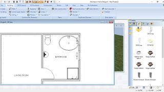
The catalog of items is better because you can double-click on an object to see a large preview of it, so that’s fine. Most items have multiple options, like various basins, toilets and showers for instance. Adding an item involves dragging it from that catalog onto your plan… except if you want to work on the 2D plan, even if that window is the frontmost one, the 3D window will pop up as you drag, vying for attention like a neglected pet. If you can still see your 2D window you can drop the item there instead, then drag it to its proper location. But then, there’s another problem: somehow, the software now insists you want to add as many of that chosen item as you can click. Of course, pressing the Esc key stops that, but would it be too much to ask for this to be an option, instead of ending up with four toilets stacked on top of each other in the same bathroom?
As you’d expect, every item you add can be resized, although it takes a lot of clicks to do so. Rather than dragging their outside edges as would be the natural and expected method, nothing is that simple here. No, you have to open its properties and then manually type in new values. If the size is not exactly what you need, you need to open the properties again and repeat the process, until it is.
Final verdict
Home Design might have been a cutting edge piece of software at one time, but it feels old and frustrating now. You can design a house to your exact specifications, absolutely, and customise it to your heart’s content, undoubtably, with as much furniture as you can drag onto it… but you really need to click way too many times to achieve results that could be done more quickly and much more efficiently. Its competitors can do it, why can’t this software?
Need help on your next creative project around your home? Check out our roundups of the best home interior design software and the best architecture software
Steve has been writing about technology since 2003. Starting with Digital Creative Arts, he's since added his tech expertise at titles such as iCreate, MacFormat, MacWorld, MacLife, and TechRadar. His focus is on the creative arts, like website builders, image manipulation, and filmmaking software, but he hasn’t shied away from more business-oriented software either. He uses many of the apps he writes about in his personal and professional life. Steve loves how computers have enabled everyone to delve into creative possibilities, and is always delighted to share his knowledge, expertise, and experience with readers.
Most Popular


