TechRadar Verdict
The Vivomove Luxe sees Garmin trying its hand at luxury watchmaking, with uneven results. The Luxe is trying to do too much at once, resulting in a watch that looks pretty and lacks focus. You could pay much less and get the same range of features.
Pros
- +
A more classic watch design
- +
Loads of health features
- +
Color AMOLED display
Cons
- -
Screen suffers under sunlight
- -
Battery could be better
- -
Too expensive
Why you can trust TechRadar
Garmin may be the titan of fitness trackers, but with the Vivomove Luxe it’s wading into the unfamiliar waters of luxury watchmaking.
Fossil, which has a more established presence in this space, has tried to find a happy medium with its own hybrid smartwatches, but many of those have failed to excite. In fact, the hybrid category as a whole sometimes feels like a skunkworks factory for experiments, like the recent Fossil Hybrid HR.
Garmin is approaching the hybrid from the other end of the spectrum than Fossil, building more traditional-looking watches on top of a foundation of fitness known-how.
Can it make this work with the Vivomove Luxe Garmin watch? Here’s our verdict.
Garmin Vivomove Luxe release date and price
- Out now
- Starts at $499.99 / £439.99 / AU$799
The Garmin Vivomove Luxe is available now starting at $499.99 / £439.99 / AU$799 and moving up to $549.99 / £479.99 / AU$849 for the more expensive models.
We can’t see it discounted anywhere right now, and given that this is Garmin’s first shot at a real luxury timepiece we wouldn’t bet on it getting a price slash any time soon.

Design and display
- Stylish but not quite luxury
- Includes a full screen behind the hands
For a $500 hybrid smartwatch that calls itself 'Luxe', you’d expect Garmin to turn in something pretty stunning here, right? Much will come down to taste, but we don’t think you can accuse the Luxe of feeling cheap or plasticky like the previous Vivomove HR.
At the same time, we don’t think it’s really playing in the luxury watch market. But herein lies the problem: Garmin is not a watchmaker, it is a sports watch maker. Its pedigree is GPS multi-sport watches where the philosophy has always been function over form.
The Luxe only comes in a 42mm size but with a choice of silver, gold and rose gold cases. Most come with a leather band, but there are two with the Milanese strap that cost more. On all models the case weighs 44.5g, which is heavy enough to keep reminding you it’s there.

The Vivomove Luxe is an extended family member of Garmin’s entire Vivomove line, which includes the Vivomove 3, Vivomove 3S and Vivomove Style, and functionally these watches are largely identical. So there’s a plethora of options if you don’t want to shell out for Garmin’s self-designated luxury model.
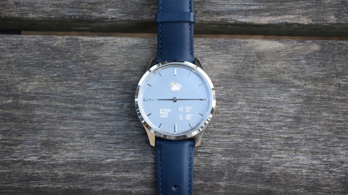
But the Luxe isn’t just about looking nice; it has some clever smarts too. When idle, there’s absolutely nothing to give away that this is more than a regular analog watch. But turn the wrist to face you or double-tap the glass and an AMOLED display will light up (well, technically two displays), revealing an entire interface behind those clock hands.
This is the big trick of Garmin’s Vivomove range. Whereas some hybrid smartwatches like the Withings Move place tiny screens on the face, and others, like some of Fossil’s, don’t use any visual displays at all, the Vivomove Luxe hides the displays behind the clock.

This has two benefits: it allows the watch to display more information than a single complication screen would allow; and those displays can completely disappear when you don’t want them.
It’s a touch interface too; swipe left and right to move through your widgets, swipe down to access Garmin Pay, and hold a finger down to open the activities menu.
In fact, there are no buttons on the Garmin Vivomove Luxe at all. All interactions happen using that touch display.

And it works… pretty well. Waking up the display can be a bit hit or miss, as sometimes it didn’t register our wrist turns (or taps, for that matter).
Most of the time it’s easy enough to read, but it does suffer under harsh sunlight. This is where we recommend changing the colors of the complications to help them stand out, which you can do in the Garmin Connect app.
And you'll want to be able to read the display, as you can view notifications on the watch – which look better thanks to the second AMOLED display; the old Vivomove only had one – or check widgets that show your step count, the weather forecast, and more.
Tapping certain widgets can open up more information too – and when you want the display to disappear, simply lower your wrist again.
But that touchscreen can be a bit fussy at times, which has led to some frustrated jabbing as we tried to hit a very small 'back' arrow or a tiny icon to tell the watch we’d finished exercising.
- 1
- 2
Current page: Introduction, design and display
Next Page Features, health, battery life and verdictHugh Langley is the ex-News Editor of TechRadar. He had written for many magazines and websites including Business Insider, The Telegraph, IGN, Gizmodo, Entrepreneur Magazine, WIRED (UK), TrustedReviews, Business Insider Australia, Business Insider India, Business Insider Singapore, Wareable, The Ambient and more.
Hugh is now a correspondent at Business Insider covering Google and Alphabet, and has the unfortunate distinction of accidentally linking the TechRadar homepage to a rival publication.

Report: Apple is stopping work on a pair of smart glasses that would have connected to the Mac

Tesla promises more affordable EVs and could start its Robotaxi service in June – but I've heard this all before

I've rounded up five printers with cheap running costs, refillable ink systems and high-yield cartridges for long-term savings
