Early Verdict
Sharp's first smartphone for the US looks like a fresh new flagship, but its budget leanings come through on first touch.
Pros
- +
Futuristic look
- +
Nearly bezel-free display
- +
Good price
Cons
- -
Weird front lens placing
- -
Plastic screen
- -
Feels hollow
- -
Little storage
Why you can trust TechRadar
At first glance, Sharp has made, well, a sharp smartphone for its first entry into the US market. The Aquos Crystal, borrowing the naming convention of the Japanese vendor's HDTVs, isn't your everyday mid-range handset.
Sporting a nearly bezel-less, 5-inch display, the Aquos Crystal looks like it would fit right in next to the Samsung Galaxy S5, LG G3 and other flagship Android phones, at least from a distance. When holding one of these in your hand, it becomes almost immediately clear that this is a budget-friendly device, albeit a greatly upscaled one.
It's a neat trick, really: create a phone that looks more like its primo competition for less than half the price off-contract at $239 (about £143, AU$257) on Sprint, and $149 on Boost Mobile and Virgin Mobile. (Sadly, Sharp is keeping it zipped on UK and Australia releases.) Spec sheet-scouring gadget nuts won't be impressed, but this phone isn't for you anyway.
Inside, the Aquos Crystal is packing a 1280 x 720 touchscreen powered by a 1.2GHz, quad-core Qualcomm Snapdragon 400 CPU and 1.5GB of RAM. Just 8GB of onboard storage is offered, but that's expandable by up to 128GB through a microSD slot.
The phone offers 4G LTE data on Sprint's network, as well as 802.11b/g/n Wi-Fi. All of this is plugged into a 2,048mAh battery that Sharp claims can provide about 13 hours of talk time. Finally, the phone runs on an essentially stock version of Android 4.4 KitKat.
Design
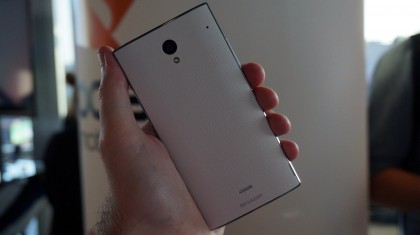
The Aquos Crystal employs a heavily rectangular shape that's heavy on angles, most likely to accentuate its nigh bezel-free panel. That capacitive touchscreen truly is the star of this show, even if it comes in at relatively low resolution and sits behind plastic rather than glass.
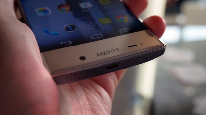
Sharp achieved an incredibly thin bezel on this phone, which shouldn't be all that surprising given the name it's made for itself in the display space. But it's nonetheless impressive. However, in attempting such a feat, Sharp was forced to push the front-facing, 1.2MP camera to the bottom end of the device. (More on that in a bit.)
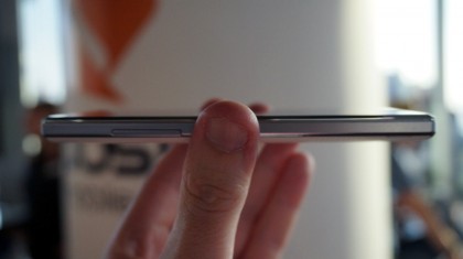
Thicker than most smartphones of today, the Aquos Crystal is wrapped in brushed silver plastic with chamfered edges for a more premium appearance. The whole device curves in an angular fashion around the back, making extra room for the internals, like a micro USB port on the bottom.
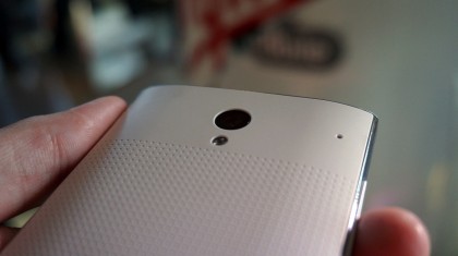
As with most phones, the power button sits up top, with the volume rocker on the left side. Around back is a matte plastic shell that comes in either a deep black or pearly white. The casing is removable, and has a slightly pocked surface between the bottom speaker and rather large 8MP shooter and LED flash up top. Speaking of cameras…
Screwing up the selfie
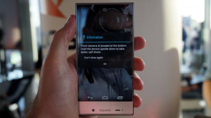
In its quest for a distinct display, Sharp was forced to make a decision: either keep all of the lens parts up top and have the micro USB port above the screen, or push everything to the bottom. The company clearly chose the latter, and the result is a phone that you have to turn upside down in order to take proper photos with the front-facing lens.
Sharp even wrote in a disclaimer into the camera app that warns you whenever you activate the front shooter, "Hey, the lens is on the bottom, turn me upside down." It's far from an ideal experience, and if not for the proliferation of selfies, I would have just nixed the front camera entirely. (The shots aren't all that great anyway, given the resolution.)
The end result is going to be an annoying learning curve if not a steep one for first-time smartphone buyers. As much as I hate to admit it, I predict this is going to hurt Sharp's chances of this phone catching on the US like it surely hopes.
Early verdict
As far as budget friendly smartphones go, the Sharp Aquos Crystal certainly stands out amidst the flurry of phones that claw at potential customers walking into the local mall's Sprint store. That said, picking the phone up reveals the typical budget smartphone feel. Frankly, the phone lacks a certain density to it that you find on premium phones – it feels more hollow than most.
As for performance, scrolling through the average website is a somewhat janky undertaking. Between the plastic screen failing to register the momentum of my swipes and, the time it took to load a simple website over a decent LTE connection, you're simply going to have to lower your expectations here. (That said, outdoor visibility of a YouTube video was fantastic in a direct sunset.)
Worse even is the placement of that front lens. The Sharp Aquos Crystal is one of the most sophisticated and futuristic-looking budget phones that I've seen. Unfortunately, the phone loses some of that elegance once in your hand. If you're on a budget, you'd be right to be drawn to its unique look. Just level your expectations. Stay tuned to for our full review.
Joe Osborne is the Senior Technology Editor at Insider Inc. His role is to leads the technology coverage team for the Business Insider Shopping team, facilitating expert reviews, comprehensive buying guides, snap deals news and more. Previously, Joe was TechRadar's US computing editor, leading reviews of everything from gaming PCs to internal components and accessories. In his spare time, Joe is a renowned Dungeons and Dragons dungeon master – and arguably the nicest man in tech.
What is a hands on review?
Hands on reviews' are a journalist's first impressions of a piece of kit based on spending some time with it. It may be just a few moments, or a few hours. The important thing is we have been able to play with it ourselves and can give you some sense of what it's like to use, even if it's only an embryonic view. For more information, see TechRadar's Reviews Guarantee.

