TechRadar Verdict
There are few phones right now, which are such head-turners. The most beautiful NEX phone yet, the Vivo NEX 3, brings an incredibly immersive "waterfall" display, which works better than expected, performs as well as the top flagships, and runs all day. For a phone this futuristic, it's the software package that holds the NEX 3 back from being the device we would recommend over the competition.
Pros
- +
Beautiful and immersive display
- +
Eye-catching design
- +
Consistently smooth and fast
- +
Reliable triple camera setup
- +
Great battery life
Cons
- -
FunTouch OS looks dated
- -
Delicate
Why you can trust TechRadar
The year was 2017. Smartphones were once again stagnating on the design front. Manufacturers were still chasing the 100% screen-to-body ratio mark, but bezels couldn’t get any slimmer. The front camera had to be displaced to a location away from the face of the phone. In an uninspiring time like this, Vivo stepped up to the task with the first Vivo Apex concept phone, which would explore radical ideas in hopes of creating a truly bezel-less smartphone, maximizing the display viewing area.
Three iterations later, the Vivo NEX 3 is the result of the same pursuit but with a slightly more innovative approach that is now ready for prime-time. Historically, the NEX series has always followed the latest Apex concept but making it more realistic and feasible, while being available for purchase. The NEX 3 is Vivo’s most refined effort yet, which takes a few bold design choices and tries to combine it with flagship-grade internals to provide a taste of the future. It’s a reasonable effort, considering that it is the debut of quite of few nascent technologies, but is that enough to woo consumers from established flagships? Let’s find out.
For the uninitiated, NEX 3 is the final version of the Vivo Apex 2019 that was shown without a selfie camera, buttons, ports, or any opening usually seen on a smartphone. It was all screen on the front and just the camera array on the back. It wasn’t a convenient approach, as with most members in the Apex lineage. However, it’s DNA is still very much present on the Vivo NEX 3— almost-buttonless edges, seamless design that continues to the back, and an eye-catching “waterfall” display. All of which combines to make an impressively immersive viewing experience on a smartphone. Questions on its practicality and structural integrity are very valid, but perhaps that is the price of innovation.
Price and availability in India
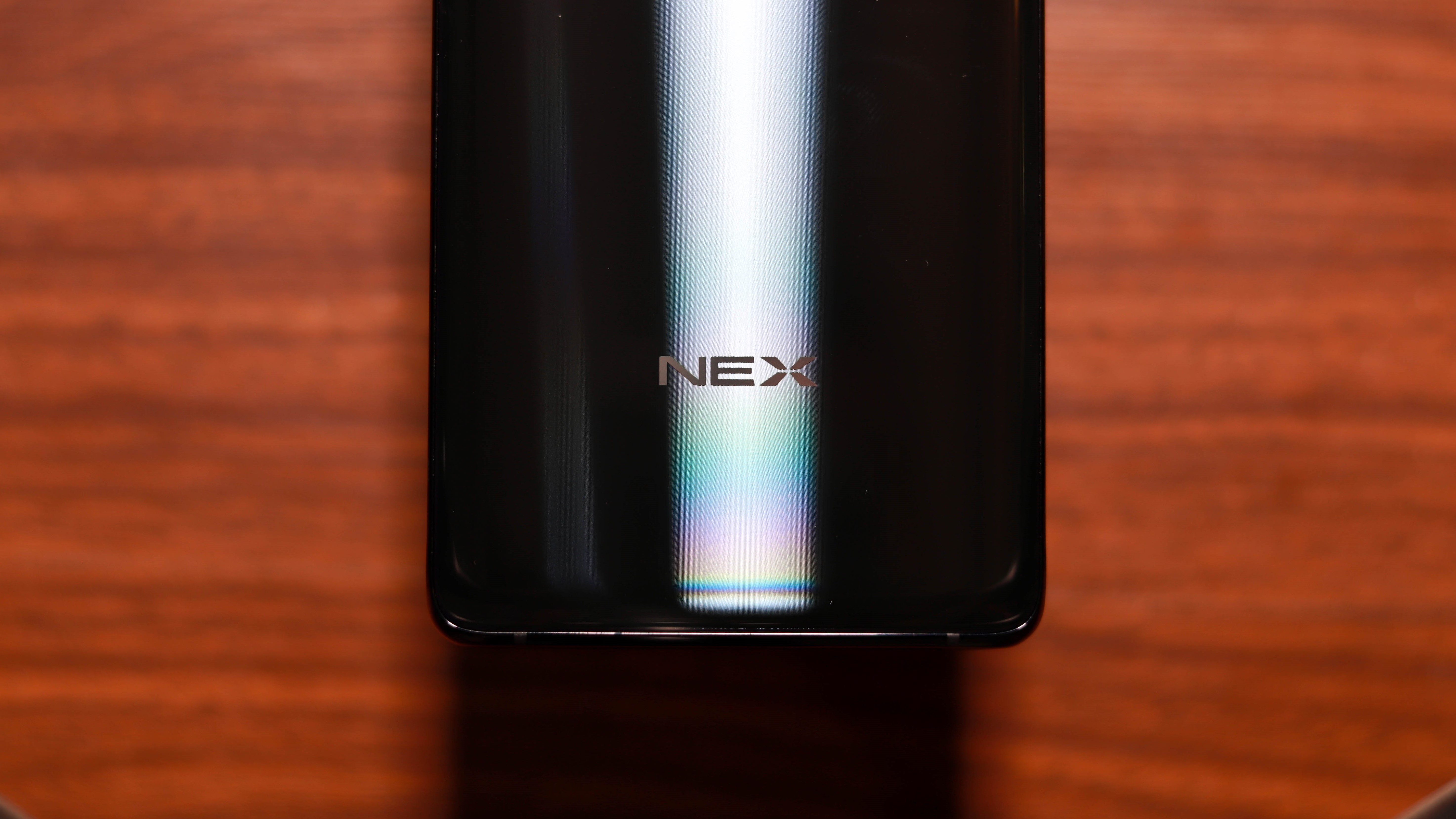
The Vivo NEX 3 is currently available in a handful of Asian countries, excluding China. The company hasn't revealed the information about its availability in India, how expensive will it be, and if it will be 5G capable.
In the Chinese market, the NEX 3 is priced at CNY 5,699(approximately Rs 58,000) for the base variant and goes up to CNY 6,199 for the top model. Keep in mind that Vivo has no timeline for an Indian launch, so this converted pricing is unlikely to be accurate.
Design
The Vivo NEX series has always stood for high-end and unconventional designs, and the NEX 3 is no different. Sure, it’s not as radical as its predecessor, which had an entire second display on the back, but the choices on this one are a lot more sensible.
It’s a very different phone to wield, as there are practically no “sides” to this phone; just an expansive front and an equally curved back which makes the phone very easy to hold. When the spec sheet suggested a tango with a 6.89-inch display, we were pessimistic about how ergonomic the phone would be, but surprisingly, it wasn’t bad at all. We’ll touch upon the screen in a bit, but this was one of the most structurally sound phones we’ve held that feels solid and hefty without crossing into the uncomfortable territory.
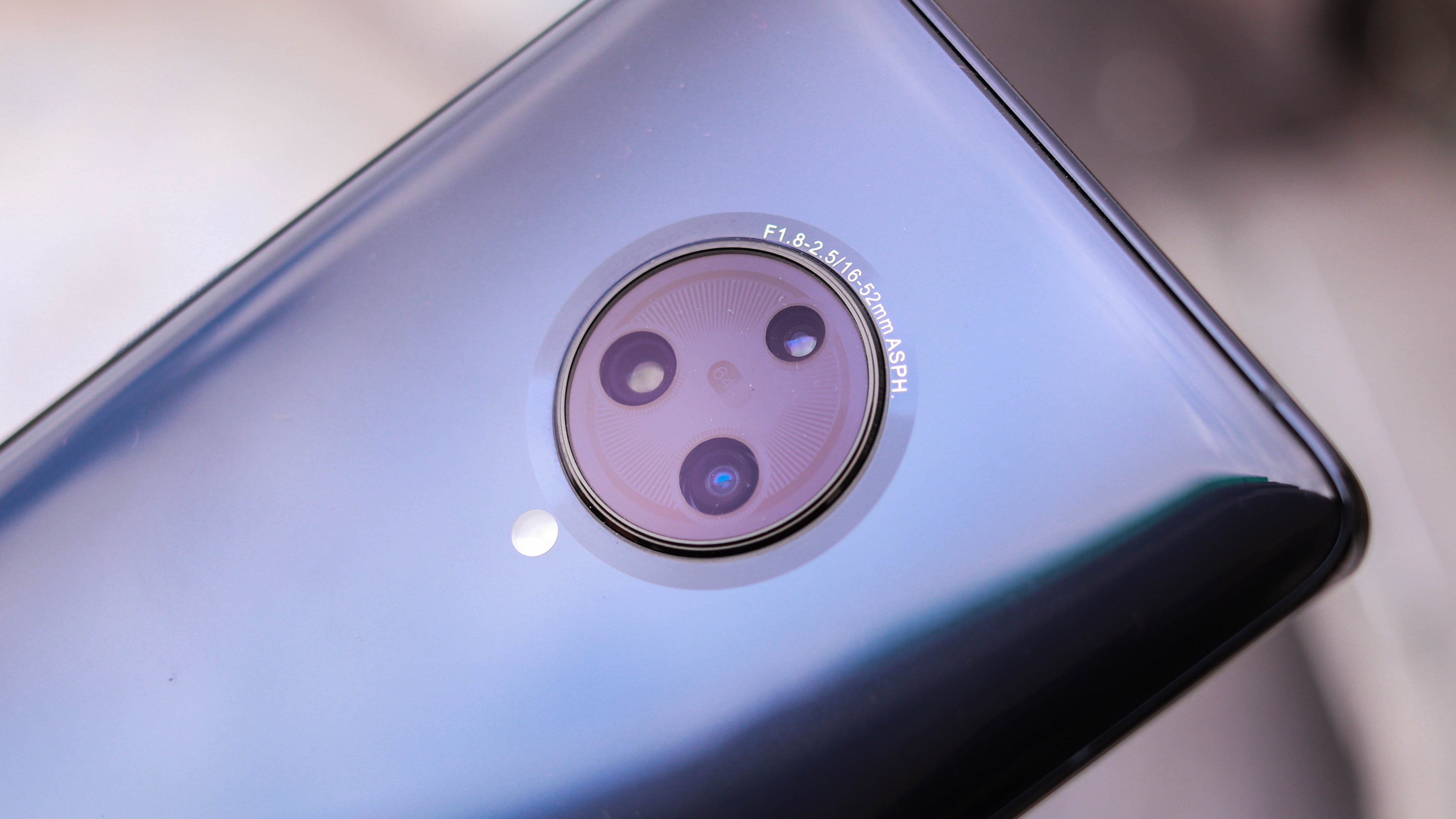
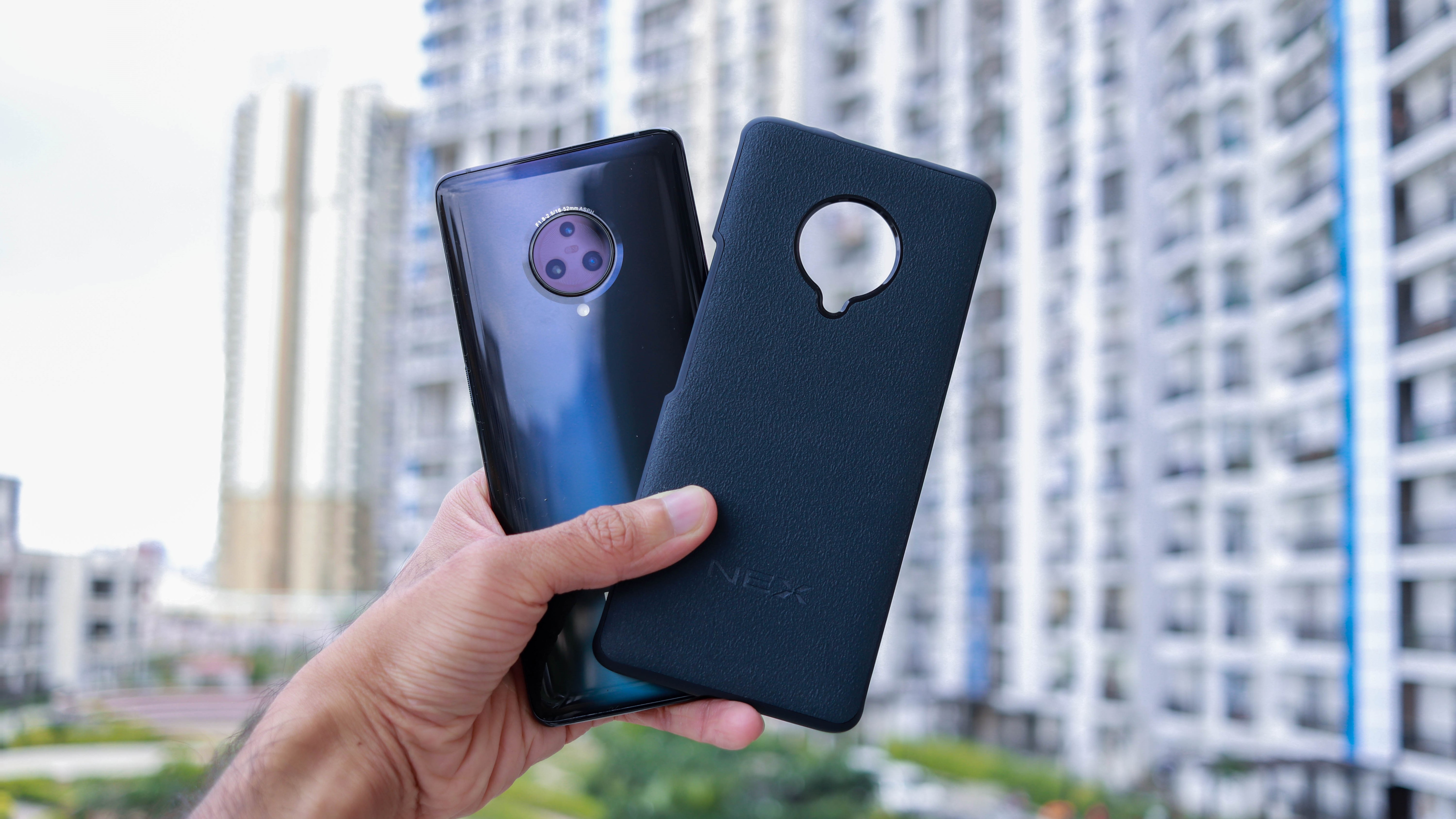
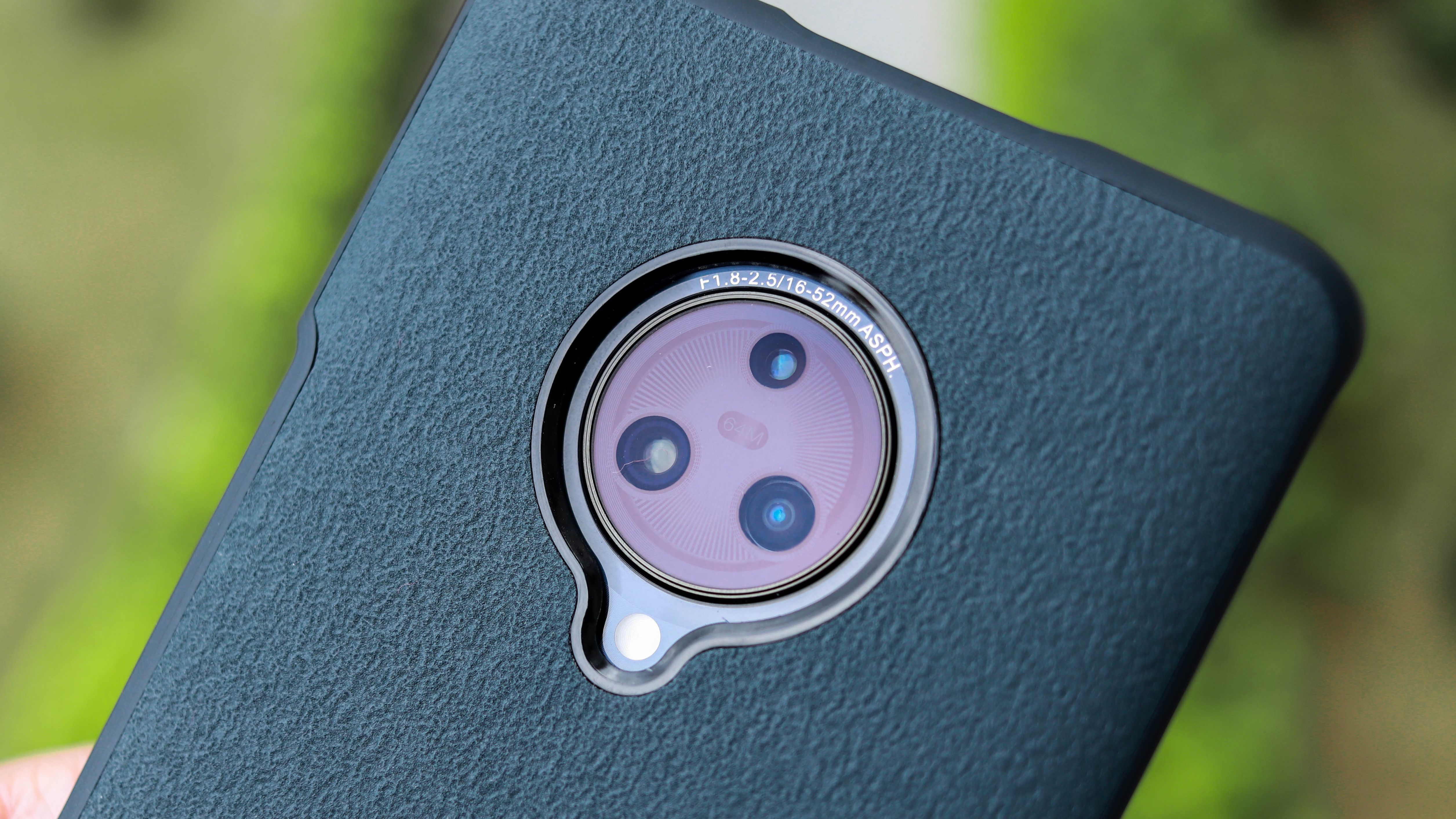
The back of our Glowing Night black variant was rather minimal, with a dark-colored glass throughout, save for the camera housing. It resembles the dial of a watch and has three cameras placed inside in a triangular fashion, which is arguably more interesting-looking than the OnePlus 7T’s camera island.
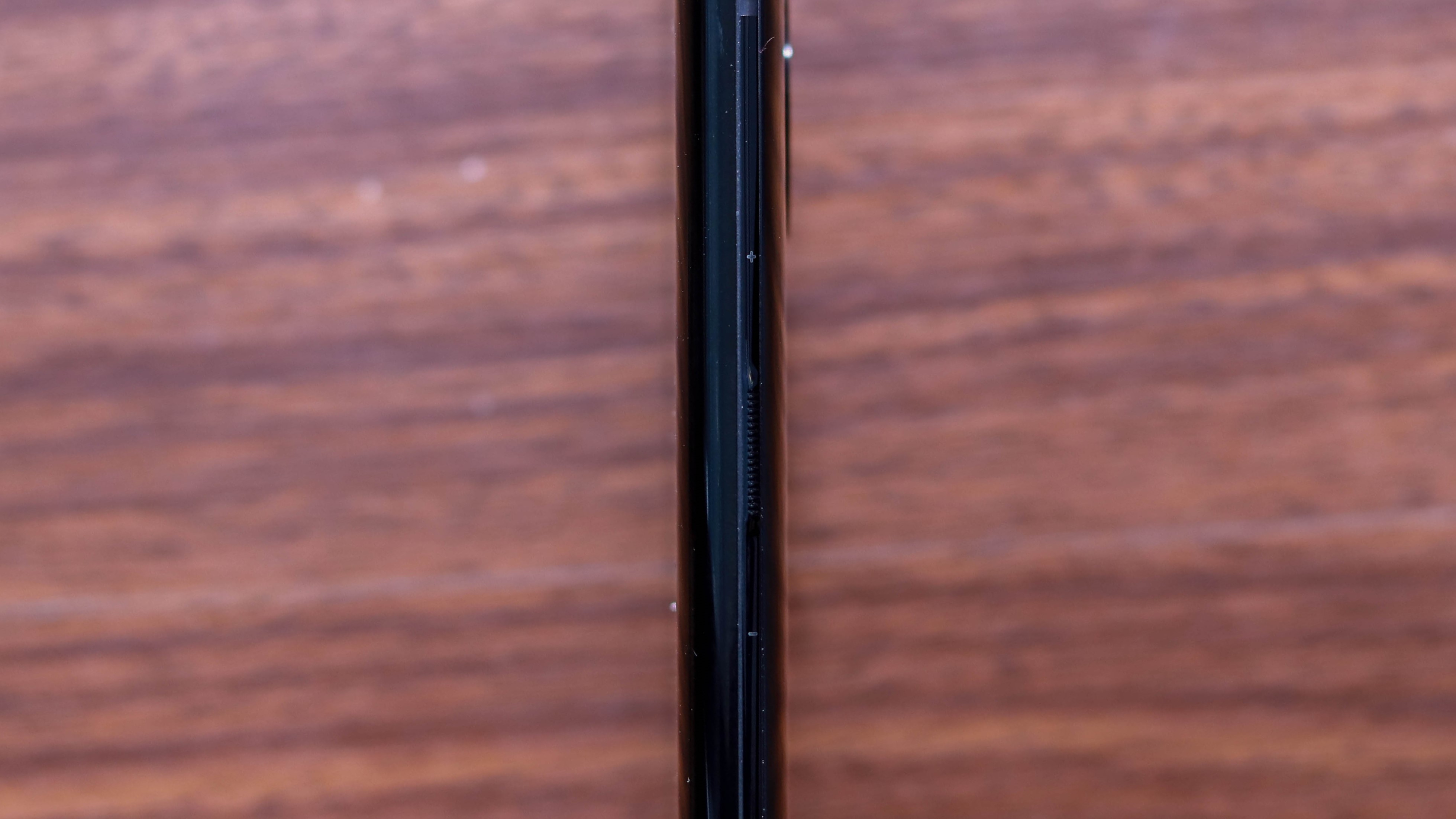
The Vivo NEX 3 also does away with the power and volume buttons, replacing them with pressure-sensitive zones along the right edge, backed by realistic haptic-feedback. Called Touch Sense, these “buttons” are demarcated with visual cues, and the power button gets a ridged texture for physical distinction. Yes, it takes a while to get used to, and you are likely to have some accidental volume toggles, but the more extensive experience will probably help the muscle memory.
The top houses the broader pop-up camera module, flanked by a secondary power button and the headphone jack. This tiny power button is not comfortable to reach and was never used by us once the phone was turned on. The headphone jack can output Hi-Fi audio and is a welcome addition. The motorized camera module also includes a front-facing flash.
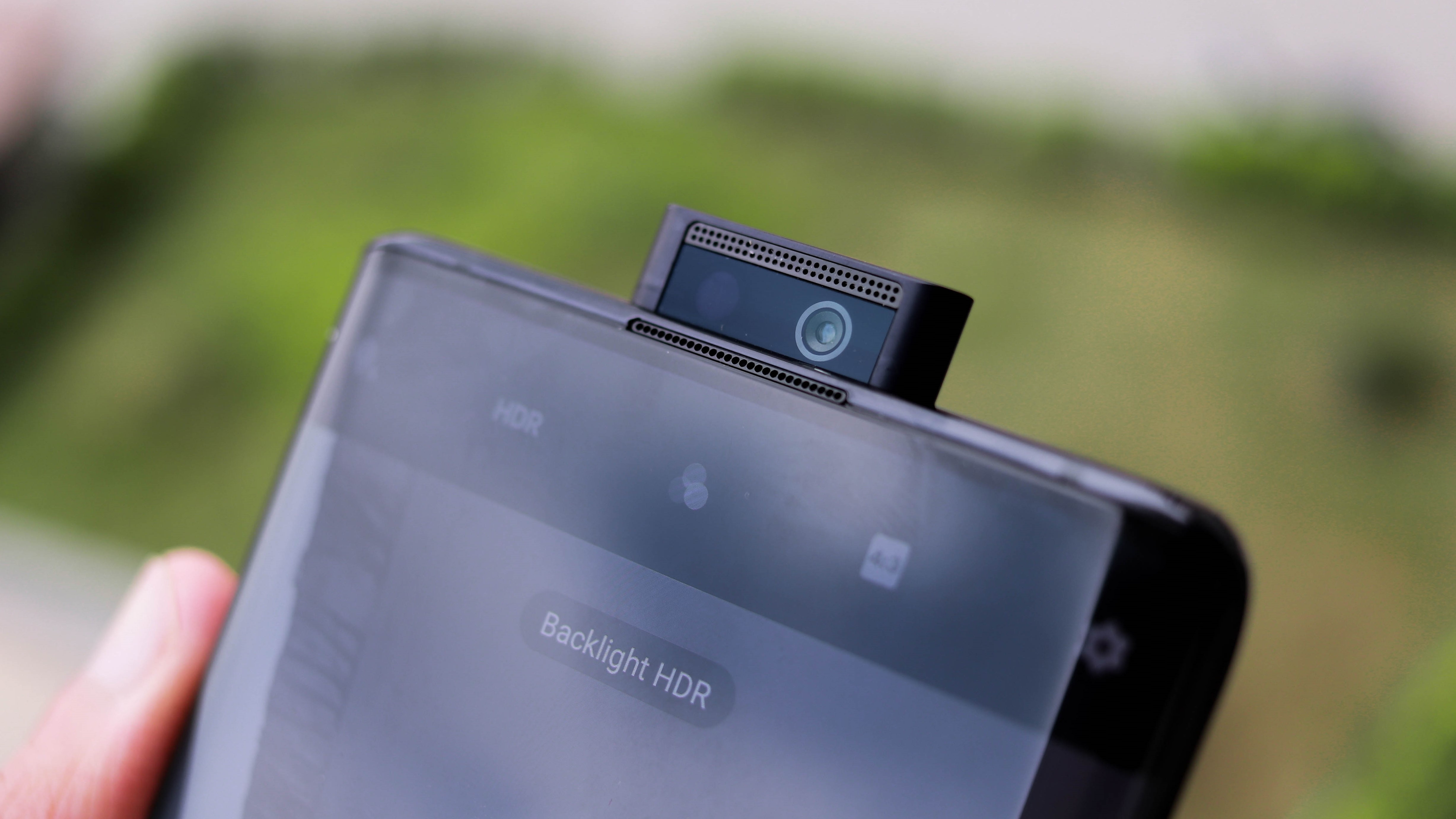
Pop-up cameras and curved displays are often associated with fragility. Nothing wrong happened in the week we had with the phone, but for those who want to be extra cautious with this looker, the included case will give you peace of mind. It is the best-designed included case we have seen with a phone. The back has a vulcanized rough texture that covers the entire back panel and stretches to the sides. The corners have added pieces for safety during falls. It makes the phone a little bulky but adds a nice touch of luxury and grip.
Display
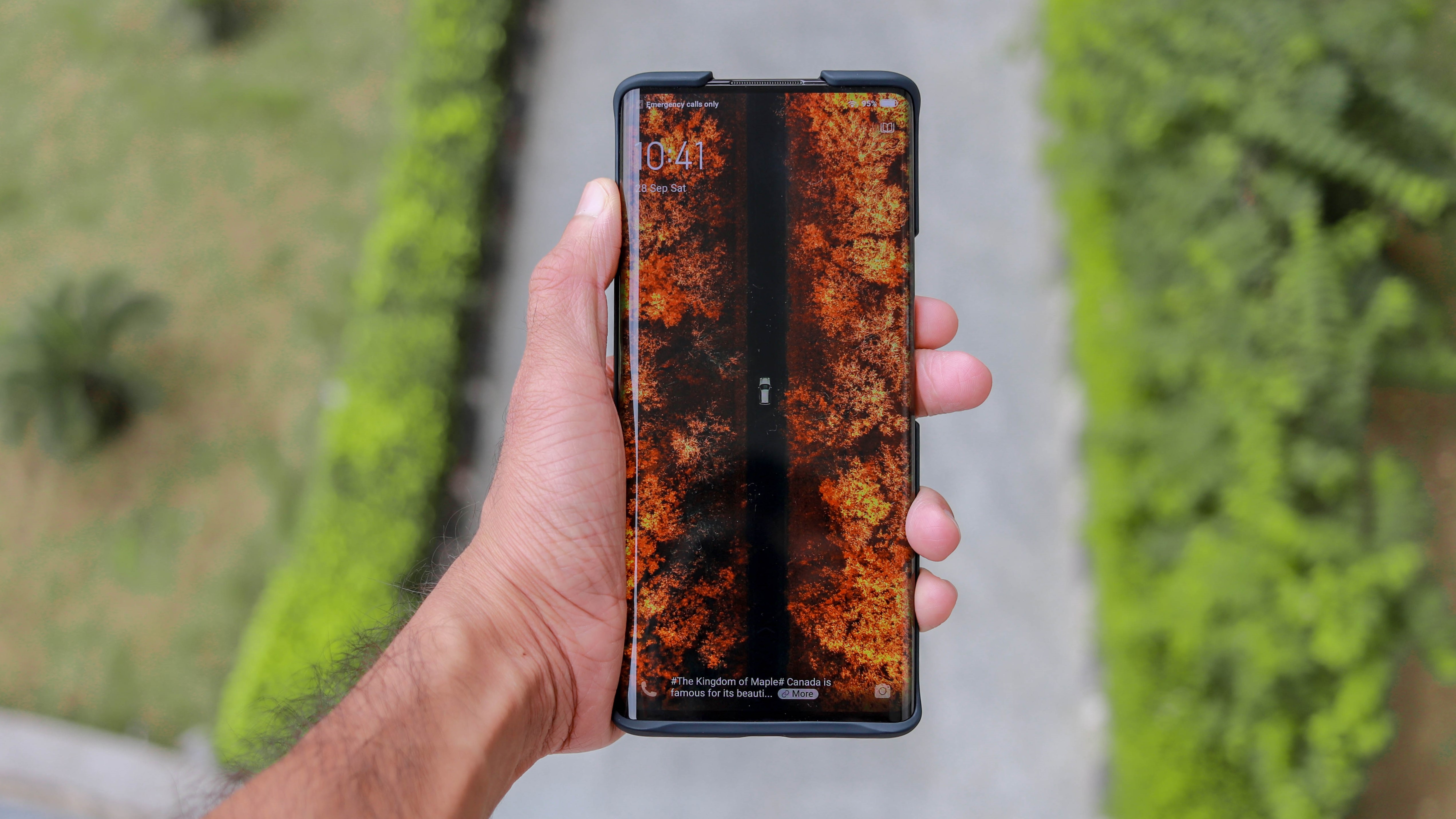
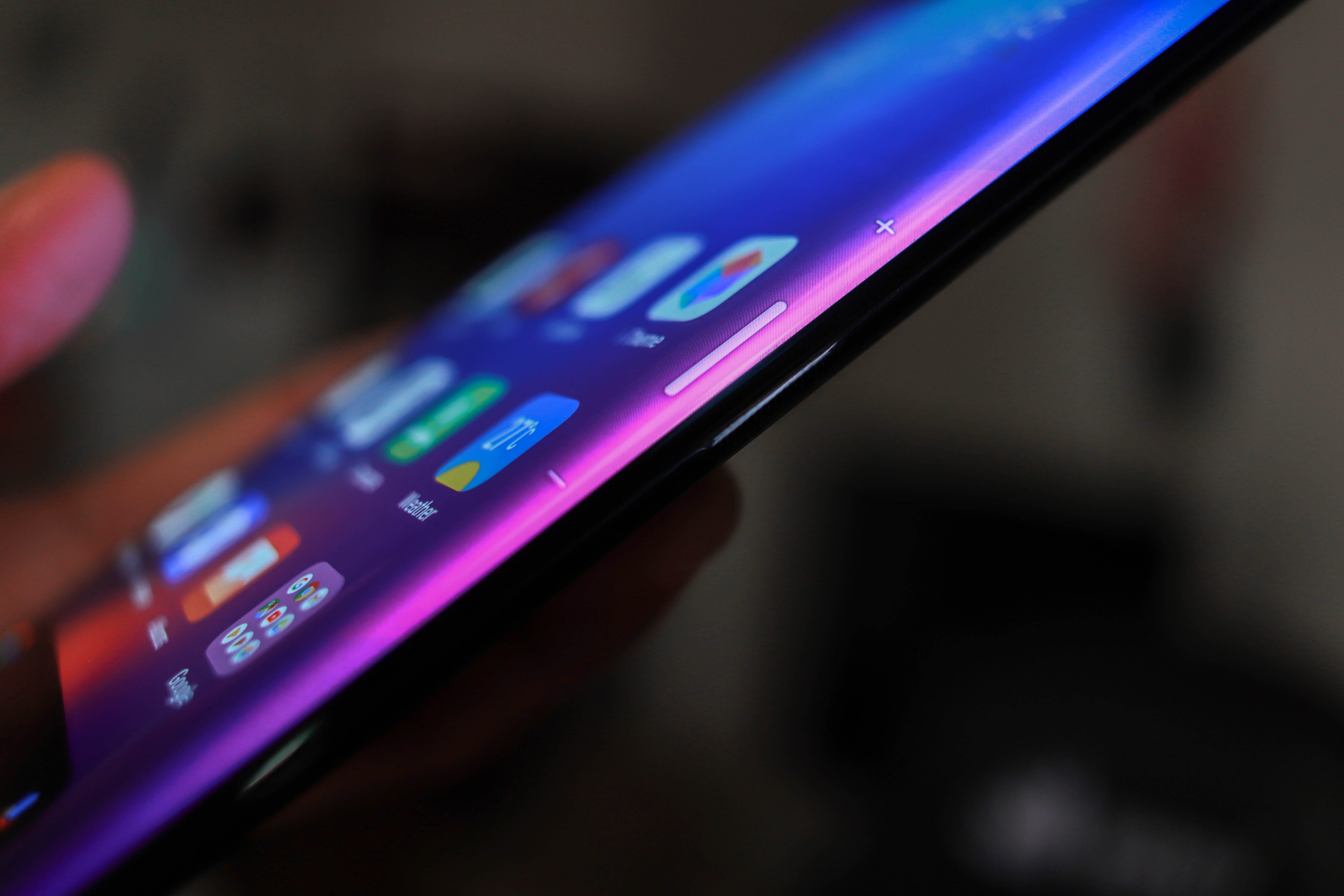
The most notable design aspect of the NEX 3 is the new waterfall display. It is an expansive 6.89-inch P-OLED display that curves by 88-degrees on the sides, making it the most-curved screen on a smartphone right now (sharing the podium with the Huawei Mate 30 Pro). Those curves help it attain a screen-to-body ratio of 99.6%!
While viewing videos or playing games, it’s impossible the see the side bezels when looked at from right angles. It makes the entire experience very immersive. No notches, no bezels, just a sliver on the top edge for the front-firing secondary speaker add to the experience.
Going into this review, we weren’t very optimistic about the handling experience, and if the curved display will mar the usage with accidental touches. Thankfully, that wasn’t the case, and the palm-rejection was spot-on 99% of the time. For context, we were able to watch YouTube videos while holding the phone in a pinch while in landscape orientation without triggering the elements.
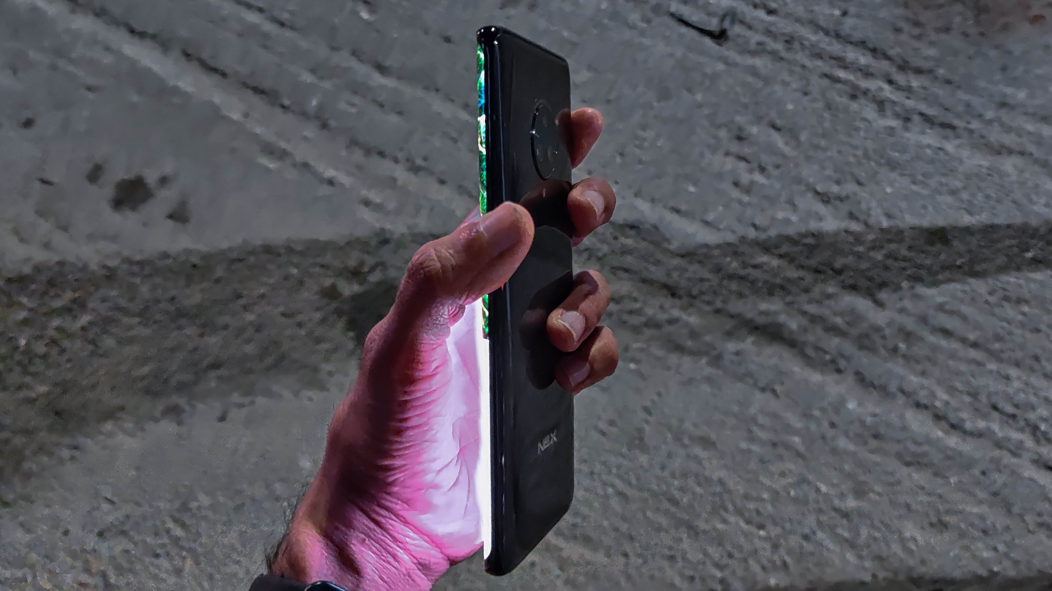
These curves even helped with typing, as our thumbs had to travel a shorter distance spread across a bigger canvas, significantly improving speed and accuracy.
The 800 nits of max brightness were always adequate and also helped the NEX 3 gain HDR10 capabilities. The OLED nature helps it produce punchy colors, the contrast was high, and the blacks were perfect.
The display aspect ratio, on paper, is 18.8:9, but feels a lot taller than that as the width reduces by quite a bit. It also enables scrolling the display contents from the sides, leaving the large canvas for viewing.
We're not saying it's easy to use one-handed, but it's not as bad as one would imagine.
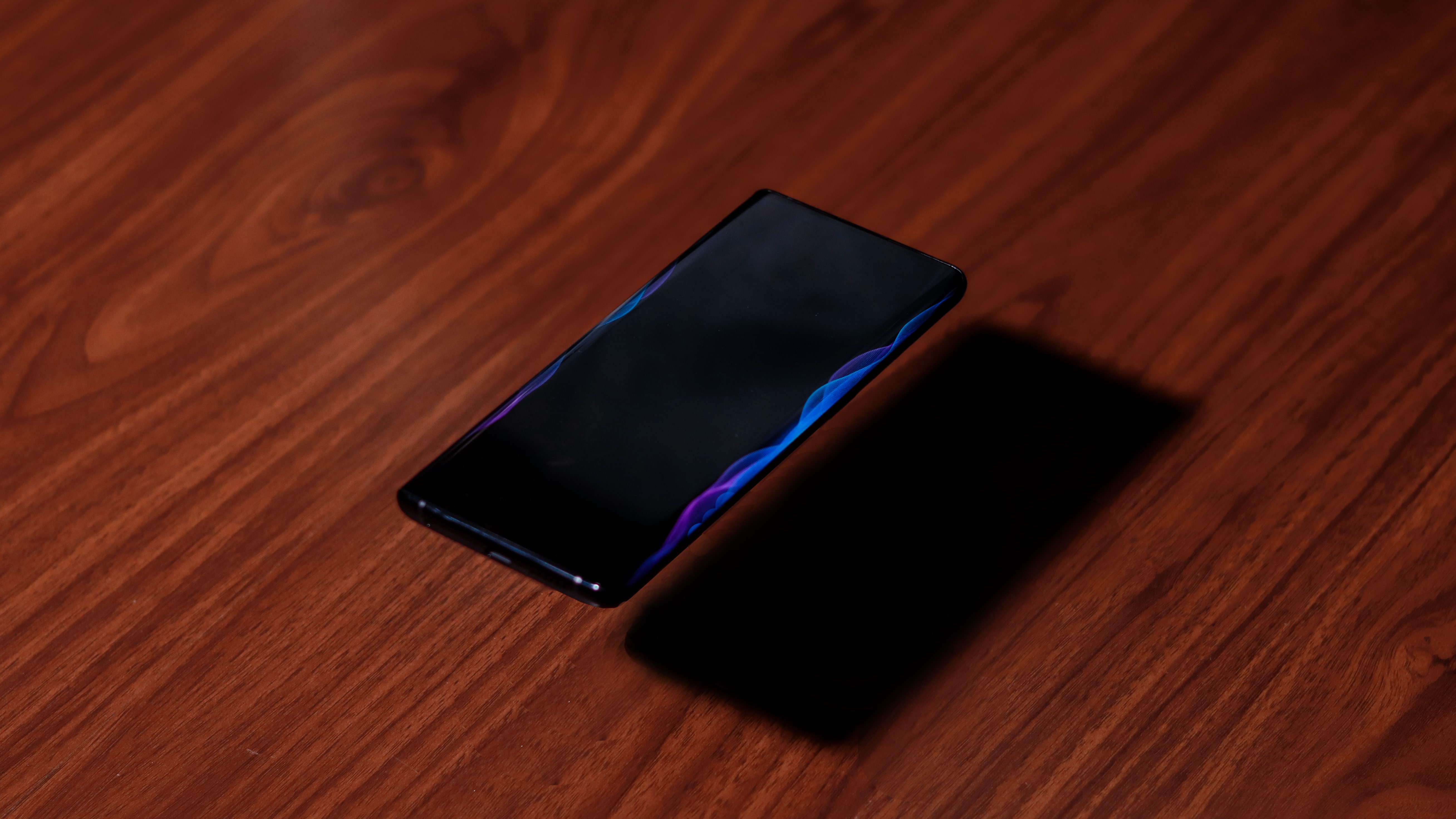
There are also a bunch of lightning effects which kick in when notifications or calls come. It can also be configured to shine as a cool equalizer while playing music.
The Vivo NEX 3 is the first phone to sport a waterfall display, but will definitely not be the last. It helps bring a better viewing and handling experience, gives the phone a nice premium touch and allows a bigger display in a smaller footprint. While our experience was pleasant for the most part, a lot will depend on the palm-rejection on the upcoming phones.
Performance and Gaming
As with most recent flagships, the Vivo NEX 3 is powered by the octa-core Snapdragon 855+ chipset. Our unit had 8GB of RAM. There’s UFS 3.0 storage as well, which made the phone perceivably faster at opening apps and transfer files.
Vivo has also fitted this phone with a vapour chamber of sorts which helps keep the thermals in check and sustain peak performance for longer. In our testing that involved a lot of 3D gaming, the NEX rarely got uncomfortably warm.
We would go as far as saying that this is the smoothest experience on an Android phone with a 60Hz display. Everything was responsive and fast to open, typing was smooth, games would launch swiftly and loading times were short. No complaints here.
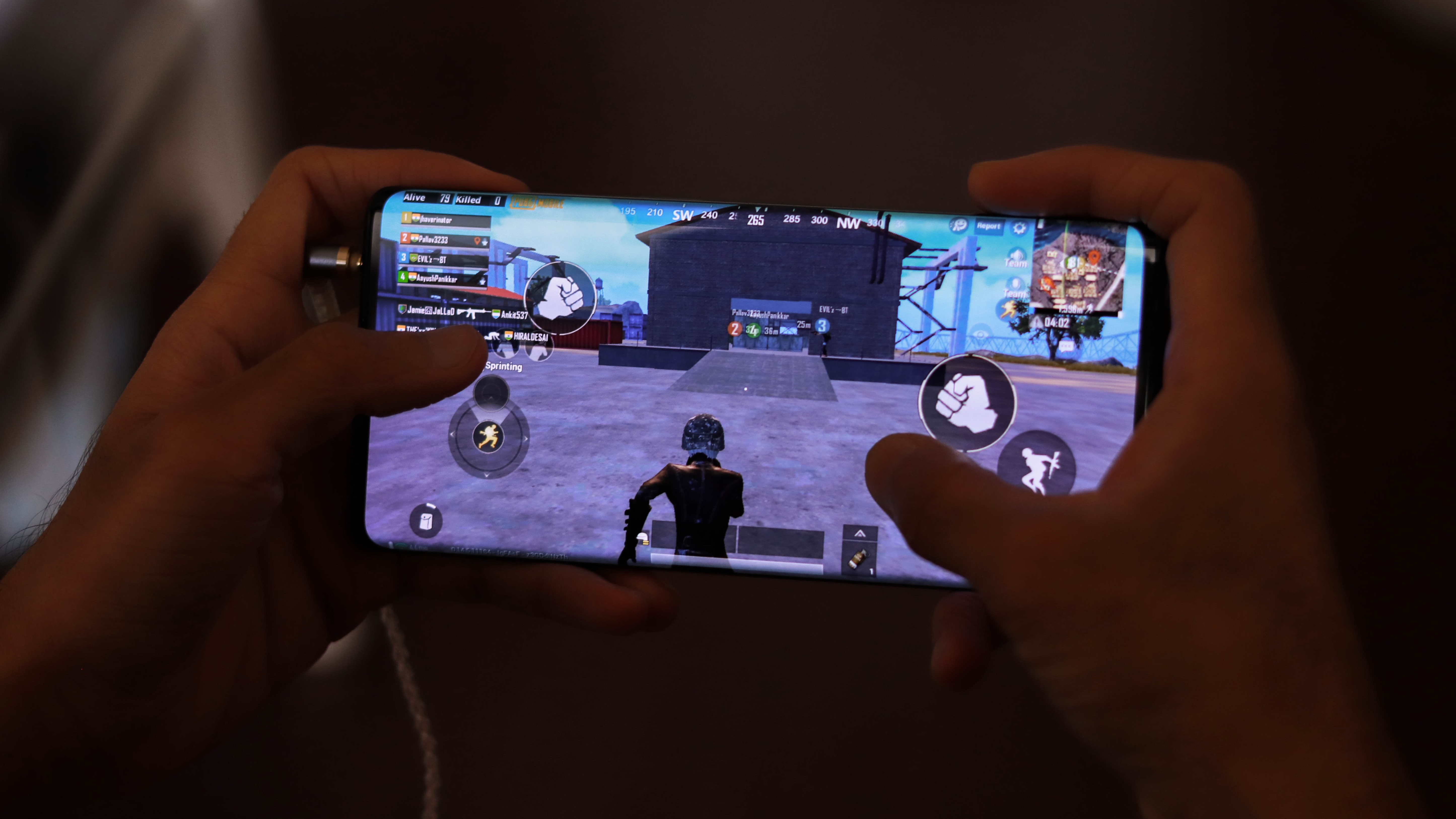
The specifications form only a part of the gaming experience, with the display and audio completing it. The big display definitely helps with the gaming, but the lack of a chin and forehead make the NEX 3 difficult to hold, but we got used it to pretty quickly. Things got exponentially worse when earphones were plugged in, as the small bit of the phone’s corner that we were clawing at was gone. Interestingly, for games such as PUBG Mobile where a lot of the interaction elements are located along the edges, accidental touch issues weren’t very prevalent. In fact, they were harder to get to respond than the rest of the display. Not very significant, but needed a mention.
- 1
- 2
Current page: Pricing and availability, Design, Display, Performance
Next Page Camera, Battery and charging, Software, VerdictAakash is the engine that keeps TechRadar India running, using his experience and ideas to help consumers get to the right products via reviews, buying guides and explainers. Apart from phones, computers and cameras, he is obsessed with electric vehicles.

