TechRadar Verdict
The Vivo Y70 makes an effort to dazzle with its large, vibrant AMOLED display and impressively fast charging. But its design, camera and performance feel disappointingly half-hearted. With the Poco X3 NFC bringing out the big guns for much less money, and several well-specced rivals asking for just a little extra, the Vivo Y70 seems destined to be overlooked.
Pros
- +
Vibrant AMOLED display
- +
Strong fast charging
- +
Clean software
Cons
- -
Underwhelming performance
- -
Mediocre, unflexible camera
- -
Unremarkable design
Why you can trust TechRadar
Two-minute review
The Vivo Y70 is an affordable smartphone that forms part of the brand’s first expedition into European territory.
Its stand-out feature is a large and vibrant 6.44-inch FHD+ AMOLED display, which we found to be thoroughly pleasant to use, even in the absence of a trendy 90Hz or 120Hz refresh rate.
We were also unexpectedly fond of (or unperturbed by, at least) Vivo’s Funtouch UI, which is way less fussy in this Western-focused guise. These two elements, combined with a relatively lightweight and unassuming design, result in a phone that’s easy to use day-to-day.
Also impressive is the Vivo Y70’s capacity to charge up quickly. Gaining 65% in 30 minutes is something we would expect from flagships.
Unfortunately, the Vivo Y70 is a little lacking elsewhere. Its Snapdragon 665 CPU can’t quite match some of the chips found in rival phones for similar money, leading to fairly mediocre performance.
Its camera, too, lacks flexibility and consistency, with just a single meaningful sensor and image quality that’s punchy yet flawed.
Elsewhere, the phone’s single speaker represents a bit of an earache, even if there is a 3.5mm headphone jack to fall back on.
Ultimately, while the Vivo Y70 averages out to a solid effort, we’re just not convinced that it represents great value for money right now. Not in such a hotly contested market where you can pick up the Xiaomi Poco X3 NFC – a more eye-catching performer in several respects – for just £200.
Vivo Y70 price and release date
The Vivo Y70 hit European markets on October 29, 2020. There’s no word on a US or Australian release as yet, but we’ll keep you posted on that front.
With prices starting from £279 (about $365 / AU$510), it runs straight into one of the most hotly contested sectors of the smartphone market. Call it ‘premium budget’, ‘lower-mid-range’, or whatever you like – all we know is that an awful lot of people want a capable phone for around the £300 mark right now.
The Vivo Y70 can count the Google Pixel 4a and the OnePlus Nord N10 for company, although you’ll have to travel a little north of £300/$300 for both. Head in the opposite direction, however, and you’ll eventually encounter the formidable Poco X3 NFC, which prompts some uncomfortable comparisons.
Design
- Glass front, plastic back and frame
- In-display fingerprint sensor
- 161 x 74.1 x 7.8mm, 171g
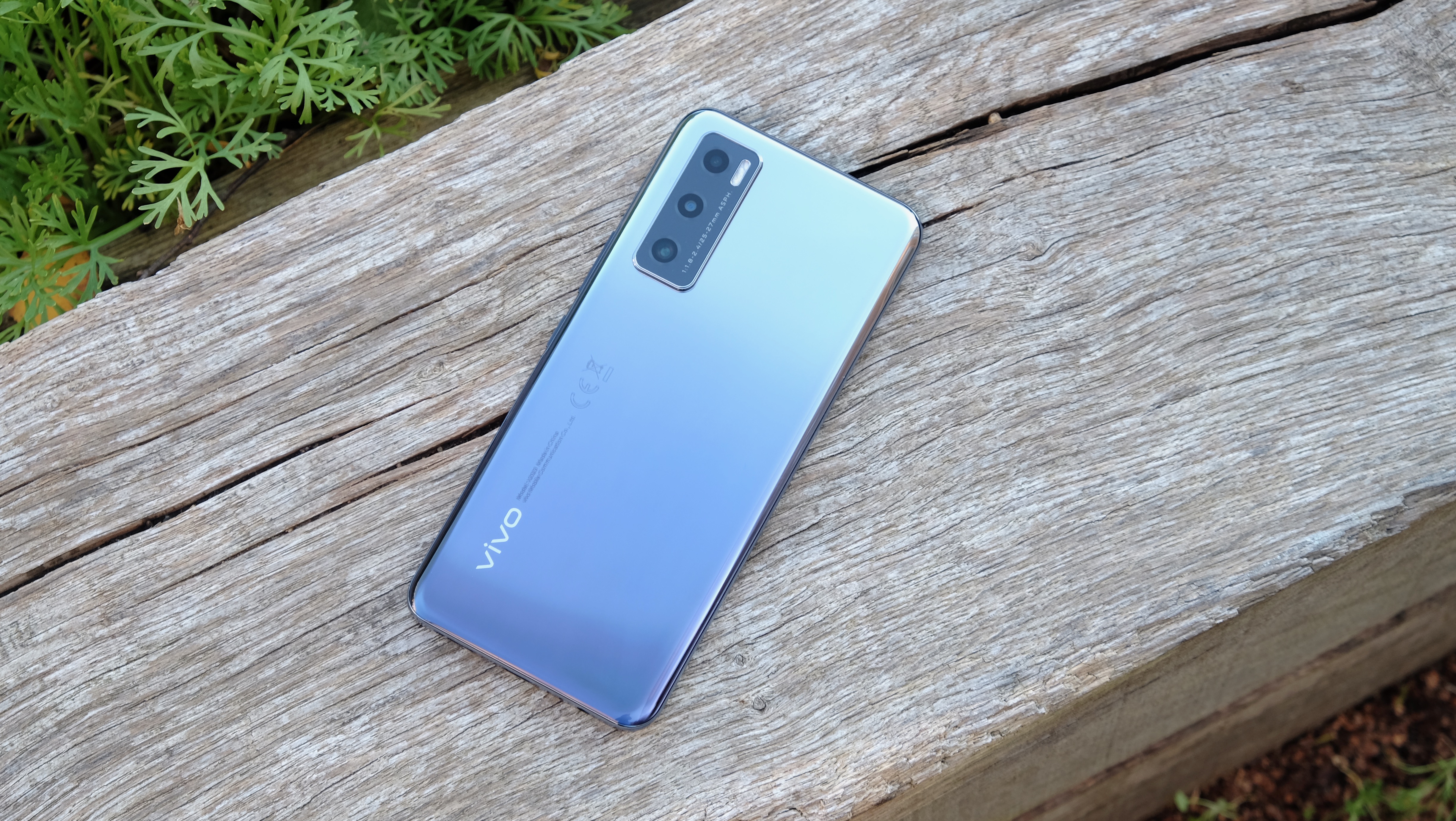
The Vivo Y70 is just about as generic a phone design as you’re likely to find. Its middling size, shiny plastic rear and frame, flat display, rectangular camera module, and its general feel in the hand will be extremely familiar if you’ve scouted the sub-£350/$400 scene in 2020.
True story: when it came time to venture out into the locked down wilderness to take pictures of our Vivo Y70, we initially walked out of the door with the OnePlus Nord N10 in our pocket by mistake. There are clear and obvious differences when you look closer for a few seconds, but there’s a basic cheap phone design template to which both handsets subscribe.
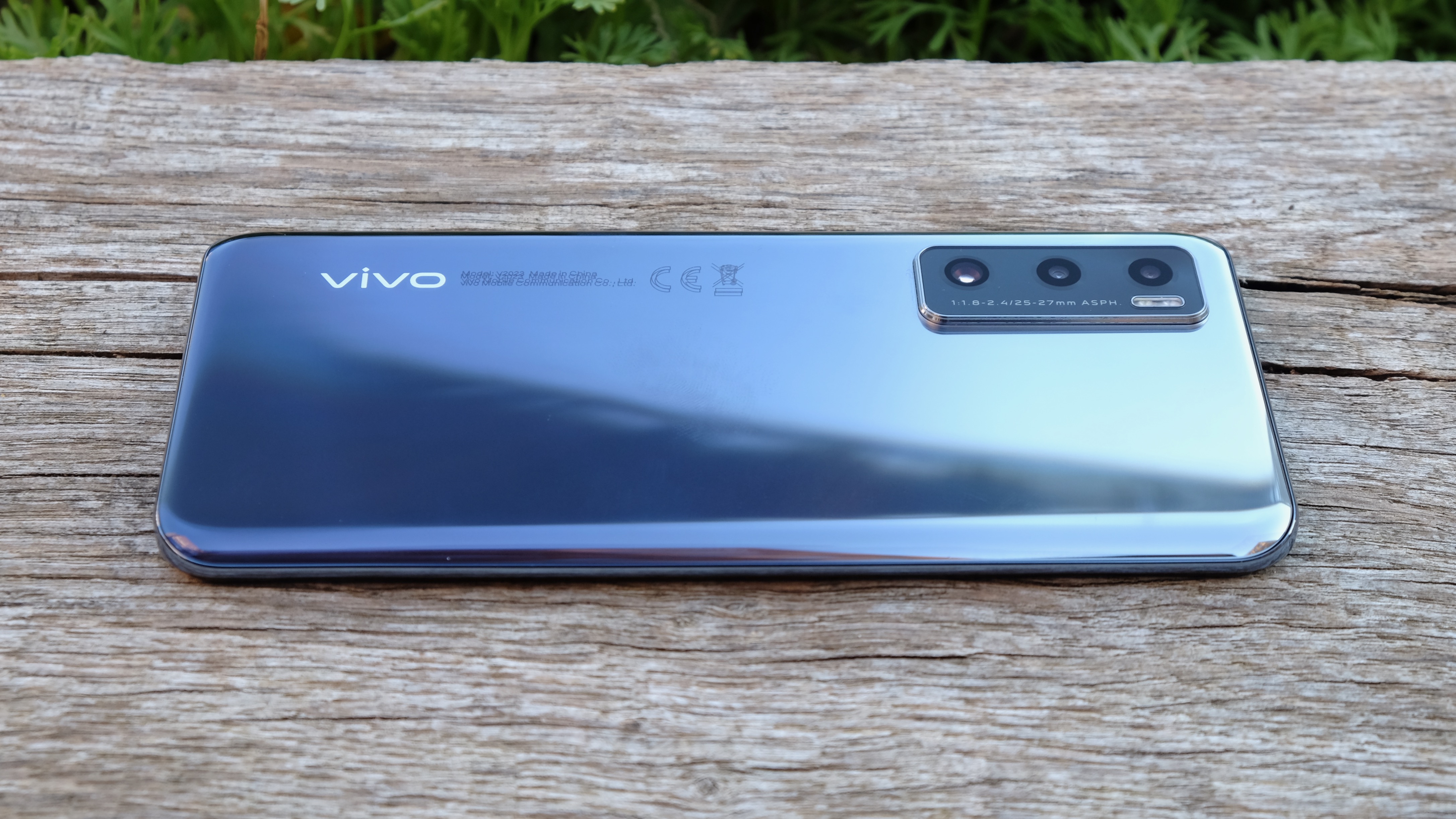
Such familiarity isn’t necessarily a bad thing of course, and neither is it a surprise when production budgets are so tight. Quality is preferable to novelty at this end of the market, and the Vivo Y70 is a very well-built piece of kit.
Its curved plastic rear fits nicely in the hand, although the reflective, two-tone plastic is an absolute dust and fingerprint magnet. At 171g and 7.8mm thick, it’s comfortably in that ‘just right’ zone, and we never felt that twinge of annoyance at having to cart it around.
We wouldn’t call the Y70’s bezels minimal, but a screen-to-body ratio of 90.12% isn’t to be sniffed at. There’s a slightly chunky chin below the screen, but that’s a common concession with cheaper phones. The choice of a teardrop notch makes the phone feel a little dated, with many rivals going down the punch-hole route.
You only get a single speaker on the bottom edge of the phone, and it really isn’t very good. The sound it produces is thin and tinny, slicing through walls and doors even when set at a moderate volume. But you’ll also find a 3.5mm headphone jack on that bottom edge, right beside the USB-C port, so you have options when it comes to audio output.
Vivo has resisted swapping out the more costly in-display fingerprint sensor for a rear-mounted unit, as other manufacturers might have done. In part we admire the decision to stick with this ostensibly premium component, but a larger part would rather the company had made the switch and packed in a better speaker instead.
Display
- 6.44-inch FHD+ display
- Punchy, vibrant AMOLED
- Only 60Hz refresh rate
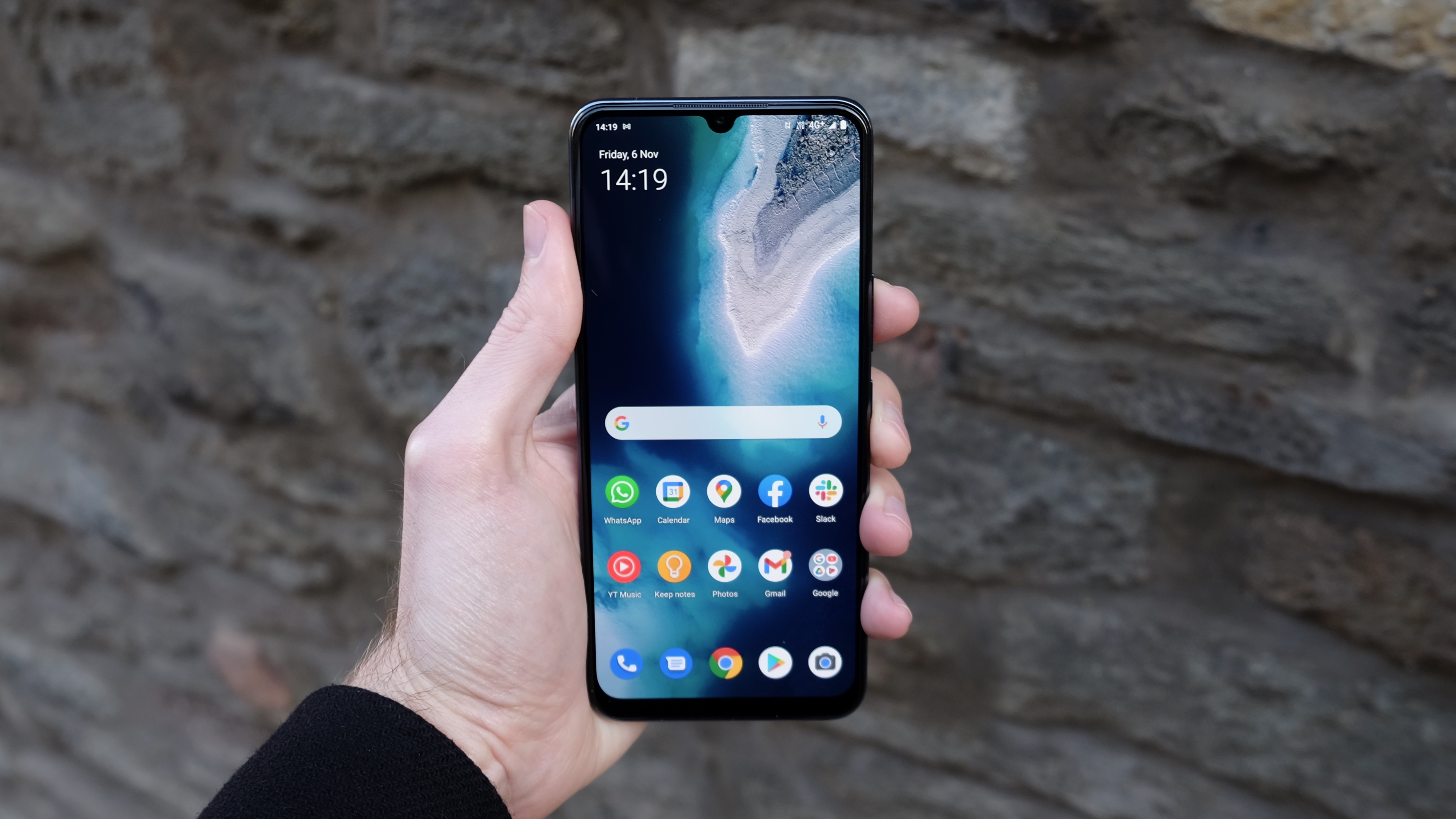
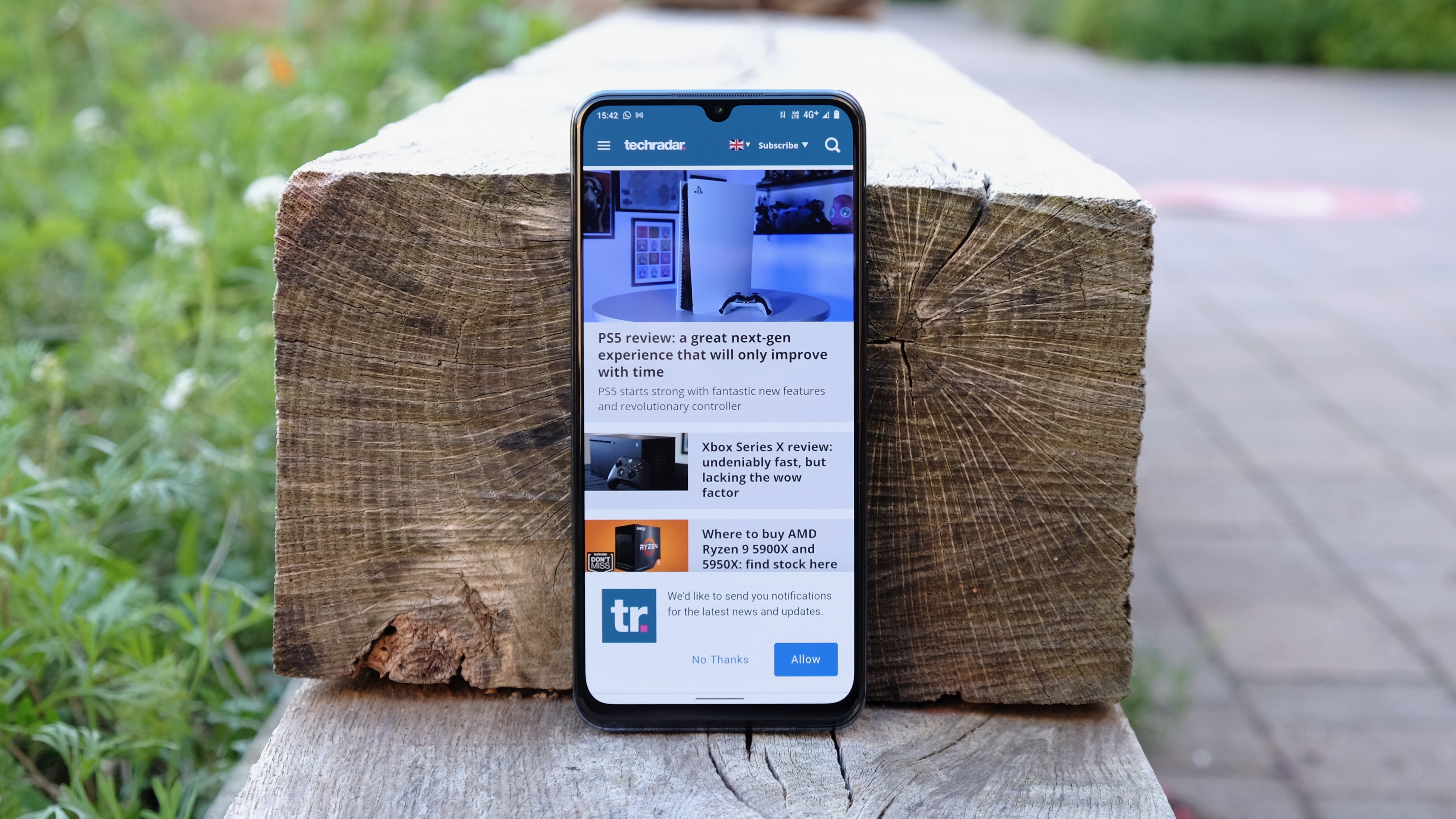
We can’t help but be quietly impressed by the Vivo Y70’s 6.44-inch FHD+ display, even if it doesn’t pack all the features of some of its rivals.
When you drop less than £300 on any smartphone, you’re not guaranteed to get a punchy, bright AMOLED panel, but that’s precisely what you’ll receive here. With a 2,000,000:1 contrast ratio, you get the kind of contrast levels of which LCD rivals can only dream.
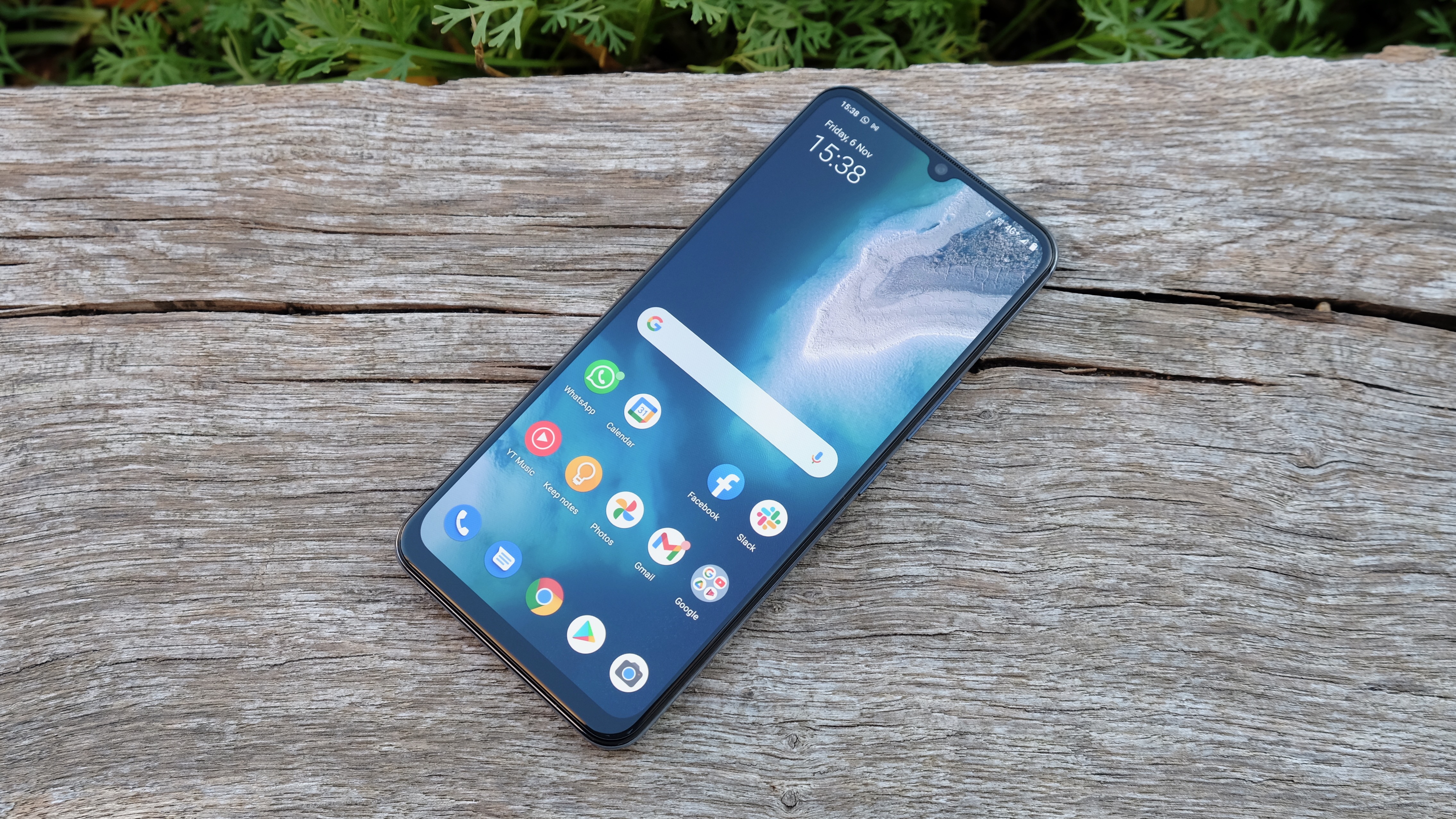
Reds can look a little gaudy here, as is often the case with OLED. But it’s possible to select from three tonal presets, and to tinker with a warmth slider to get the colors more to your liking.
What you don’t get is a particularly fluid display. Unlike the OnePlus Nord N10 and the Realme 7, which both offer 90Hz refresh rates, the Vivo Y70 is stuck at 60Hz. That’s literally half the refresh rate of the 120Hz Poco X3.
It’s not a major downer at this end of the market, where there often isn’t sufficient processing power to do full justice to higher frame rate games, for example. But it’s definitely a box you can tick for £300 or less these days, and it makes general navigation in the Vivo Y70 feel a little less premium.
Ultimately, if it’s a choice between AMOLED or a higher refresh rate, we’d opt for AMOLED every time. Its benefits are apparent all of the time, whereas a faster refresh rate only enhances certain tasks. But we suspect opinions may vary.
Camera
- Three rear cameras: 48MP main, 2MP macro, 2MP depth
- No ultra-wide or telephoto lens
- Underwhelming shots with unreliable AI
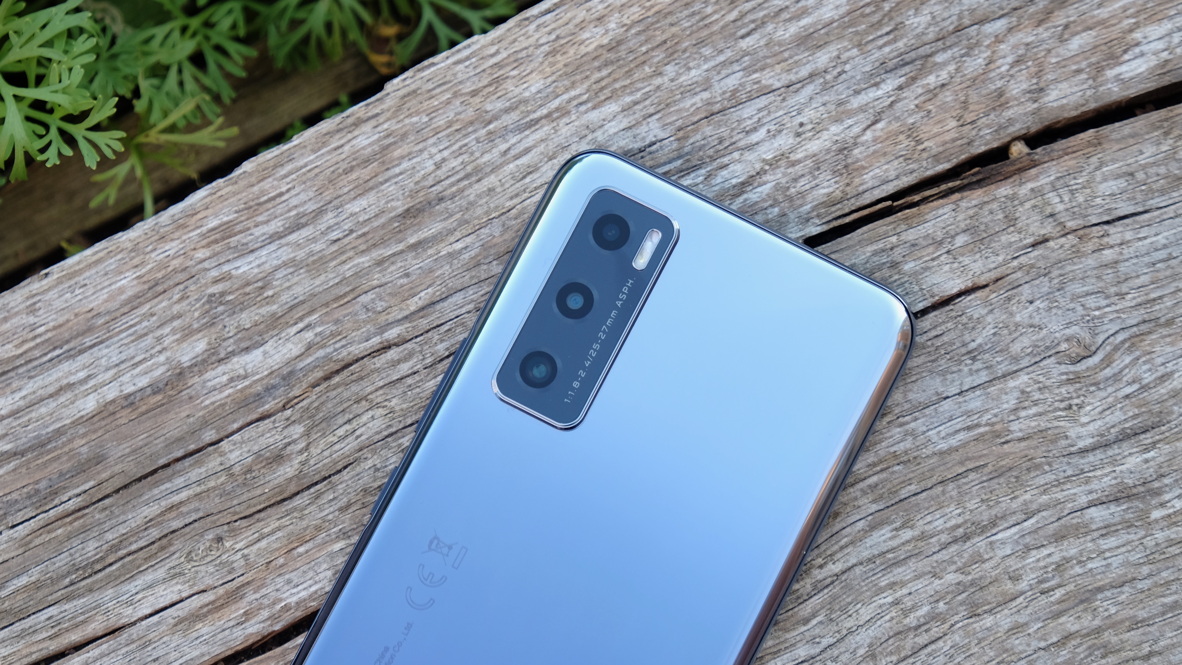
Vivo’s camera offerings tend to vary quite widely, from the impressively innovative gimbal system of the Vivo X51 5G at one extreme to the deeply underwhelming Vivo Y30 at the other. Not surprisingly, the Vivo Y70 falls far closer to its series-mate, the Y30.
This is a triple-camera system in name only. While it’s led by a 48-megapixel f/1.8 main sensor, the other two cameras are a 2-megapixel macro and a 2-megapixel depth sensor, neither of which are especially useful in general shooting.
While it wasn’t a particularly good sensor, it would have been nice to at least have the Y30’s 8-megapixel ultra-wide to offer some more framing options. There’s no telephoto lens here either, so you’ll have to make do with cropped-in 2X shots, although the use of a fairly high megapixel main sensor ensures that they’re not write-offs.
In terms of 1X shot quality, there’s mixed news. In well-lit environments, the main sensor tends to take bright, punchy shots that really catch the eye in a Google Photos thumbnail. However, a closer look often reveals that those colors have been jazzed up to a slightly artificial-looking degree, while blue skies contain a fair amount of grain.
As is so often the case with cheaper phone cameras, there’s the tendency to overexpose, with the phone failing to compensate adequately with HDR. Indeed, the camera’s AI scene selection seems a little spotty in a variety of scenarios.
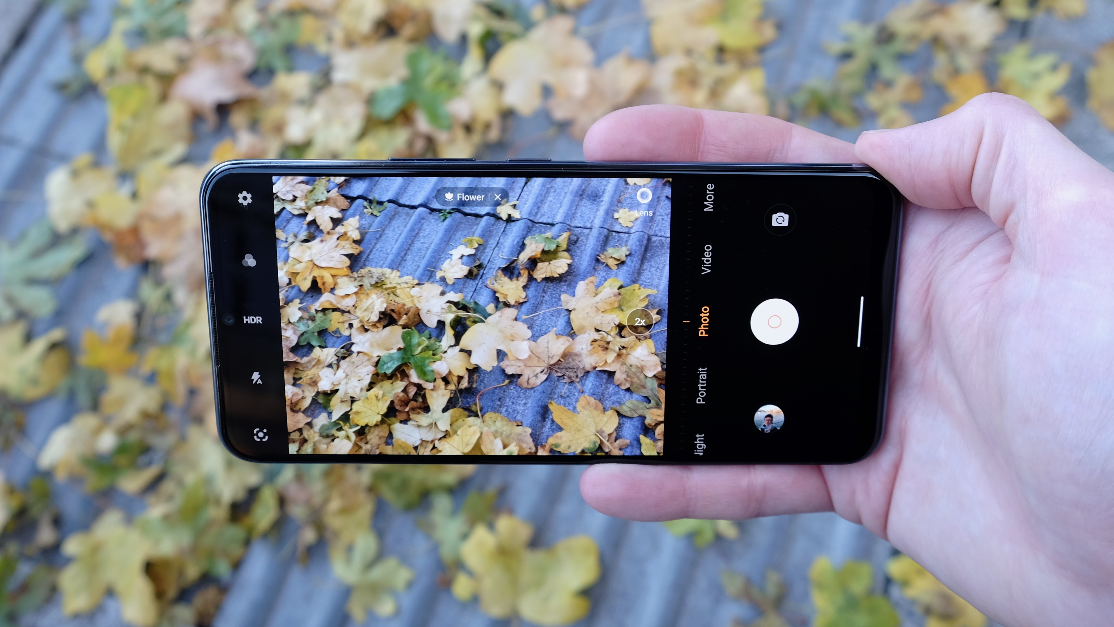
In common with the Y30, we found that two consecutive shots from slightly different angles could yield wildly different results – when taking evening food shots in a restaurant, for example. One shot of some mortadella ham was excessively flat and dim, matching the dark tone of the table. The next, taken from a slightly different angle, was suitably bright and blushing, suggesting that the AI was slow to recognise what it was seeing.
To Vivo’s credit (and perhaps that 2-megapixel depth sensor), portrait shots look quite natural here, with the subject reasonably well delineated from the background. But the background itself lacked the creamy bokeh effect of better cameras, and also suffered from an off-putting degree of overexposure on the bright autumn day on which we chose to shoot.
Any form of lesser lighting scenario would tend to produce murky results, whether in a low-lit restaurant or a night-time marina scene. While there’s a Night mode here, as is the case with most cheaper phones it serves to brighten things up rather than pull out any extra layers of detail or lessen noise. The implementation is far short of that of the Google Pixel 4a.
Camera samples


Specs and performance
- Qualcomm’s Snapdragon 665
- 8GB of RAM
- Android 10 with Funtouch 11
There are a lot of different chip configurations out there in the sub-£300 smartphone territory, which means that performance can vary quite dramatically between seemingly similar handsets.
In the case of the Vivo Y70 you’re looking at a rather creaky, if dependable, setup. The Snapdragon 665 CPU at its heart has been around for some time, having powered various 2019 and 2020 phones such as the Xiaomi Mi A3 and, more recently, the Moto G Pro.
With a Geekbench 5 multi-core score of 1,309, the Vivo Y70 doesn’t stand up well to slightly pricier competition such as the OnePlus Nord N10 with its newer Snapdragon 690, which scored 1,847. But it’s even more notable that it trails behind the Xiaomi Poco X3 NFC (1,699) with its Snapdragon 732G, as well as the Realme 7 (1,625) with its MediaTek Helio G95. Both of these latter phones can be had for less than £200.
In gaming terms, we were unable to run stalwart PUBG Mobile in HD graphical settings – at only Smooth or Balanced, which are the two lowest options. 2D action game Juicy Realm ran on higher frame rate and resolution settings, but activating post-processing brought about a frame rate warning.
Still, the tried-and-tested Snapdragon 665 does result in solid performance for all the basics, no doubt aided by an ample 8GB of RAM. On the internal storage front, 128GB should see to all of your app and photo needs, and you also get a microSDXC slot.
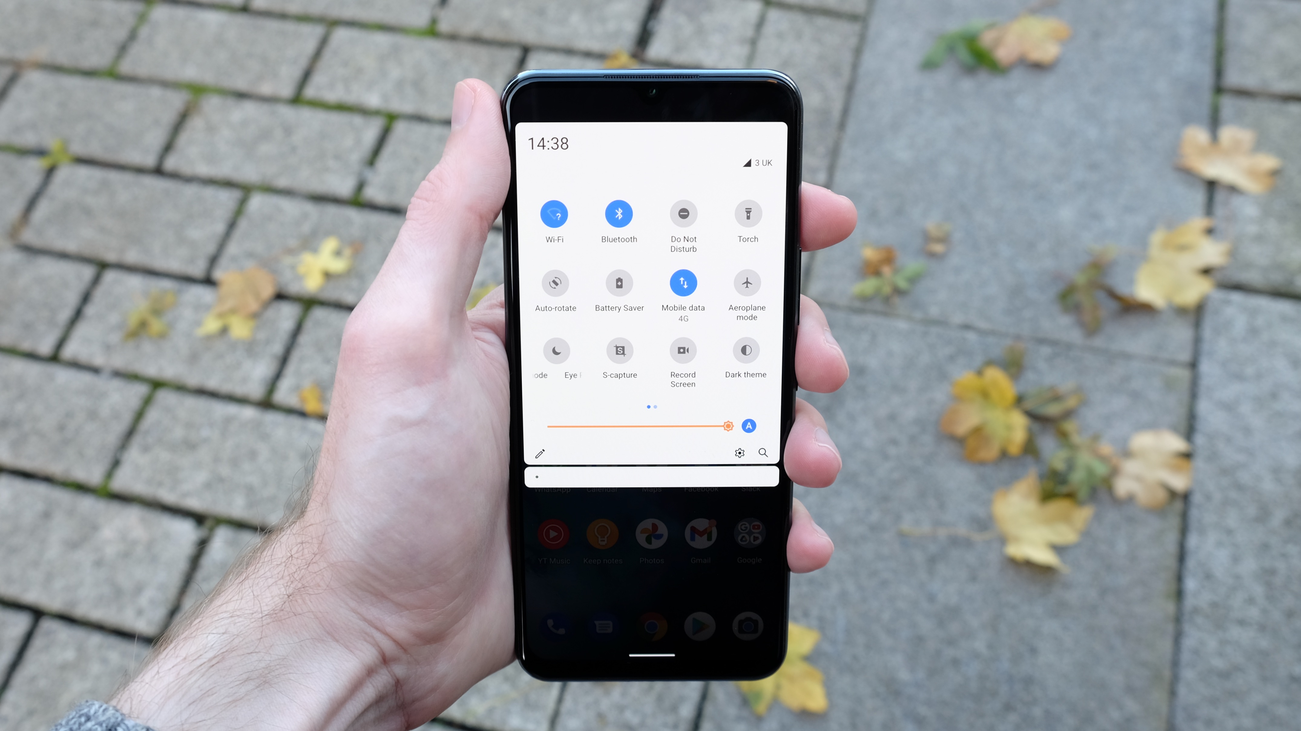
The phone’s fluid home screen and menu navigation is likely helped by Vivo’s surprisingly fuss-free Funtouch 11 UI, which sits lightly on top of Android 10. This particular take on Funtouch is a much slimmed down and cleaned up take on the brand’s custom interface, with way less of the bloatware that we’ve seen in Vivo phones from other markets.
There are a handful of Vivo provisions from the off, such as an Albums app that isn’t strictly necessary with Google Photos onboard. And we could take or leave the prominently positioned iManager tool, which is intended to keep your phone clean and secure. We really don’t need a permanent link to the Vivo website on our home screen either, thanks, and we’d rather decide for ourselves whether to install Instagram, Facebook and TikTok.
Essentially, though, Funtouch leaves the basics in place. The menus and icons feel nice and stock, and the helpful Google Feed sits to the left of the home screen rather than the tacky custom aggregation tools provided by some of Vivo’s rivals.
Battery life
- 4,100mAh battery
- 33W fast charging
The 4,100mAh battery packed into the Vivo Y70 is far from the biggest we’ve seen in an affordable phone. Several rival efforts contain a 5,000mAh unit, including the Vivo Y30.
But it’s still comfortably up to the task of getting you through a full day of moderate usage. Around 4 hours of screen-on time across two full days (with Airplane mode activated overnight) got us down to around 20%, which is a reasonable – if far from spectacular – result. It will stand up to a day of more of intensive use without trouble.
The Vivo Y70 handles media duties quite well, too, with an hour of Netflix streaming at full-screen brightness draining 8%. That’s a reasonably strong result for a budget phone.
Far more impressive than the Vivo Y70’s stamina, however, is its recharging capabilities. The phone comes with the exact same 33W fast-charging system as the much more expensive Vivo X51.
Vivo claims that it can gain you 65% in just 30 minutes here, and we can corroborate this figure from practical use. After exactly 30 minutes of charging, we were able to power up our Y70 from 30% to 93% – an increase of 63%. What’s more, we were right back up to 100% within 45 minutes.
Of course, the Poco X3 NFC – which seems to be haunting this review – gives you very similar 33W fast-charging for much less money.
Buy it if...
You favor punchy colors over fluid scrolling
We’re as guilty as the next outlet of spouting off about how great a 90Hz or 120Hz display feels. This has led to a recent mini-trend for budget phones that adopt high refresh rate screens, often at the expense of visual clarity. The Vivo Y70 is almost reassuringly old-school in its insistence on the punchy colors of AMOLED over a super-silky LCD. It’s worth carefully considering which visual attribute you favor.
You need the ability to charge up quickly
Generous battery life is great to have, but some people will never feel comfortable unless there’s a wall charger close to hand. If you favor the ability to charge up quickly, as and when you get the opportunity, then the Vivo Y70 has you covered. Its 33W fast charger seems to have been airlifted in from a more expensive phone, and can gain you 65% in half an hour.
You like your smartphone UI to be clean and unfussy
When it comes to software and UI, only a small handful of budget phone makers have the good sense to leave well alone. Vivo isn’t entirely blameless here, but for its first European phones it has smartly read the room and stripped out a lot of the usual bloat. As a result, the Y70 is pleasantly clean and relatively free of unwanted bloat.
Don’t buy it if...
You’re a gamer on a budget
Although £200 to £300 might sound like quite a limited smartphone budget, it is still possible to get genuinely good gaming performance for that money. The Xiaomi Poco X3 NFC comes in right at the bottom of that bracket, yet it beats the Vivo Y70 and its creaky Snapdragon 665 for performance; it also boasts stereo sound as opposed to the Y70’s single tinny speaker. Ditto for the slightly pricier OnePlus N10.
You like an ultra-wide framing option when taking pictures
Ignore the claims of a triple-camera system in the Vivo Y70 – it has a single sensor backed by a fairly useless 2-megapixel macro and a limited 2-megapixel depth sensor. While it’s possible to wring usable 2X zoomed shots from that 48-megapixel main sensor, there’s no ultra-wide option whatsoever. That’s a bit of a fail, even at this end of the market.
You’re after a little design pizzazz from your next phone
The Vivo Y70 is solidly built, and we quite like how slim and light it feels next to some of its rivals. But it’s generally quite anonymous to look at and handle. If you’re looking for a phone that makes a visual statement, or anything of interest to look at beyond its agreeably vibrant screen, this isn’t the phone for you.
First reviewed: November 2020
