24 years ago, Steve Jobs made tech sexy again
The first iMac was unlike any other PC on the market in 1998

Tech is sexy, or at least it can be, and that's mostly thanks to Steve Jobs and the iMac, which was unveiled 24 years ago this week.
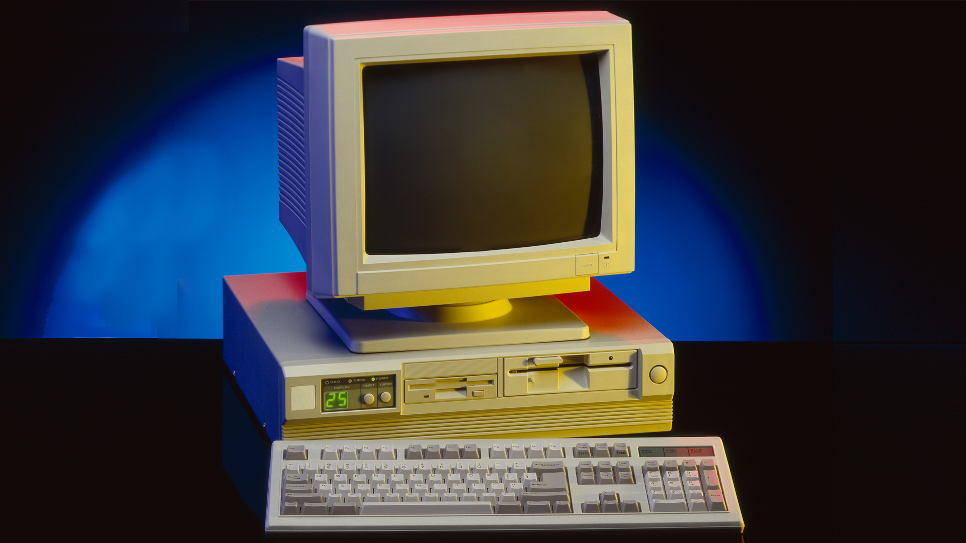
Your options for home and office computing in 1998 were dull and duller. So-called white-box PCs dominated the personal computing landscape. They were invariably white or beige rectangles, featuring multiple removable storage slots, a grill to let some air move over the large motherboards, and giant CRT monitors balanced on top of them. The keyboard and mouse were rote efforts that got the job done.
The iMac's unusual design came out of dire necessity, not just to shake things up in a dull-as-dishwater industry, but to save Apple from the dust bin.
Steve Jobs rejoined Apple just a year or so before unveiling the first iMac. The plan, as Walter Isaacson explained in his Steve Jobs biography, was to build "an all-in-one product with a keyboard and monitor and computer ready to use right out of the box. It should have a distinctive design that made a brand statement."
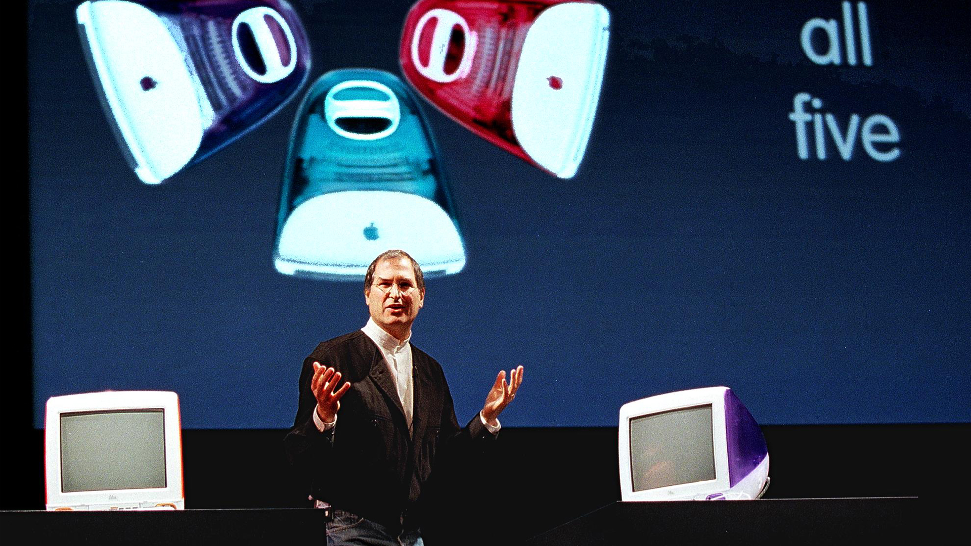
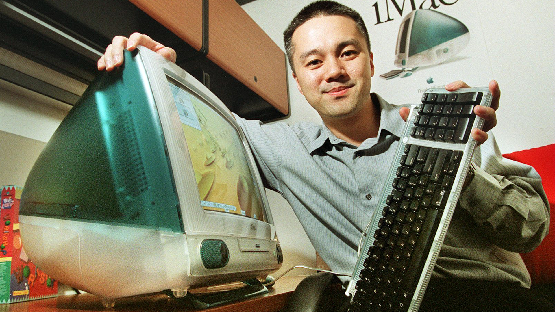
With its curvy, no-sharp-corners- design, candy-colored translucent back, forward-facing stereo speakers, small keyboard, and perfectly round mouse, the iMac accomplished all that and more.
While almost any brand computer across the entire Windows PC industry in 1998 could hardly be picked out of a lineup, there was no mistaking the iMac as anything but an Apple product.

The iMac was not just a distinctive product, it was a statement of intention. Apple would, as it had done almost fifteen years before, Think Different, casting aside the known and comfortable for the exciting, eye-catching, and special.
Get daily insight, inspiration and deals in your inbox
Sign up for breaking news, reviews, opinion, top tech deals, and more.
To Apple and Job's credit, the first iMac was not just a sexy package, Apple took risks on the component side, as well. It had a PowerPC processor (co-developed with IBM and Motorola), but didn't have a floppy drive. At the time, every single PC worth desktop space (and many laptops) had a 3.5-inch floppy drive. Apple did away with it and inside only included a CD-ROM drive. The iMac introduced the still then relatively new USB port to the Apple audience (no previous Mac had one).
Apple also pushed the envelope with connectivity, introducing the 56K V.90 modem, a connectivity option so new that many ISPs weren't ready to connect to it. And in a nod to the original Macintosh, the iMac even had a handle that let you carry the somewhat bulky computer around.
Jobs intended the new iMac (which came in five different candy-colored options - another first in the PC space) to be a consumer device. But sales were swift and I can remember them popping up all over offices in 1999. In fact, a design team I worked with back then insisted that we only buy them new iMacs.
The iMac turned on a generation of technology consumers in ways few products had done before. It gave us license to get excited not just about what technology could do, but how it could look and feel. Most competitors were slow to get the message, but not Apple.
In the years that would follow, Apple would unveil one iconic product and product design after another. In the iBook, iPod, iPhone, and iPad we would see echoes of the iMac's inspiration. Not that all the products looked like the iMac. They didn't. In fact, the next iMac, which featured an LCD display, looked nothing like that first design but the DNA of that approach, of emotion-eliciting design first, was clear.

Apple pulled back a bit from allowing form to totally override function. Current Apple designs are now marked by both their simplicity and beauty. Where the original iMac might've been accused of overdesign, a Mac Studio might be said to have almost no design at all.
That wouldn't be true, though. As I see it, every Apple product is still designed to elicit a response – much like a car you see driving down the road. You can't touch it as it races by at 70 mph, but you saw it, remember it, and have an opinion about it.
Without the original iMac, our laptops would still be ugly, boxy extensions of their desktop counterparts. Tablets might have square edges. Our phones might look more like, well, phones instead of smooth, glossy slabs.
Every bit of technology we touch is built in the shadow of the first consumer electronics technology design to break the mold since the original Mac. Few seemed to learn from that 1984 product, but the industry got the message in 1998, and nothing, thankfully, has been the same since then.

A 38-year industry veteran and award-winning journalist, Lance has covered technology since PCs were the size of suitcases and “on line” meant “waiting.” He’s a former Lifewire Editor-in-Chief, Mashable Editor-in-Chief, and, before that, Editor in Chief of PCMag.com and Senior Vice President of Content for Ziff Davis, Inc. He also wrote a popular, weekly tech column for Medium called The Upgrade.
Lance Ulanoff makes frequent appearances on national, international, and local news programs including Live with Kelly and Mark, the Today Show, Good Morning America, CNBC, CNN, and the BBC.