48 hours with the Motorola Razr: our first two days with the new foldable phone
Still an inspiring yet expensive design

The Motorola Razr 2019 impressed us with its audacious return to flip phone functionality - but after our brief first look, we were left with plenty of questions that could only be answered with a proper review. We’ve finally gotten our hands on the phone again, so here’s what we’ve found after a weekend with the world’s second major and widely available foldable - and first to sport a clamshell design.
The first thing to note is how easily the Razr melds into a pocket. Folded closed, it takes up half the footprint of a typical smartphone - and even if it’s a bit thicker, the Razr fits so well next to the rest of the items filling our pocket (keys, wallet, AirPods Pro case) that we occasionally forgot it was in there. That happened this weekend, even while helping move a friend into a new apartment - the Razr can, and likely will, disappear into a pocket.
Which is why we expected the compact size to be far more exciting for consumers, especially for those wearing pants without pockets. But given how long we’ve all lived with bigger and bigger handsets, workarounds - even simply stuffing phones into a back pocket - have made this less of a compelling selling point for the Razr.
Perhaps it would be compelling if the phone didn’t cost 50% more than an iPhone 11 Pro or Samsung Galaxy Note 10. Time and again, people gawked at the Razr as we flipped it open and closed in public, noting how much they missed the simple kineticism of flip phones. That nostalgic yearning dried up when we mentioned the Razr’s price tag.
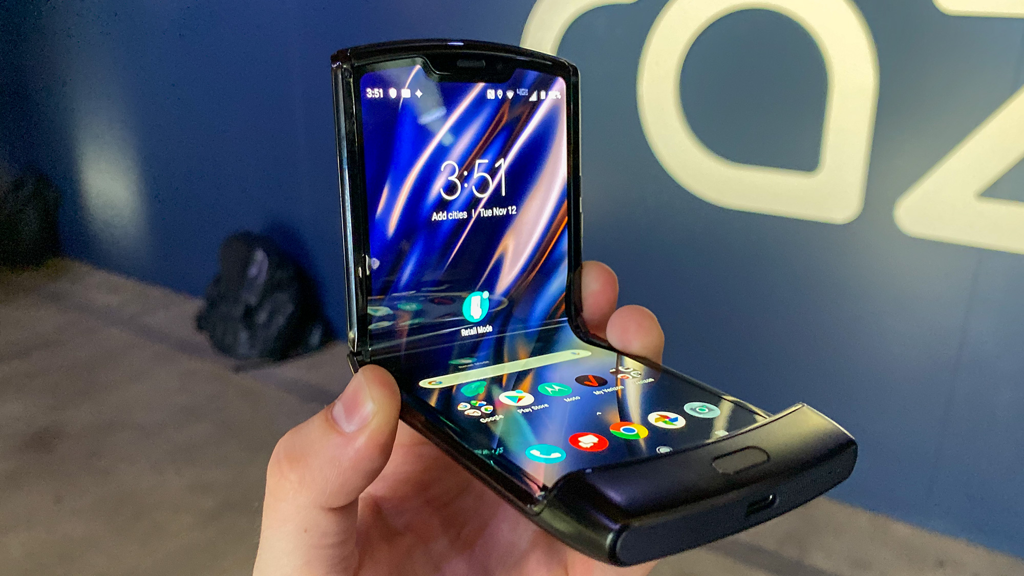
And truly, it’s hard to disagree with that price shock given the handful of ways this phone falls short of premium. The hinge feels impeccable, though it still takes a bit more effort to pry open than is comfortable, but the interior plastic display is thin, and you can feel the bumpy hinge while running your finger up and down the screen. It bugs us more than we expected.

Undoubtedly, this is a design compromise - no phones have foldable glass yet - but it’s one of a few small annoyances that keep the Motorola Razr from feeling like it has worked all the kinks out. As another example, the volume rocker and lock button are slim to the point of sharpness, and largely indistinguishable, making the effort to check the time (a quick lock button press away) a guessing game.
Thankfully, some typically benign features come to the rescue - in this case, lift to wake lets you bypass the buttons entirely. And there are some genuinely sublime moments thanks to the synthesis of the new front mini screen and Moto gestures, making the ‘twist to launch camera’ motion a quick and reliable way to snap a swift selfie.
Get daily insight, inspiration and deals in your inbox
Sign up for breaking news, reviews, opinion, top tech deals, and more.
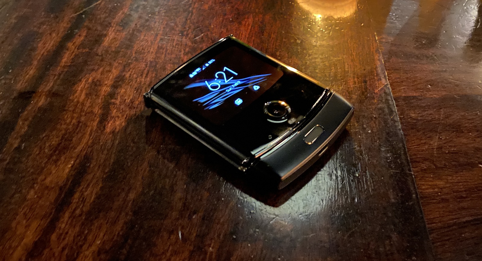
And as we predicted, that tiny front screen is a delight. It really does surface the essential information much like a smartwatch would. Given the Motorola Razr’s small footprint, it’s far less trouble to pull it out of a pocket to check the time or notifications than it would be a typical large phone.
It’s the promise of small, unobtrusive phones like the iPhone SE and then some. Of course, that mini screen’s small real estate means you don’t get more than a few lines of text, but often that was enough.

The Razr shoots well in daylight (apologies, all shots are in portrait)

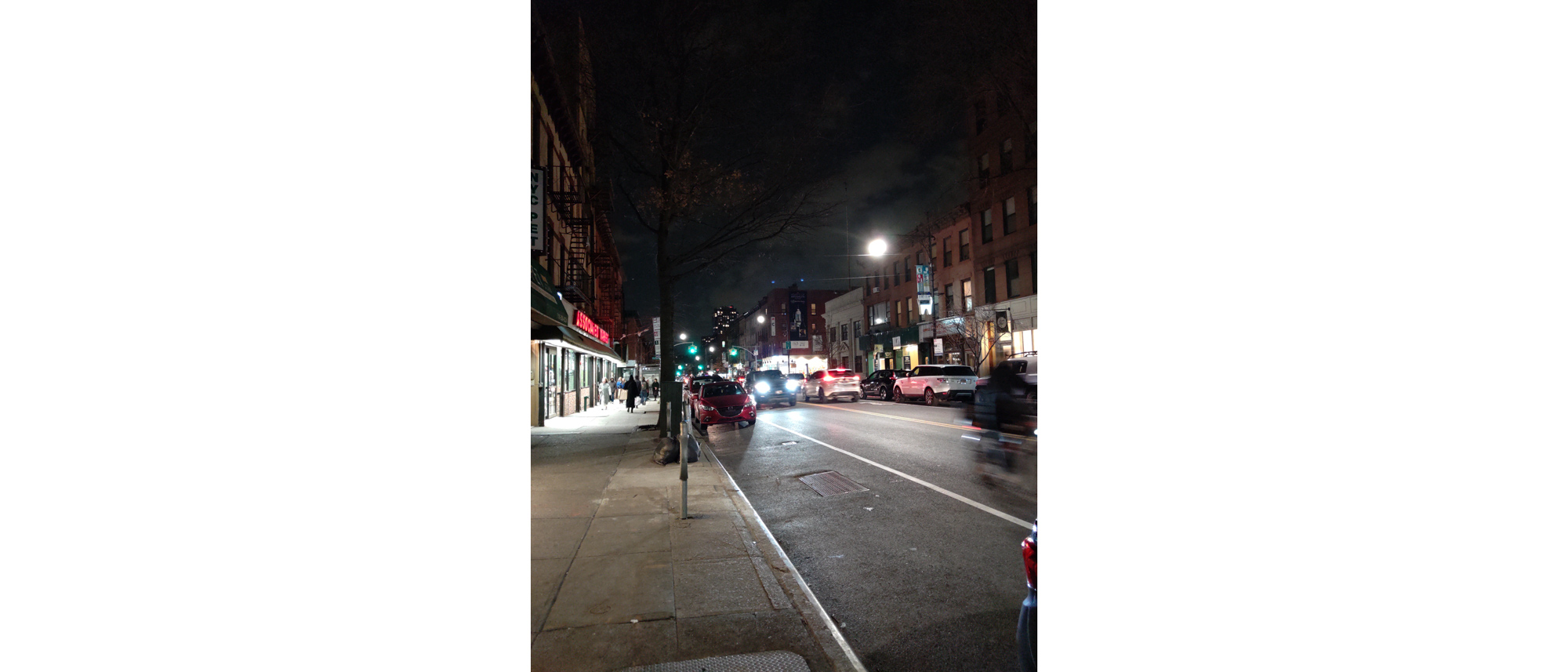
At night, the phone's light sensors struggle a bit...

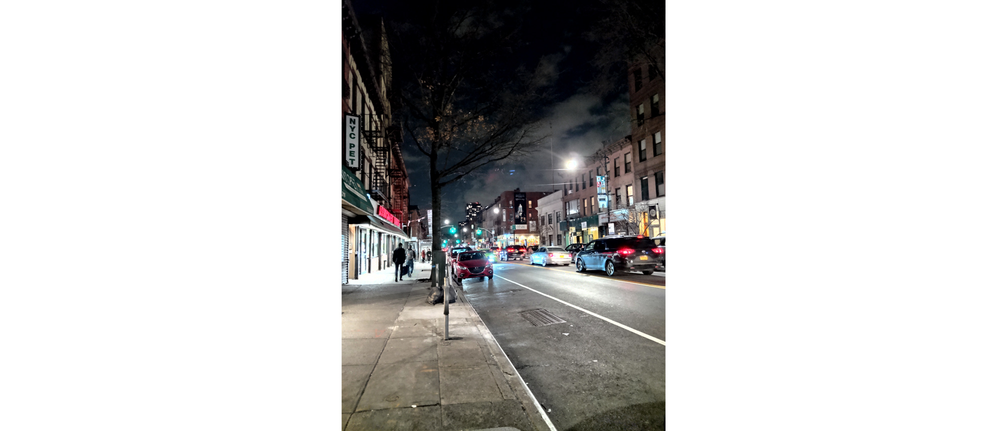
...even with Night Mode, which amps up the contrast.

Food photography is fine, if unspectacular.


The phone's cameras also struggle a bit with dark interiors...

...though night mode helps here too.
While we didn’t have time to put the Razr’s cameras through their proper paces, we did compare their shots - which you can see above - with those taken with an iPhone 11 Pro Max (our standby) and found the results typical of Motorola phone camera units. It seems to have inherited the augmenting software from the Moto Z4, as the single-lens 16MP rear camera does decent work.
In daylight, the rear camera rivals flagship performance, full stop. In low light, even in night mode, it suffers a bit, failing to harness enough light to make shadowed elements surface, like text, and often struggling to focus.
As is typical with Motorola camera setups, the color is vibrant - seemingly in an attempt to make up for the lower clarity in comparison with sharper photos taken by phone cameras with better low light performance.
Overall, our first weekend with the Motorola Razr was promising yet uneventful - which makes sense, given the phone is a compressed flagship with reliable if upper mid-range specs. It’s a compelling device by look and design, but the underlying lack of outstanding features lead us to wonder how much value the clamshell mechanics deserve.
For $1,500 / €1599 (around £1,350, AU$2,000), it’s hard to argue the Motorola Razr is worth the cost - even if its design turns heads and inspires hope that the flat-screen rectangle standard isn’t the only viable phone design.
David is now a mobile reporter at Cnet. Formerly Mobile Editor, US for TechRadar, he covered phones, tablets, and wearables. He still thinks the iPhone 4 is the best-looking smartphone ever made. He's most interested in technology, gaming and culture – and where they overlap and change our lives. His current beat explores how our on-the-go existence is affected by new gadgets, carrier coverage expansions, and corporate strategy shifts.
