8 OS X El Capitan features you'll love
Improve productivity with Apple's latest OS
Introduction
The latest version of Apple's desktop operating system, dubbed OS X El Capitan, has finally arrived for the public at-large. And even though this update is mostly focused on performance improvements and working out some of the kinks of last year's Yosemite, that doesn't mean there aren't plenty of new features to unpack.
From the new split-view and tweaks to the Notes app to more under-the-hood additions like Apple's Metal graphics API, the latest version of OS X packs plenty of interesting tweaks that could help improve your workflow.
Split View
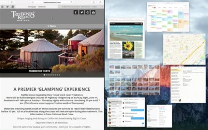
While this one may have been copped straight from Microsoft's playbook, there's good reason for it. Even for the most dedicated Mac faithful, juggling multiple windows has always been a bit of a pain. With Split View, Apple has made that process just a little bit easier.
To get started with Split View, you simply click and hold on the green full-screen button in a window's upper-left corner. One half of your screen will then turn blue, and you can drop the windows there. After the first windows is set, other open Split View compatible apps will appear on the opposite side, and you simply click one to set it in place. And if you already have a window open in full screen, you can open Mission Control and drag another window on top to get to Split Screen view as well.
The process may take a fair bit of fiddling around, and it's a bit clunkier than Microsoft's implementation, but it's good to see Apple making more of an effort to improve multitasking in OS X.
Smarter Spotlight
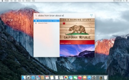
Apple's latest iOS release isn't the only kid on the block with a smarter Spotlight Search. OS X El Capitan has brought the same improvements over to the Mac with natural speech recognition, weather, sports and stock information, and more.
The most useful addition is likely the natural speech recognition. You can now open Spotlight search and type in complex phrases like "emails from Juan in May" or "documents I edited last week" and Spotlight will pull up anything that matches. While it may not seem like a huge deal, it could be a boon for the disorganized among us by saving a bit of time spent looking for that latest presentation or spreadsheet that seems to be lost in the ether.
Are you a pro? Subscribe to our newsletter
Sign up to the TechRadar Pro newsletter to get all the top news, opinion, features and guidance your business needs to succeed!
Additionally, Spotlight Search can now pull in more information from around the web, giving you quick access to weather info and stock information. If you're deciding whether to walk to lunch or hitch a ride, or keeping a sharp eye on a particular stock, Spotlight can help keep you informed better than before.
Gestures in Mail and more
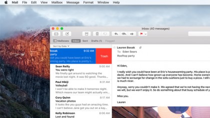
Mail isn't the most loved app in Apple's ecosystem, whether it be on OS X or iOS. However, Apple has made some handy improvements to the default email application in OS X El Capitan , bringing gestures over from iOS and bringing it further up to par with third-party offerings.
If you're looking to quickly burn through your inbox in the new Mail, you can now use two-fingered gestures on the trackpad to whisk your way through emails. Just swipe right to mark a mail as read or left to trash it, and you're done.
In addition, Mail now includes tabs in the compose window while you're in full-screen, allowing you to tend to multiple emails at once, along with quick links to your calendar when you send or receive an email with an appointment date inside.
Tidier Mission Control
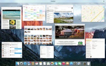
If you're a frequent user of Mission Control to manage your tasks and windows, you'll notice the feature has been tidied up a bit in OS X El Capitan. Swipe up on your trackpad with three fingers, and you'll now see that multiple windows of the same app are no longer layered.
Further, app icons over windows are now gone, with descriptive labels showing up only when you hover over the windows. As for the banner running across the top of the screen, each desktop initially appears as a simple label, with a thumbnail only appearing once you've hovered over it.
Overall, Mission Control's changes are on the minor side, but they have to make the feature look a little less cluttered and slightly more mature.
Safari tweaks
Like some of the other updates in El Capitan, the tweaks to Safari aren't sweeping by any means, but they're convenient quality-of-life improvements nonetheless.
The main addition to Safari in El Capitan is the ability to pin sites. If you have a number of websites that you find yourself going back to throughout the work day, you can now control-click a tab to pin it. That page will now show up as a mini-tab with the website's icon in the upper-left of the windows each time you open Safari.
Additionally, Apple has taken a cue from Chrome and finally added in a quick-mute for tabs. If you're doing a bit of research or wasting time on a website when a pesky video ad loads, you'll now see a speaker icon on whatever tab it's coming from. Simply click the speaker and it will mute the sound.
Rocking out with Metal
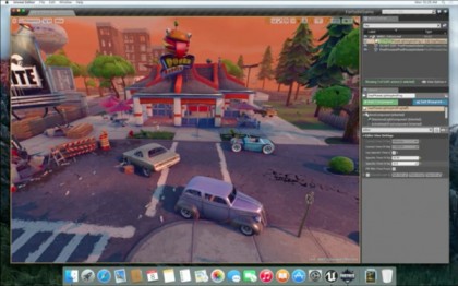
Apple has opted to bring support for its Metal graphics API, which first debuted on iOS, over to OS X El Capitan. This one is a bit of an under-the-hood improvement, but you should be able to notice its effects throughout your Mac.
The most obvious application of the Metal API is with gaming, but Apple has noted its ability to increase overall system performance as well. For example, if you do a lot of work with Adobe software, Apple says that Metal has increased graphics performance and efficiency by 50 percent and 40 percent, respectively. Simply put, you'll notice that El Capitan is a bit snappier with graphically intense programs like After Effects.
Handier Notes

Perhaps one of the most useful updates in El Capitan is the revamped Notes app. Long-gone is the barebones Notes app of yesteryear, with new features gracing the app that make it a worthy contender for your brainstorming sessions.
The most visually apparent change in the new Notes app is that it is now larger. Specifically, it's now made up of three panes, rather than the previous two. The reason for the added heft is to accommodate a folder pane, allowing you to see and switch between notes on your Mac and those synced from iCloud, along with the option to create folders to further separate your notes.
While you could add images to your Notes in previous versions, the new Notes now allows you to insert more types of media, including PDFs, videos, and location snapshots from Maps. And now the Notes app is included in the Share Sheet for several of Apple's other apps, meaning you can quickly send snippets of locations from Maps to Notes and more.
Lastly, the most minor change, yet one of the most satisfying, is the ability to make checklists in Notes. Previously, you could make bulleted and numbered lists, but bow you can outfit a list with checkboxes to show what you've completed and what you haven't.
Other odds and ends
Finally, El Capitan adds a couple of bits that, while minor, add a bit of polish and convenience to the OS.
If you find yourself struggling to find your cursor when waking your Mac up, for example, there's a new gesture on the trackpad that makes the cursor temporarily grow and "pop out" by quickly shaking the mouse around.
In addition to the speed improvements that Metal brings to the table, overall performance has increased a bit, with Apple stating that apps will open 1.4 times faster, app switching is twice as fast and PDF previews will now open four times faster.