The Apple Watch 5th anniversary: what we got right and wrong in our review
We revisit our Apple Watch 1st generation review on its fifth anniversary

Time passes quickly, and that clichéd saying even applies to the state-of-the-art Apple Watch 5, which is accurate up to 50 milliseconds of the global time standard, according to Apple.
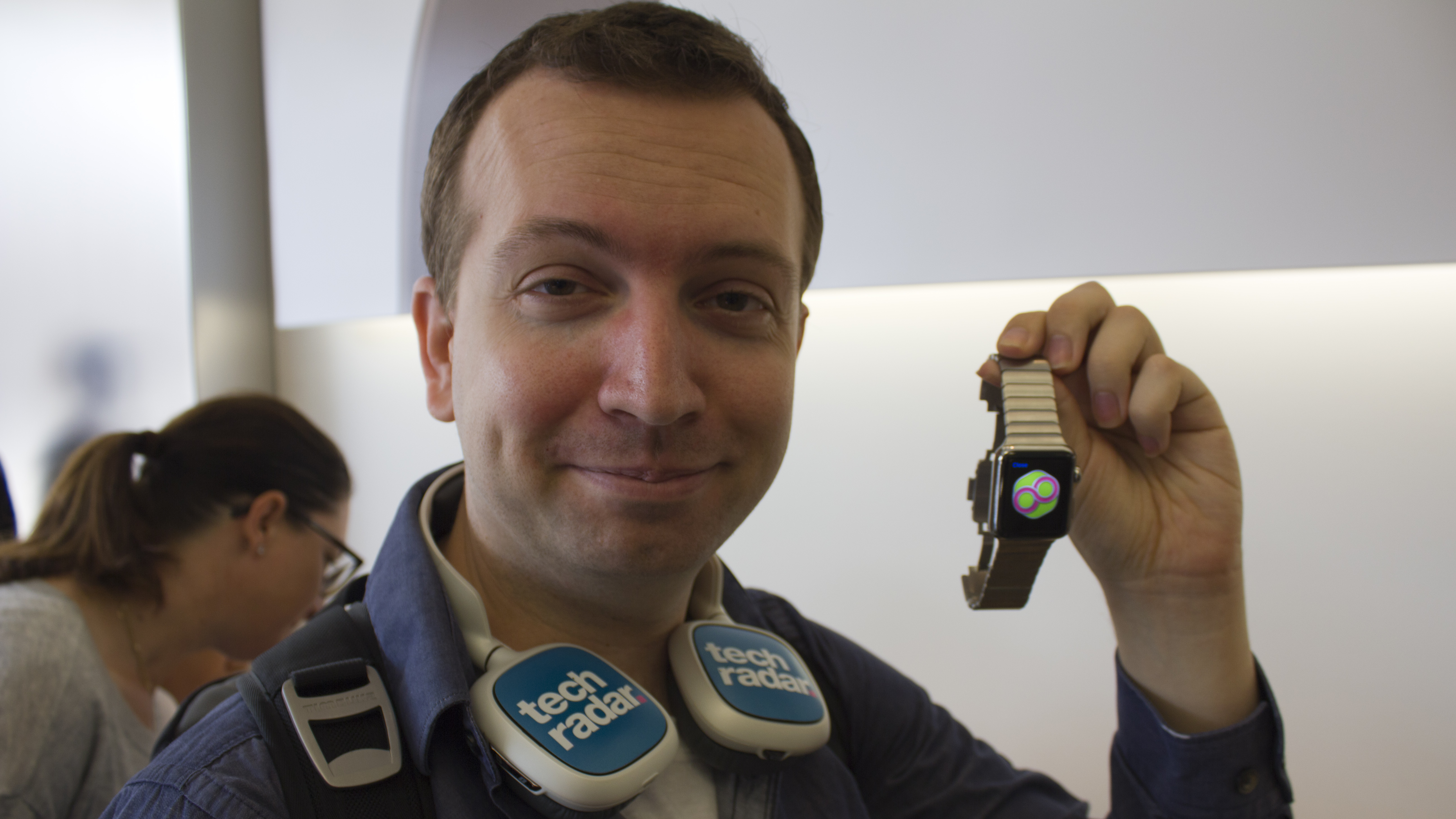
It’s the 5th anniversary of the original Apple Watch, which, on Friday, April 24, 2015, launched to hype, long lines, and limited quantities. I was there to interview the first people in line in the US and rush home to write an in-depth Apple Watch review.
We nailed it when we called this iPhone-connected wrist hugger “Apple’s most personal gadget” in a review, jointly written by myself and TechRadar's Global Editor-in-Chief Gareth Beavis. We also forecasted more daring designs to come eventually, including a more stunning circular sequel to compete with Motorola’s then-critically acclaimed Moto 360 (2014). That still hasn't happened.
Let's analyze our review, notes and some dated launch day photos, as the first Apple Watch turns five.
We were there. Browse through the slideshow from the 2015 Apple Watch launch day, including photos of the first people to buy the Apple Watch in-person in the US.



Nailed it: ‘Apple’s most personal gadget yet’
"Apple Watch is ticking away on my wrist right now, and while it’s no longer called the iWatch, it really is my watch and Apple’s most personal gadget yet."
I loved starting the review with this opening line, which paid tribute to the long-rumored ‘iWatch’ name, and segued into highlighting how intimate it was to don the then-brand-new Apple Watch.
It was a novelty in 2015; a square-shaped iPod nano-like device was strapped to my wrist all day and became a gateway to being served important notifications, beamed from my pocketed iPhone (the still-rather-new iPhone 6). I could set the digital watch face (there were just ten faces at the time), and I was able to track my every move with unique-looking activity rings (which translated into ‘stop writing, start standing’). It felt personal.
Get daily insight, inspiration and deals in your inbox
Sign up for breaking news, reviews, opinion, top tech deals, and more.

It was also customizable compared to other gadgets. Here are all of the original Apple Watch cases and bands, which we meticulously laid out ahead of the launch day. We wrote an in-depth guide, detailing the differences between them all.

This TechRadar-compiled graphic includes the extremely pricey and discontinued 18-karat gold Apple Watch Edition you probably forgot about. With so many swappable strap types and colors, it only added to the distinctive charm of this brand new tech.
The personalization trait has only become more true today: Apple packed additional health sensors into Apple Watch revisions. The Series 1 and Apple Watch 2, launched in 2016, and the Apple Watch 3, launched in 2017, detect low- and high heart-rates as well as irregular rhythms (Afib). The Apple Watch 4 in 2018 added fall detection and an ECG (Electrocardiography) feature.
The Apple Watch – with reminders to stand up, move around, and simply take deep breaths when life gets a bit too crazy – continues to be Apple’s most personal gadget and a steady companion for iPhone users five years later.

Rare miss: Needs to be circular
"All of Apple's flowery marketing rhetoric about reinventing the classic watch look - from digital crown to complications - didn't end up translating into that traditional round watch design, which is one of my largest criticisms with the form factor."
Apple didn’t create a circular Apple Watch in 2015 and, at the time, I was disappointed. Now, in 2020, and five similar-looking Apple Watch iterations later, I don’t care nearly as much.
Things looked very different to me in 2015. In the seven months leading up to the Apple Watch, I was wearing the Moto 360 (2014), and it was simply stunning. Motorola’s forward-thinking circular take on the smartwatch idea made this third Android Wear watch an instant hit.

I recall reviewing the first of two simultaneously launched Android Wear watches – Samsung Gear Live – while our now-Deputy Editor John McCann reviewed the LG G Watch. We, a dynamic duo in the early smartwatch days, both cited that these early watches sported incredibly boxy designs that impressed... absolutely no one. Motorola took the smartwatch idea in an exciting new circular direction, so it felt like the Apple Watch dialed things back.
I stand by the fact that circular smartwatches look the part of a traditional watch better than a square watch with curved corners. But the functionality of a round touchscreen doesn’t always work well when you swipe – it feels like corners are cut, as I’ve experienced on other elegant-looking circular watches.
Apple proved it didn’t have to mirror the classic watch look and, instead, invented a fashionable look of its own. Would I like to see the company rival the circular Samsung Galaxy Watch? Yes, but only if Apple’s UI worked on a circular watch just as well as it does right now.

Nailed it: beaming iPhone notifications to a watch is a 'wonderful convenience'
"Beaming apps like Messages, Mail and every iPhone notification to an always-on-hand gadget is a wonderful convenience."
Apple nailed this perk from the beginning, and so did I when when I said beaming notifications to our wrist a ‘wonderful convenience’. Some people complained ‘this or that app’ wasn’t on the watch, but seeing notifications at a glance was – and remains – the best Apple Watch feature.
OK, other smartwatches of the era did relay notifications, too, but Apple’s interface was refined, even in watchOS 1. Want proof?

This was the stark contrast I saw in our review testing: Android Wear displayed at maximum of eight words of a text message (anything more was cut off) and usually the top of someone’s forehead in an outdated Hangouts profile picture (it's often not like the near-perfect demo photo about). Apple, meanwhile, used a slick animation dominated by the green Message icon and the person’s name (or their phone number if they weren’t in your contact list). That was it – at first. This information then automatically slid up to reveal almost the entire text message.
The big green Messages icon and the person’s name flashing on the watch face were key to Apple claiming this win. Here was a typical scenario circa 2015: At dinner, I’d feel a vibration on my wrist while in a real-life conversation with someone, gently turn my wrist to quickly glance at the watch face, and immediately know two things: Green bubble icon? This is a text. Someone I didn’t need to talk to right away? I could instantly dismiss the text in my brain and get back to the real-life conversation. From day one, this felt leagues better than showing a portion of a text, someone’s name, and their broken photo all at once on a tiny watch face.
Miss from others: 'Apple Watch battery can die after 3 hours' (but we nailed it)
"Apple Watch battery can die after 3 hours"
A lot of other publications – NOT ours
I’m struggling to come up with another miss from our Apple Watch review, so I’m using this as a chance to highlight the most sensationalist launch window headlines, written by others, that I saw and tried to counter with actual explainers. It’s fit for modern times five years on, right?
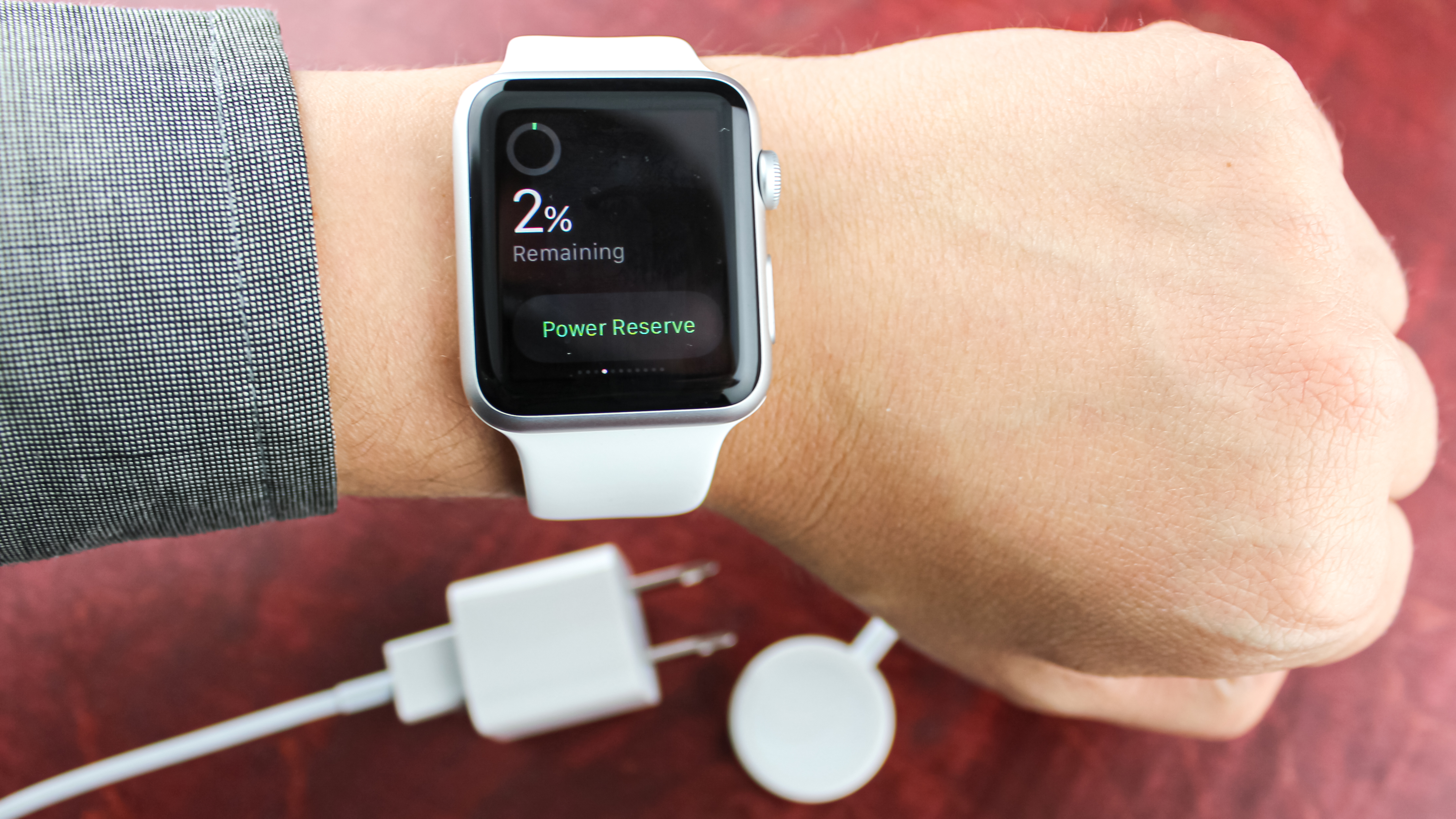
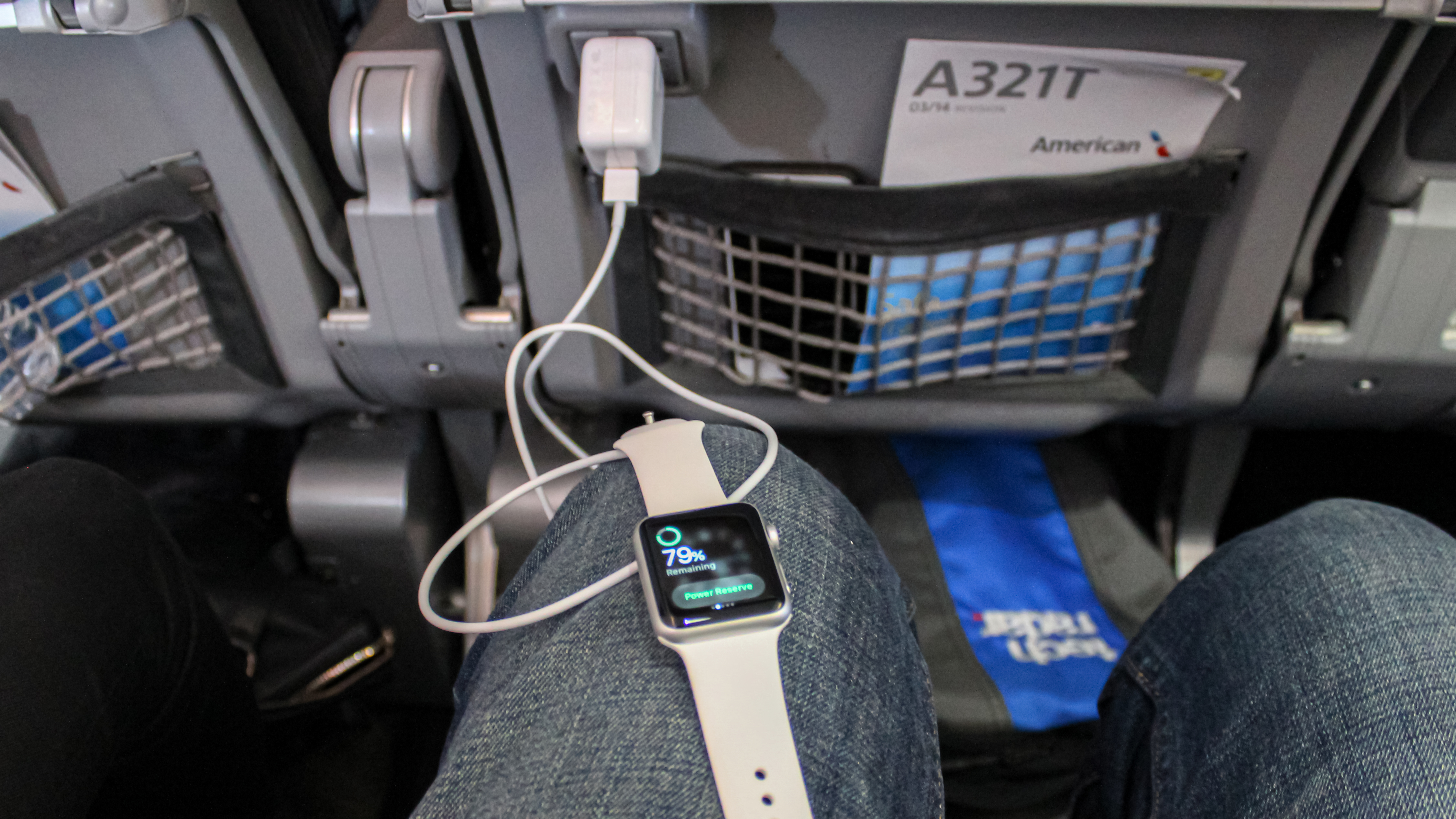
Something we didn’t do was run a headline like “Apple Watch battery can die after 3 hours”. That’s a real headline. And plenty of other sites that ran similar headlines. It’s technically true and makes for great clickbait – using the power-hungry phone call feature drained the battery in 3 hours (instead of 18 hours). But, in my five years of using an Apple Watch, I’ve never gone past 45 minutes on a call. I use the feature in smaller chunks, when cooking dinner or washing dishes.
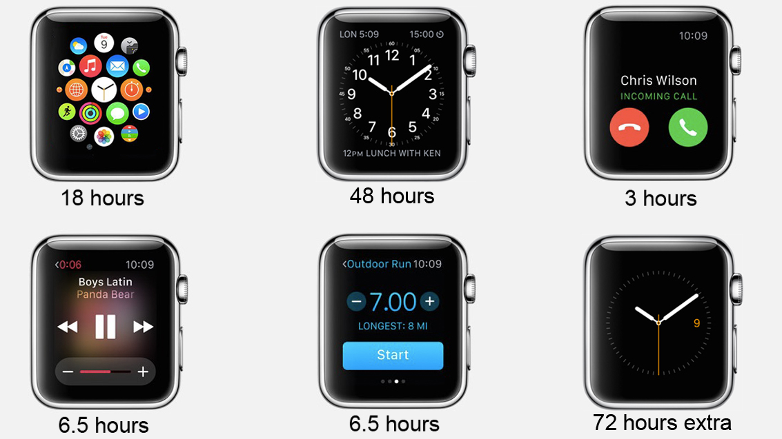
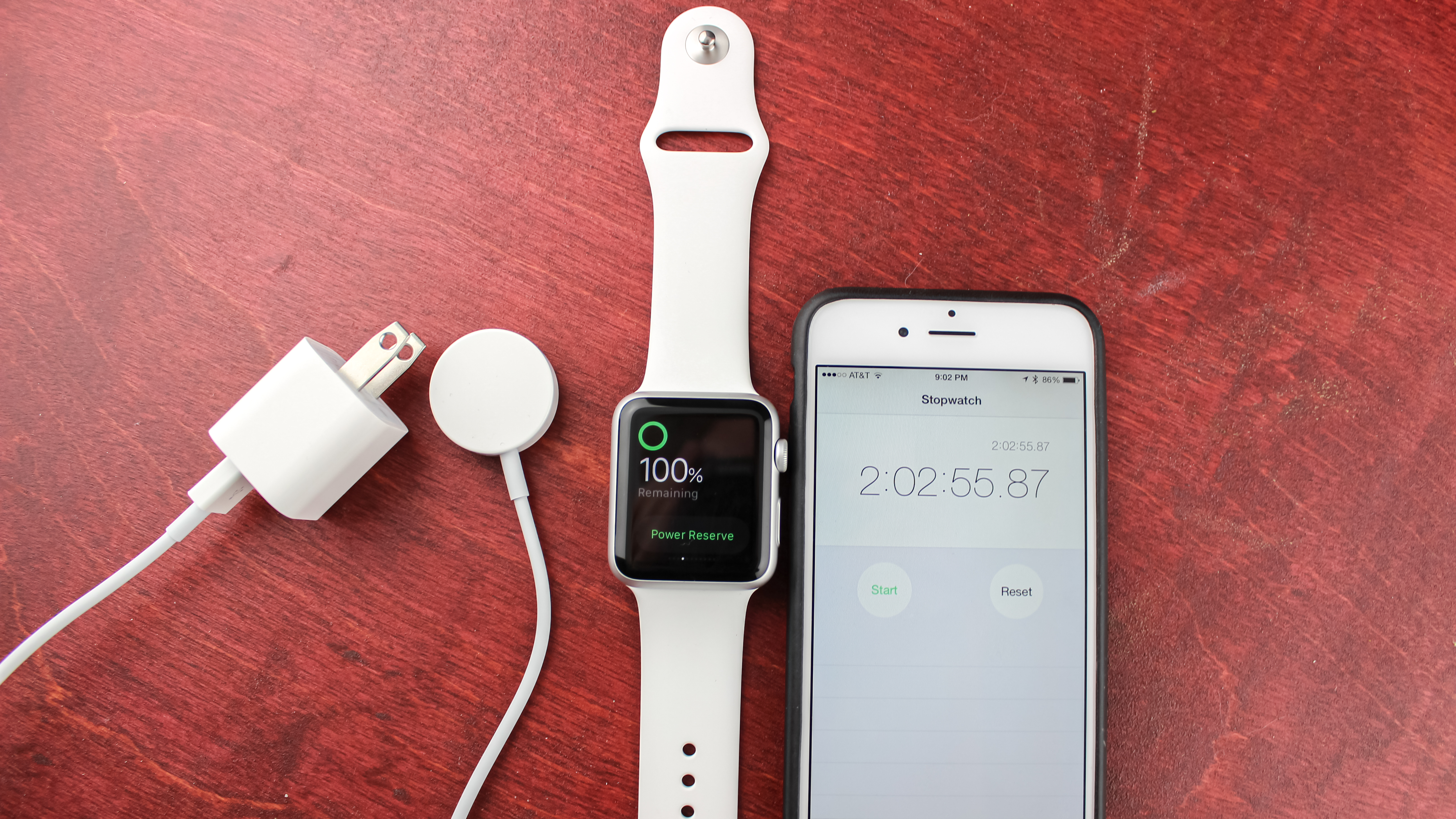
The truth is, the original Apple Watch battery lasted ‘all day’ as Apple had promised and, at times, longer. If you kept a routine sleep schedule and didn’t push the heart rate monitor like a fitness guru, I saw a day-and-a-half of power. Things improved with the Apple Watch Series 2, 3, and 4, though I’ve found the Apple Watch 5 does die on me slightly faster than the Series 4 did when the always-on screen is enabled.
There is something small I failed to put into the 1st gen Apple Watch review that I would have liked to let Apple know about. So if I could make an amendment – five years after the original review – here it is:
I called the inductive charger ‘clever’ – and it is – but over the years, whenever I have forgotten my Watch charger on a trip, I always think, “It would’ve been better if its cable was a Lighting cable plugged into the disk-shaped inductive charger.” That way, I could buy an extra charging disk, leave it in a small pocket of my backpack at all times, and, if I ever forgot my main Apple Watch charger, I’d always have that extra disk to charge my Apple Watch via a Lighting cable. It’d be easier to store a small disk than the cable-tied inductive charger we have now, and it’d give me more cable length variety. Maybe Apple can do that with USB-C for the Apple Watch 6.
Nailed it: Apple Watch's fitness aptitude had yet to be realized in 2015
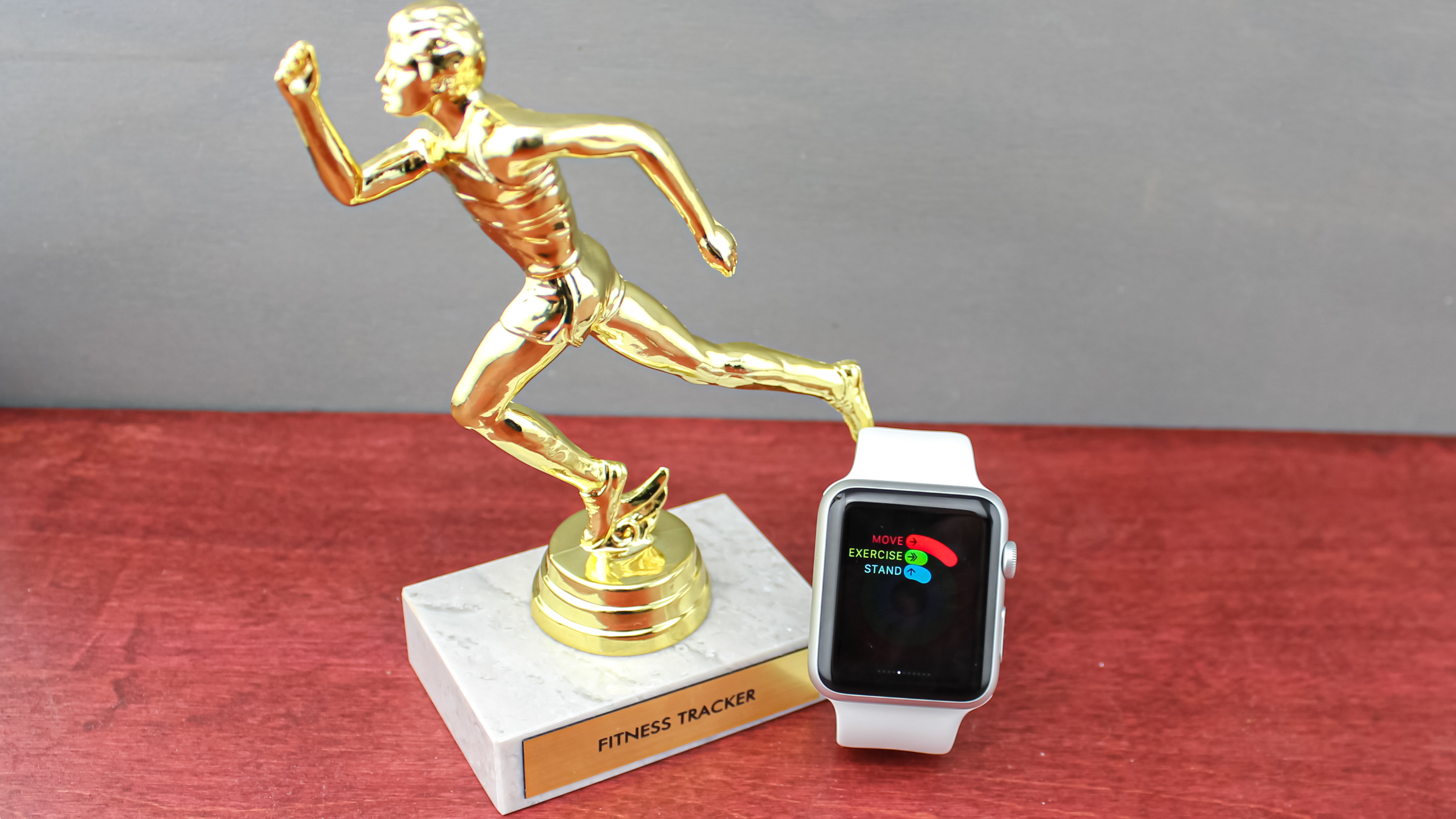
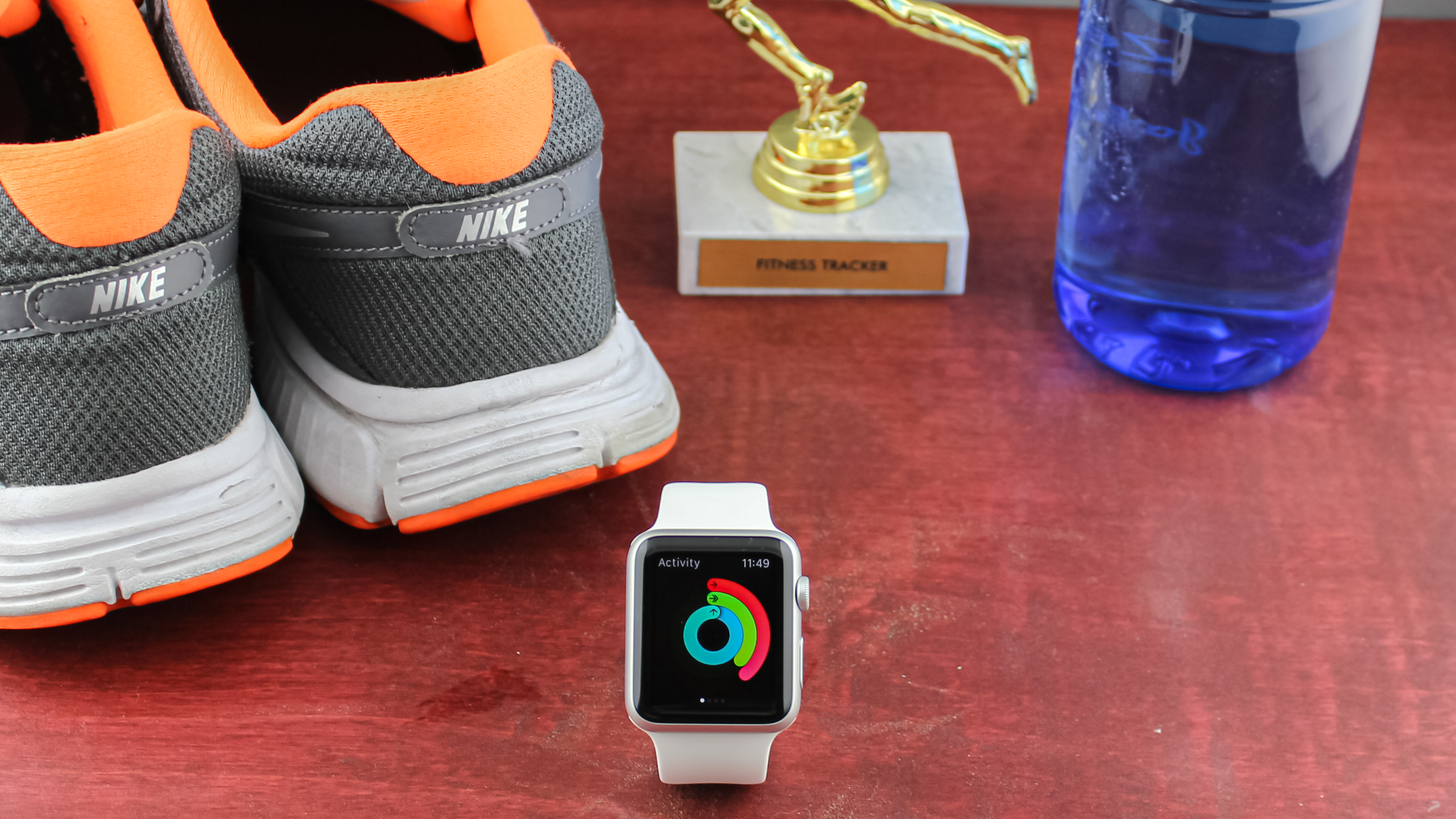
"It's far too basic to be considered a rival to a Garmin or Polar device, and for the new user it doesn't have any way of helping you get fitter."
Apple made a point to tout health and fitness tracking in the lead up to the Apple Watch launch – I recall Apple execs Jay Williams and Jay Blahnik taking ABC News behind the scenes at its secret lab. They had employees, all wearing Bane-like breathing masks to record vitals, running on treadmills and doing yoga. Apple was serious about fitness, but the first Watch left us wanting.
“We’re just beginning,” said Williams in that 2015 ABC interview. “The impact on health could be profound.” That comment foreshadowed better fitness tracking in subsequent Apple Watch models. Those masked runners must have kept running in that secret lab.
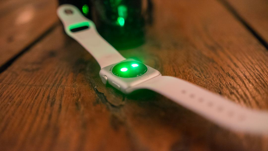
In our tests, we found the Apple Watch 3, with GPS built-in, to offer accurate distance readings on runs in which we also used a calibrated Garmin running watch. Likewise, the heart rate monitor became more precise in the Apple Watch 4 and 5 releases.
Loud noise alerts and menstrual cycle tracking are some of the newest additions along with the aforementioned low/high heart-rate notifications, ECG and Afib alerts, and fall detection. Apple’s software can also take into account if you’re using a wheelchair – we don’t see this level of commitment to accessibility on many non-bespoke watches. Apple has come a long way since the original Watch, which, remember, wasn’t technically waterproof and lacked GPS entirely.

Wrap-up: we gave it 3 1/2 stars – and got it right
"It's a time-telling and time-saving convenience, though one that still requires a nearby iPhone and a hefty sum to buy."
The first Apple Watch held a lot of promise and, at the time, was considered the best smartwatch available. But, after much deliberation, we gave it 3 1/2 stars out of 5. Looking back five years later, that was the right score.
It was certainly a four-star idea, but we can’t review ‘promise’ or the concept of something that’s bound to be great in the long run. I gave the Samsung Galaxy Fold the same score for this very reason. It’s the best foldable phone I’ve tested and paves the way for a tremendous future. But that’s not what people are going to buy today.
We could tell that the Apple Watch had room to grow, and it’s done just that. The Apple Watch 3 price drop puts it at an obtainable price for most people with all of the core features you’d want, while the Apple Watch 5 gives early adopters more perks that make it a four-star innovation.
- Our one-year retrospective: IRL: The 10 Apple Watch apps I use every single day
