Bang & Olufsen’s VP of Design talks about TVs and how he helped develop the Apple PowerBook
Gavin Ivester knows that iconic designs set the tone for unforgettable products
Bang & Olufsen holds design as one of its hallmark pillars when it comes to any of its products. The company’s signature approach to how its products look and feel has pushed it above and beyond what other competitors offer, and it’s something that will continue to evolve with future products.
TechRadar recently chatted with Gavin Ivester, Vice President of Design at Bang & Olufsen. Ivester is a design expert with an extensive portfolio in creative and design and has worked with global brands like Apple and Nike, as well as consulted for famous individuals like Bon Jovi.
He’s a student of design and architecture. He’s also a fan of the late Zaha Hadid’s work as well as Frank Gehry who took advantage of emerging computer-driven construction capabilities to create a whole new form language for buildings.
Here are his thoughts on starting with Apple and why design holds such an important role in Bang & Olufsen’s product DNA.
Working with Apple on the first ever PowerBook
That first PowerBook was a challenging journey that, for me, started a year or two before as a young Apple designer exploring future forms of mobile computing devices.
One day I was called to a meeting with John Scully, our CEO, along with Jon Sedmak, an engineering project leader. It was a short meeting: John told us that by that time the next year, the personal computer market was projected to be 30% laptops, a huge jump.
There was no Apple laptop yet and creating one would easily take more than a year with normal resources and processes. We calculated how many millions of dollars per day 30% of Apple’s business was worth— it was a big number. So we were able to get all the resources we needed, and project TIM was born— taken from ‘Time to Market’.
Get daily insight, inspiration and deals in your inbox
Sign up for breaking news, reviews, opinion, top tech deals, and more.
There was a huge challenge built in - using the Mac operating system meant using the desktop metaphor on-screen and required a mouse. In addition to getting something great out quickly, we had to figure out how to solve the mouse problem. Before that first Powerbook, there had never been a laptop with the keyboard pushed toward the back of the machine— they were always right along the front edge, like a typewriter.
The ergonomic goal was to get that front edge to be as thin as possible, for comfort, assuming you would use the laptop on a desk. The breakthrough came from a system integration engineer named Jonathan Krakower, who proposed we push the keyboard back, and then put the battery in one of the now-empty front corners, and the disc drive in the other corner.
That left a space in the middle for some kind of cursor control, and trackballs were the best solution at that moment. That gave us our potential solution to the mouse problem, but no one knew whether real people would be able to use such a setup or if they would like it. Additionally, this setup created a large, funny-looking (at the time) space we were now featuring as a palm rest instead of slimming down that front edge.
My challenge was then to design options to bring that layout idea to life as a product, prototype them, test them with real users, and design better ones until we either had a final design or proved it would never work.
It took months of design and redesign, quite a few one-off working prototypes with hidden cables hanging out the back connecting them to other computers and loads of videotaped user sessions to refine it down to the first Macintosh PowerBook 170 and 140. It was a thrilling journey.
With that first PowerBook, we changed the basic layout of almost all laptops from that point forward. Jon Krakower’s oddball, brilliant idea and a load of design exploration, refinement and testing made it possible. Even today the basic ergonomics and layout of every MacBook Pro goes back to that starting point.
Bang & Olufsen’s iconic designs
Bang & Olufsen design is legendary, and the company has always been on my radar as one of the great design brands. It feels incredible to be here. It’s a dream job not only because of that legacy, but also because the role engages everything I’ve learned from the technical side and usability at Apple, to the lifestyle and business side in footwear. It’s technology, but that’s not why customers love the brand. We need to strike the right emotional tone while elevating sound, design and craftsmanship on every product.
If you start the design process with clarity of purpose, it’s a reasonable goal. It’s similar to the thought process behind extremely high-performance automotive design, but for us it’s about acoustic performance— our products should give you goosebumps when they play.
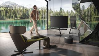
When you finish products with extra care toward fine details and craftsmanship, you wind up with something that really stands apart. Taken together, that’s our definition of luxury. So, before we design anything, we always start with the sound performance we want, along with insights about how the product will be used. That’s how we started the Beovision Harmony project: we set out to create the best-sounding TV ever. Performance that can handle anything.
The built-in speakers on TVs are typically tuned to do well with the frequencies of human voices, so you can hear dialogue. That’s important, but the sound content of TV and film has become better and better over time. There’s a lot of excitement missed in many movies unless the higher and lower frequencies— especially the lower frequencies— are strong. Yet if you overdo it on the highs and lows, you lose some dialogue. You need both., and that’s what we designed into Beovision Harmony - sound that puts you in the scene.
We gather insights from customers and partners about the experience of living with our products every day, and we realized we’ve become used to much larger screens. But when the TV is off, it can be visually disruptive to a beautiful interior design.
Harmony’s screen diminishes when you’re not watching by folding into a smaller form when not in use. The speakers pivot inward as the screen sinks down toward the floor. It’s a magical, synchronized movement that has to be seen. The speakers transform from a very wide rectangle for cinematic sound, to a narrower, taller shape that hides most of the TV screen in its lowered position. In the down position, a margin of the screen is left exposed, and you can still use Harmony as a powerful music system. The exposed edges of the TV screen are there to show you what you’re listening to.
Each size of Harmony speaker section is as wide as the screen. On a 65” or 77” TV, that is very wide, and yet on the aluminum and wood speaker grille, the hundred or so gaps between the aluminum and wood slats are just a few millimeters. They must be perfectly consistent.
Craftsmanship is one of the pillars of Bang & Olufsen, and it’s a key part of the Beovision Harmony story. Our aluminum factory in Denmark, where we make key parts of Beovision Harmony, is one of the secrets behind the longevity of our products. We’re the only company in the world that knows how to make some of the things we can create there and the level of finish on the parts is unparalleled.
It’s an incredibly powerful design enabler— when you create a new way of making something, you find a path to design something truly new.
TechRadar would like to thank Gavin Ivester for sharing his thoughts and experiences and look forward to the innovation his team brings in future products.
Abbas has been living and breathing tech before phones became smart or clouds started storing data. It all started when he got his very first computer- the Sinclair ZX Spectrum. From computers to mobile phones and watches, Abbas is always interested in tech that is smarter and smaller because he believes that tech shouldn’t be something that gets added to your life- it should be a part of your life.