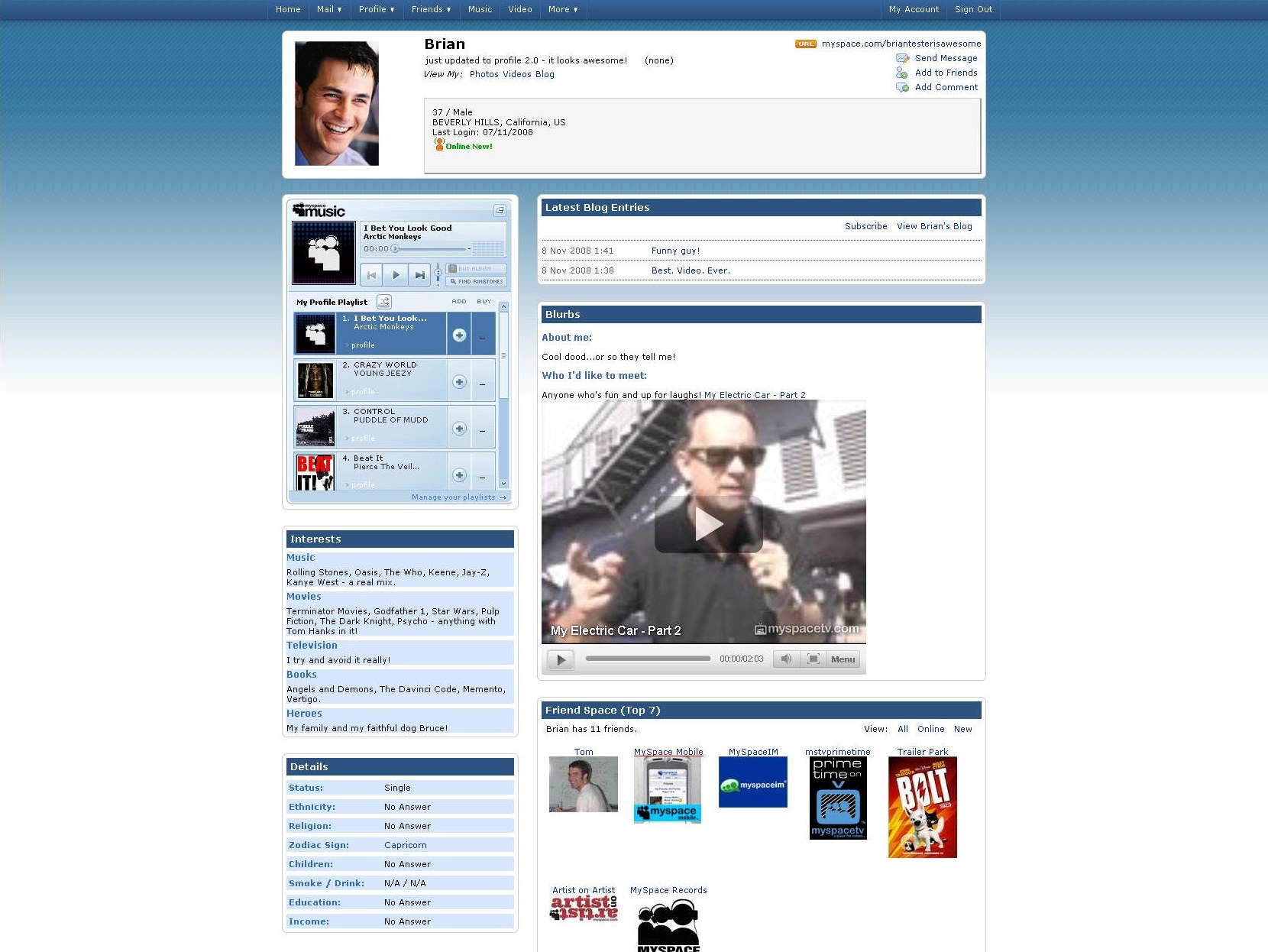
MySpace redesign launches with a whimper
Company introduces drag-and-drop features, everyone yawns

Sometimes controversy is a good thing. When Facebook announced its re-design earlier this year, hardcore users of the site feared change and campaigned for the old look to be brought back, while folks up and down the country argued about which version was better.
A lot of people threatened to stop using it, but nobody actually did. In fact, the publicity meant that more people logged on than ever before.
MySpace has decided not to court controversy and is drip feeding its new redesign to the public. And not only that, anything the website changes, users of the site can opt not to go with the new look. Talk about sitting on the fence.
Drag and drop
The changes to the site so far are less than revolutionary. There's a drag-and-drop feature, where you can move parts of your page round to your taste.
You can also divide information up and dish it out to certain groups of friends. So, if you want your best mates to know about your all-night bender, you can do it, safe in the knowledge that your workmates won't get the feed. Okay, forgetting our cynicism for a second, TechRadar kind of likes this 'friend exclusion' idea.
Lastly, there are now 50 'skins' to choose from to make your MySpace page really your space.
Get daily insight, inspiration and deals in your inbox
Sign up for breaking news, reviews, opinion, top tech deals, and more.
Considering that third-party sites have been offering a similar thing for free for years, MySpace is hardly doing anything ground-breaking with its gradual – and let's face it, long-needed – redesign.
Marc Chacksfield is the Editor In Chief, Shortlist.com at DC Thomson. He started out life as a movie writer for numerous (now defunct) magazines and soon found himself online - editing a gaggle of gadget sites, including TechRadar, Digital Camera World and Tom's Guide UK. At Shortlist you'll find him mostly writing about movies and tech, so no change there then.
