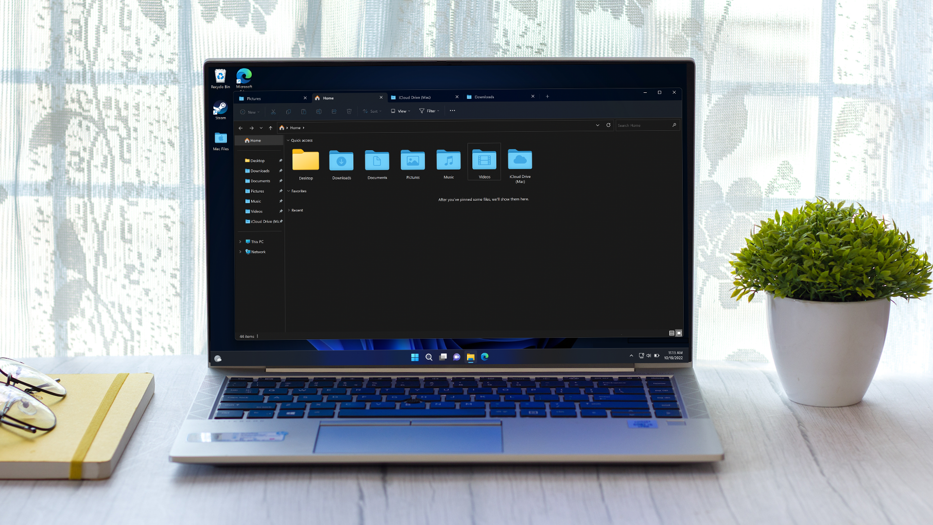
Can a new-look Windows 11 make more people love it?
Not if bloat gets in the way with purported major revamp of File Explorer

A fresh leak suggests Windows 11 is set for a major change to its appearance with a huge revamp of File Explorer, the core element of the operating system (where you deal with the nuts-and-bolts of folders and files). So, might this help more folks rush to upgrade (or adopt) Windows 11? We’ll come back to that question shortly, but first off, let’s look at the spillage itself.
FireCube on Twitter, a developer and leaker, posted details of the purported File Explorer redesign complete with illustrative screenshots (as flagged up by Windows Central). Note that these grabs are just mock-ups of what the UI could look like based on hidden code unearthed in recent Windows 11 preview builds, and as such they’re filled with placeholders (and are very rough in general).
WIP File Explorer homepage UI reconstruction by Microsoft. It includes the upcoming "Recommended" Items.Everything is clearly very WIP hence why Vive id doesn't workNote: Image is placeholder, text is placeholder except for "Danya edited this"#Windows11 #FluentDesign pic.twitter.com/ENvkg8H8KmJanuary 9, 2023
We’re told that File Explorer will be graced with a home page plus details pane that will contain a bunch of extra info, such as ‘Insights’, ‘Recommendations’, ‘Activities’, ‘Properties’, ‘Related files’, ‘Conversations’ and ‘Sharing status’.
So, for example, the latter will let you know if a document is shared, and if another user has recently edited the doc (as is shown in the grabs provided).
As Windows Central further points out, the overall design of File Explorer will also be modernized (to match the header, which has already been given a modern design). Furthermore, our sister site’s sources say that the revamped File Explorer aims to be more touchscreen friendly, making use of bigger hitboxes (areas where clicks, or rather touches, register) and a generally simpler and cleaner UI.
Analysis: Please don’t bloat File Explorer…
This could just be exploratory work to look at potential redesign elements that never see the light of day, of course. Just because code is hanging about in the background of a preview build doesn’t mean it’ll ever come to anything. First off, we’ll have to actually see the redesign appear in preview, and even then, based on feedback it may well be changed or tweaked considerably.
In short, let’s not get ahead of ourselves, but it certainly makes sense that Microsoft needs to bring File Explorer in line with the modern Windows 11 look, particularly after the header has already been changed, so now we’re left with a kind of hybrid of modern and legacy design – not a very satisfying situation. (But hardly a rarity in Windows 11, of course).
Get daily insight, inspiration and deals in your inbox
Sign up for breaking news, reviews, opinion, top tech deals, and more.
It seems that part of Microsoft’s aim here is to provide a more tightly-knitted bond between Windows 11 and Microsoft 365, with that example of the status of shared files – and updates when other users edit them – underlining this.
There could be many benefits to this new design, most obviously in the overall coherence and integration with the rest of Windows 11 in terms of the modern look, and also on the productivity front. This could put a lot more info right at the fingertips of users, and that’s something folks may well appreciate.
This apparent direction comes with equally obvious perils, though. Most notably the danger of all the whistles and bells mentioned above pushing File Explorer towards becoming a source of information overload. Bloated panels are most certainly not what we need, but there’ll hopefully be options to turn off features (this was true with the recommendations for websites in the Start menu which were in testing, but ultimately got scrapped, to pick out a recent example).
Microsoft clearly needs to make moves to help coax people to adopt Windows 11, and as long as the company treads carefully enough here bloat-wise, there’s no reason why an all-new File Explorer couldn’t prove a useful boon and encouragement on this front.
It's a good bet that if the outlined plan proceeds – or something similar – we’ll see the results this year. File Explorer has already benefited from some considerable changes, including a big one with the introduction of tabs (which work just like browser tabs) at the tail end of last year.
Darren is a freelancer writing news and features for TechRadar (and occasionally T3) across a broad range of computing topics including CPUs, GPUs, various other hardware, VPNs, antivirus and more. He has written about tech for the best part of three decades, and writes books in his spare time (his debut novel - 'I Know What You Did Last Supper' - was published by Hachette UK in 2013).