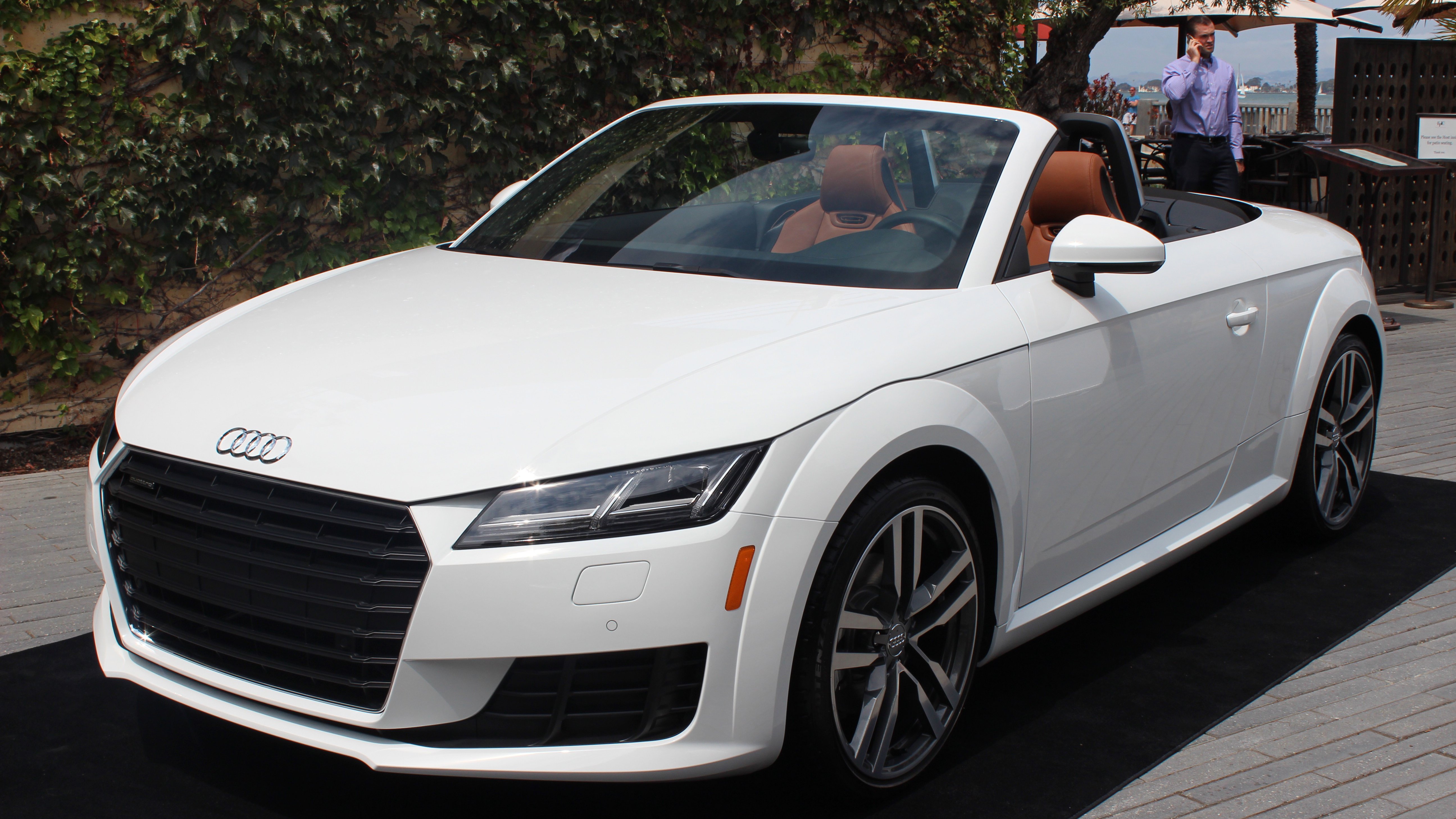
Audi's new all-digital cockpit kicks gauges to the curb
Testing Audi's digital dashboard of the future

Audi has plenty of experience when it comes to in-dash infotainment systems. Its Multi Media Interface (MMI) platform has been a core feature of its automobiles for over a decade. But enter the 2016 Audi TT and TTS sports cars, and the German car maker has radically rethought infotainment in a way that lets you focus on driving and not the screen situated inches from your eyes.
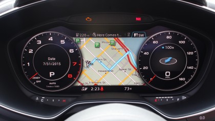
Out are traditional speed gauge and fuel level indicator and in is a massive digital screen located smack in the center of the dashboard. Called the virtual cockpit, it's a single, unified interface for everything from basic driver information to directions, music playback, and more.
In-dash infotainment systems aren't new, and neither are attempts to digitize instrument clusters. But what makes Audi's virtual cockpit unique is how it combines the two into a single interface that is attractive, easy to read and always viewable while driving.
Audi describes this approach as "driver-centric," and it makes a lot of sense. Instead of having to look over at your radio to see what song is playing or glancing at your navigation screen for directions, you can simply glance down at the instrument panel. As a result, you have fewer places to look and, ideally, fewer things to pull your attention away from the road.

Meet the Audi Virtual Cockpit
I got to check out the 2016 TT and TTS' virtual cockpit at a recent press event in San Francisco. While Audi wouldn't let me drive the nearly $50,000 cars myself, I got a walk through of the new system firsthand.
The cockpit combines the functions of a traditional driver instrument panel and Audi's MMI systems. It's all centered around a 12.3-inch, 1,440 x 540 display located behind the steering wheel.
A traditional-looking speedometer lives on the right side of the screen and the tachometer (which reads RPM) rests on the opposite left side. It looks like a standard dashboard, but instead of dancing needles, the display simulates everything you'd normally see with digital doohickeys. The space between the two digital gauges also changes to show maps, what song is playing on the radio or current weather conditions.
Get daily insight, inspiration and deals in your inbox
Sign up for breaking news, reviews, opinion, top tech deals, and more.
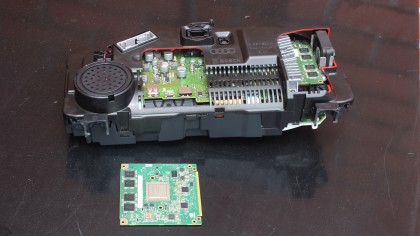
At the heart of the virtual cockpit is a Nvidia Tegra 3 system-on-a-chip, the world's first quad-core mobile processor. This chip was designed for performance and rendering video at up to 60 frames per second and in 24-bit color.
Thanks to the chip, the cockpit screen is fast and responsive. The Tegra 3's processing power even allows for some unique touches, such as a 3D map view that lets you see the real-world contour of the roadway and landscape ahead of you.
Audi isn't the first to use Nvidia's Tegra 3 chip, however. The Tesla Model S, for instance, utilizes a similar chipset to drive a massive 17-inch touchscreen that's as responsive as a smartphone.

Crisp screen, clean interface
The experience of actually using the virtual cockpit all starts with the screen, and it's a good one. It's bright and crisp with nice color and minimal glare. I sat in the TT convertible outside with the top down in the middle of the day, and I could easily read the display without any difficulty. It was a mostly cloudy day with filtered sunlight, so I can't say for certain how easy it would be to read in full, direct sun.
Though the screen isn't even approaching HD quality with its 1,440 x 540 resolution, one of Audi's design goals is to make the screen sharp enough that you can't discern individual pixels from a normal viewing distance. Thanks to antialiasing tricks and from the driver's seat, it actually looks plenty sharp. However, peeking at it upclose will let you pick out individual pixels.
The virtual cockpit's display isn't a touchscreen, which makes sense given its position behind the wheel. After all, it'd be awkward to reach your hand around and through the wheel to get at touch gestures and control the vehicle at the same time.
Not all gauges appear onscreen, however. The fuel and temperature gauges are integrated into two smaller slits below the main display and utilize a more traditional light-up display. The emergency indicators also aren't part of the main virtual cockpit display, instead sitting above it. This is a good design decision, and ensures you won't be completely in the dark, information-wise, should your virtual cockpit screen fail for some reason.

High-tech physical controls
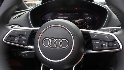
Instead of touch, the virtual cockpit's control mechanisms are more traditional knobs and buttons used to navigate through the interface, as well as voice search. Audi placed controls on the steering wheel for easy access while driving, but it also included a second set of controls on the center console for someone in the passenger seat to use, too.
The whole setup actually has fewer buttons than Audi's previous MMI incarnations, which should make it much easier to find the button you want without having to avert your eyes from the road.