The Tesla S has the most insane in-car touchscreen multimedia system ever
Massive 17-inch touchscreen revolutionises in-car tech but also raises safety concerns
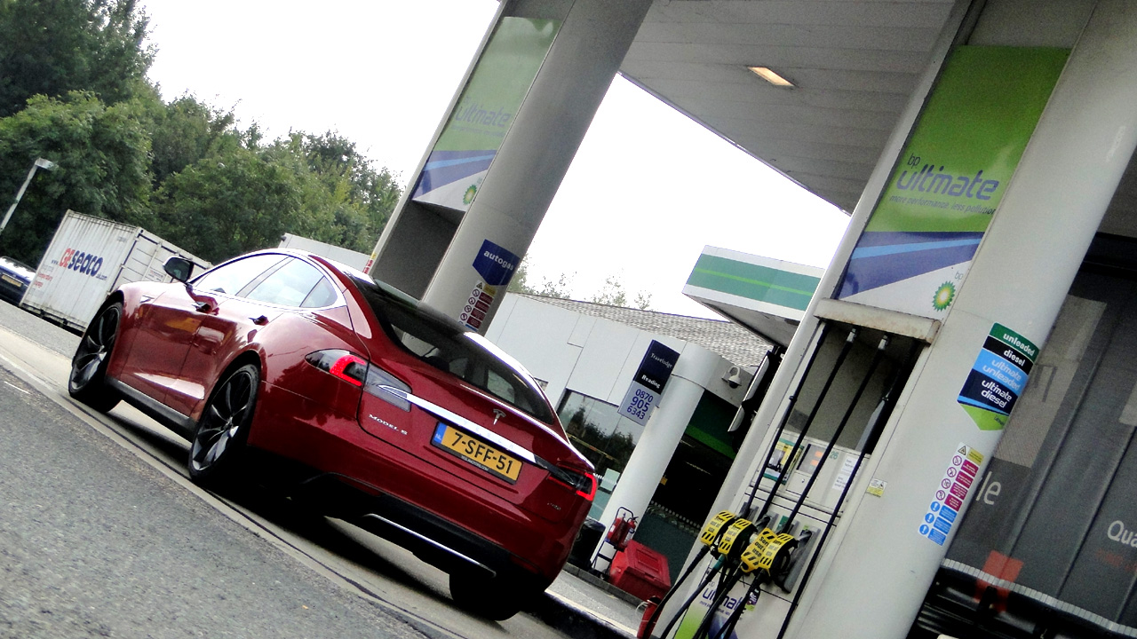
Tesla's new Model S has the best in-car multimedia system yet. There, we've said it.
Centred around a preposterously huge 17-inch capacitive touchscreen, the Model S's bonkers in-car system is far from perfect. On paper, it's also far from being the Model S's main attraction, what with its world-beating 310-mile pure-electric range.
But TechRadar was lucky enough to be the first to get its hands on the full European-spec version of Tesla's all-electric luxury saloon. And we've discovered that the Model's S's infotainment is the most surprising aspect of a car that defies expectations on several levels.
After all, electric cars have had a frosty reception in many markets. Here in the UK, around 2,000 electric cars were sold in 2012. Over 2,000,000 new cars found homes last year, putting electric car sales at just 0.1 per cent of the overall UK market.
Yet the Model S turns out to be much more usable as real-world transport than most would expect from an electric vehicle as well as a car that has us rethinking in-car interfaces.
Titanic touchscreen
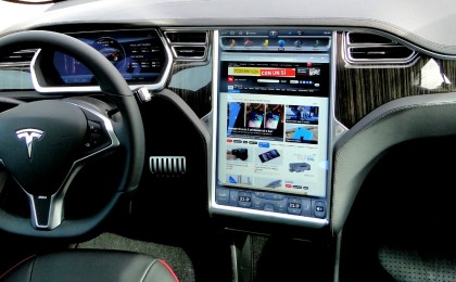
First, let's deal with the elephant in this article or least the touchscreen that seems to be suffering from elephantitus. We won't deny it, when we first saw the Tesla's huge 17-inch touchscreen, it looked ridiculous.
It's almost as if Tesla took a blasé bigger-is-better approach and simply slapped a large PC monitor into the dash. If anything, the incongruity of finding such a large screen in-car makes it look even bigger than 17 inches. It's massive.
Get daily insight, inspiration and deals in your inbox
Sign up for breaking news, reviews, opinion, top tech deals, and more.
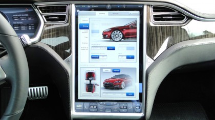
Then there's the question of how practical a capacitive touchscreen is in an automotive context. There's a school of thought in the industry that says capacitive screens are a bit sensitive, a bit flighty for cars. A nice deliberate resistive screen that needs a good, hard prod is what you need.
Then there are issues like, ergonomics, tactility and physical feedback. At the very least, the jury is out on touch. Some major manufacturers like Audi and BMW prefer wheel-based inputs while others, including VW, go with touchscreens.
However, even the touchscreen camp has kept the functionality on-screen strictly limited. Conventional physical controls for a wide range of functionality typically remain.
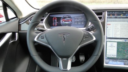
But not in the Model S. Tesla has ditched almost every physical button and control. There's a steering wheel with some short-cut keys, buttons for the windows, a hazard light switch and a button to release the glove box lid. And that's it.
Yes, really. Literally everything else from the climate control to the suspension settings and even the sunroof is controlled via virtual menus on the touchscreen. Again, we have no problem admitting that, on paper, this sounds like a very bad idea.
New approach to navigation
But here's the thing. It actually works. Probably the best aspect of the system is the navigation functionality. In-car navigation has long worked well for simply getting from point A to point B. We're talking turn-by-turn navigation.
Some systems are more accurate than others. Some have more detailed internet-based traffic data or points-of-interest databases than others. But most are pretty good at getting places.
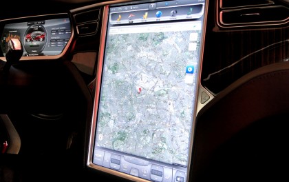
Provided, that is, you know where you actually want to go. What these systems have so far been rubbish at is allowing you to get a feel for where you are and what's around you, to explore. The bigger picture, so to speak.
The Model S is absolutely awesome at that. That's because is combines the best of both worlds. On the one hand, you have traditional turn-by-turn navigation on the large LCD screen that replaces the driver's instruments.
But you also get a huge, highly detailed rendition of Google Maps painted across the main touchscreen. Just like Google Maps on a smartphone or tablet, there's multi-touch support for swiping around the map, zooming in and out and all the rest. After driving the Model S, you feel like you're flying blind in other cars.
Intriguing interface
The rest of the interface defies convention, too. Thanks to the big screen, menus for things like hands-free telephony are big, bold and clear.
What's really impressive here is just how quickly you become comfortable with the interface. Within five minutes of syncing an iPhone, we reckon you'll find making calls in a Model S more effortless than any other car.
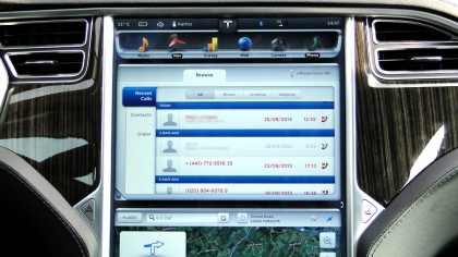
The multimedia playback is just as good, playing back tunes from your handset and mass storage devices or streaming music via TuneIn Radio and thousands of internet radio stations.
Tesla has done a good job offering plenty of configurability, too. You have the choice of dedicating the entire display to one main function, like mapping.
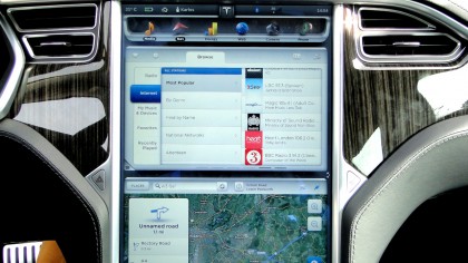
Or you can split it vertically and even swap the functionality top to bottom. So you can have Google maps up top and media playback in the bottom half. It's up to you.
Motorway browsing
The final major piece of the puzzle is the web browser. It's where the Model S's infotainment is sometimes at its most revelatory, but also reveals some major shortcomings and safety concerns.
First up, the browser does what it says on the tin. It won't play embedded video. But it will do most things. In our experience, most functionality that depends on Javascript or HTML5 works.
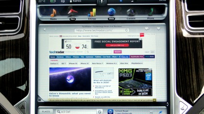
Thanks to that big old screen, you get a proper desktop browsing experience, too. Which is where the good and the bad really begin to kick in.
You can, for example, load up your web mail and stick that in the top half of the display. It really is possible to drive along, refreshing the page for new emails. Tesla doesn't lock out any functionality on the move.
It's something of a revelation to have that kind of functionality so accessible and usable on the move for the very first time. But the question is, should you be able to do this at all?
There's a big debate going on right now regards driver distraction as a function of in-car tech and we fear Tesla may find itself on the wrong side of it.
While we prefer to make our own choices as responsible adults, the safety lobby will no doubt take a different view. At the very least, it would be advisable for Tesla to provide a reduced functionality driving mode that can be optionally enabled.
Patchy performance
It's also worth mentioning that system performance is sometimes patchy. Scrolling response in the web browser can be pretty awful. Google Maps rendering and response to swipes and scrolling can be very sluggish, too.
In truth, the Model S needs a faster processor. But that doesn't stop the system overall being a true revelation. It's totally transformed our attitude towards in-car touch and virtual controls. They may not be the only solution for the future. But the Model S proves in-car touschreens aren't just viable. They're highly desirable.
- 1
- 2
Current page: Tesla Model S: Multimedia system
Next Page Tesla Model S: Driving, range and chargingTechnology and cars. Increasingly the twain shall meet. Which is handy, because Jeremy (Twitter) is addicted to both. Long-time tech journalist, former editor of iCar magazine and incumbent car guru for T3 magazine, Jeremy reckons in-car technology is about to go thermonuclear. No, not exploding cars. That would be silly. And dangerous. But rather an explosive period of unprecedented innovation. Enjoy the ride.