10 things you need to know about OS X 10.10 Yosemite
A new look, some fantastic new features, but no sign of Siri
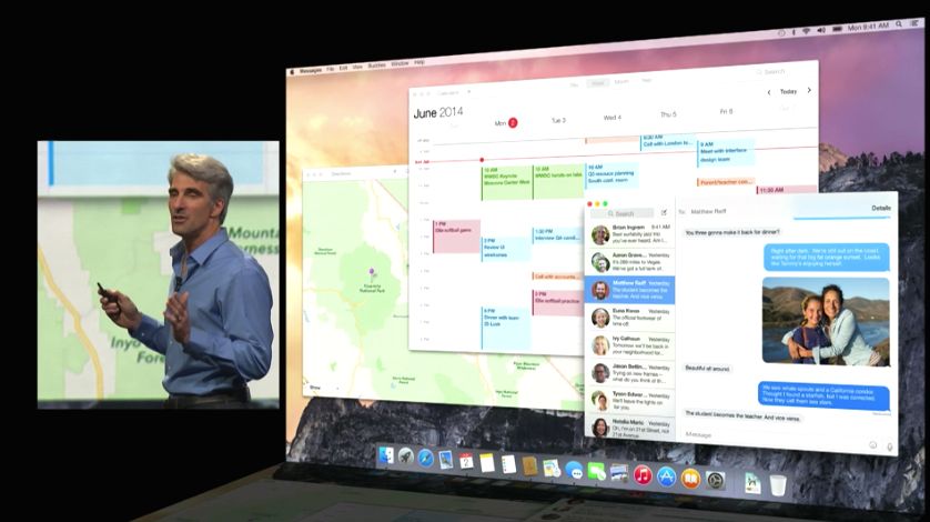
The new OS X, OS X 10.10, will be called Yosemite (sadly it's named after the place rather than the Looney Tunes cartoon character). There's a brand new interface, some impressive new features and the odd prospect of Macs becoming rather large and expensive iPhone accessories. Here are the 10 biggest things about OS X Yosemite.
1. It's got a brand new interface
Yosemite has new typography, a flatter design and lots of translucency. Some observers have rightly pointed out a resemblance to iOS 7; other less kind observers have equally rightly pointed out the similarities to Windows Vista. The dock looks like a single block of frosted glass, the icons are flatter and the title bars are translucent like Safari on iOS 7. Translucency is used throughout to emphasize content; for example, in messages the messages themselves are on solid backgrounds but the message list is translucent.
There's good news for pro app users too: there's a new dark mode that turns the menu bar and other elements dark grey to match the darker interface of apps such as Aperture and Logic Pro X.
2. It's got Windows Vista's Sidebar
Apple calls it Notification Center but we're not fooled: the presence of app widgets in the slide-in panel means it's a 2014 take on the old Windows Sidebar. The Center provides an at-a-glance Today view, just like iOS, and there's a second list of app notifications and other key information.
3. Spotlight does much more
Spotlight looks rather like the excellent Alfred app: instead of popping out of the top right corner of the screen it takes pride of place in the center, providing easy access not just to files but to Wikipedia, your apps, to maps and associated Yelp reviews and any other content you might be interested in. It displays results as inline previews and looks rather nifty.
4. Mail works
"Email works now" isn't much of a boast, but it solves a problem for a lot of OS X users. The revised Mail app focuses on the basics - fast fetching, not hiding sodding messages for no good reason - and also includes a nifty feature called MailDrop. It's designed to prevent email attachments from being bounced, and if you send mail with huge attachments - up to 5GB - to a non-OS X user they'll get a download link instead of a file attachment.
Mail also gets MarkUp, which enables you to scribble on and annotate images you send in messages. It works on PDFs too.
Get daily insight, inspiration and deals in your inbox
Sign up for breaking news, reviews, opinion, top tech deals, and more.
5. Stream smarter
The new Safari promises two additional hours of Netflix before your battery runs out. It also features significantly faster web app performance, and it's been given a redesign too: the interface has been condensed to a single bar. When you click in the address box your favorites appear in an iOS-style grid. There's an iOS-style sharing menu too, and private browsing is now available on a per-window basis instead of putting the entire browser into private mode. Apple also promises easy subscriptions to RSS news feeds, which it ditched after Safari V.6.
Writer, broadcaster, musician and kitchen gadget obsessive Carrie Marshall has been writing about tech since 1998, contributing sage advice and odd opinions to all kinds of magazines and websites as well as writing more than a dozen books. Her memoir, Carrie Kills A Man, is on sale now and her next book, about pop music, is out in 2025. She is the singer in Glaswegian rock band Unquiet Mind.


