iPhoto: the ultimate guide for Mac and iPad
Master iPhoto on OS X and iOS
Using iPhoto for iOS
Get started by importing, organising, and tweaking photos on your iOS device
To make the most of iPhoto on your iPad or iPhone you'll need some photos to play with. There are several ways to get photos onto your iPad or iPhone camera. For starters, you can use the actual device to take the photo, or email yourself a file (save images to your Photo Library by holding your finger down until a menu pops up, letting you choose 'Save Image'.). Or you can use Apple's Photo Stream to keep all your photos in sync across your devices.
Get files
Photo Stream is available whenever you are online, and is the most seamless way of getting files from one device to another. It's part of iCloud, and if you don't already have it switched on, visit Settings > Photo Stream to do so.
Once on, any photo you take is downloaded to all your devices, including your Mac, ready for editing. If you're shooting with a separate camera, look into buying Apple's Camera Connection Kit. This is a dongle that fits into your iPad's docking port and lets you plug in memory cards and USB leads to download images from your camera directly onto your iPad.
The iPad will convert RAW images into editable JPEGs for on-screen work. To get the images onto your Mac just plug in your iPad, run Image Capture and you'll see them all there, ready to go into Aperture, Photoshop, or any other editor you prefer using. Any edited version will be saved alongside them.
Your final option for getting photos onto your iPad is to sync via iTunes. To do this, make sure your iPad or iPhone is connected, select it in iTunes, and go to the Photos tab. Here you can sync with iPhoto or a folder on your hard drive, usually Pictures, and copy files into there. When you sync, files will be updated on both sides.
If you're syncing with iPhoto you can choose selected albums, Events or Faces to sync. On the iPad or iPhone iPhoto (and the default Photos app) arranges your snaps into Albums, Events and Places. Any pictures taken on your iPad or iPhone are saved in an album called 'Camera Roll'. Anything from iTunes takes its Folder name or iPhoto album name as its album title. Anything imported via the Camera Connection Kit is placed under the Events tab, labelled by a photo's date. Once your images are imported to your iPad they automatically appear in iPhoto.
Get daily insight, inspiration and deals in your inbox
Sign up for breaking news, reviews, opinion, top tech deals, and more.
Get organised
To sort and get rid of photos, double-tap on one, and iPhoto selects it with similar shots, giving you a larger preview in the main window. Swipe to switch between them. Or, maybe you want to compare shots. Tap and hold photos to add them to a group.
When you find images that you want to work on, tap the rosette icon at the bottom of the screen to mark them as a Favorite. Or, if you find a dud, tap the cross icon. This doesn't delete the file, it merely hides it from view.
To bring it back, tap the photo count above the album grid and choose 'Hidden Photos', then select the image and remove the mark of shame by tapping the cross again. On the iPhone screen, you'll need to flip the device into landscape mode to see this menu.
Editing in iPhoto
Powerful editing means you might never need iPhoto on your Mac again
Crop & Straighten tool
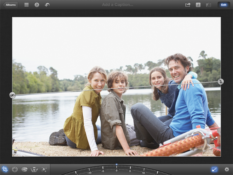
Even with the steadiest hands, most photos don't come out entirely straight, or completely focused on the subject. This tool fixes that.
Drag left and right on the dial at the bottom of the screen to rotate the image, using the popup grid to gauge the horizon. If iPhoto automatically detects one, it'll show you a preview and offer a button to tap to do this automatically. To crop, tap the gear icon to set a suitable aspect ratio for the finished image, then drag the photo with your finger or pinch to zoom in and out.
Colour tool
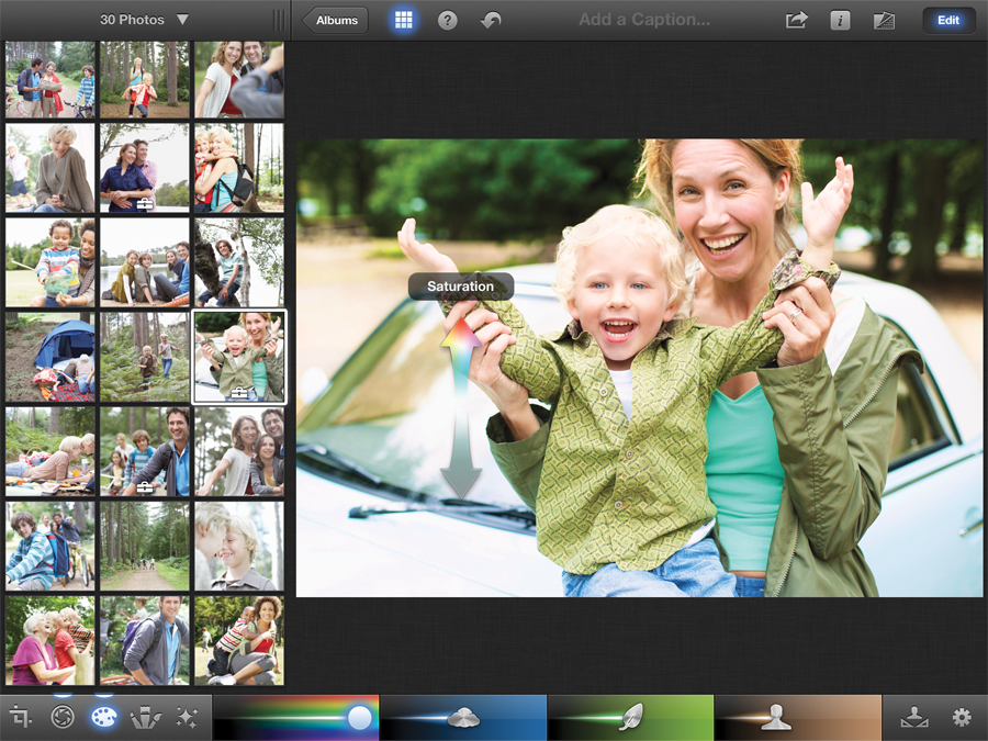
Washed-out colours suck the life out of a photo, but these tools will help restore them. Try not to over-compensate and end up with something gaudy, though. Your basic control is Saturation, which pumps up all the colours at once.
However, you can be more specific. The other three bars here focus on blue skies, greenery and skin tones. They're not that fussy though, so anything blue will be deepened by that slider, sky or not. Hold your finger on the image and drag up and down to alter global saturation. If you tap something blue, green or skin coloured, you can also go left and right to tweak that. Tap the gear icon and switch 'Preserve Skin Tones' if people are looking orange.
Exposure tool

Exposure manages the effect of light on your photo, making this arguably the most important option in iPhoto. Tap it and you'll see a bar with five draggable icons. The ones on the sides determine how the darkest and lightest parts of the image should look, adding depth to the image and pulling out detail invisible to the naked eye. Tweak these first.
The one in the middle controls overall brightness. The two on either side move together and control the image's contrast. A little tweaking goes a long way, but if your photo looks washed out, this is the bar that fixes it.
White balance
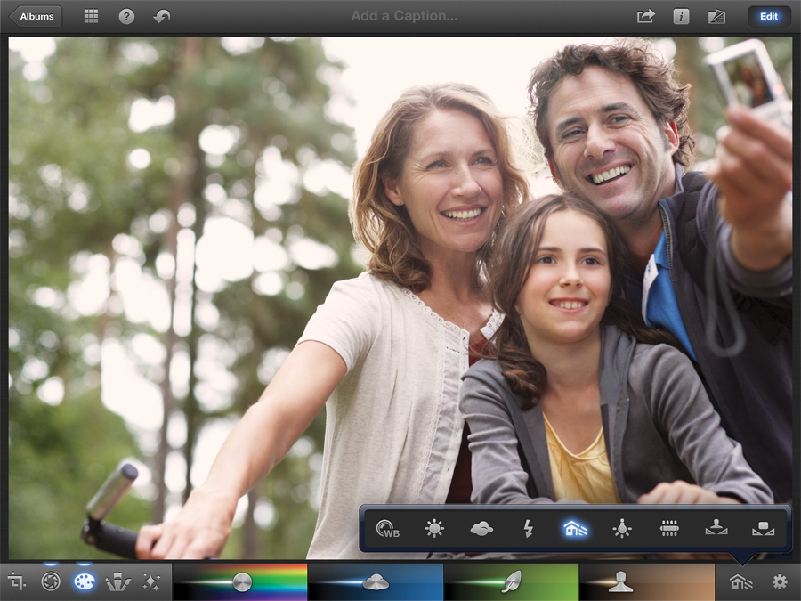
White Balance is how your camera adjusts for the different temperatures and colours of light you might encounter - a flash bulb versus a tungsten light versus the sun. If it's wrong, you'll get a notable colour-cast on your images.
In most cases, leaving this on its default setting will be okay. If not, tap the White Balance button to switch from everything from Sun to Florescent. At the end of the row are Face Balance, which you use to select a face, and Custom, which you can point at any colour to find a setting that works.
Copying/pasting adjustments
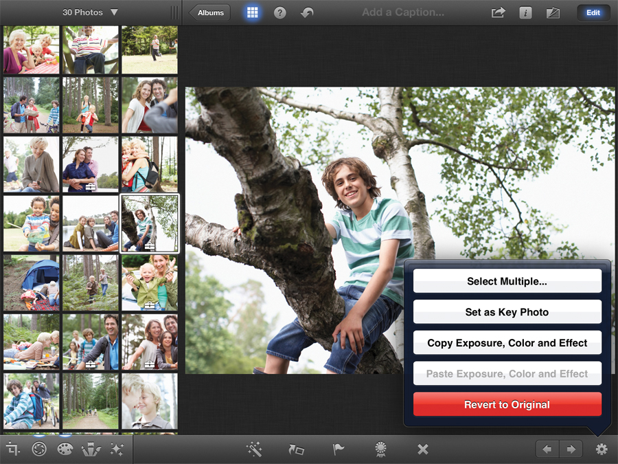
Many images taken at the same time and place will be very similar, and you don't want to have to repeat every edit on every single one of them. Luckily, you don't have to. Tap the gear button, either on the main editor or a specific editing tool, and you can copy the Exposure, Color and Effect settings (all at once or individually). Open a new image, tap the gear again and Paste to apply them. You might still need to do a few extra tweaks, but it'll be much faster - and more consistent - than recreating your tweaks by hand.
Auto-Enhance
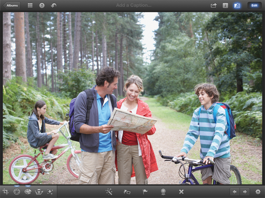
Auto-Enhance does exactly what it sounds like - automatically trying to work out the best brightness, colour and contrast settings for an image without you having to get involved at all. If not, it might still work as a better base for fiddling with iPhoto's other options than the original raw image. In the worst case scenario, if it looks worse or takes the various options too far, simply tap the Undo button from the top bar and start the editing process afresh, the old-fashioned way.
Flagging and favouriting images
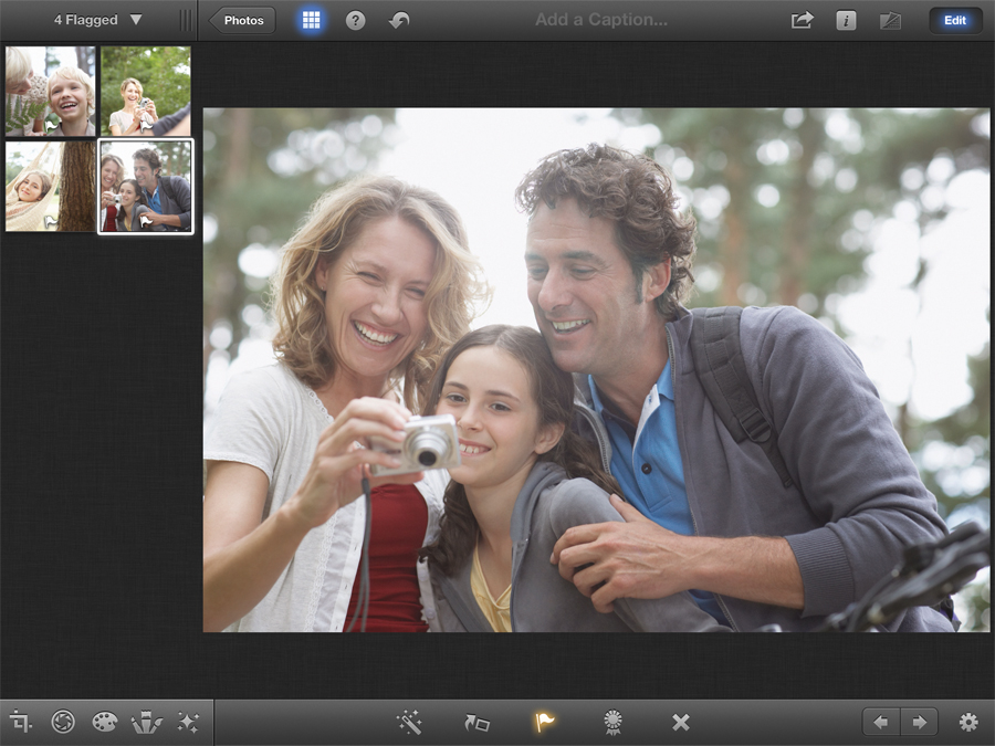
Both these buttons mark images for future reference. Once you use either, an Album is created holding the photos bearing that mark. The best way to work is to treat Flagged images as ones you plan to edit, and Favorites as a collection of pictures you want to show off. This is the only real way you can create a dedicated album without your Mac, even if only temporarily
Brushes in iPhoto
Brushes are a stand-out feature of iPhoto for iOS - here's how they work
Repair
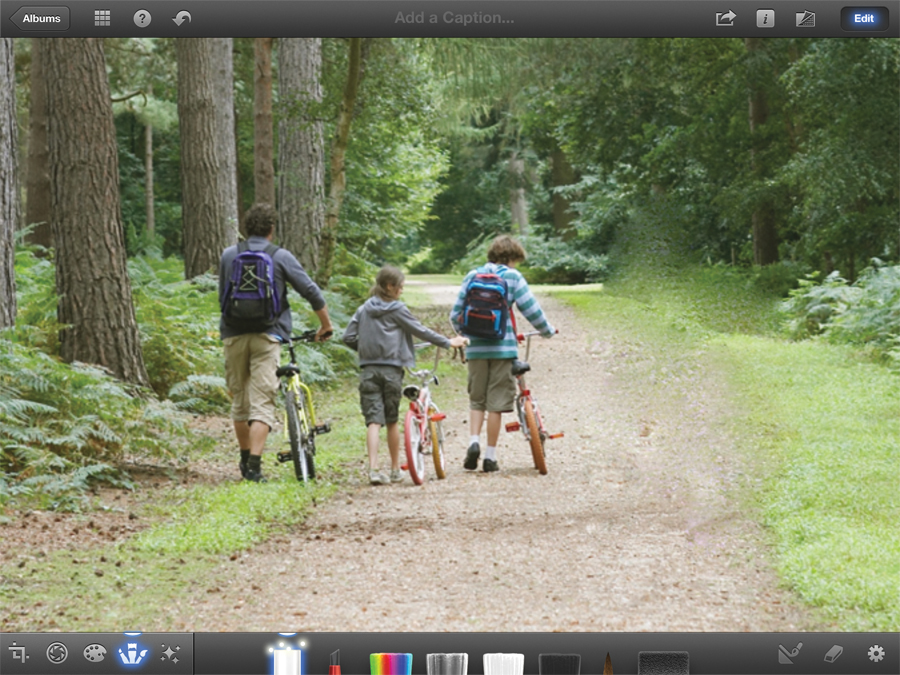
Repair is a clean-up brush, getting rid of splotches, dust and other minor problems with the image. It won't do anything as advanced as removing a tourist from the background, but it's fine on more subtle edits. To use it, zoom into the image and paint over the artefact as carefully as possible. If you can't zap it, you may need to bite the bullet and use the Clone Brush tool in a desktop app like Pixelmator instead.
Red-eye

Red-eye is a common problem with photos taken with a flash - the effect of the light hitting the back of the eyes and creating a sinister demonic look. The Auto-Correct option will try to get rid of it without your intervention, but this brush will sort out any lingering traces. Zoom in on a face and tap it. Either the brush will go to work, or make an "uh-uh" sound and show a shaking circle if it doesn't see anything to fix.
Saturate
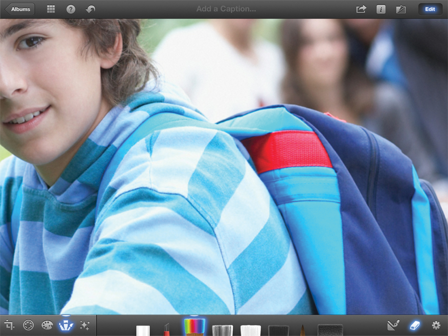
Saturate adds colour to an area. This is useful if the general Saturation controls aren't subtle enough, for instance brightening up a t-shirt without affecting the theme park behind it. However, remember, what looks good in editing can look garish the next day. Take a break and look on a different screen before finalising.
Desaturate
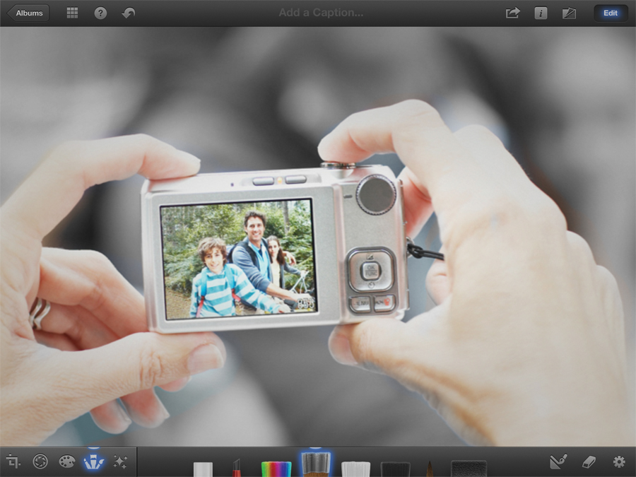
This removes colour to the point of going monochrome. However, if you're looking for a noir look, you won't get the options to filter the colour to create different attitudes, only to tone it down. Desaturate is handy for touching up areas that the general controls took too far.
Sharpen
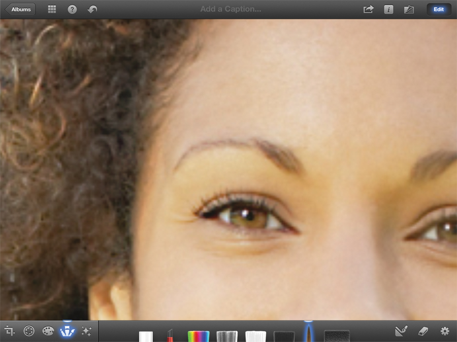
The sharpening brush draws extra definition from the image, which will often come off your camera looking overly soft. Painting sharpening onto an image of people, focus on their eyes over almost anything else. If those are sharp, the rest of the picture looks after itself.
Lighten
The Lighten brush lights up dark parts of the image. Photos conceal detail in its darker regions, and this tool lets you pull some of it back. A light brushing over your subject will help draw them out of the background. The lack of pressure control can make it fiddly to do this neatly though, especially compared to the control you have with tools that have full masking capabilities.
Darken

The same as Lighten, but in reverse. This is used to add shadows back and add definition to creases, folds and anything else that looks flat. It's best saved for very small touch-up work though, and its effects are noticeable (in a bad way) when over-used. Skin, for instance, will usually look mucky. Done lightly, and it's perfect for adding depth and repairing over-exposed scenery.
Soften
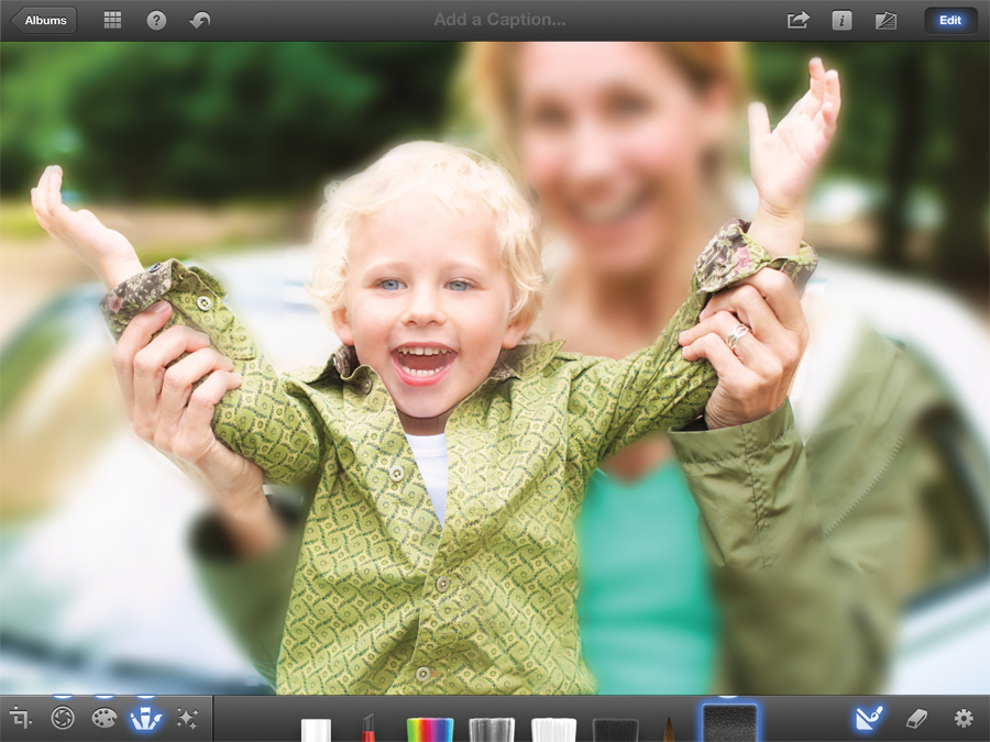
Soften is a blur effect that can be used to highlight an object in sharp focus, cover up glitches, or add a hazy look to all or parts of it (though this is better done with Effects). Even the Low setting is very strong, making this less useful than it might have been, but filling the whole area and painting out the bits that you want to remain sharp is an easy way to make good use of it.
Sharing your photos
Sharing your photos is fun in itself - that's where iCloud comes in

Both the Mac and iOS version of iPhoto offer several ways to share files, though, for some reason, some of these ways are unique to just one platform. With the iPhone/iPad for instance, you can create blog-like online Journals hosted by iCloud, which you can't with the current Mac version. At the same time, it's only with the Mac that you can order physical collections of your photos. Swings and roundabouts.
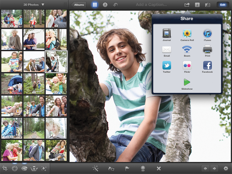
On the iPad, most sharing is done on a picture-by-picture basis from an individual Album, though it is possible to group multiple pictures together and upload/send them somewhere in one go, and tapping the Share button will give you the option to send everything in your current view.
The standard destinations are to a Journal, which we'll get to in a moment, the Camera Roll for easy importing into other image editors and your desktop (as well as your Photo Stream if you have it switched on), an email message, another iOS device via Beaming, Twitter, Flickr, Facebook, an AirPrint enabled printer, or iTunes. If you choose this last one, you'll find your files in a folder in iPhoto's slot of the Apps screen.
Journal is the newest option. Select an image or group of images, tap the Share button, choose the Journal option, and you'll be asked to either create a new one, or add the images to an existing one. If it's new, give it a name.
What makes Journals interesting is that you can combine your images with notes, quotes, maps and other bits of information and lay them out as if using a simple desktop publishing package. They don't have to be shared online, but they can be, with iCloud hosting the finished version and automatically updating it as you add content and make changes. You likely wouldn't use it as a photoblog for professional purposes, but it's the perfect way of keeping friends and family in the loop without going to the hassle of setting up a Wordpress account, and with more flexibility than Facebook or Flickr.
Even if you don't have any interest in publishing your photos online, Journals offer a second handy function - building customisable slideshows for your iPad/iPhone. You can do this from any Album or Event screen, but not being able to move images around makes that problematic. Here, you can include anything, with your choice of music, integrated captions, and a choice of a soundtrack from Apple's plonkity-plonkiest archives or your own music collection.
Unfortunately, while iPhoto does remember your previous settings, you can't specify a preset style and track for each slideshow individually.Subscribe and save

Find out more about MacFormat magazine
>
Over on the Mac, you may not be able to create Journals, but there are plenty of extra options to compensate tucked away in both the Share and Create menus. For starters, while both it and the iOS version can create slideshows, only the Mac version can export them as video files for easy sharing, and it's only there that you can control timing - how long each slide should appear for, and if the whole show should be tied to the length of the music.
You also get more control over transitions, while the iOS version only offers a few specific themes and a Ken Burns floaty effect to liven up your still images. If you prefer your memories a little more physical, return to the Create button and note the Book, Card or Calendar.
To create one, select an Event or Album, then the option you want. Each one begins with a few standard templates. Click on Picture Book for instance and you'll see both the cover, available in a few different colours you can set by clicking on the fabric swatches in the main screen, and a preview of how the book will look inside. Here, it's clean and simple.
Move over to Old World Travel and it takes on a more tactile look, with images scattered and framed more like a scrapbook. You can also opt for a hardback, soft cover, or wire-bound album, each in a selection of sizes and prices. Click the Create button and you get to drill down to individual pages.
You can't simply put things wherever you like, but there are multiple layouts to choose from that should fit whatever you want to do. Some are simply images. Others are importable graphics like maps. The choice is yours on each page, giving you free reign to do things like keep the left-hand pages as diary entries with associated pictures on the right, or simply filling every inch with up to 16 photos in a single go.
For books, you get a certain number of pages as standard, but can add extra (for a price) if you need more space. They're far, far too expensive to sell to other people, but make for extremely handy gifts for family and friends.
To add a photo, simply click on one of the preset photo blocks and select it from the album view on the right. You can also pull in content from other albums and events using the dropdown bar. When you're sure everything is right, and after clicking the Options menu to untick the option marked 'Include Apple logo at the end of book', click Buy Book to hand over the cash and sit patiently for a few days as you wait for it to arrive.
The process is the same for cards and calendars, just with fewer options. Most modern sharing is done digitally though, and both versions of iPhoto have you covered there. Click the Share button in either to bundle up your images for email, Flickr or Facebook groups, or send individual shots out to your Twitter account. This is obviously quicker from the Mac, especially if you're adding captions.
There is one big benefit of doing it from iPhone/iPad though - any Facebook or Flickr comments people leave on the image are available in iPhoto itself. Tap the Info button to read them.
How to create a journal
1. Assemble your photos
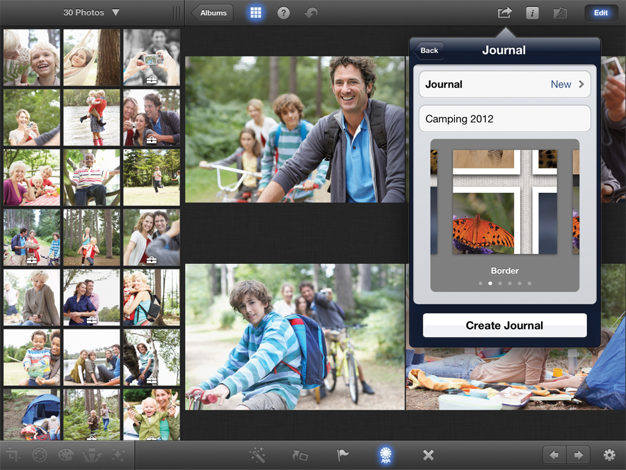
Open an album containing photos you want to journal. Select them, flag the ones you want, or export everything. Tap the Share button. Next, enter a name for your Journal and pick a style by swiping the thumbnail. You can rename it or change the style later.
2. Digital scrapbooking

Your images will be added in a grid form. Hold your finger on an image until it lifts off the background and drag it around. Tap the plus icon to add other elements. Keep your finger down while pressing the arrows by the Page number to move elements between pages.
3. Photos in the Cloud
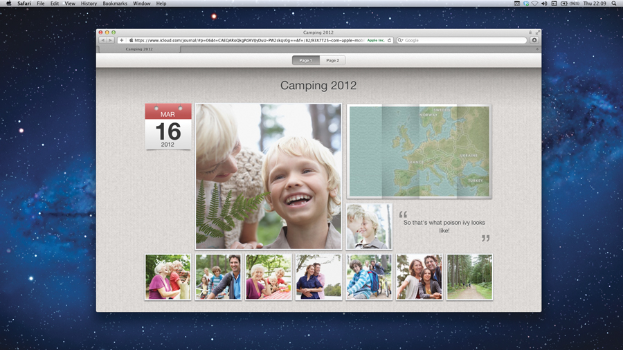
When you're done, tap the Share button. Choose iCloud and your Journal, and any later changes will be pushed to the web. There's also a button to mail links. Or, choose iTunes and find files on the Apps tab that can be sent around or uploaded to your own webspace.

Rod is an independent photographer and photography journalist with more than 30 years' experience. He's previously worked as Head of Testing for Future’s photography magazines, including Digital Camera, N-Photo, PhotoPlus, Professional Photography, Photography Week and Practical Photoshop, and as Reviews Editor on Digital Camera World.