OS X 10.10: what to expect
Mavericks hasn't been with us for long, but OS X 10.10 is already on the way...
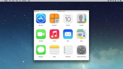
From a system standpoint, we expect to see further refinement of some kind. Jony Ive is obsessed with getting UI out of the way, so content can shine, but if every window behaved as iBooks does, removing chrome entirely until it's needed, we suspect Mac users would go nuts. Less extreme changes could work nicely on the desktop: flatter, simpler icons; the re-emergence of some colour in an OS that's become depressingly monochrome; and an emphasis on subtle depth, layering and transparency.
However, plenty of reports have suggested we're going to see far more radical changes; OS X won't necessarily be a straight clone of iOS, but the update will reportedly very obviously visually separate OS X 10.10 from its predecessors. How that will work in practice is anyone's guess; any major departure in design language is likely to leave OS X looking fragmented, rather like it did during the 'Mac OS 9 to OS X' transition. Apps reliant on default frameworks would get the new look for free, but others wouldn't, resulting in a mishmash of styles rather than a beautiful, coherent whole. Regardless, expect more Helvetica Neue than you can shake a stick at.

Window-snapping in OS X 10.10
This one is admittedly pure speculation, based largely on rumours surrounding iOS 8. We're still unsure about this, but there are suggestions the iPad will get a window-snapping feature, enabling you to view apps two-up, rather like in the latest flavours of Windows.
If that functionality comes to the iPad, it would also make sense to bring it to OS X. The Mac's window management has always been a bit awkward, and so simplifying a means to get two apps side-by-side without faffing about dragging and resizing would be of value to users. (In the meantime — and in the event this rumour doesn't come to pass — third-party apps like Moom ably provide such functionality.)
New OS X 10.10 apps and features
In recent versions of OS X, several iOS apps have made their way to the Mac. Reminders and Notes mirrored their iOS equivalents, making it easier for people to switch between Apple's platforms. With Maps, users could finally work with Apple's maps solution on the desktop and send directions to mobile devices. And then iBooks arrived, primarily, we imagine, because it was simply too absurd that you could buy a book in Apple's bookstore and not read it on your Mac.
Of the remaining iOS-only apps, Newsstand would be the most obvious OS X candidate, magazine subscriptions joining books. We can also see a place for Weather - although, surprisingly, even the iPad doesn't yet have an Apple weather app. Smaller features might also make their way across: an optional PIN-style passcode lock; notification tabs for 'today', 'all' and 'missed', and a Notification Center that's an overlay rather than intrusively pushing everything else off-screen.
Control Center is also rumoured to be making its way to the Mac, which would replace or augment existing menu bar extras. The existing extras perform the vast majority of tasks iOS's Control Center covers, but are perhaps opaque to new users, not least in how to activate them from various System Preferences panes. A central location for them would therefore be beneficial.
Are you a pro? Subscribe to our newsletter
Sign up to the TechRadar Pro newsletter to get all the top news, opinion, features and guidance your business needs to succeed!
One final group of apps we've not mentioned is those related to elephant-in-the-room iTunes. This digital jukebox grows increasingly bloated, performing more tasks than it was ever designed for. By contrast, separate iOS apps — Music, Video, iTunes Store, App Store, Podcasts — seem more usable and efficient. We'd be happy to see iTunes radically rethought, but it would require a monumental effort on Apple's part and leave question marks over the Windows version; on that basis, we think this is unlikely to happen, even if it's top of our wish-list.