The web designer's guide to the iPad
Could Apple's iPad shake up the entire web design industry?
Sign up for breaking news, reviews, opinion, top tech deals, and more.
You are now subscribed
Your newsletter sign-up was successful
Join the club
Get full access to premium articles, exclusive features and a growing list of member rewards.
Understanding device orientation is also important for successful iPad design, and this is something few web designers will have battled with. For Budiu, orientation switching is a usability concern:
"Some iPad apps lack consistency between modes – sometimes features are only available in landscape mode and users don't find them, so we don't recommend having different designs for different orientations. If you think otherwise, ensure everything that can be done in one orientation is available in the other, and be aware that users may become disoriented when switching modes."
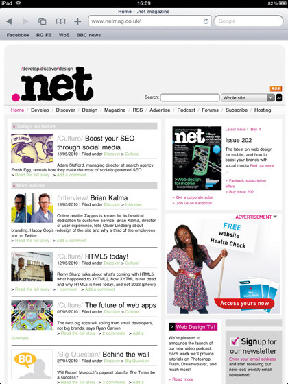
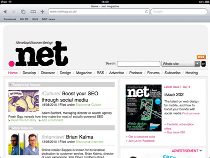
For websites, orientation also changes the nature of the fold. "The ability to change orientation makes the fold exist twice, in two different places," says Ghoshal. He jokes that he hopes this will stop people worrying about whether users will scroll – "because if there was ever a device that makes someone want to scroll, the iPad is it".

Bains thinks savvy designers may be able to capitalise on this aspect of the iPad. "In portrait, it feels like you've double the area, even though the page is simply scaling," he says. "Do your maths and your fold is at (1024/768)*1024 = 1365. If you're designing specifically for the iPad and don't need to scroll, that could be a 'hard' position for a footer, to frame a page and give your site a solid 'app' feel."

FOLD OF DREAMS: Since the iPad is designed to be used in any orientation, there are effectively two 'folds'
However, Robinson argues that there's little value in addressing orientation (bar ensuring a site is usable in both modes) unless you're designing a native app. "In doing so, a designer can take advantage of the native interactions, and the benefits are a much more pleasant experience for end users," he says.
"We've seen similar with the iPhone. A mobile web app can deliver a fairly good experience, and the same goes for Safari for iPad, but anyone really interested in giving users the best will go native."
Sign up for breaking news, reviews, opinion, top tech deals, and more.
App-happy
The drive for iPhone OS apps is so strong that some commentators believe apps will 'take over' from websites. This is unlikely in a general sense – there are thousands of iPhone OS apps, but users of other platforms have far fewer.
However, Budiu points out that, while in 2009, research showed that mobile users preferred websites to apps, in 2010 the opposite was true for iPhone users, due to the browser being associated with slow, non-optimised sites.
On iPhone OS, app options are to go native via the App Store or create a web app, based on web standards that also utilises the iPad's native capabilities. In our interview, developer Matt Gemmell talks about the former path, but the latter is also worth considering.
Web apps can be deployed to multiple platforms, updated without going through an approval process, and, as Schmitt says, enable you to "leverage your experience for a new platform". He recommends deciding whether your web app can be self-contained.
"If the user needs to go outside to another app, your idea might not be suitable for an app," he says. "You also shouldn't have an app that only provides one piece of the puzzle – for example, don't offer movie showtimes for a city without also offering times for nearby theatres and the ability to buy tickets."
Hume reckons the App Store's currently too strong a draw for users and developers, hindering the uptake of web apps. But he believes they'll flourish long-term "once more mobile devices support HTML5 and touch, and as developers get to grips with the possibilities HTML5 offers for web apps".
Schmitt's more optimistic, predicting that the likes of the PhoneGap framework will result in an explosion of web apps. "It lowers the barrier to entry," he points out, "and means you needn't use a dedicated developer to build a native app."
PhoneGap can also aid in deployment across multiple platforms. Clearly, the lines are blurring, and Gemmell reckons you'll soon not know whether you're using a web app, a website or a native app. "Any prediction focusing on technologies is ultimately meaningless anyway, since computing is about the user experience above all," he argues.
"The real currency isn't the technology – it's the ability to empathise with your user, satisfy their needs, and delight them with how much your software understands how they want to use it. Real professionals care about that goal, and use any available technology as a means to reach it."
Game changer
So will the iPad shake up the industry, inform design for other devices, and change how we approach design for the web? "I think for many it will change how design is approached," says Robinson. "If we look at the way people are going to be consuming web content, we'll see a shift from desktop to laid-back, casual consumption."
Although this will hit home with many, Robinson argues that the iPad shouldn't influence the way all sites are designed. "A designer's job is to produce the best possible experience," he says. "To do that, you must design for the context in which users are interacting with your designs. The content might be the same, but the use-case and context is greatly different when you're comparing iPad to a desktop browser or a mobile phone."
Budiu largely agrees, although she notes there's some overlap between iPad and iPhone design principles. "To the extent that there will be a huge iPad design wave, it may spill back some awareness of good design practices to other devices," she admits. "But, overall, the constraints are quite different. On mobile, the small screen size imposes a different page layout. Every extra click on the mobile web counts, but it doesn't mean as much on the desktop or an iPad."

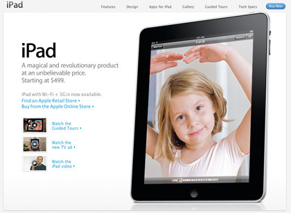
LEARN MORE: Once you're past the marketing drivel, apple.com/ipad provides a useful tech spec overview
For designer Tom Muller, things are simpler, with the iPad just being another step in the evolution of the way we design for the web. "As with every new web-capable device, we have to take into account subtle differences and play to its strengths and weaknesses," he says.
"With the iPhone, we created iPhone-optimised sites that sat within its viewport. With the iPad, it depends how prolific it becomes, but I think that with its laptop-like screen real estate, similar tweaks will be needed to make sites great.
"However, I think it'd be bad practice to develop websites specifically for one platform – the iPad in this case – just as we no longer create sites specifically for the Mac or PC."
 Become a TechRadar Insider


