False Start: Possible Windows menu changes trigger Red Mist of Fury
Microsoft set to start all over again

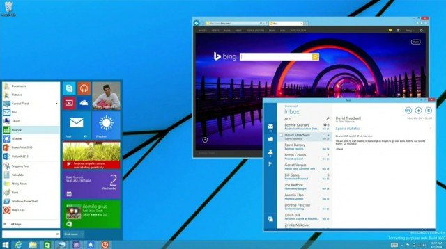
Rumours this week suggested that Microsoft might be readying more changes to its Windows 8 OS, with a supposed leak of Windows 8.2 claiming the Start menu will come back to prominence once again.
All quite exciting, but for the point that most people's issue with Windows 8 isn't just the Start situation. It's the fact there's also a tablet OS included for free, one you find yourself accidentally crashing into, and one that's seemingly there for no good reason other than to bewilder users and cross-promote Microsoft's phone ambitions. And nobody likes obvious cross-promotion.
Can something as small as a new button salvage the image of Windows 8? Can anything salvage Windows 8, or, seeing as it comes with virtually all PCs anyway and most people have no choice in the matter of being given a copy and using it, does it really need saving at all? Isn't Windows a thing we put up with no matter of its state or condition, like the carpet in a rented flat?
Save the tiles for your bathroom, Gates
Over on PC World, the enthusiasts, as ever, used the latest rumours to criticise Windows 8 to its very core. Dg27 summed up the hardcore's dislike of W8 in a couple of sentences, saying: "I have no interest in these built-in distractions. Until they come out with a true desktop version I will stick with 7 Pro. IMO all the tiles crap and these extra doodads are intended for people who actually don't do any serious work on their machines."
In reply, reader Rondtroy went a step further in his mockery of Windows 8 and its fans, saying: "Like you are saying, all I want is the 7 Pro (and Home) GUI. I'd like it on top of the underlying system improvements in 8. I think tiles are for children and animals."
Children will eventually grow into adults with money to spend on computers, Ron, so perhaps Microsoft is just thinking 20 years ahead with its fridge magnet-style touch OS?
OS BOGOF
On Information Week, commenter Daniel Cawrey doesn't get why there's the sort of familiar PC-style Windows 8 and the other one with all the purple boxes at all, posting: "The byzantine method of separating 'modern' apps with 'desktop' ones is just not working. I get why Microsoft did it from a technology standpoint, but the reality is that mainstream users don't understand the purpose of having to switch back and forth because they want to use a certain program."
Reader BobLoblaw2 is, on the surface at least, excited about the return of the Start system, enthusing wildly with: "Whoa. Start menu coming this fall. No it's too much innovation to take in all at once. My head is spinning from the possibilities. What genius has developed this game changer? Does Ctrl-Alt-Delete still work?" Good to see some genuine excitem… oh.
Get daily insight, inspiration and deals in your inbox
Sign up for breaking news, reviews, opinion, top tech deals, and more.
Meanwhile, Asksqn came out with this brief gem of an insight: "Windows 8.x is the turd MS keeps polishing in hopes of forcing more consumers to use it. It is, no doubt, part and parcel why it ended support for XP despite the wild popularity of the OS."
Cognitive Behavioural Therapy
Over on ExtremeTech, the nuts and bolts of exactly why people seem to dislike Windows 8.x were discussed. Reader Scott says it's because: "Microsoft's ultimate mistake was made many, many years ago when they built the concepts of their GUI on the idea of directory structure in the first place. Remind me again why we didn't get away from trying to make users memorize file paths about twenty years ago?"
But that's not the reason W8 is so widely loathed according to amateur behavioural psychologist Cmrpaja, who spelled it out like this: "People hate it because they experience constant cognitive dissonance over the entire UX of using the operating system. The system is rubbing the renewed organization of key functions on the users' faces making people wonder 'If this is supposed to make my life simpler, why do I feel constantly confused?'"
He continued with: "The Windows renewed UX train wreck starts from individual things like hiding the shutdown option behind Settings icon in the original Windows 8 and following by a plethora of non-intuitive twists on the existing desktop use paradigm (hiding battery and network information behind non-intuitive charm categorization, fitting touch based gestures badly with mouse interaction etc.). This made many common users wonder if they were using a naivistic square-based toy interface or a utility based desktop system."
A very comprehensive takedown, there, that also includes word of the week "naivistic." We looked it up and it means childlike or similar. He doesn't like the purple cube side of Win8 either.
WWSJD?
A classic quote was dug out of the archives by reader GodTM on Geek, who mocked the Start menu lovers and their disorganised Windows worlds, saying: "If people are relying on the start menu, they're 'using it wrong' to borrow a quote from Jobs. You pin to the taskbar what you use constantly, and pin to the start menu what you want to easily find. Then you're digging a lot less..."
Mr God expanded on his workplace ethos a little further down the thread too, suggesting: "A computer sitting on the Metro Start Screen (or clicking on the Start Menu in v7) is a computer that isn't being used."