The Start menu is dead. Long live the Start menu!
Familiar to anyone who's used Windows from 1995 onward, the Start menu has been an essential but unassuming fixture in the bottom left corner of your screen. It's so important that there's even a dedicated Windows key on your keyboard - you know, the one you accidentally hit when you're trying to push 'Alt?'
It's a crucial part of Windows and has made navigating the operating system incredibly convenient. Instead of needing to sift through directory after directory just to start a game of Minesweeper, users can simply summon it in the Start menu. For casual Windows users, the Start menu was a blessing when first introduced, removing another wall of arcane DOS knowledge from the experience while reducing the 'Run' function to something only for power-users and stubborn old-schoolers, clinging to their backslash and colon keys.
The Start menu followed a steady evolution of improved functionality until, suddenly, it was gone. It's removal sent shockwaves through the Windows community, who called for its prompt reinstatement.
There's a happy ending for users who clamored for its comeback, but before we get to that, here's a look back at the the storied rise, fall and triumphant return of the Windows Start menu.
Windows Chicago: A humble beginning
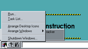
Before Windows 95 famously started up with a Rolling Stones TV-ad, there was Chicago. Microsoft was still in the experimental phase, building a new OS with hints of Windows 3.1 lineage, but it also included plenty of new elements, like the taskbar and My Computer features. Most importantly, on the lower left was a row of three buttons that would later evolve into the Start menu we've come to know and love.
Windows 95: Start it up
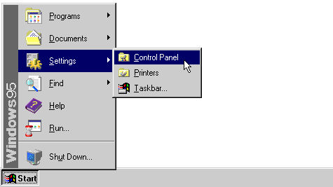
Now, the menu truly came to be in Windows 95. The addition of the Start menu was so revolutionary to the Windows experience, Microsoft went as far as building a marketing strategy around it. It licensed "Start Me Up" from the Rolling Stones for a princely sum, marking the first time ever the Stones allowed their music to be used in an advertising campaign. So to say the its introduction was historic is true in more ways than just functionality.
Suddenly, everything a Windows user wanted to do was nestled within the Start menu. Programs, documents and settings could all be easily accessed from the menu's top level. It took the place of the program manager in previous versions of Windows, simplifying the process of launching applications and helping to streamline the entire user experience.
Windows 2000 and ME: Steady as it goes
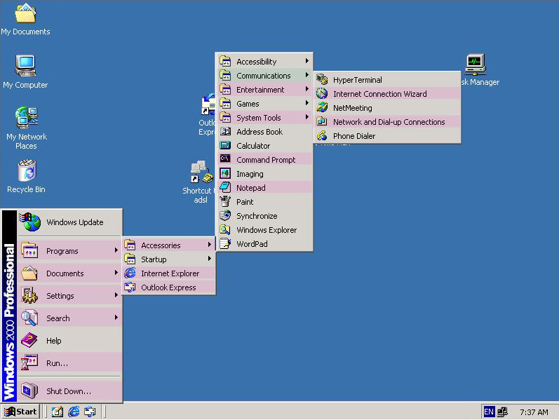
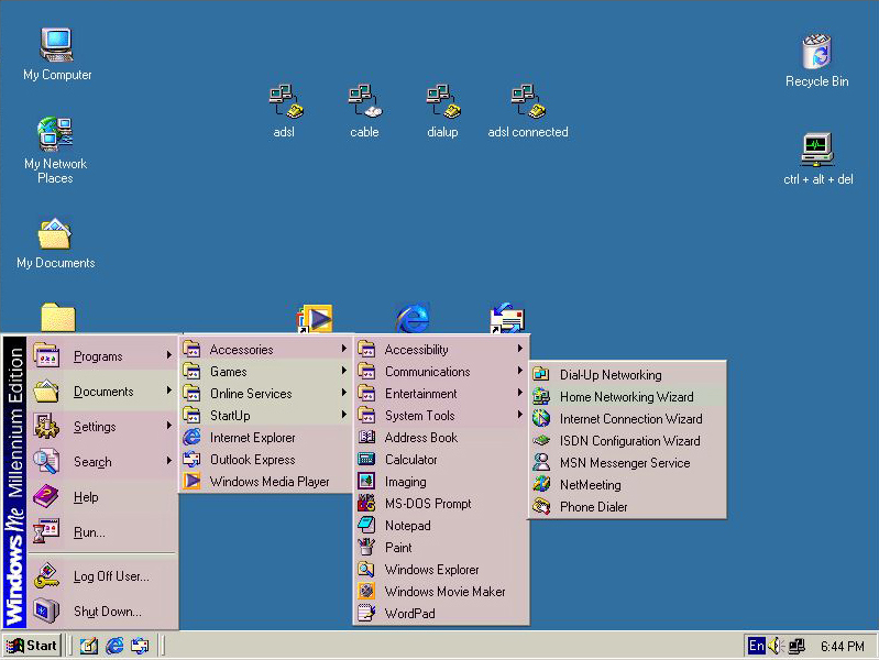
The Start menu remained roughly the same through subsequent versions of Windows, including 98, 2000 and ME. Programs were nested within menus, and trying to access them sometimes meant the desktop was crossed almost entirely by sub-menu upon sub-menu. Microsoft's tendency to move around shortcuts within the menus was seemingly arbitrarily from version to version. For example, check out the differences in starting a dial-up connection between Windows 98, 2000 and ME.
Windows XP: Major redesign
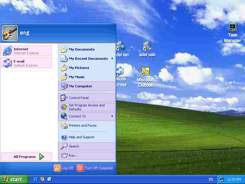
The most significant change to Windows since 95 came with XP, and the Start menu was no exception. Gone was the boxy, desktop-obscuring mess of sub-menus from versions past. With XP, the Start menu became two columns.
On the right side sat commonly accessed locations such as My Documents, My Computer and Control Panel. Populating the left column were programs you used most regularly.
XP brought the option to pin programs to the Start menu, so if you played a lot of Warcraft 3, you could access it quickly. 'All Programs' was also included at the bottom of the left-hand list, laid out alphabetically in a huge nested menu.
On top of its redesigned functionally, the XP Start menu was smoother and came in color for the first time, making it a decidedly turn-of-the-millennium design to match the rest of the OS. Power users still had the option to turn off all of the window dressing and return to the grey, hard-edged look of previous editions while Windows newcomers had a soft, lovely and customizable menu to call their own.
Windows Vista: Enter search bar
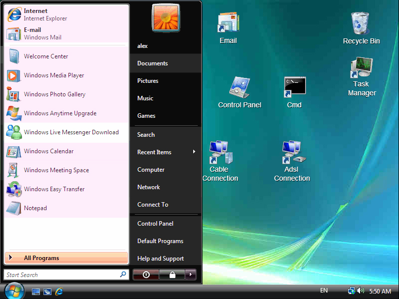
Windows Vista retained the same basic layout and formula of the XP Start menu when it launched in late January 2007. It looked different, thanks to resource-intensive Aero, but it was still broken into two halves, with one side holding general locations on your computer and the other listing most used programs. But Windows Vista made one tremendous leap in ease of use. For all the hate Vista gets, it brought the search bar to the Windows experience.
The search bar is arguably the greatest step forward for the Start menu since its inception. Simply typing a phrase into the search bar text field would bring up a selection of matches. The Start menu would only be filled with results that matched the text entered, making it incredibly useful for nearly anything on your computer. If you wanted to find a cover letter you named "CoverLetter.doc," typing in the first three or four letters of the file name would bring it up. Same with programs, settings, control panel menus and file types.
The search bar brought an extra layer of welcome functionality to the Start menu. The search field made it so literally anything on your computer could be started or opened with just a few keystrokes. It had the simplicity of the 'Run' function, but didn't require special knowledge to use.
Windows 7: Rounded corners
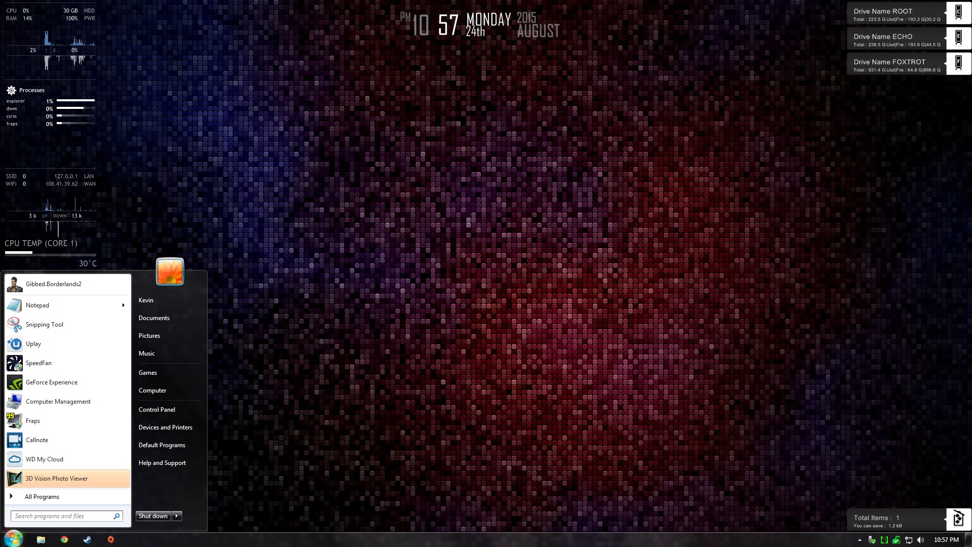
The searchable Start menu made the leap from Vista to Windows 7, and overall is remained largely identical from version to version as far as function. There were a few aesthetic changes as Windows 7 took on a clear glass look compared to the smoked black bars Vista users had grown accustomed to. Other small changes included replacing the power and lock button with simpler menu options and moving the user icon a few pixels up.
While there were a few minor tweaks from Vista to Win 7, the biggest change of all for the beloved Start menu was yet to come.
Windows 8: Enter the Start screen
The Start menu, first introduced in 1995, had reached near perfection with the introduction of the search bar in Windows Vista. With rumors of Windows 8 and its emphasis on a touch interface, excitement grew at the thought of Microsoft making the Start button, which launches the menu, even more useful. As people began to get their hands on Windows 8, reports of the Start button's demise began to flood forth.
Most Windows users fears came true with Windows 8 was released: that ever-so-useful function of Windows, one that had been refined and improved for nearly two decades, was no longer a part of the OS.
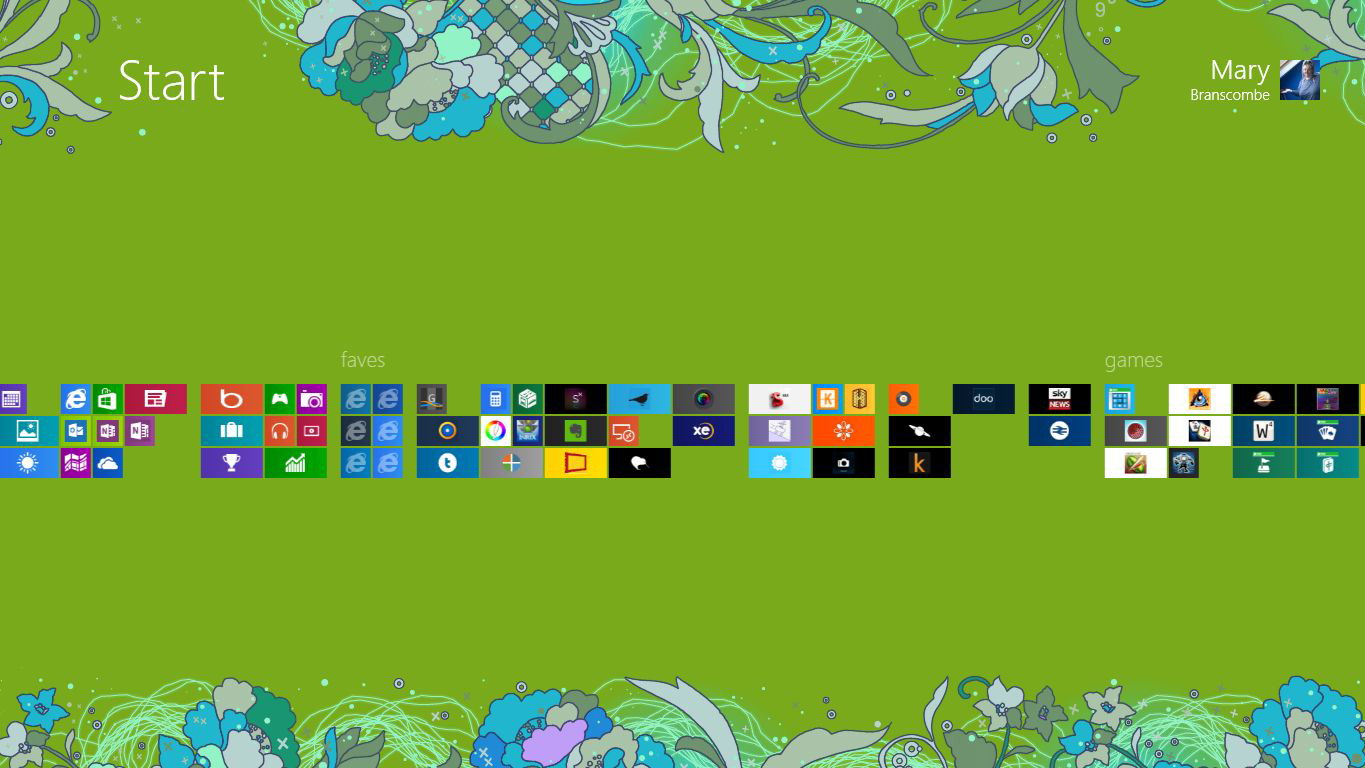
Instead of a Start menu, Windows 8 came with a Start screen, and the relatively compact and familiar menu was replaced with a scrolling screen of applications and shortcuts. If it bore any resemblance to the Start menus of yore, it was more akin to the pre-XP versions in that both obscured the entire desktop.
To make matters worse for casual Windows users, controls to shut down or restart the computer were not immediately accessible. One of the Start menu's functions had been, ironically enough, allowing users to shut down their machines. With the loss of the Start menu, people couldn't restart their computers in the same way they had since 1995.
Windows 8.1: You tease
Apps that replicated the Start menu and all its familiar and useful ways began to pop-up in the wake of the menu's demise. Google searches for "Start menu" ticked sharply upward shortly after Windows 8 released in October 2012. With 8.1, Microsoft brought back the familiar Start button, but the Start menu remained missing.
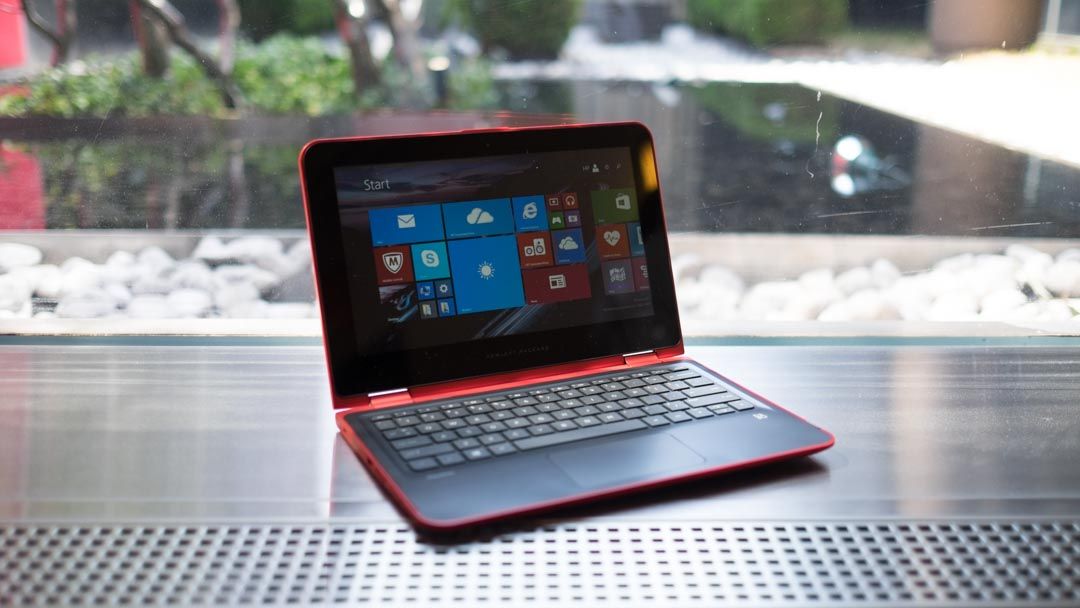
For Windows 8.1 users, the return of the Start button was only half of the story. It was in the same place it had always been, but it didn't do the same thing it always had. Instead of bringing up the beloved Start menu, it simply provided a quick, on-screen link to the Start screen introduced in Windows 8.
The return of the Start button was the ultimate tease. While it offered a familiar way for people unfamiliar with Windows 8.1 to get to the new Start screen, it didn't offer the convenience of the Start menu. Part of the beauty of the Start menu is its ability to allow you to access the contents of your hard drive without needing to page out of whatever you're currently working on.
Microsoft knew the inclusion of the Start button was satisfying only part of what people loved about earlier versions of Windows, and in an arguably un-Microsoft way of doing things, they took the outcry to heart.
Windows 10: The return of the Start menu
After much public outcry and criticism from reviewers, Microsoft finally acquised and to brought back the Start menu.
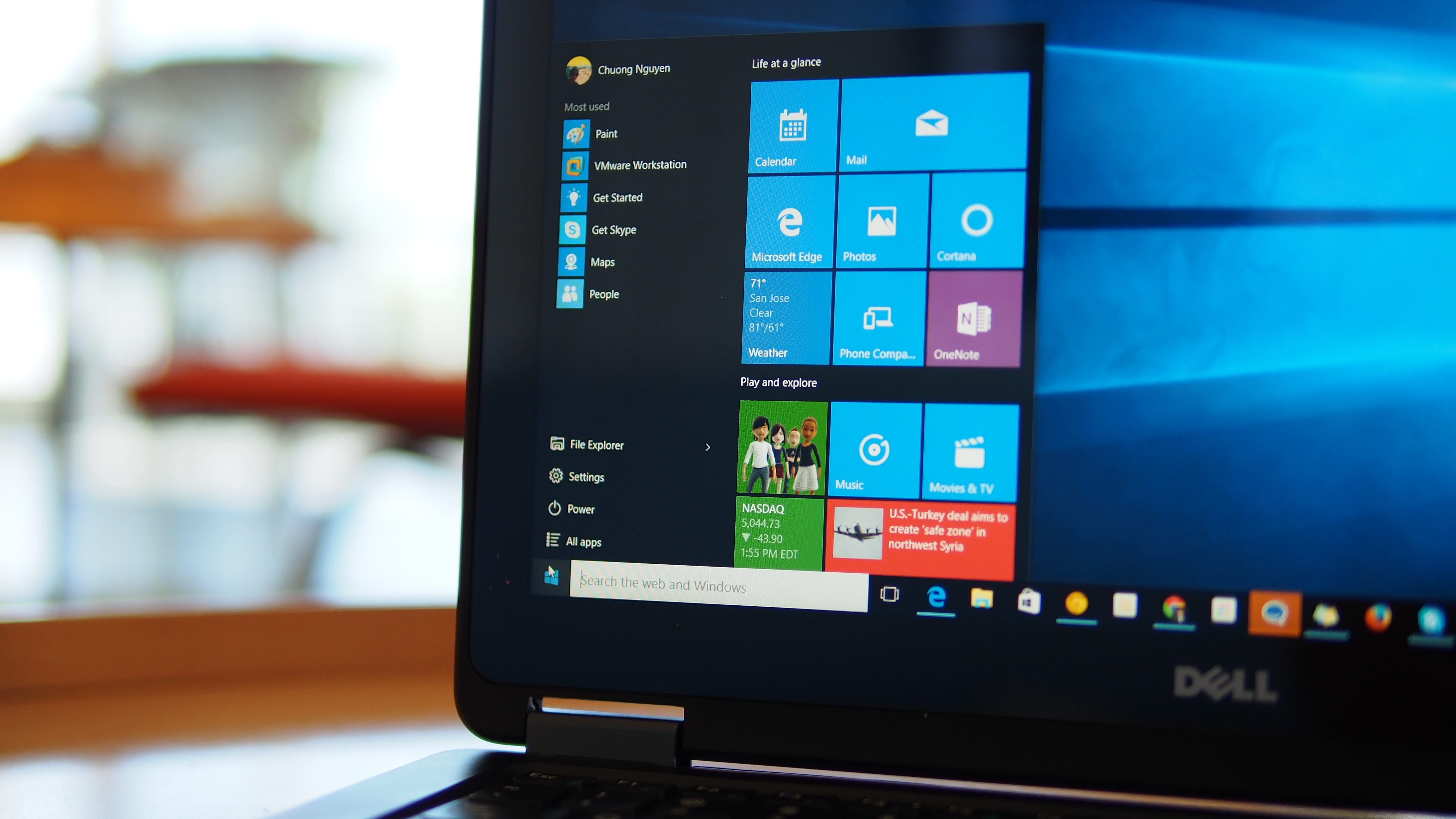
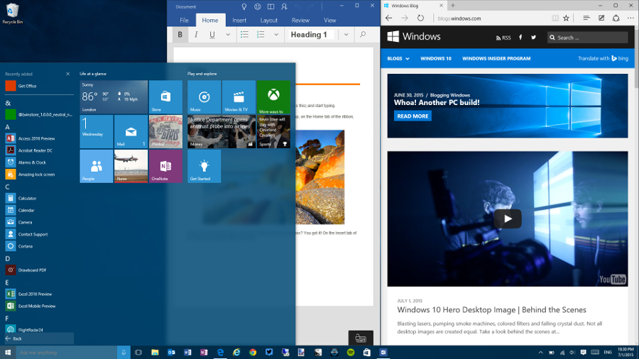
The Start menu made a heralded return with Windows 10, rolling out now. As hybrid between the old standard and the layout from 8 and 8.1, the new Start menu is both familiar while also adopting a few new features. Once again, users can scroll through a list of programs and pin their favorites, though now it also lets users include their most used apps.
There's still the option to run Windows 10 in "tablet mode," which sees 8's Start screen return, but long-time Windows users will feel comfortable navigating the new interface. And when it comes time to shut down your computer, the log-off options are right where they used to be.
Of course, there are some big additions, including flipping live tiles that update with new information. Cortana also stands in for search, allowing users to verbally ask queries along with looking up standard file names and applications.
It's been two decades since Microsoft replaced the program manager with its much-hyped Start menu. In that time, it has grown and improved, and barring a jarring hiccup with Windows 8/8.1, has been an integral part of the Windows user experience. It remains one of the defining features of the OS. With access to programs, files and settings, as well as the options to log-off and shutdown, Windows quite literally begins and ends with the Start menu.