Microsoft gets defensive over Xbox One's 'holistic' design
It's awesome, we swear!
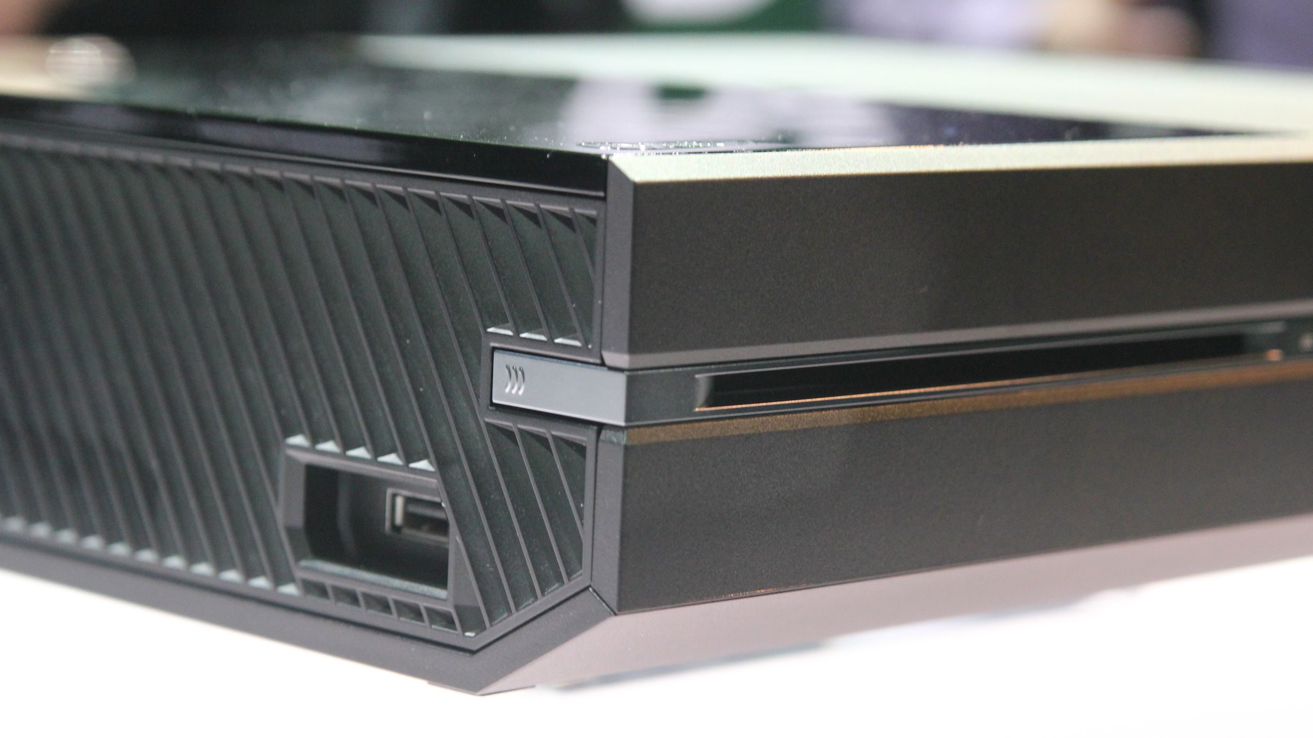
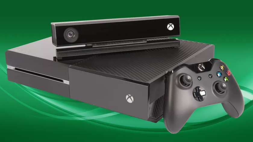
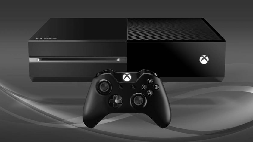
Responding to criticisms that the Xbox One looks like a VCR from about 1995, Microsoft has opened up about its design choices in the hope of making it all seem a bit more rational.
Most of us were expecting something a bit more flattering than the boxy form revealed last week, but Microsoft insists it has taken "a new approach to design" in the way it brings all of the console's features together.
Posting on its Xbox One blog with an accompanying six-minute video, Microsoft has walked us through the process of creating the new Xbox, from the mock-ups of sensor bars to the wireless controller.
Microsoft's black swan?
"We wanted to think from a holistic perspective," said Ramiro Torres, Creative Director of design on the Xbox One. "Its design has to make an appropriate statement that reflects its capability as an all-in-one entertainment system."
Colour played a big part of this, according to Microsoft. "The console and Kinect sensor are liquid black so they melt into the background when being used, allowing the content on your TV to dominate the living room."
You can check out the new video below - it includes a glimpse of a few initial designs that didn't quite make the cut.
Get daily insight, inspiration and deals in your inbox
Sign up for breaking news, reviews, opinion, top tech deals, and more.
Hugh Langley is the ex-News Editor of TechRadar. He had written for many magazines and websites including Business Insider, The Telegraph, IGN, Gizmodo, Entrepreneur Magazine, WIRED (UK), TrustedReviews, Business Insider Australia, Business Insider India, Business Insider Singapore, Wareable, The Ambient and more.
Hugh is now a correspondent at Business Insider covering Google and Alphabet, and has the unfortunate distinction of accidentally linking the TechRadar homepage to a rival publication.








I'm pausing my Prime Video, Apple TV+ and Paramount+ subscriptions in April 2025 – here are the 3 streaming services I'm keeping instead
“No matter who you are, what you do, what form factor you choose” - how Intel is bringing AI advantage and unrivaled security to every industry and ecosystem

I’ve never seen a PC with an Intel Core i3 CPU, 24GB RAM, 500GB SSD and two Gb LAN ports sell for so cheap


