The evolution of gaming graphics
The technologies that brought all the best carnage to life
To catch a sprite
In the days of CGA, everything was incredibly simple. With EGA, artists could finally start cutting loose. Backgrounds became more detailed. Shading could finally be more subtle – if not by much – than simply overlaying dots on bits of the screen that were meant to be in shadow.
However, in both cases, the results looked like the computer generated graphics that they were. Backgrounds were clearly made up with simple lines and fills, with blocky characters overlaid on top.
This changed dramatically when VGA entered the picture. VGA allowed for 256 colours at once, giving artists much more freedom. Games such as King's Quest V and Monkey Island 2 replaced computer generated backgrounds with scanned-in paintings, giving their worlds an incredible sense of detail and atmosphere. Spare colours could be used for effects, such as flickering lights, gradients and proper shading.
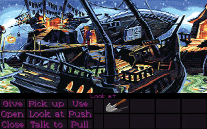
DETAILS, DETAILS: VGA games used every trick going to make backgrounds look attractive
Interestingly, this usually only applied to the backgrounds. It quickly became acceptable to have different styles for the overlaid characters, typically keeping them cartoony, regardless of their settings. This was primarily a logistical issue, given the number of animation frames that would have to be stored and created, but few minded.
Many games were quite happy to chop and change media types on the fly, whether by kicking off with a 3D rendered introduction (as in King's Quest VI, Syndicate and almost every early CD game), or showing detailed pictures of characters in conversations.
Get daily insight, inspiration and deals in your inbox
Sign up for breaking news, reviews, opinion, top tech deals, and more.
One media mix that never worked well in this context was FMV, partly due to the often woeful production values of the games that used it, but mostly because of issues with converting footage into something that could be used as a game sprite. Low resolutions turned them into a blurry mess and higher resolutions hammered home how badly the non-antialiased sprites sat in the world.
As just one example, an FMV character will always have more superfluous detail than a cartoon one, leading to more obvious problems if their walk cycles get broken - frequently making it harder to read body language. Rendered 3D figures suffered from these problems as well, but rarely to such a degree.
The only games that made the leap successfully simply used the original footage as a starting point, rather than trying to implement it into the game as-was. These included Prince of Persia with its rotoscoped character animations, and Tex Murphy, which avoided having 2D versions of its characters in the 3D game world wherever possible, and simply cut to a full-on blue-screened FMV sequence for conversations and important actions. It was jarring, but consistent.
All of this gave the early 90s a fascinating look. It was an era of mixed media, with classic animation sitting alongside revolutionary new ideas. Free of the constraints of flat colours and simple shapes, developers jumped at the chance to create unique worlds.
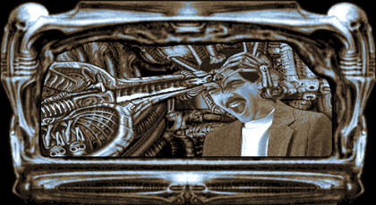
NO FUN: We'd scream too if our world was made up of such clashing styles
In adventures, we saw everything from the pure cartoon style of Day of the Tentacle to photographic/3D rendered hybrids in the likes of Lost in Time, to early attempts to put real people into the mix during the horrific age of interactive movies. One of the most bizarre was Darkseed, which featured two worlds: ours, and a Dark World based on the biomechanical paintings of HR Geiger. (There was talk at the time that the artists needed therapy due to this, but we call bull on that one…)
Before there was 3D
The success of 3D accelerator cards heralded the birth of a new era for PC games – one where 3D is mother and father and little sister all rolled into one. This is a good thing. Sprites have to be created frame by frame, which makes them inherently limited. Put a skeletal structure in a 3D model and it can do anything from pick up a laser gun to dance the tango, not to mention perform subtle actions such as making eye contact or following you around the room.
3D models also have depth, whereas sprites are just cardboard cutouts. Using the same engine for them and the backgrounds also helps reinforce the notion of a consistent world that characters can interact with.
However, PCs powerful enough to make the most of 3D are a recent development and for a long time, sprites vs polygons was a genuine debate. Elite had wireframe polygons back in 1984, as did the first Star Wars space simulator, X-Wing, in 1993. Until Quake in 1996, which also gave the mainstream its first true 3D shooter, almost every FPS was sprite-based, with exceptions such as Terminator: Future Shock few and far between.

PROGRESS: Floppy disks eventually became big enough for proper cartoon fun
The main reason for this was that sprites offered more detail than the polygons of the time could handle. Much like the early days, it was fine to have simple iconic shapes for spaceships and the like, which is why X-Wing's instantly recognisable ship silhouettes worked so well. However, early games didn't even have texture mapping (instead relying on simple colours and shading based on the position of the area's light source) and 3D characters were awkward-looking, low-polygon affairs.
With sprites, if you could draw it, the computer could handle it. When making Doom, id actually modelled several of its more complicated characters in clay then photographed them from multiple angles to maintain consistency.
The first Wing Commander games used a clever trick to fake space, simply moving and scaling sprites in front of the camera to add depth. It fell down when approaching capital vessels, but made for instantly recognisable ships and graphical assets that sat comfortably alongside the character portraits used in menus and cut-scenes.
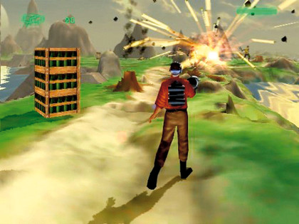
SERIOUS FIREPOWER: As dodgy as it looks now, Outcast was a stunning game in 1999 - if your PC could handle it. Most couldn't
3D was much slower to impress on anything other than a technological level. Quake was a particular disappointment, regardless of its technical prowess. Doom gave us a whole cast of memorable enemies to shoot at, ranging from the humble Imp to the awe-inspiring Cyberdemon. Few of Quake's blocky, blurry opponents came close, outside of the leaping Fiend and hulking demon Cthon.
Not until Sin and Half-Life in 1998 did 3D characters start to impress and even then, the fact that most of them were still animated frame by frame made them feel stodgy. Half-Life's skeletal animations provided freedom, even if they did usher in several years of comedy ragdolls.
Adventures in hyperreality
As with the dawn of 2D, 3D games quickly began splitting art styles along genre lines. This was typically done for pragmatic reasons rather than stylistic ones. The more restrictive the game, the more realistic its world could be.
Driving games such as Midtown Madness, Driver and GTA could get away with something that pretended to be a real city by confining players to roads and other external locations where real-world textures could turn a simple box into a credible store or tower block.
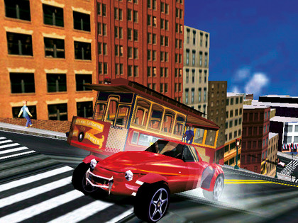
EASY RIDE: Driving games have it easier than most. You don't see much detail at 100MPH
Most games stuck with a different approach: creating the illusion of reality, not trying to recreate the actual thing. The more games tried to do this, the more they hit the Uncanny Valley problem – deviations from the expected that break the suspension of disbelief. The simplest solution was to shunt things around a little by setting a game in the future, or in a lab, or in many cases, just not trying too hard.
When Tomb Raider 3 set a level in Saint Paul's Cathedral, the challenge was conveying that vibe with a game engine that had only just developed the ability to build levels using triangles instead of square blocks, not recreating reality.
Similarly, Deus Ex took great pains to trash New York and Gabriel Knight III devoted as much effort to recreating the village of Rennes-le-Chateau as the Tomb Raider team did to King Midas's crypt. It didn't matter. Much as the classic 2D games hinted at a world beyond the bits that you got to visit, the best 3D games feel like there's more going on behind the invisible walls that block your passage.
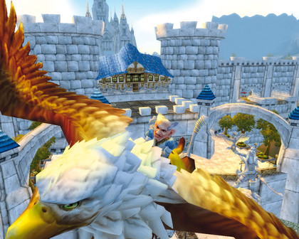
TAKING OFF: Despite the dramatic music and statues, you can still cross Stormwind faster than you can say 'Not very big, is it?'
It'd be wrong to say that current games aren't constrained by technology, but the challenge is different. With modern graphics, we can create almost anything to an acceptable level. The challenge comes from the difficulty of creating all the necessary assets, with level design stretched across multiple disciplines, from 3D modelling to animation and physics calculation.
The next step, along with increasing the polygon count and texture resolution, is likely to be to take as much of the load away from the artists as possible to create bigger worlds that retain the handcrafted look. Wherever games go next, they're going to look fantastic.
-------------------------------------------------------------------------------------------------------
Liked this? Then check out Why are movies based on games so terrible?
Sign up for the free weekly TechRadar newsletter
Get tech news delivered straight to your inbox. Register for the free TechRadar newsletter and stay on top of the week's biggest stories and product releases. Sign up at http://www.techradar.com/register