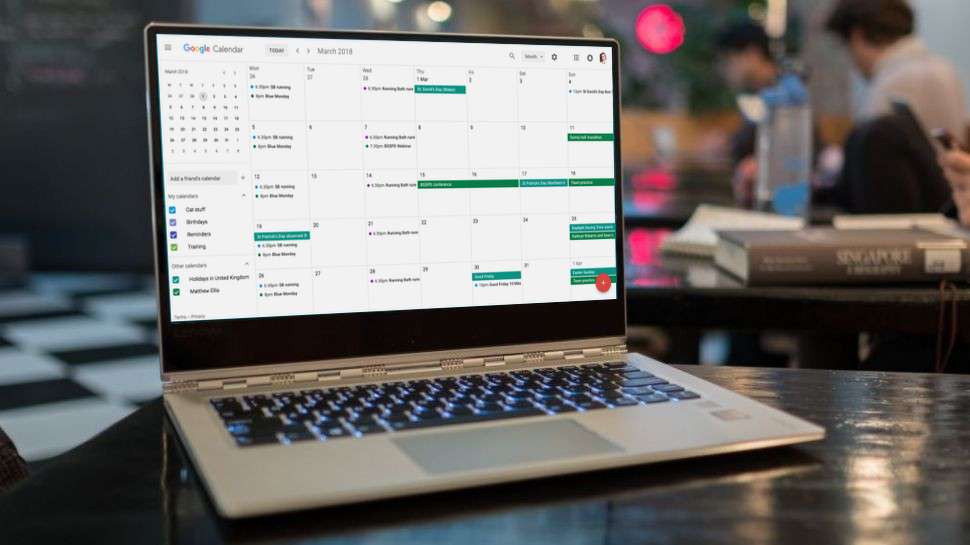
Google's streamlined new Calendar layout will be rolled out to all users at the end of February.
Google introduced the new desktop design in October, letting users switch back to the 'classic' look if they preferred, but from February 28, that option will be removed.
The redesigned web app is bold and clear, with more space dedicated to each time slot (whether it's a day, a week or a month) and fewer buttons.
Clicking an event now lets you see all attendees at a glance, along with RSVP status, meeting rooms, video call links and attachments. You can see each event's invitation status without clicking an event, and use the new Density setting to adjust the number of events visible for each time slot.
Save the date
It's not all good news though; the new design does away with the Quick Add function, accessible via the 'Create' button on the top right in the Classic view. Users could type a title like ‘Meet TechRadar 9am next Tuesday’, and the Calendar would parse the time, date and location, and create a new event accordingly.
Now, new events can only be created by clicking a time slot or using the orange plus icon in the bottom right.
If you're not a fan of some of the changes, Google is inviting early adopters to ask questions and give feedback on the new design on its Help Forums.
Get daily insight, inspiration and deals in your inbox
Sign up for breaking news, reviews, opinion, top tech deals, and more.
Via TechCrunch

Cat is TechRadar's Homes Editor specializing in kitchen appliances and smart home technology. She's been a tech journalist for 15 years, having worked on print magazines including PC Plus and PC Format, and is a Speciality Coffee Association (SCA) certified barista. Whether you want to invest in some smart lights or pick up a new espresso machine, she's the right person to help.