Google Chrome logo gets a change - first time in 8 years
But it's so subtle that you can barely notice it
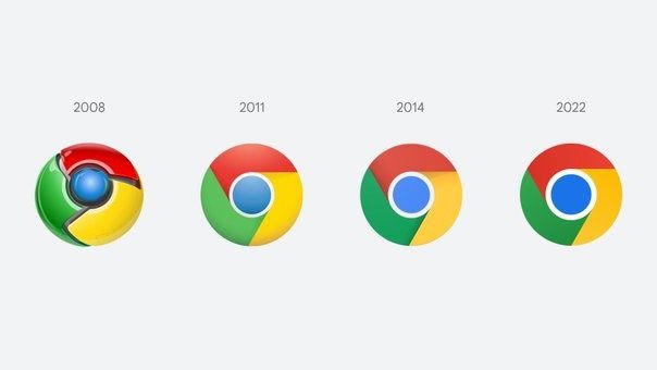
Google is tweaking its Chrome browser logo for the first time in eight years. Just as well that a Google Chrome designer took to Twitter to point it out. Otherwise many of us would not have noticed it. For, the logo design change is --- okay, we will be kind here --- subtle.
"We’re refreshing Chrome’s brand icons for the first time in 8 years. The new icons will start to appear across your devices soon," the designer Elvin Hu wrote on his Twitter timeline.
In his words, Google has simplified the icon "by removing the shadows, refining the proportions and brightening the colors, to align with Google's more modern brand expression."
In the new logo, the three colours - red, yellow, and green are simply flat and do not have any shadow. Also, the blue circle in the middle seems to be bigger and brighter.
- The best Google Chrome extensions in 2022: do more with your browser
- One of the best Google Chrome features is getting an upgrade
But why such a subtle change?
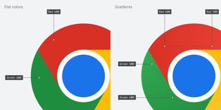
The designer said that certain shades of green and red next to each other created an unpleasant colour vibration. Therefore, the team introduced a very subtle gradient to the main icon.
The design team has also created OS-specific customisations, meaning, it will look more colourful to complement the other system icons but on macOS, the logo will have a small shadow. The Windows 10 and 11 version has a sharper gradient.
But perhaps anticipating the snark in our responses, Elvin added: “You might ask, 'why bother with sth. so subtle?' We tailor Chrome’s experience to each OS, with features like Native Window Occlusion on Windows, day-one M1 support on macOS, Widgets on iOS/Android, and Material You on Android. We want our brand to convey the same level of care.”
Get daily insight, inspiration and deals in your inbox
Sign up for breaking news, reviews, opinion, top tech deals, and more.
But explanation or no explanation, the reaction on social media platforms was on expected lines. People just let the sarcasm flow on Google Chrome logo design change that wasn't.
The new Google Chrome logo will be live for users across all devices with the release of Chrome 100 soon. You would be seeing the new icon now if you use Chrome Canary (the developer version of Chrome), but it will start rolling out for everyone else over the next few months.
Want to know about the latest happenings in tech? Follow TechRadar India on Twitter, Facebook and Instagram!

Over three decades as a journalist covering current affairs, politics, sports and now technology. Former Editor of News Today, writer of humour columns across publications and a hardcore cricket and cinema enthusiast. He writes about technology trends and suggest movies and shows to watch on OTT platforms.
Most Popular


