Google's Wear OS will soon look a lot more like Apple's watchOS
More Apple-style polish and consistency is en route

Google has stepped up its bid to make Wear OS smartwatches look and feel as premium as the Apple Watch by introducing some major new design guidelines for apps running on its watch platform.
Google says the new guidelines, which all Wear OS developers will need to follow from August 31, have been introduced to "improve the quality of apps for Wear OS and their presentation in the Google Play Store".
That's an admission that some Wear OS apps currently lack the visual polish and consistency of their equivalents on Apple's watchOS – and Google is mandating three main changes to bring its smartwatch experience up a notch.
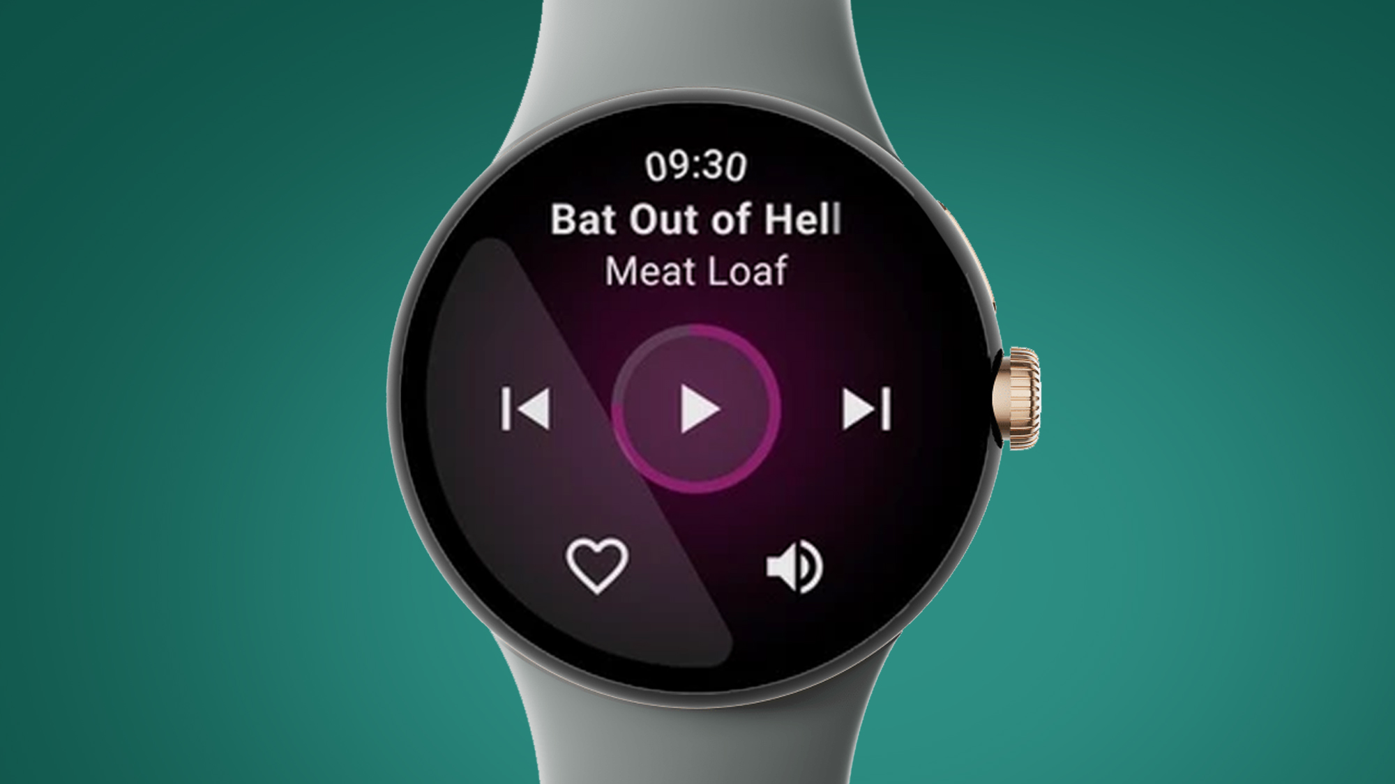
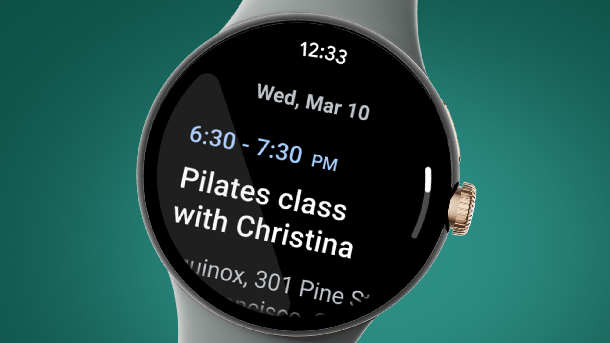
Firstly, all Wear OS apps and Tiles (which provide glanceable info) will have to use a black background, with all other colors banned. This could bring a couple of benefits. A black background can blend into the bezels of a watch like the Google Pixel Watch, making them a little less obvious.
There's also a chance that black backgrounds in apps could help boost a watch's battery life and also improve their readability. This is why Apple also recommends that developers use black backgrounds in watchOS apps.
Like on the Apple Watch, Google will also be mandating that all Wear OS apps show the time of day in the same place at the top of every app's home screen and any activity screens. It's a minor tweak, but one that will again bring some consistency to the overall smartwatch experience.
Lastly, Google's new guidelines should make it a bit easier to see when you have an ongoing activity, like a workout, running on a third-party app. App developers will now have to show an icon on the watch face when an activity is running, and also show this in the app's Tile (if the app is in your Tile carousel).
Get daily insight, inspiration and deals in your inbox
Sign up for breaking news, reviews, opinion, top tech deals, and more.
While these changes aren't collectively as big as a software update like the rumored Wear OS 4 (which may not land until 2024), they do show that Google is keen to bring some added polish to its smartwatch platform – with many of the tweaks inspired by Apple's learnings on the more mature watchOS.
Analysis: Wear OS gets some much-needed consistency

Google's Wear OS has made big strides in the past couple of years, most notably when it merged with Samsung's Tizen last year in Wear OS 3 – and these new design guidelines continue to show its commitment to creating a consistent smartwatch experience.
All three of those app design rules have echoes of Apple's watchOS, with the mandated black backgrounds potentially having the biggest impact on the visual polish of Wear OS smartwatches (and hopefully their battery lives, too).
On paper, they don't sound like dramatic changes, but Google says the updates "span visual experience, functionality, performance, and Google Play listings" to help give Wear OS fans a "consistent, intuitive and enjoyable experience".
It's that greater consistency that could benefit the best Wear OS watches in their battle with the best Apple Watches, particularly as new players are seemingly entering the game – with recent rumors suggesting that Xiaomi could be launching a Wear OS watch later this year.

Mark is TechRadar's Senior news editor. Having worked in tech journalism for a ludicrous 17 years, Mark is now attempting to break the world record for the number of camera bags hoarded by one person. He was previously Cameras Editor at both TechRadar and Trusted Reviews, Acting editor on Stuff.tv, as well as Features editor and Reviews editor on Stuff magazine. As a freelancer, he's contributed to titles including The Sunday Times, FourFourTwo and Arena. And in a former life, he also won The Daily Telegraph's Young Sportswriter of the Year. But that was before he discovered the strange joys of getting up at 4am for a photo shoot in London's Square Mile.