How Android adapted to design changes over time
There's an essence of Apple's influence on Android's design innovation

A recent report from Bloomberg stated that Google will be working towards improving the look of the software. The new generation of Android might mimic Apple’s controversial notch design to let OEMs achieve the bezel-less panels similar to the iPhone X. If rumours are to be believed, Huawei P20 will be incorporating the iPhone X like notch design.
Android, which was originally meant for digital cameras, has grown and evolved a lot over a period of close to ten years. The OS has seen major overhaul from the design to features in accordance with latest technologies over time.
Since Android P is still in works, let’s give some rest to speculations and recall the instances when the world’s most used smartphone OS changed shapes based on evolving hardware technologies and trends.
The beginning
Android started in 2003 known as Android Inc. till it was bought by Google in 2005. The OS wasn’t out in the wild until the first iPhone was released in 2007. The original iPhone was followed by the first Android phone from HTC in 2008 that came with a 3.2-inch touchscreen display.

During the initial phase, there were minor changes to the vintage Android skin. The changes came in form of a simple search box and an on-screen keyboard in the Android 1 Donut update.
The next iteration, Android 2.0 Eclair, brought features like live wallpapers and Google Maps navigation. Users could also access multiple Google accounts on this update, but there wasn’t anything that could refresh the experience as there weren’t any major innovations done by the component makers and designers.

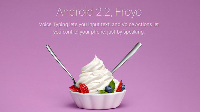
The first Nexus phone made its debut in 2010 which was again based on a similar design that got updated to Android 2.2 Froyo soon after the release. It was succeeded by Android 2.3 Gingerbread, which brought in support for extra-large screen sizes and resolutions.
Get daily insight, inspiration and deals in your inbox
Sign up for breaking news, reviews, opinion, top tech deals, and more.
Fast forward to 2011, the Android 3.0 Honeycomb turned out to be a major development from team Android at Google. The platform was designed solely for tablets, as it was the era when tablets were freshly in. In its next update, there was support for resizable Home screen widgets.
Later, based on the same UI, Android Ice Cream Sandwich was introduced as a shrunken version of the Honeycomb. It brought new blue coloured Tron themed icons, holographic interface, on-screen navigation keys and face unlock.
Till this time, there was nothing that could be said to be a considerable overhaul in terms of UI design. It continued with the Jellybean in 2012, where features like "Daydream" screensavers, showing information when idle or docked and Google Now made their debut.

In 2013, Android 4.4 Kitkat was announced, but history repeated and we didn’t see a lot happening there again. The only change in design was a fresh interface with white elements instead of blue.
The turnaround

By 2014, a 5-inch and 1080p display had become a norm in smartphones, but Google wasn’t ready until the version 5.0 Lollipop was out. It was the same year when Apple introduced their first 4.7-inch and 5.5-inch phones— the iPhone 6 and 6 Plus.
Users seemingly started adapting bigger displays, and Apple wasn’t the first one to realise it. In fact, customers leaning towards bigger Android phones was apparently one of the reasons why Apple went in that direction.

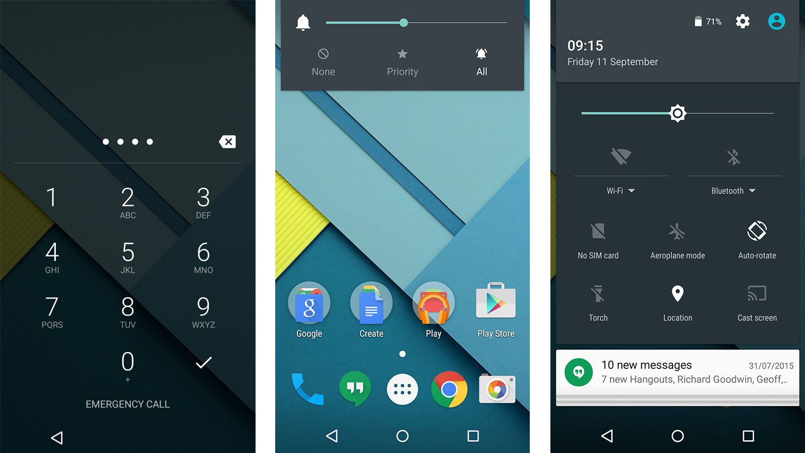
Google also rolled out Material Design update with Lollipop 5.0, which was a major revamp considering it changed the whole interface. It arrived with a new notification panel, lock screen notification feature, redesigned soft keys and a lot more.
To future-proof the OS, Android now supported scalable vector graphics in the interface, which allowed it to be used on displays of any size and resolution.
One year later, Google made a jump to Android 6.0 Marshmallow, which introduced a bunch of new features like native fingerprint sensor support, Google Now on tap, vertical scrolling app drawer, USB Type-C support and a bunch of new features.
But again, there wasn’t a major design change even in Android 7.0 Nougat but it brought some incremental changes on the surface. The biggest features were the split screen multitasking and rearranged notification shade. They came along with bunch of performance improvements under the hood too.
The most current version of Android, the 8.0 Oreo was released in 2017. We saw a redesigned Quick Settings and Settings with a white background with black and accent font colours. Restructure of settings by regrouping in sections and adaptive icons were new this time.
Long story short
Google has been improving Android’s interface over the time, but there were two instances when the change was huge. One is when Google released Android Honeycomb dedicated to tablets and the second was Lollipop, when the Material design was introduced.
Interestingly, the Honeycomb update came around Apple’s first iPad release in 2010, and the second one collided with Apple’s new big display phones in 2014. Now, since Apple has revised the design with the iPhone X, it is highly possible that Google might also bring a major renovation in the UI design in the Android P.
Sudhanshu Singh have been working in tech journalism as a reporter, writer, editor, and reviewer for over 5 years. He has reviewed hundreds of products ranging across categories and have also written opinions, guides, feature articles, news, and analysis. Ditching the norm of armchair journalism in tech media, Sudhanshu dug deep into how emerging products and services affect actual users, and what marks they leave on our cultural landscape. His areas of expertise along with writing and editing include content strategy, daily operations, product and team management.
