10 cool Twitter visualisation tools
Turn tweets into animations, graphs and glyphs

Sign up for breaking news, reviews, opinion, top tech deals, and more.
You are now subscribed
Your newsletter sign-up was successful
You might think of Twitter as a way to chat with your friends, keep up with news or to hassle minor celebrities.
We think of it as a ceaseless stream of data that only really becomes useful when you filter and sort it.
Here are 10 tools for doing just that, with a twist. They take your tweets and turn them into animations, graphs and glyphs for your visual delectation. They're Twitter visualisers, the best the web has to offer.
Article continues below1. TweepsKey
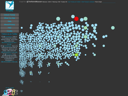
Enter any Twitter account name in TweepsKey and you'll get a visual representation of their follower's activity. Dot size, position and hue are determined by followers and tweeting frequency. Never mind that though - look at the pretty patterns!
2. StreamGraphs
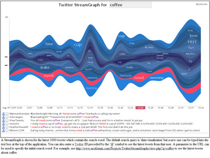
One among a number of apps from developer Jeff Clark at Neoformix, StreamGraphs is a keyword visualiser. It displays words related to search terms you enter, using Java to render beautiful graphs with selectable sections. Trippy.
Sign up for breaking news, reviews, opinion, top tech deals, and more.
3. ISParade
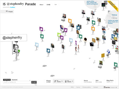
ISParade is a Japanese slice of digital lunacy which went viral about a month back. Enter Twitter usernames or keywords and it generates an animated parade of avatar-headed followers, complete with thumping soundtrack, farmyard noises and tweets popping out in speech balloons. Freaky and fun.
4. Tori's Eye
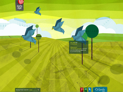
Putting the twee back into tweet, Tori's Eye converts Twitter output into origami birds flying over a crafty landscape. Hover your cursor over one of the paper avians and the message pops up. Sweet, pointless and oddly reminiscent of Michael Gondry movies.
5. Revisit
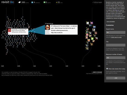
Getting a bit serious again, Revisit displays a timeline of tweets based on Twitter's search syntax. Using Boolean queries you can build highly selective, animated graphs of incoming messages, with the newest displayed live and large on screen.
6. TweetFlare
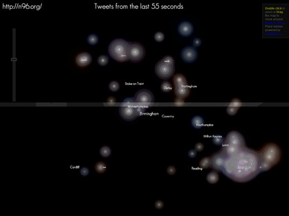
There are several visualisers that display tweet frequency on maps, but few as compelling as TweetFlare. Every tweet lights up a geographic area, overlapping and incandescent. Concentrations of activity around major cities are easy to see and lovely to behold.
7. Twistori
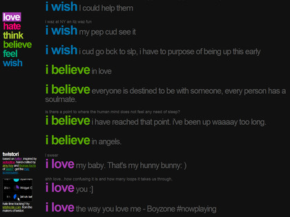
An oldie but a goodie, Twistori lists tweets documenting the Twitter population's state of mind. Pick from love, hate, think, believe, feel or wish and you'll see the hopes and dreams of the world laid out in primary colours. And also lots of swearing.
8. Visible Tweets
Visible Tweets. They're tweets and they're visible. And they animate too. Enter keywords to be rewarded with a deluge of animated twittering, from a choice of three pretty styles. Bonus - the background colour changes with each refresh.

9. MentionMap
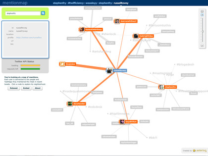
A little unusual, MentionMap tracks the relationships between tweets as users mention other users. The data stream is live and animated, and young can zoom into any hashtag or user to pull up more and new data. Has the considerable visualisation virtue of actually being useful...
10. TwitterMotion
Have you ever wanted to chop up your friend's tweets into animated chunks, making them look like the opening credits of a 90s action movie? Just us then. And we've found a tool that does it for us - TwitterMotion. All we need now is a CD full of James Bond themes and a big bag of Maltesers.
