Bing announces design changes to speed up web searches
Cleaner look offer quicker search

Bing has announced that it has been given a design refresh with the focus on getting faster results to users.
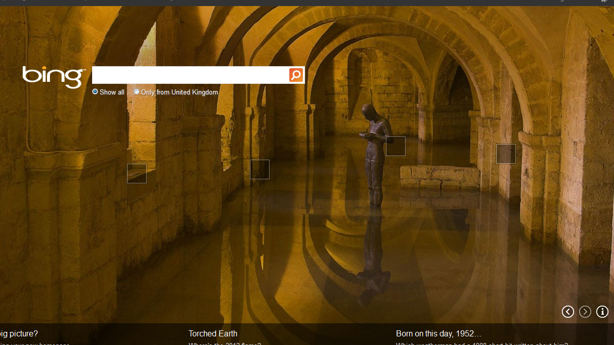
Announced on the search engine's blog, the Bing homepage has been de-cluttered and the daily image expanded as a result.
"Most of us would like to spend less time searching for information online, as, let's face it, there is more to life than search," explained Peter Maxmin, head of Bing UK.
"We want to make your search experience quicker and easier so you can get on with the important stuff."
Clean-up
We are not quite sure what's more important in TechRadar's life than search, but now we can go do it apparently and it is all thanks to Bing.
Other changes include the removal of information of the left of the page and a smaller header.
According to Bing, by doing this, searching will be more prompt as it "raises the level of consistency and predictability while making it easier for you to scan the page and quickly find the information you want".
Get daily insight, inspiration and deals in your inbox
Sign up for breaking news, reviews, opinion, top tech deals, and more.
The changes have also been put in place with phones and tablets in mind, with the blog noting: "Increasing the space between lines improves readability and optimises the page for touch devices."
This is all rounded off with faster load times and improved relevance – something Bing will hope will give it the edge over the rather large elephant in the room.
Marc Chacksfield is the Editor In Chief, Shortlist.com at DC Thomson. He started out life as a movie writer for numerous (now defunct) magazines and soon found himself online - editing a gaggle of gadget sites, including TechRadar, Digital Camera World and Tom's Guide UK. At Shortlist you'll find him mostly writing about movies and tech, so no change there then.
