Gmail and Google Calendar get restyled
Decluttered new-look for the Big G

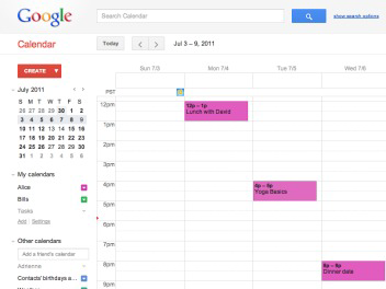
Google has started to rollout design changes to Google Calendar and Gmail, in a bid to de-clutter the online services.
The changes are merely cosmetic for now, and are not affecting how Calendar or Gmail works.
In the calendar, a number of tweaks have been made to the layout. These include the quick add button moving to under the create button, the print and refresh links are now buttons and visual indictors on calendar entries will now only appear if you hover over the event.
Google has made these changes to focus more on the functionality of the calendar, rather than providing an overwhelming information overload.
It is also so that the look of the desktop, tablet and mobile versions of the service will be more consistent.

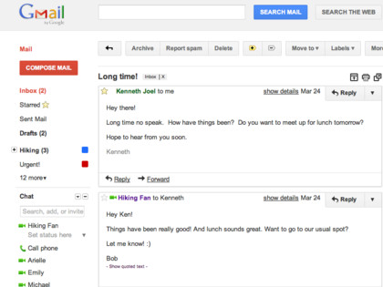
As well calendar, Gmail is getting a new look which takes a similar streamlined approach and adds a number of new themes.
Preview and Preview (Dense) have been created to accommodate different screen sizes, which is set to happen some time in the near future.
Get daily insight, inspiration and deals in your inbox
Sign up for breaking news, reviews, opinion, top tech deals, and more.
We're embarking on a series of interface updates to help strip out unnecessary clutter and make Gmail as beautiful as it is powerful," said Google about the new design changes.
"This is part of a Google-wide effort to bring you an experience that's more focused, elastic, and effortless across all of our products."
Marc Chacksfield is the Editor In Chief, Shortlist.com at DC Thomson. He started out life as a movie writer for numerous (now defunct) magazines and soon found himself online - editing a gaggle of gadget sites, including TechRadar, Digital Camera World and Tom's Guide UK. At Shortlist you'll find him mostly writing about movies and tech, so no change there then.
