Google explains overhaul to Chrome Web Store
Look and feel changes

Google has explained the process behind the redesign of its Chrome Web Store, hoping the changes make it easier to download the latest apps to your browser.
The Chrome Web Store is a key part of Google's strategy going forward, and vital to the success of its Chromebook project.
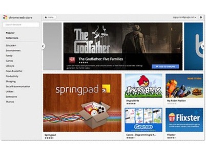
To that end, the UI of the Chrome Web Store has been given an overhaul – with a more graphical offering and a refined process.
Wall of images
"Apps and extensions are now presented in a wall of images that's updated every time you visit the store," explained project manager Shannon Guymon on the Chrome blog.
"We hope this will help you quickly scan the store and find interesting things to try out. In addition, apps and extensions are easier to install—just hover over an image on the grid and click "Add to Chrome."
"Getting additional information about an app or an extension is just a click away. When you click on an app, extension or theme, you'll see a panel featuring screenshots, videos and other relevant information neatly organized into separate tabs.
"The store also includes a brand new reviews interface that links to the Google+ profile of each reviewer."
Get daily insight, inspiration and deals in your inbox
Sign up for breaking news, reviews, opinion, top tech deals, and more.
Google is planning more changes, insisting that features are on the way for the Chrome Web Store as it competes with some major names in tech.
Patrick Goss is the ex-Editor in Chief of TechRadar. Patrick was a passionate and experienced journalist, and he has been lucky enough to work on some of the finest online properties on the planet, building audiences everywhere and establishing himself at the forefront of digital content. After a long stint as the boss at TechRadar, Patrick has now moved on to a role with Apple, where he is the Managing Editor for the App Store in the UK.
