Google shows off new home page
Fade in...

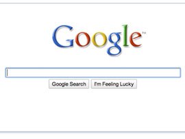
Google has unveiled its new homepage look – with the most important features appearing first and other options fading in over time.
Marrissa Mayer – Google's VP of Search Products – discussed the changed on the official Google blog, explaining why you'll start by seeing only the logo, search box and buttons.
"You may have noticed that our homepage is sporting a new look," blogged Mayer.

New version
"Today we're excited to be releasing a new version of our classic homepage. The main feature of the new homepage is that it "fades in" — when the page first loads, it shows only our logo, the search box and the buttons," she continued.
"For the vast majority of people who come to the Google homepage, they are coming in order to search, and this clean, minimalist approach gives them just what they are looking for first and foremost.
"For those users who are interested in using a different application like Gmail, Google Image Search or our advertising programs, the additional links on the homepage only reveal themselves when the user moves the mouse."
Get daily insight, inspiration and deals in your inbox
Sign up for breaking news, reviews, opinion, top tech deals, and more.
Mayer explained that Google had trialled 10 different ideas for the refreshed home page, and an even more minimal idea – where the buttons didn't appear until a mouse move – proved to be the least popular; presumably because it meant that people had to press return.
You can check out the new page at, guess what, http://www.google.co.uk/
Patrick Goss is the ex-Editor in Chief of TechRadar. Patrick was a passionate and experienced journalist, and he has been lucky enough to work on some of the finest online properties on the planet, building audiences everywhere and establishing himself at the forefront of digital content. After a long stint as the boss at TechRadar, Patrick has now moved on to a role with Apple, where he is the Managing Editor for the App Store in the UK.
