How to create your best website layouts ever
From sketch to screen - how to get results you'll be proud of

Ah, the blank canvas: probably my favourite part of the design process.
What I love about it is the multitude of opportunities it represents: free rein to create without being encumbered by any of the restrictions that come into play further down the line. Anything can happen!
There are a number of ways to approach this stage. Some like to jump straight into Photoshop (or their layout tool of choice), but personally I try to stay 'analogue' for a while and work with good ol' paper and pens.
Such tools are far more freeing than using a mouse and computer screen. They enable us to throw down ideas as soon as they come into our heads and be as expressive as possible, having absolutely no concern for things like neatness, which – at this stage, at least – just get in the way of creativity.
If you haven't worked this way before, give it a try: it's extremely liberating.
To get further outside of your comfort zone, try doing your sketches in a completely different environment to where you do your more finished designs. If you're not using a computer then you can travel light and not worry about things like electricity, so use it as an excuse to get outside. If it's a sunny day, find a patch of grass. If it's raining, revel in the hustle-and-bustle of your local coffee shop.
The sketchpad
Get daily insight, inspiration and deals in your inbox
Sign up for breaking news, reviews, opinion, top tech deals, and more.
My weapon of choice at this stage is my trusty A5 pad, which is just small enough to carry around easily but just big enough to fit in plenty of ideas. I prefer a blank one myself – because it feels the most 'free'. Many designers favour the Moleskine.
Later, when you're getting ready to neaten up your sketches (obviously it's impractical to continue down the path of freeform messiness forever), using square gridded paper can be a great way of deciding on your own grid structure, but more on that in a moment.
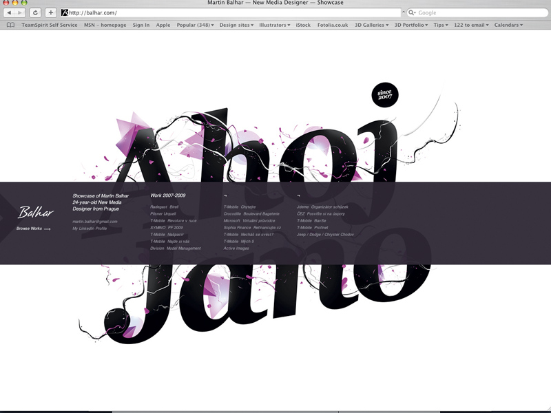
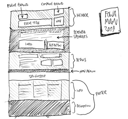
If sketching is a new concept to you and you're not sure of the best way to approach it, try this exercise. Look at an existing website – ideally, one created by a designer you admire – and re-create it as a rough sketch in your pad.

SKETCH IT OUT: Sketching out sites designed by others can be a great way of rethinking your own approach to layout
Firstly, this will help familiarise you with the relationship between sketch and finished product. Secondly, with long pages that have lots of content, it'll help clarify how an entire page fits together – that is, the full height of any given page rather than just the bits we see in the limited browser window.
Sketching is a handy way of coming up with ideas, and refining your sketches before jumping into Photoshop means you can sort the good ideas from the bad quickly, without wasting time in an actual layout app.
However, there's no point in refining sketches too much, because detailed design is best saved for the medium in which it will eventually be experienced: the screen. Personally, I sketch in my pad until I become frustrated enough that I'm not working out the technicalities in Photoshop. At that stage, it's time to start blocking out elements using wireframes.