How to create your best website layouts ever
From sketch to screen - how to get results you'll be proud of
Wireframes can mean different things to different people, and even vary from project to project. Some designers or clients like wireframes to go into great detail and define exact proportions of the grid that the site will eventually follow. Others treat them as nothing more than 'neatened up' versions of the most refined sketches.
In reality, there are no hard and fast rules to live by, except to say that wireframing should enable you to see how the website will be laid out before any of what I call 'the pretty stuff' gets added on top.
As I said in last issue's article about working as a solo web designer, this is why it's a good idea to separate out the wireframe and aesthetic stages of design: although they're both parts of what you could liberally call 'the design phase', they focus your client's attention on different aspects, one part at a time.
Very loosely, you could say that wireframes enable them to think about layout from an interaction point of view, and aesthetics let them concentrate purely on the emotive experience.
Whether you decide to define your exact grid during the wireframe stage or later, when you approach the 'proper' design, is an important decision.
A popular grid is the 960 Grid System, which – at 960 pixels wide – can be divided into many different inner widths, such as 16 or 12 equally wide columns with gutters.
However, it doesn't really matter which grid you use, be it your own or one created by others, because ultimately it should be one that suits the content and provides you (the designer) and others (the site's maintainer) with a guide that allows for the aesthetically pleasing alignment of a variety of different page elements.
Get daily insight, inspiration and deals in your inbox
Sign up for breaking news, reviews, opinion, top tech deals, and more.
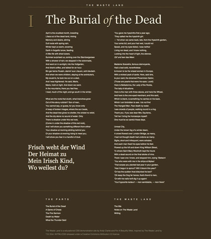
Carried across a site's various pages, this considered alignment helps create a visual consistency. In his presentation 'Walls Come Tumbling Down' , designer Andy Clarke reminds us that for large sites with a lot of dynamic content, we're designing a system, not a page. (Andy is also a big fan of creating your own bespoke grids that are dictated by the site's content. A number of his experiments with varied grids can be found here).

EXPERIMENTAL: Andy Clarke's experiments with alternative grids are legendary. Here, he presents the poem in a traditional book format
For more on grid-based theory and how principles from the art world can assist with our layout choices – such as using the Rule of Thirds or the Golden Ratio to define your relative widths – see Mark Boulton's book A Practical Guide to Designing for The Web or my own recent book, Sexy Web Design.
So, with our sketches informing our wireframes and our wireframe helping to formulate the grid on which we'll base the actual design, it's time to move into the meatiest part of the project and start turning our ideas into something that resembles a functioning website.
My tool of choice for this task (and the wireframing stage before it) is Photoshop which, although not perfect, is a powerful program that enables me to visualise what I have in my head in the quickest and easiest way, at least in the first part of the design phase.
Others prefer Fireworks, which was created for the specific task of designing for the web. But again, the tool is not important: it's what you do with it that counts!